Initial experiments and ideas
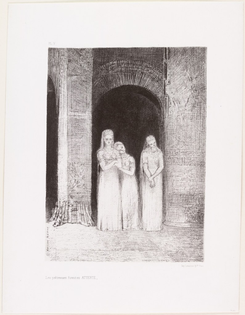
From my previous exercises and collection of work I have already created, I had a clear vision going into this assignment of what piece of work I wanted to create for my final still life drawing for this part of the module. I really liked my more recent pieces, experimenting with my style, creating atmosphere and how I create tone in a piece of work. Furthermore I feel the style I have recently developed while looking at Odilon Redon’s work, being influenced by how his markings hold a lot of atmospheric weight and effectively purvey tone, is one I would like to explore further. I like how my experiments with ink and etching came out, and knew that they would be drawing mediums I would want to utilise for this piece.
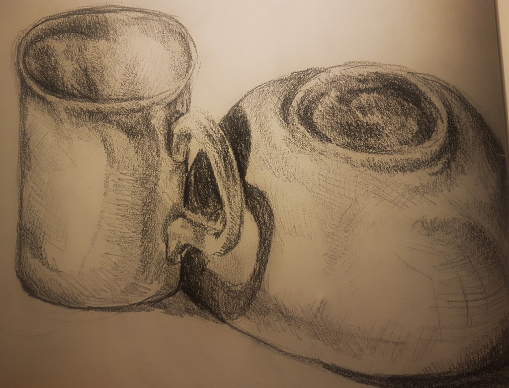
Keeping in mind my ideal mediums and ideas I decided the objects I would focus on would be lamps as they can be very atmospherical. Especially if one were turned on, I thought that would create an atmospherically unique composition. To keep to my minimalistic aesthetic within my drawing, I decided two lamps would be most effective, to create further intrigue within my composition I decided on a hanging light and a floor or table lamp, with a bold black background, to help guide the focus onto my two objects.
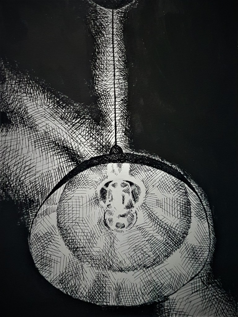
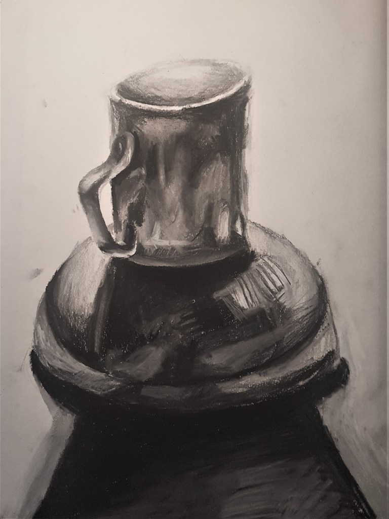
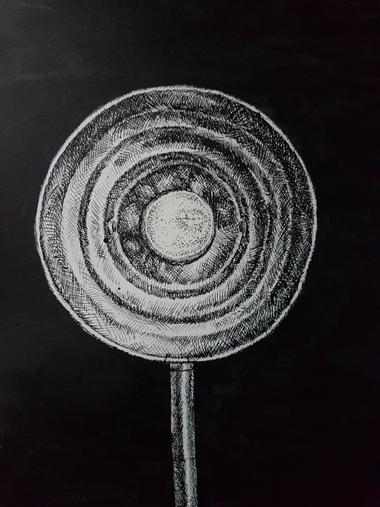
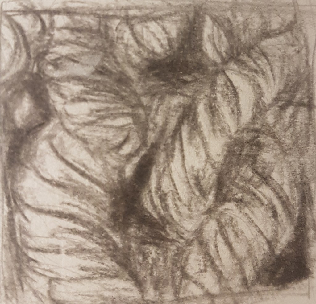
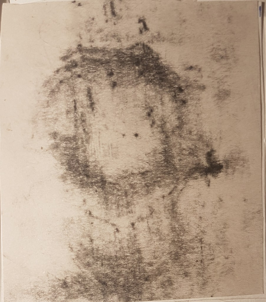
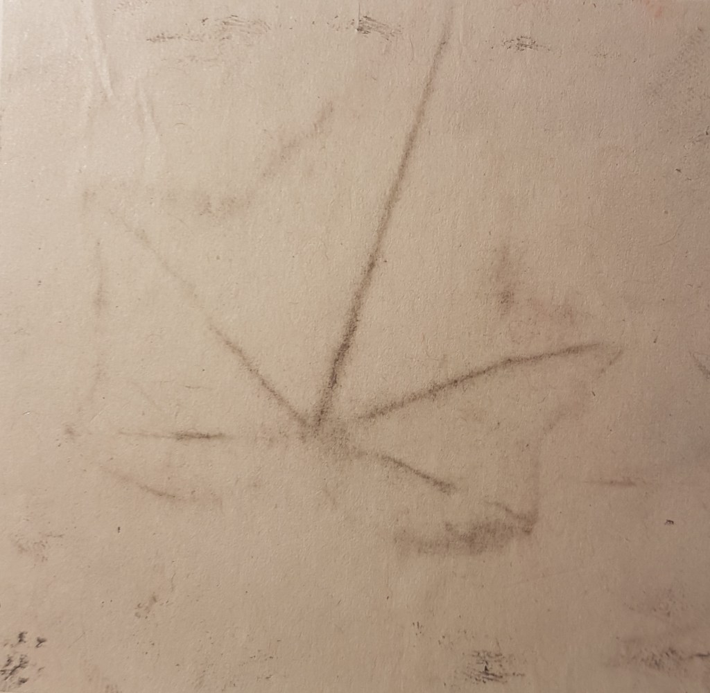
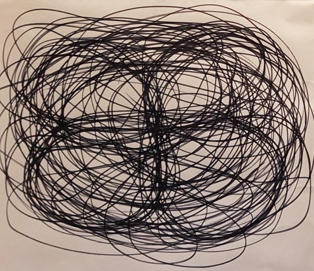
To begin with I decided to test out my ideal drawing style in ink on one of the lamps I wanted to draw. I like this angle I decided on as the some of the bulb details are very clear and I like the way the light reached out from the shade. I had to highlight around the darker parts of the lamp that would have otherwise disappeared into the black background to help show the shape. I t feel this adds to the glow of the light which I quite like. However I feel that some of the highlights, such as around the cord, are to bright and would be better executed by drawing with the highlights. However I like the mysterious and foreboding atmosphere I have created within this drawing.
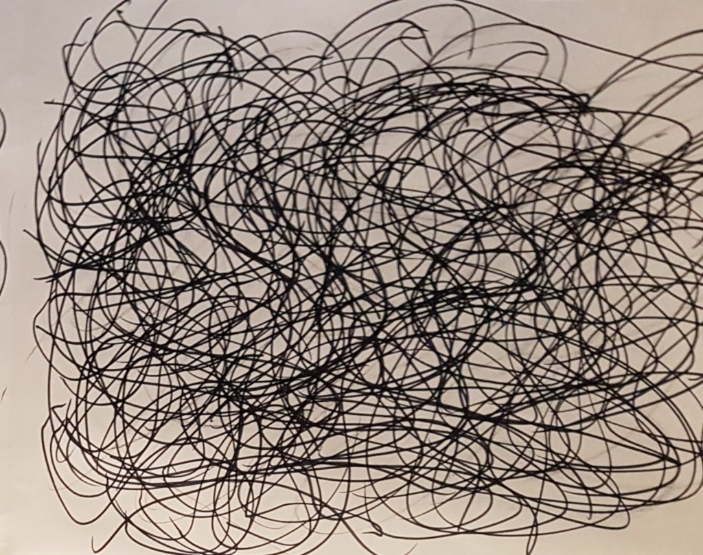
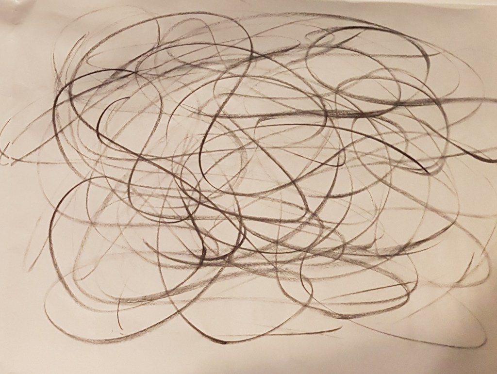
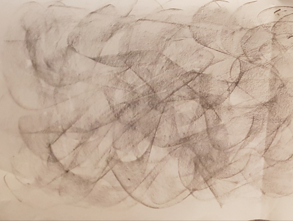
[1] 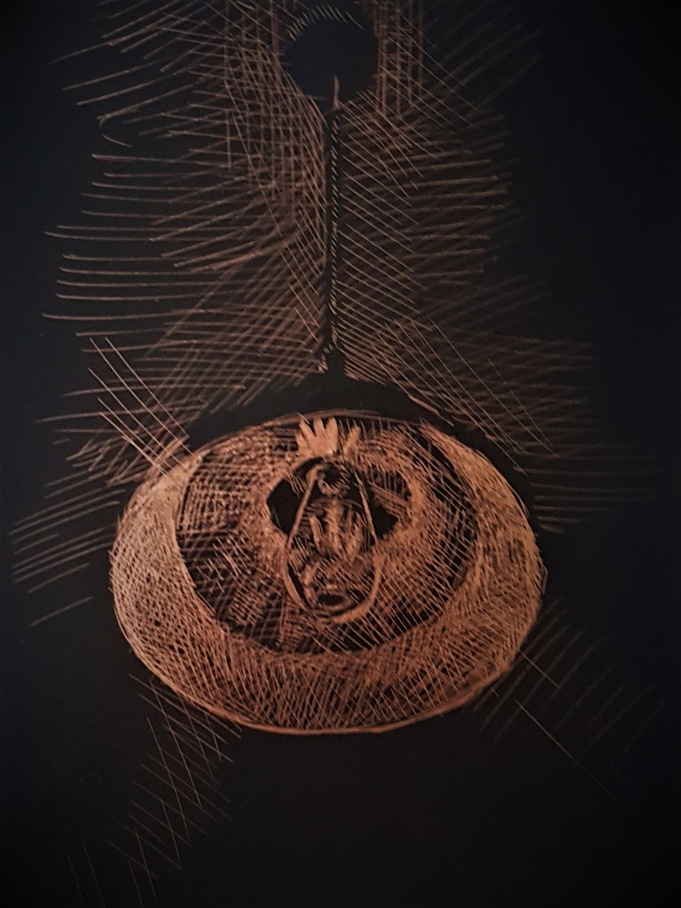
[2] 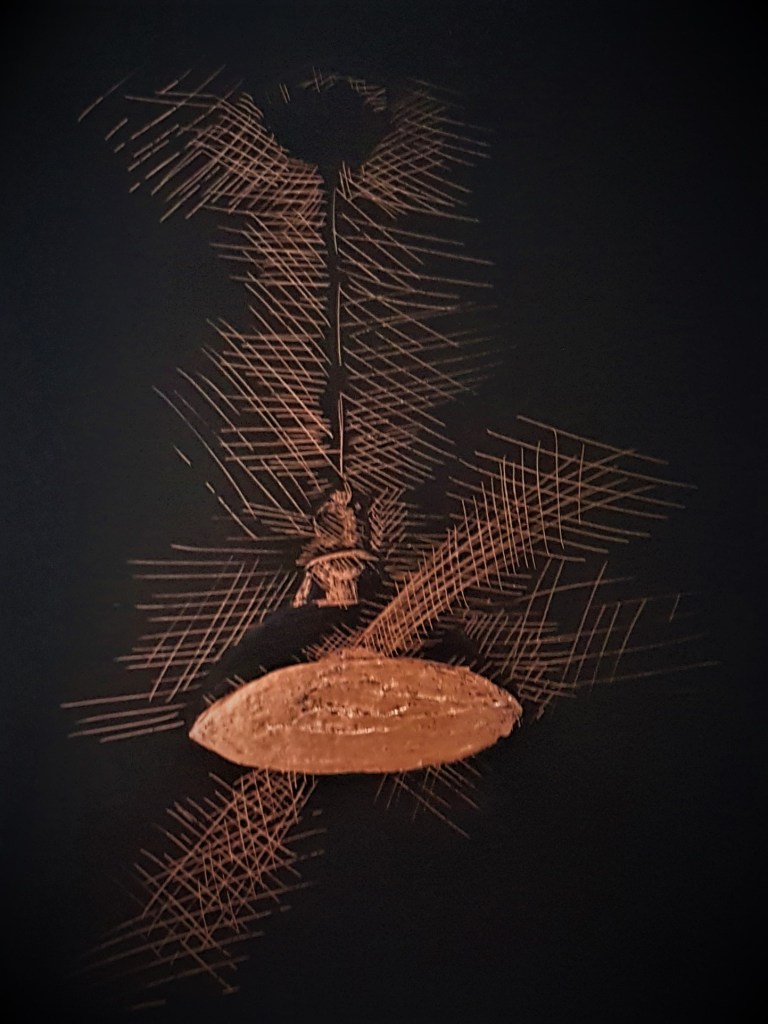
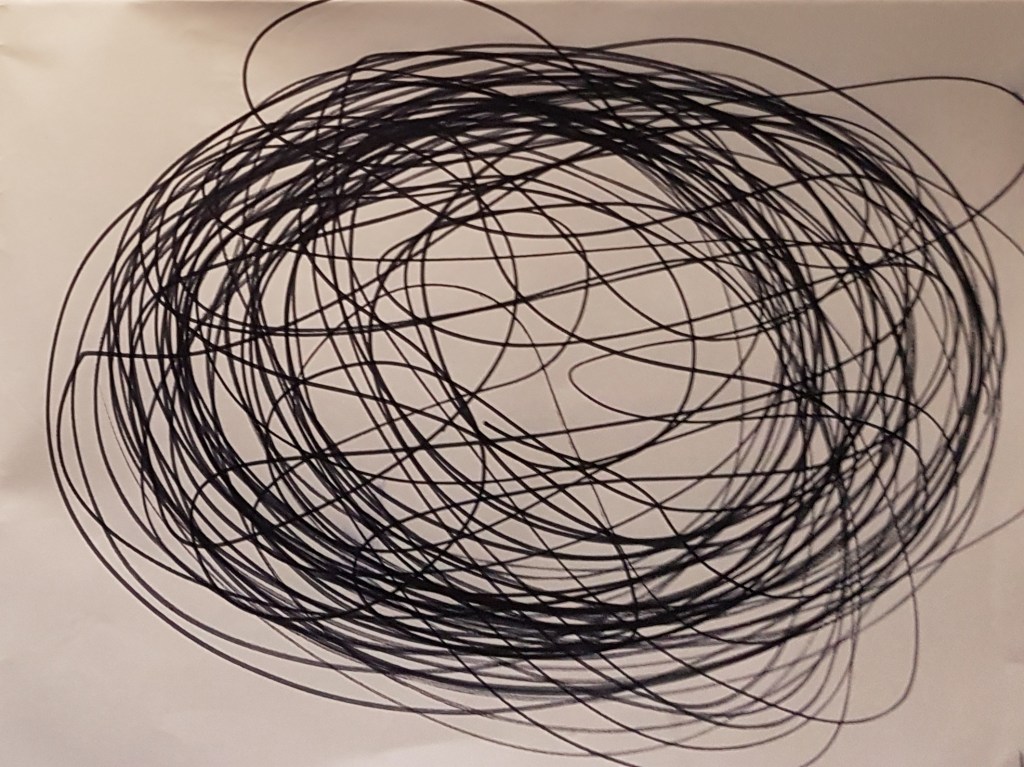
[3] 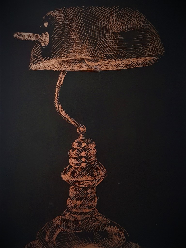
[4]
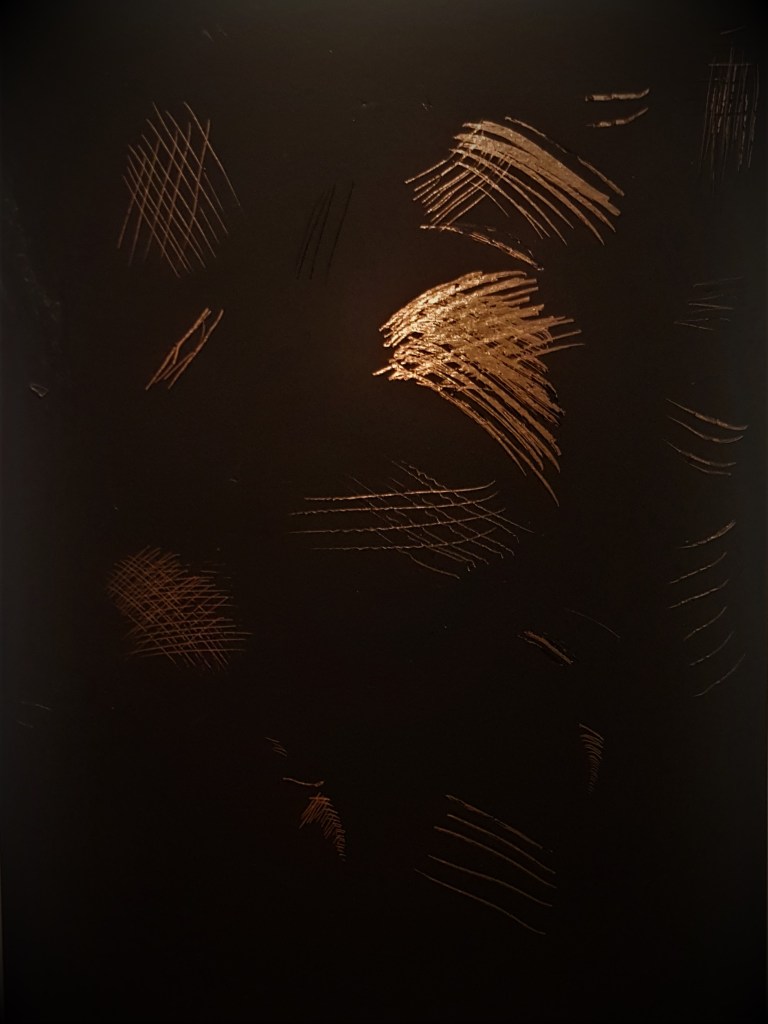
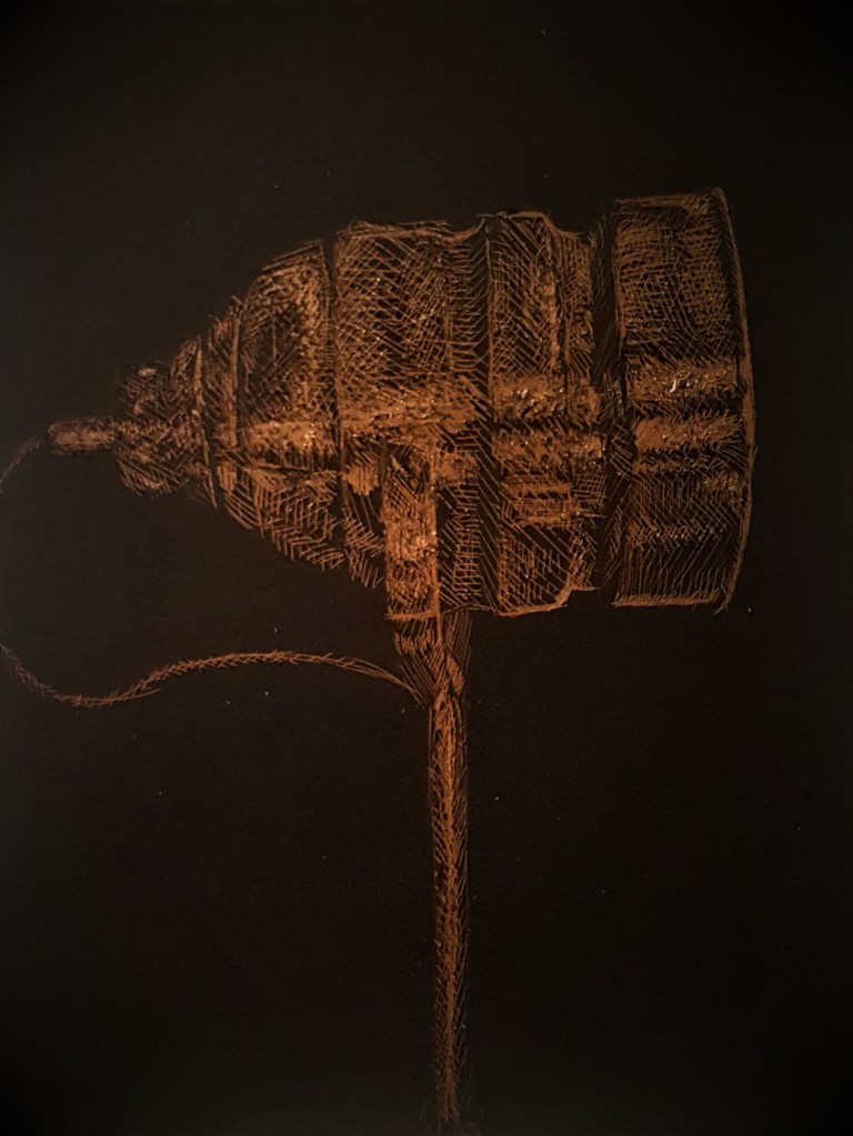
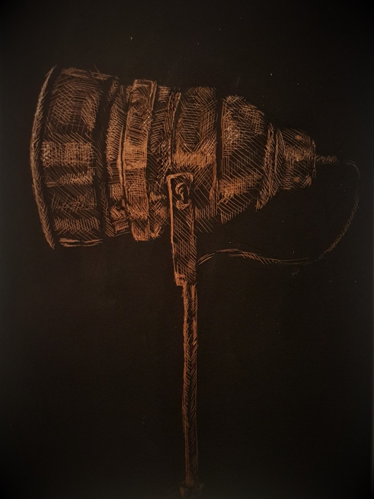
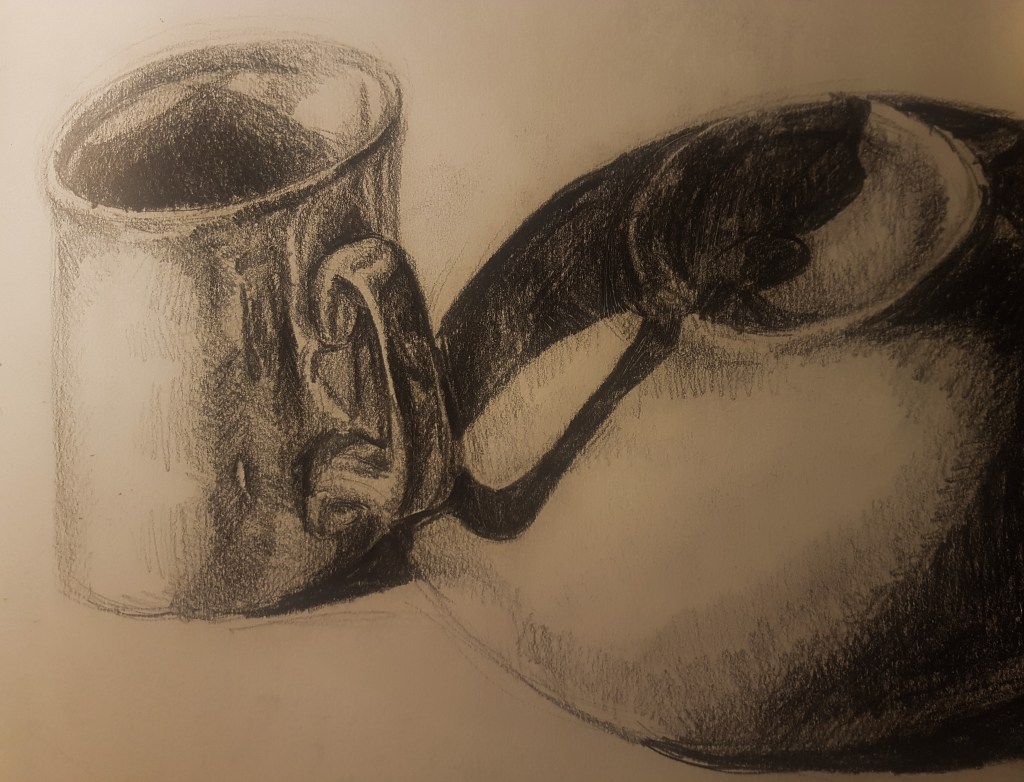
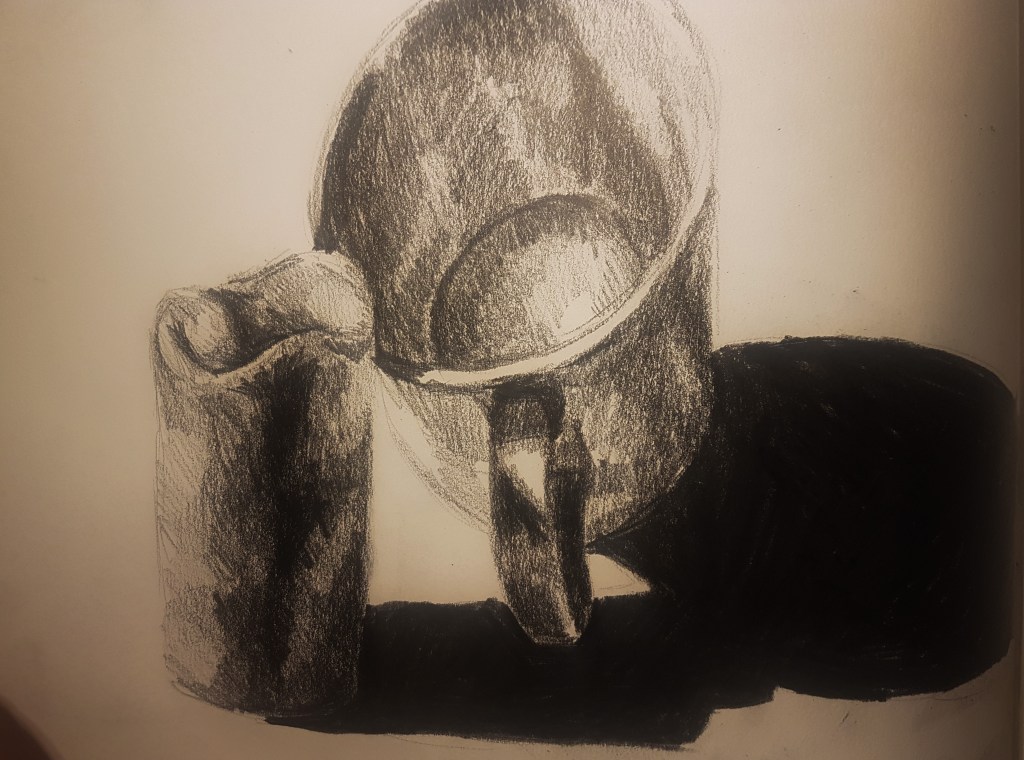
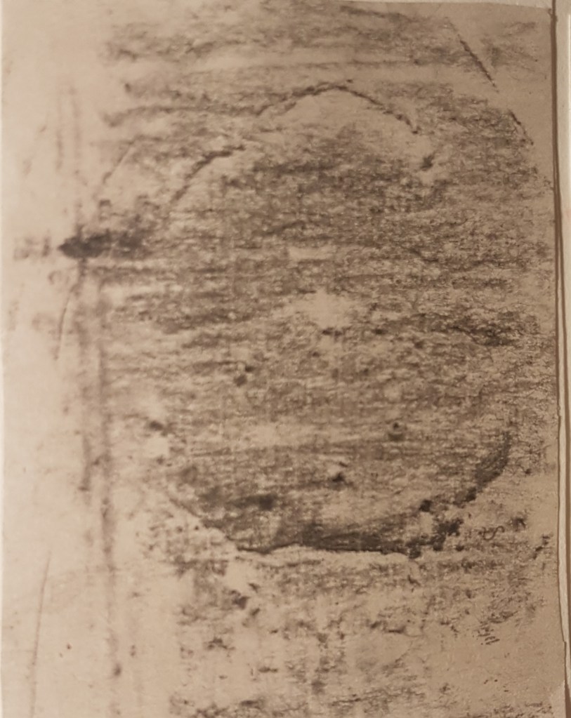
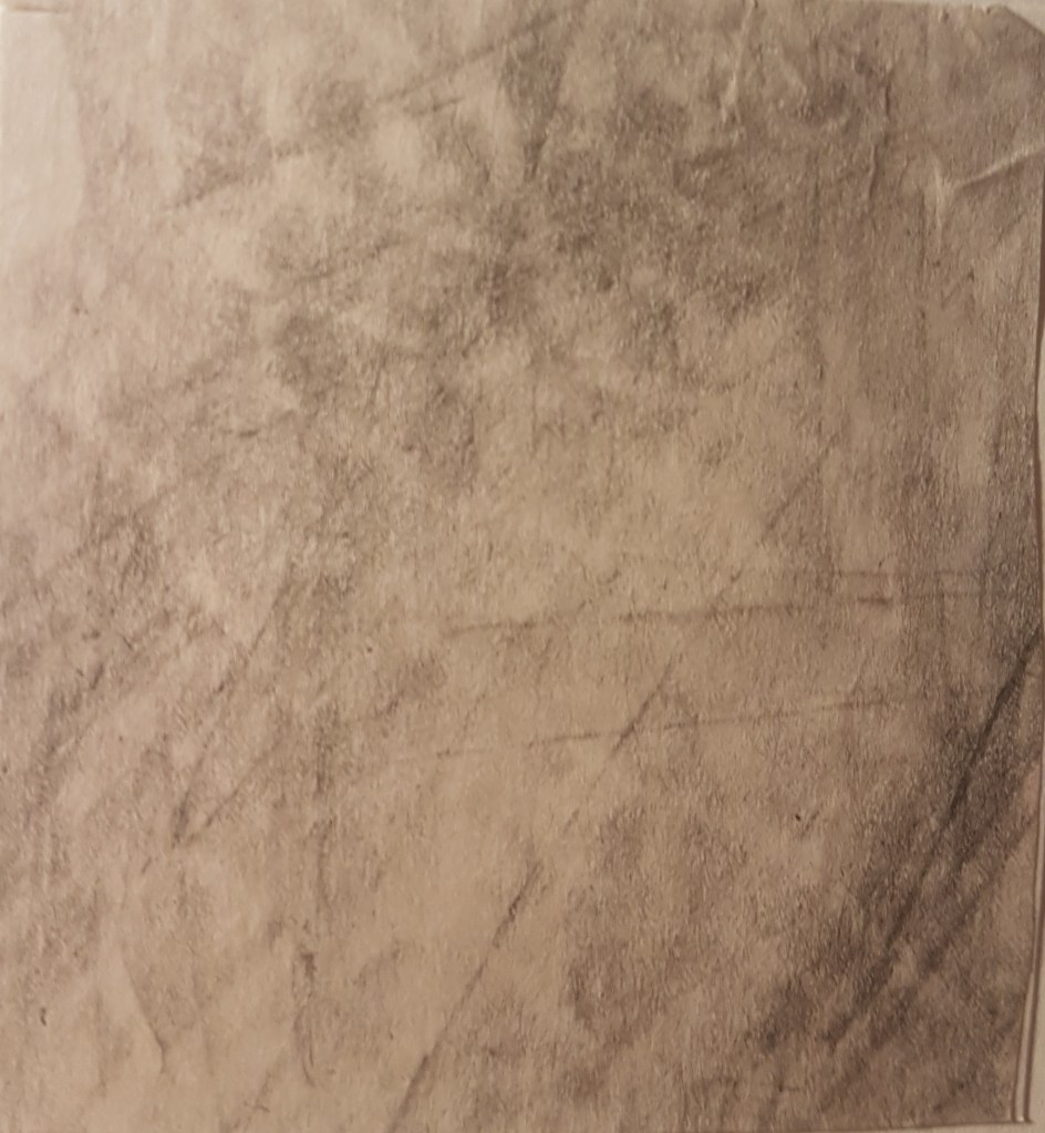
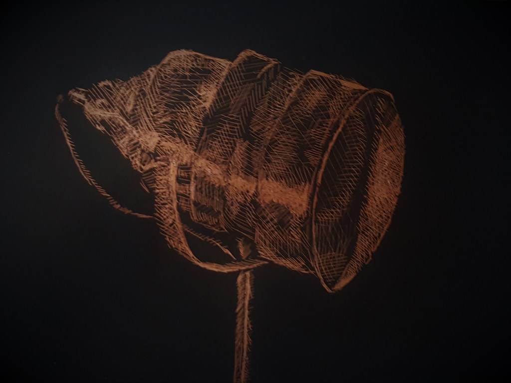
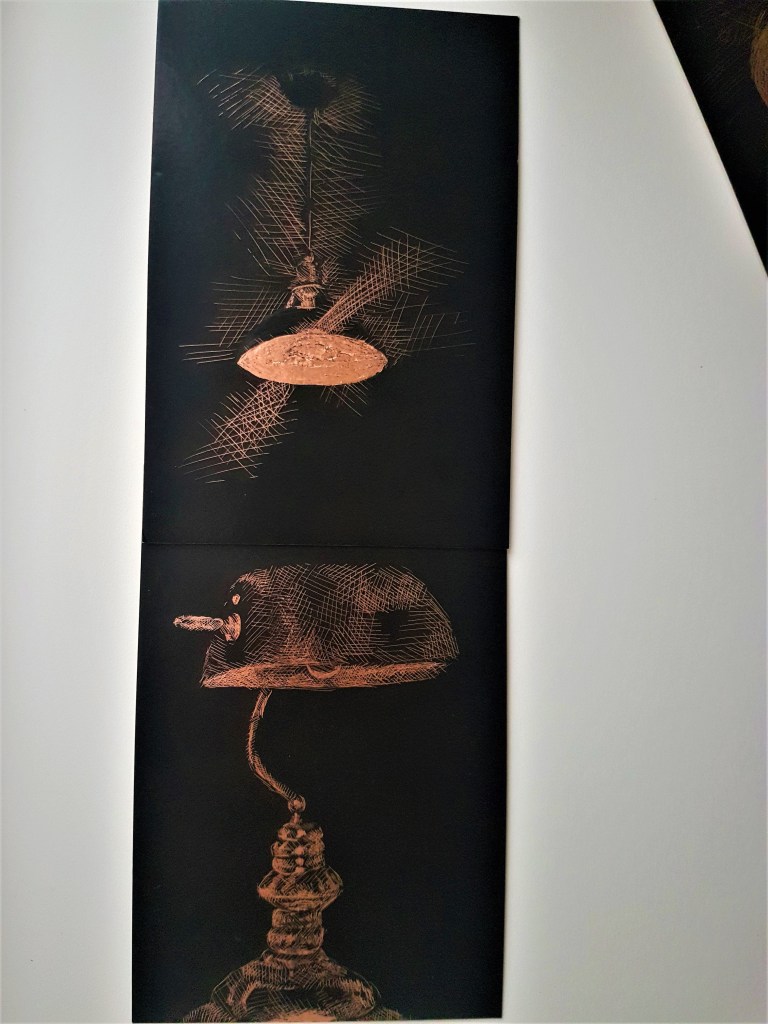
Moving on, I began experimenting with another idea of using the copper etchings as a effectively show use of tone in a unique way, due to the shine of the coper foil. I like the way I can show the shine of the light from the ceiling lights in a much more natural and more effective way, its way more subtle than how I did it with the ink. In terms of choosing between the floor and table lamp for my second object, I think lamp[1] has more interesting details than lamp [4]. Furthermore I think the lamp shade from drawing [4] is too bland and not as interesting tonally as lamp [1] with the metallic head.
Experimenting with composition
In order to decide on my composition I laid out all of my cards, keeping in mind the possibility of doing them in ink. The cards were useful for deciding how to place my composition and to decide on my which lights/lamps would be the two I’d like to use.
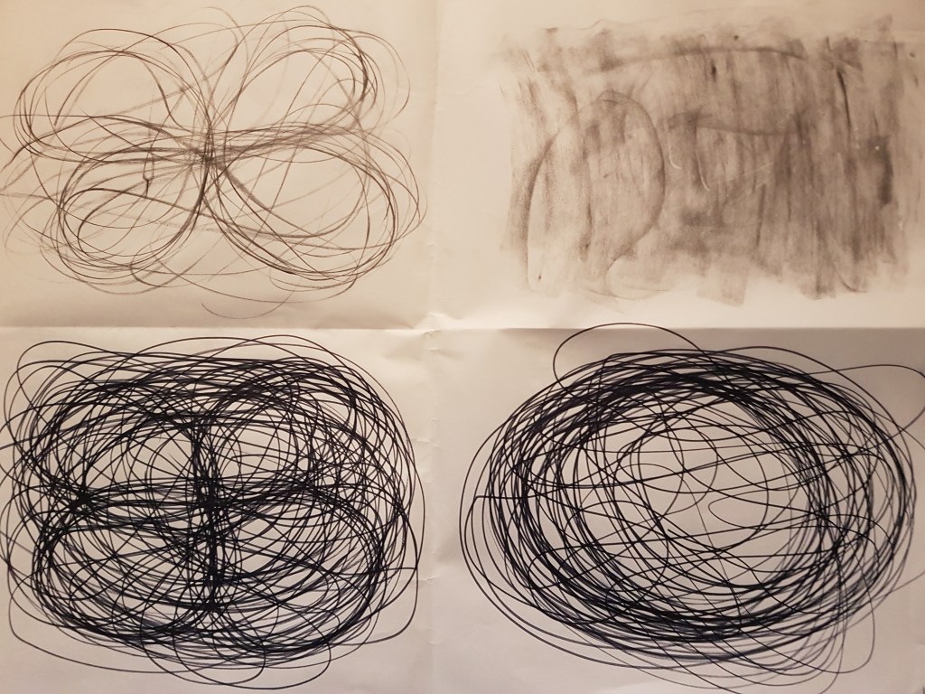
[1] 
[2] 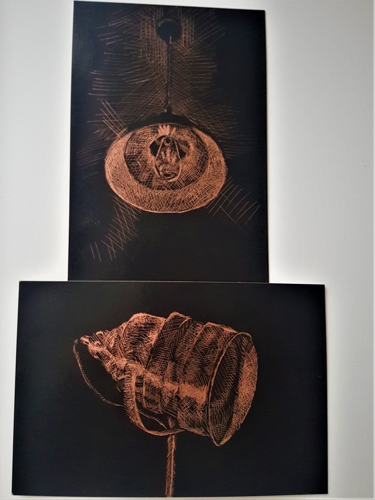
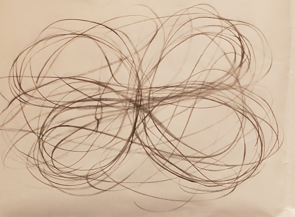
[3] 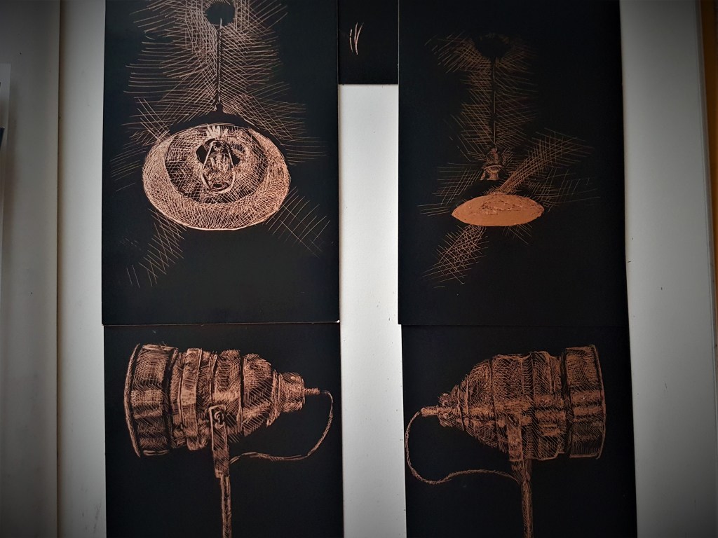
[4] [5]
By placing out all of the cards like such, it helped me to understand how the lamps could possibly look when arranged together for a still life. As discussed before, I quickly ruled out possibilities [1] and [2] due to the bottom lamp, it wasn’t as interesting as the metallic one but also it would be hard to position under the ceiling lamp. I also ruled out [3] as I didn’t like the angle I chose for the bottom lamp, I found I much preferred a simple side view, which fit into the minimalistic style I wanted better than if it were at an angle. I really do like the attempt at the ceiling lamp in [5] with how bright it is, however I preferred being able to see the detail of the light bulb, and thus I went with composition [4].
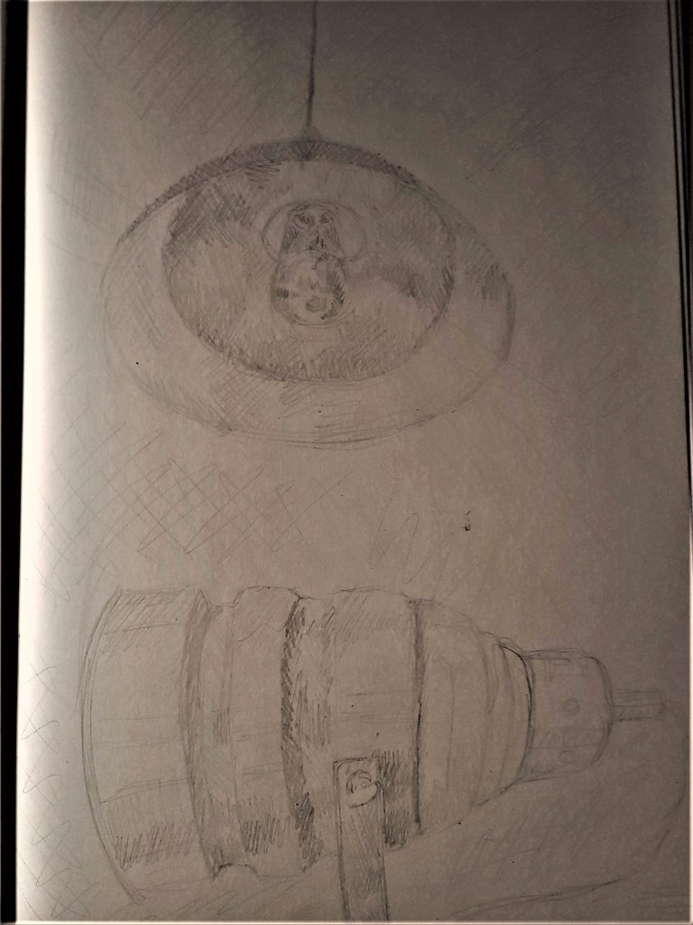
To finish off this process, I did a quick pencil sketch of what I wanted to achieve with my assignment piece. I then thought about what media I wanted to use to produce the piece. I did like the traditional look of using ink. However I thought the use of metallic foil added an industrial feel, was more effective in portraying the highlights of lights and created a mysterious atmosphere that I liked. I decided on the metallic foil card and etching, however the biggest card available for the foil was A4, I decided to take a risk and do a smaller assignment piece in order to have my stylistic choice, as I feel it is more effective in showing the feeling of my markings and portraying the tone of the objects.
Assignment One
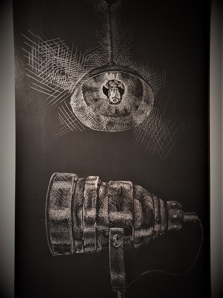
I went for a silver foil card, in order to creating a bigger contrast between the black background and my markings, and cropped the card so my two chosen objects were much more centre. I think I could have improved on the bottom lamp by having more areas of shadow to create more detail, as for the ceiling lamp, I regret adding highlights to the outside shade, I feel it would have been a more effective use of tone to not highlight that area. I do love the way I captured the rays of light flaring from the ceiling light, and highlighting the cord of the ceiling light. I think I did well at creating a mysterious, foreboding atmosphere, in terms of my markings, I feel they’re very calming and smooth. I’m happy with the finished product and the process to getting it to this point.
Reflection on progress
I feel I have a good grasp on my technical and visual skills, however I could work on making sure my proportions are accurate, as sometimes they are slightly off. This is due to not having a proper working space yet and sitting at an angle, so I need to sort out a proper desk to work from. I feel as though my writing could be improved, especially with how I analyse other Artists work, finding references and sources discussing the work etc. I think I could be a bit more experimentive, and try out many more ways of drawing and experimenting with media, and in the process develop more of a personal voice, especially within my art work.