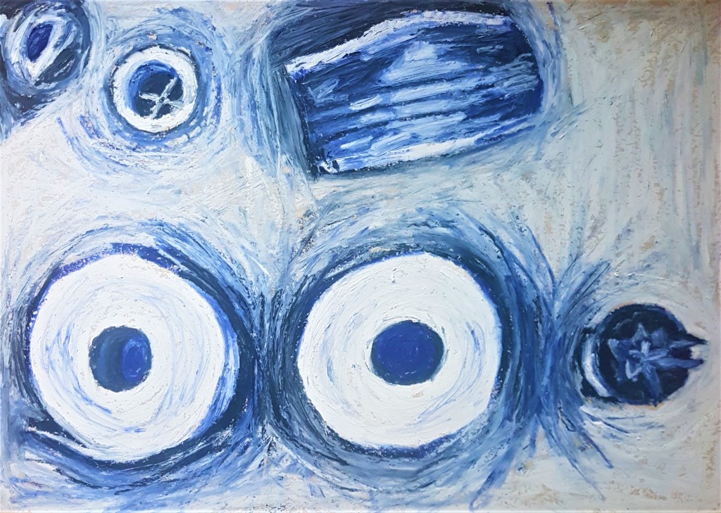
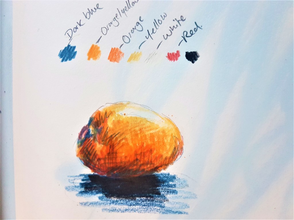
For this exercise, my goal was to create an image in a singular colour looking at both natural and man made objects. I decided to keep a focus on the pandemic, looking at toilet paper, a mask and a plant positioned near a sink drain.Keeping in line with my drawings from the previous exercise. I liked the look of my minimalistic composition and decided to get to work. Beginning with further exploration on oil pastels.
First attempt- Oil pastels
Blue and white oil pastels
I used an elevated position for my composition in order to focus on minimalistic shapes that fit into the minimalistic style and composition I have opted for in this drawing. I chose the colour blue as it’s a cold colour and fits into the impersonal, medical theme I was aiming to achieve. I liked the expressive loose marks that oil pastels gave me, and found it easy to blend tones together and highlight shapes. I really liked the texture, it looks quite paint like while still holding qualities of a drawing medium. The only difficulty I really encountered in this drawing was how fast my pastels were wearing down, so moving forward with this medium I should look into ways I can move the product around as to not waste so much. I could look at blending it out with rubber brushes and also experiment with how that technique could affect the outcome and how I blend and work my colours and tones together. I found this medium worked well to produce a monochrome piece and was easier for me to work with as an artist, if I made a mistake it wouldn’t be obvious as I can cover it up by going over it with more pastel. However if I made a mistake with ink such as a drip or applying too much, it will be noticeable and not easy to cover up. I think ink can still be an effective medium, but pastels worked much better here for a much softer and looser approach to a Still Life.
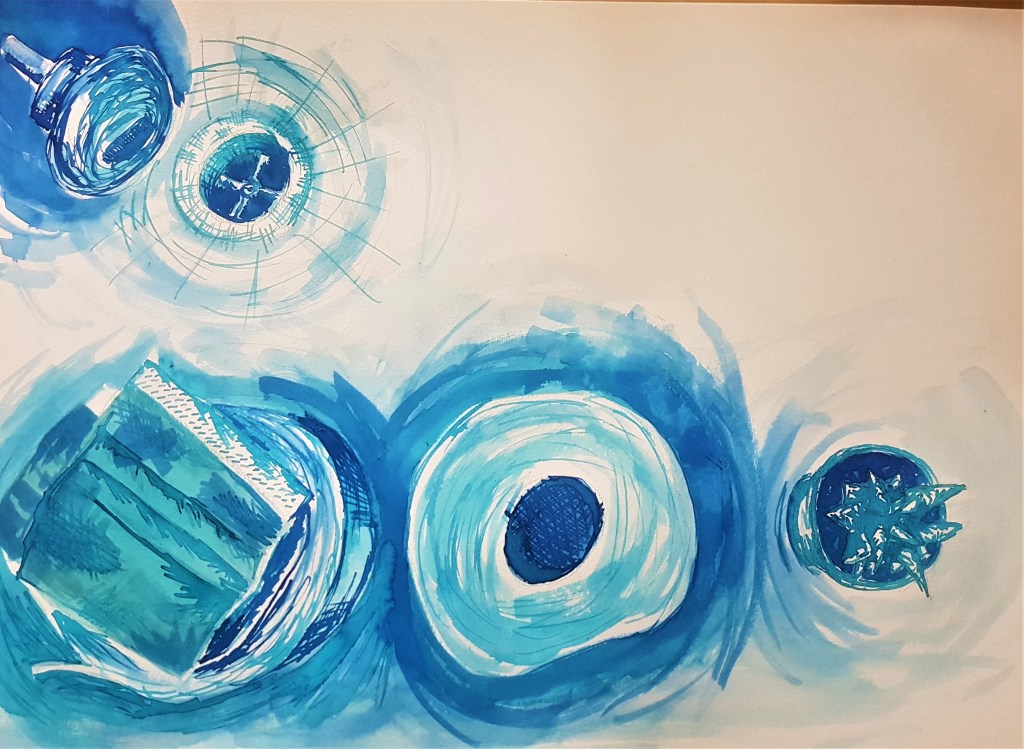
Second Attempt: Ink
Blue ink on paper
For this second attempt, I used a similar composition, but tried the mask on top of the toilet paper in order to make a wider negative space within my composition which I found I preferred as the space feels less cluttered and planned, it simmers out the focus from left to right which I think works well. I think I could have created more of a contrast with my tone, I think the piece as a whole is a bit too light and I could have layered up my ink for a darker colour or went in with some black ink as well. I think I focused too much on what I did previously and used a lot of wash instead of focusing on the media and its strengths. I should have went for a more illustrative style that works well with this media like I have done in the past, I got caught up trying to recreate the style I achieved with oil pastels rather than trying to be a bit more experimentive. I think th3e washes worked well for conveying the more subtle tone of the shadows cast by the objects, however for the objects themselves I should have used more crosshatching and lines to make them stand out and more detailed. I definitely prefer my first attempt and working with oil pastels, and I shouldn’t have tried to replicate the same style in my second drawing.
Moving Forward
I found this exercise interesting , as I have already explored a monochrome palette before in previous exercises, and I feel these didn’t come out as great. I think working a darker colour such as brown makes it easier to layer and add tone and detail, where as the blues I worked with were a lot lighter in comparison. I learned further about oil pastels and how to use them, but as I said earlier I need to explore other options of using them so they don’t wear down so fast. I did enjoy the process of blending the pastels together to create areas of tone and being a lot more loose and free with my strokes. I think moving forward I need to keep in mind what media I use and how I should use it. What works best? What style will work better with the textures and techniques I can use and create with the media I have chosen. As I feel I could have done more with my use of ink. I liked my composition choice this time, I think it worked well and maintained a very simple feel, so I feel I have progressed further in that area.
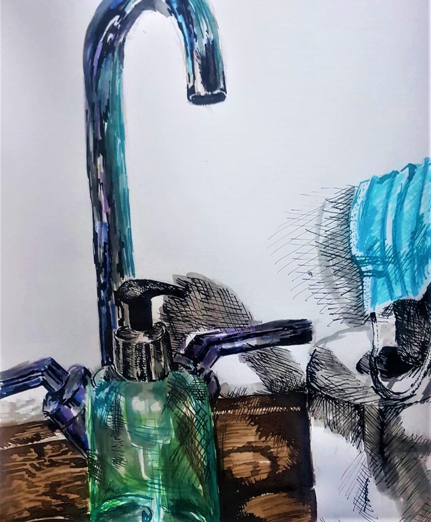
For this exercise I decided to focus on a new range of objects relating to the current situation of the pandemic. I looked at placing a mask, toilet rolls and hand soap at an angle near my sink when experimenting with what my composition could be for my first attempt at this exercise. With a good variety of textures in there, I could explore a range of interesting media and their effects, and create a unique drawing.
Felt tips, black and brown ink and liquid water colour in Sketchbook.
For my first attempt I looked at incorporating non-traditional media such as my 9 year old sisters felt tip pens and dipping ink, utilising it with more traditional media such as liquid watercolour. I found that the felt tips and liquid water colour worked well to create the metallic reflective texture of the tap. Fir the tap I kept my strokes straight and loose, but still blurred together, which contrasts with the outlines I created with dipping ink for defining the tone on the toilet paper. With each piece of media being introduced into my drawing I found my technique changed slightly. With dipping ink I was more in control and rigid with my strokes, I created harsher lines. I found the white wall in the background worked well to incorporate negative space within my work and give a focus to the objects in the foreground. However, I feel its a bit too bare and could make the drawing look unfinished. Moving forward I kept this in mind progressing on to my second attempt at the exercise. I chose a darker area to set up my Still Life with artificial lighting coming from above and behind.
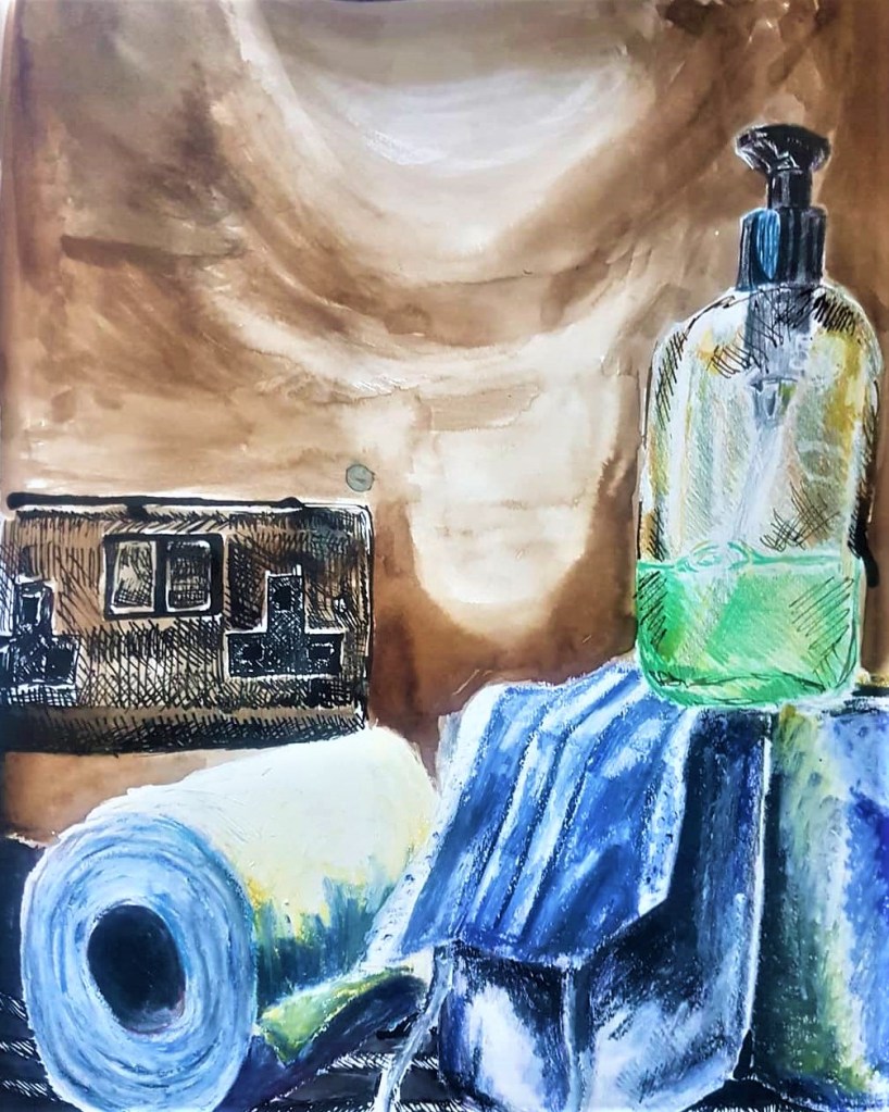
Still Life using; dipping ink, oil pastels and coloured pencils.
For this attempt I kept my incorporation of dipping ink but also tried colouring pencils and a medium I haven’t used before, oil pastels. I found that the different mediums didn’t blend as well as in my prior attempt as they all are very different (wet, dry and oily/thick). Thus the different areas where I change media stand out and apart from the rest of the drawing. I think the difference is obvious with the change between the brown ink wash background and the introduction of oil pastels in the toilet paper. Again I found my technique changes with each medium, I found I really like working with oil pastels best. They made a big change from what I have used before and had a paint like quality I really liked. it blended well together and worked great for capturing the tonal qualities with colour. The coloured pencils didn’t really work or blend into the drawing that well, so I ended up applying some ink cross hatching to link it to the rest of the image and tie it together a bit more.
Final Thoughts
I found this exercise a difficult one to put together, as I struggled trying to make the variety of media work well effectively as a piece. I think the variety of media worked well together in my first attempt, but I wasn’t entirely happy with the composition I chose, there wasn’t a main focal point and it seemed a bit all over the place. I much prefer my composition in my second attempt, but it still needs some work. although I don’t think my choice of colour and media work well together, I did enjoy the process of discovering a the medium of oil pastels. I found they work well to show and express tone in blocks of colour that you can continue to mould after putting them onto paper. I would want to explore this medium further as I continue to the next exercise and what effects and atmosphere I could create with the bold paint like strokes I can create. I would like to further develop my compositional skills moving forward, in order to create interesting and well put together drawings. I am happy I explored the ideas of combining media, but I am not sure it is something I’d use for an assignment piece. It did however help to see how my techniques change and differ when I use different pieces of media and to focus on these changes. It was useful to see how a variety of media can make, change or break a drawing. And this process will be kept in mind moving forward as I think about my composition, colour and choice of media.
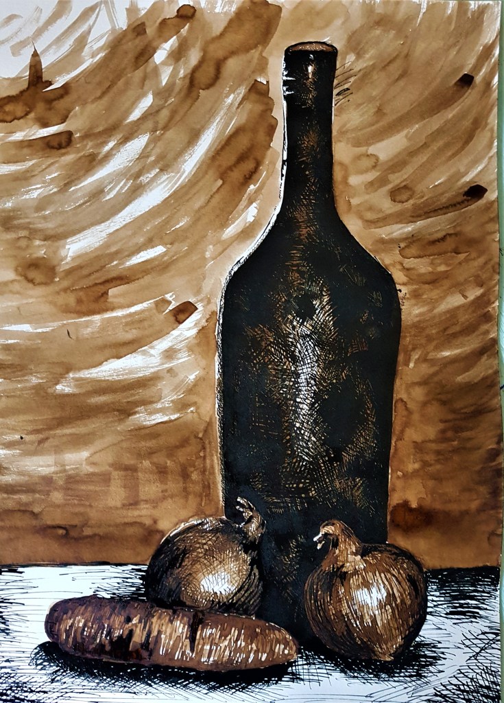
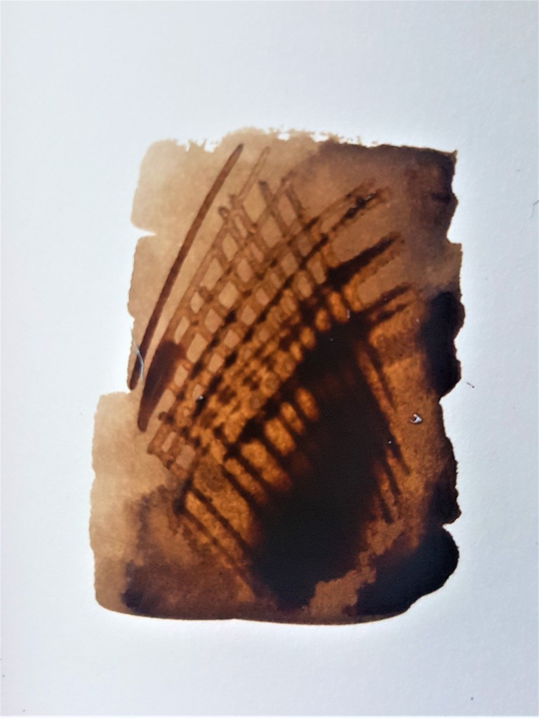
For this exercise I ended up with two attempts as I felt my first attempt didn’t quite work with what was asked in this Exercise. I focused too much on the tonal elements rather than my use of line.
Walnut and black ink on A3 paper
For this drawing, I chose objects similar in function and story, for example food and drink. I based my composition on one of the ideas for composition I came up with on Project 2. My aim with the composition was to build up height with the objects and have the viewers gaze follow it up. I used a long, dark bottle to fit with this concept and also to contrast with the smaller items in front. Since I went with a monochrome palette with strong shadows in my composition I thought it might be hard to distinguish between the different objects, so I used black ink and layers of ink washes in a walnut ink before using a lot of lines to add in detail. I began with using light washes of my walnut ink, layering them up somewhat for a bit of blocked in tone. I went in darkest on the bottle. As my Still Life reference for the bottle was incredibly dark I decided to go straight in with my black ink to capture this, building up my cross hatching to capture very faint reflections on the bottle as well as the dark tone. I used a similar technique on the onions and carrot, however using my brown ink to add the first few layers of cross hatching on top of my ink wash before adding the final details with black ink. I think looking back, I could have used more lines to define the carrot a bit more and solidify what it is. For my background I kept it simple to keep the focus on my Still Life objects, I created contrast by making the table white and using black ink to define shadows and tones. I’m happy with how it came out however, this exercise asked me to focus on my use of line and relating objects to the background, which I feel I did not do well enough. The background is bare and simple and only relates to the objects with the monochrome colour scheme and washes of ink and cross hatching. I wanted to try again sticking closer to the given guidelines and see if my composition improves but to also give a bigger focus on my use of line.
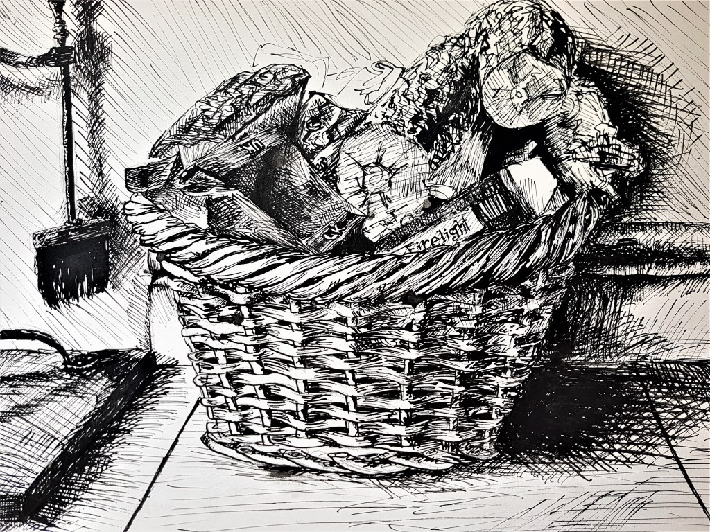
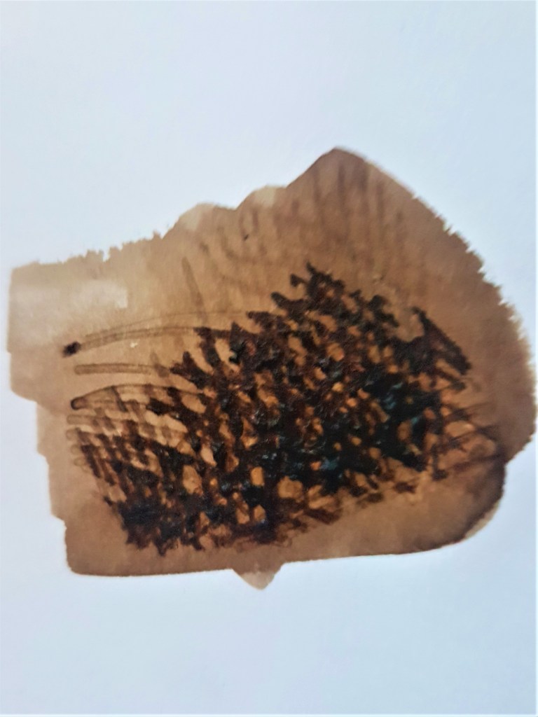
Black Ink on A3 paper
For this piece I told a story with my chosen Still Life focus, a basket of wood and fire lighters, and the side of a fire place, blending the purpose of the focal objects with the background. It relates. I relied only on my black ink cross hatching to depict the objects and tone and I think it worked well. I enjoyed using my lines to capture the pattern and texture of the basket, and also the shadows cast by the light. I altered my technique when it came to applying texture to the wood, using squiggles rather than straight lines, in order to show an uneven log texture. I kept my viewpoint straight ahead, so perhaps in later exercises I should consider looking from different and more unique angles and see how that changes my composition style.
I think I have good use of line on individual objects but struggle relating them to the background, often leaving my drawings feeling flat rather than immersive. I would like to work on my use of depth, which may involve attempting a much more dynamic background that feels natural to the focal objects rather than separate. I feel my use of tone does help somewhat with adding depth between the foreground and background, but I need to work at portraying this in a more effective and believable way. I found some difficulties in using only line in my second attempt as it is much more finnicky to portray a darker atmosphere within the piece. In order to effectively portray tone I find it easier to also incorporate techniques outside of line, such as in my first drawing with washes, in order to create a much more realistic scene, instead of a more illustrative style. But I do find a lot of my drawing strengths with my use of line and cross hatching.
Exercise 2- Still Life in tone using colour
For this exercise I found I had to switch up my technique to a much more fast paced stroke style of drawing. I worked very fast and scribbly in order to keep the piece ‘spontaneous and energetic’ as the brief asked.
Coloured pencil on A3 paper
I was happy with how this piece came out and so didn’t do any further attempts. I started by blocking out the tone before layering colours over one an other to get a fuller, more vibrant piece. I love the overall loose feel from my fast strokes and scribbles, emphasised by the many layers of colour. Like my previous coloured pencil piece from Project 2, I think layering blue tones over warmer tones as shadows works really well, and I’ve captured a rushed, energetic feel within my work. I find the background feels much more dynamic this time around and has a lot of depth to it, it works hand in hand with the focal objects rather than feeling more separate. I think this style and medium of coloured pencils works really well to capture a Still Life scene effectively, however it is a lot more time consuming than my previous mediums. I think the colours work really well to add a sense of depth and bring everything together. I found that working solely with tone rather than focusing on line, creates a much smoother drawing, with not as much detailed texture, though I found this worked well with the metal and glass textures that I chose for this Still Life. It affected my method as I was shading in big blocks of colour rather than taking my time to plan out lines to best shade an objects, but I do like the end result, I think it works well together.
Moving forward
I would like to experiment with my use of colour and composition further, I want to effectively use the two to create better quality drawings. I think moving on into future exercises I should think strongly about the two, especially my use of background in order to create more interesting and dynamic Still Life pieces, that include a sense of depth within the environment. To do this, I will think much more carefully about my composition and the angles I draw from, and experiment with different media in order to show colour and tone effectively within my work.
After experimenting with line and capturing detail or groups of natural objects with ink and pencil, I decided to move forward to exercise 1, and look at spending more time, and adding colour, something I haven’t quite done with Still Life so far.
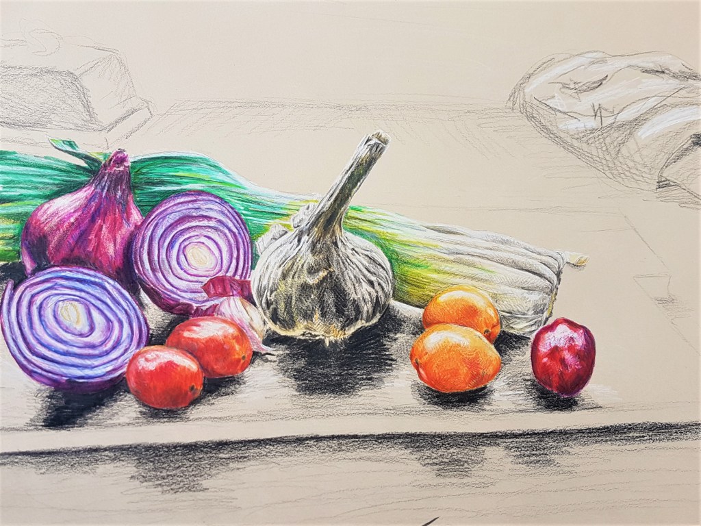
I began by setting up a Still Life, using natural forms that I have previously looked at, and some I haven’t before. After settling on my choice of vegetables for my Still Life, I positioned them into place and looked at them from various angles before deciding on what angle I will draw from.
The process
Coloured pencils on toned A3 paper
I decided to use toned paper, in a slightly beige colour, so I could make my highlights pop. For my composition, I layered the vegetables, the smallest in front, in a curve (crescent shape) in order to draw the gaze into the centre, the garlic. By highlighting the underneath of the garlic, I think I made it really pop out against the shadows, and really made it an area to focus on for the viewer. I layered colours on top of one another with cross hatching to add tone and vibrancy to the vegetables. I kept the background loose and monochrome to keep the focus on the vegetables and their composition. I like the detail I managed to get on the vegetables, but I think I need to experiment more with how I present my backgrounds. Do I show everything with detail, or create contrast with the clarity between the foreground and the background? Moving forward into my other exercises, this is something I would like to keep in mind.
Reflection
With project 2, I found it very useful in terms of looking at what media I use, and what effects I can create with them. I found it challenging to use coloured pencils at first, and very time consuming, however I found the end result to be detailed and vibrant, and a medium I would like to look at using again, to explore what other drawings I can create. I also looked at new techniques with media I have previously used a lot. I looked into doing light washes with ink to get a base for tone, before going in with cross hatching to build that tone up further. Furthermore, adding black ink, whether its to a monochrome brown sketch or a coloured ink sketch, really helps to add in fine tonal details to my sketches and drawings.
[1] Layering ink washes, and then cross hatching
[2] Ink wash and cross hatching
[3] Ink wash and cross hatching in brown and black ink
Techniques for tone and detail in my drawings using ink
As seen in the images above and previous drawings I’ve done, layering ink washes and cross hatching can be very effective in showing tone and texture. I found this technique worked really well for my onions prior to this exercise. I love the monochrome effect when using browns and blacks, and also when using coloured inks. I think it works best for me in a monochrome style, as it’s easier not to think about colour but rather focus on building up the tone. Using colour is something I should explore further so I can feel more confident and comfortable pursuing that style.
Quick sketch, showing my layering technique with coloured pencils.
I found working with coloured pencils to be rather tedious to begin with but I did like the results I achieved with exercise 1. Layering the colours in different ways and directions can help create not only tone, but patterns and textures too. By using long straight lines on the leek for example, I was able to somewhat depict the smooth ridges the vegetable has. I liked layering the dark blue tone as a way of adding more subtle shadows, rather than using black. I found this worked really well over warmer toned colours, such as on the tomatoes and red onions. I would love to explore this technique further, and become more confident and skilled at using this medium.
Variations of pressure while shading with a pencil
Finally I experimented with tonal pencil drawing when studying the Still Life of dead fish. I found varying pressure can help define areas of darker tone and pattern. I played around with pressure to depict the pattern and texture of the fish scales as they reflected light, so there was a big variation in tone there. I feel very confident using pencils to sketch and draw still life, and these skills worked well when applying them with coloured pencils for this exercise also.
Creating more interesting compositions
Although I am pleased with my technical drawing skills with this exercise, I feel my compositional skills with Still Life needs some work, especially with organising a background that effectively works with the foreground. I’ve done some rough sketches to think through how I could lay out my still life compositions moving forward.
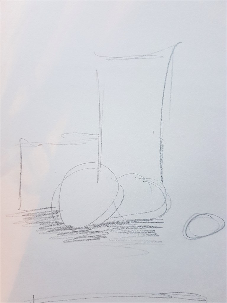
Quick Sketch looking at building a composition with height.
I began by looking at the idea of building a structure in a sense, or a staircase. Slowly building up the height of my objects to draw the viewers gaze to the tallest one, working their way up from the smallest to the tallest. I think this could work great in a portrait composition, to really focus on the height that I am building up, bringing focus and concentration into the structure of the objects and their composition as well as tonal qualities and details.
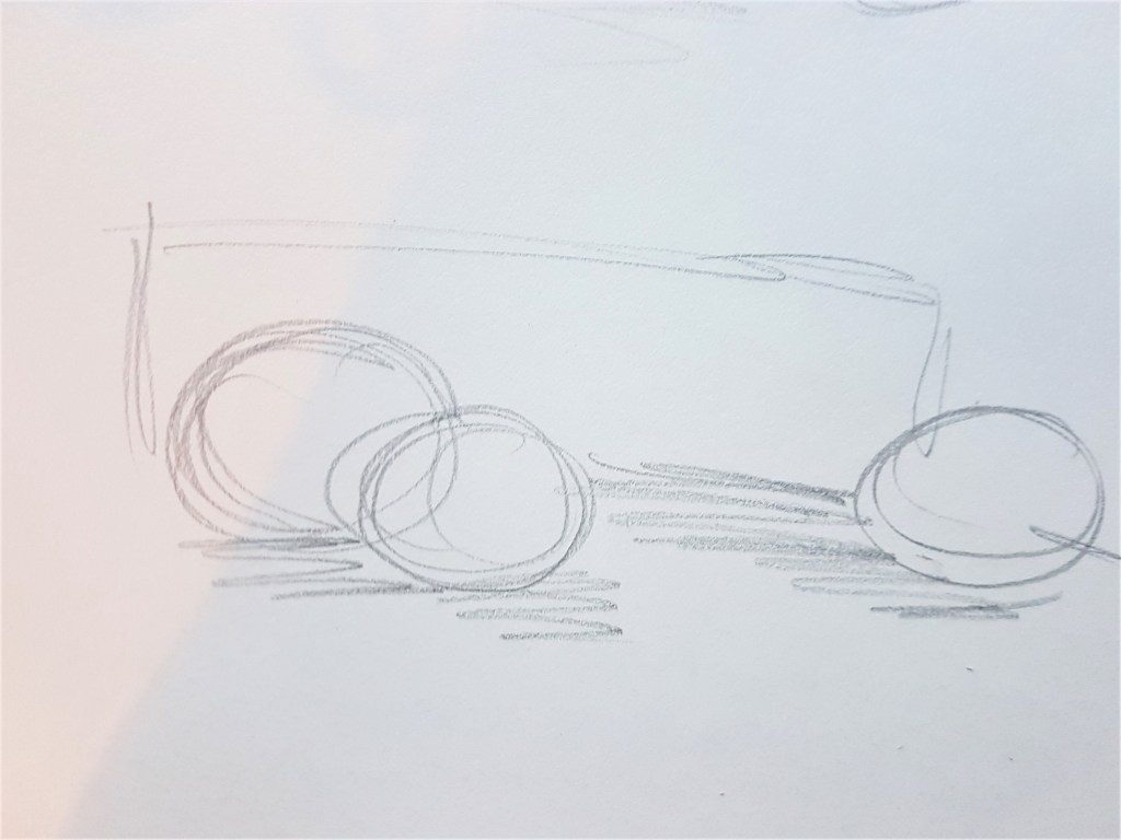
Quick sketch looking at building up a composition with length
Similar to the composition I used in this exercise, I created a quick sketch, toying with the idea of drawing the viewers gaze across a landscape page, the opposite of my previous idea but close in concept. I could perhaps use a long object, such as the leek I used to create a long space that draws the viewers gaze across naturally, adding in other objects along the way to add intrigue and complexity. Unlike my attempt with this current exercise, I should look at filling more of the page with this concept.
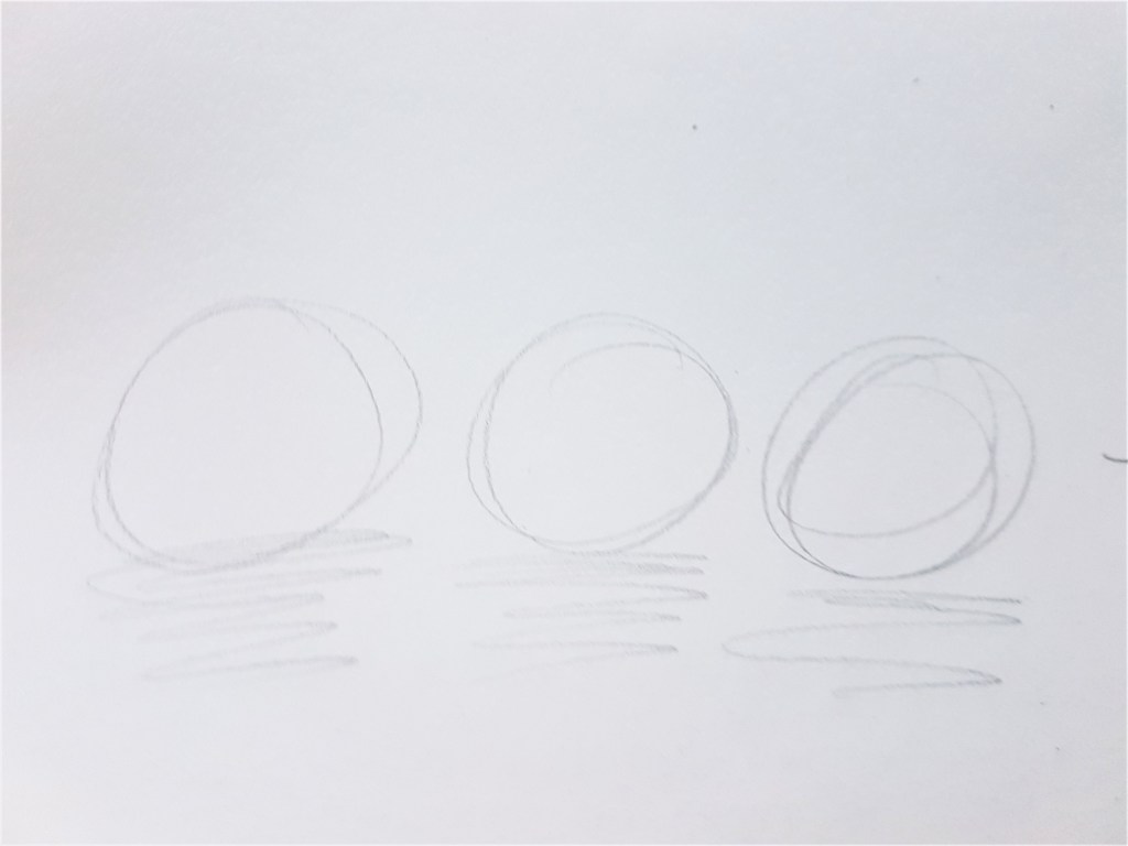
Quick sketch looking at using a minimalistic composition
I also want to look at maybe trying a minimalistic approach to a composition as well as more complex ones, and experiment with what works with my style and choices of media. In this concept sketch, I look at placing similar shaped items, maybe identical in a row, and playing with something simple and pleasing to the eye. I think that could work well with a detailed approach to the still life subjects and a simple background. It could also work very effectively with my technique of ink washes and cross hatching.
I would like to look further into my use of composition and take into consideration the ideas I have just looked at with the next exercises in part 3, and see what i can create and what works well an dwhat needs rethinking.
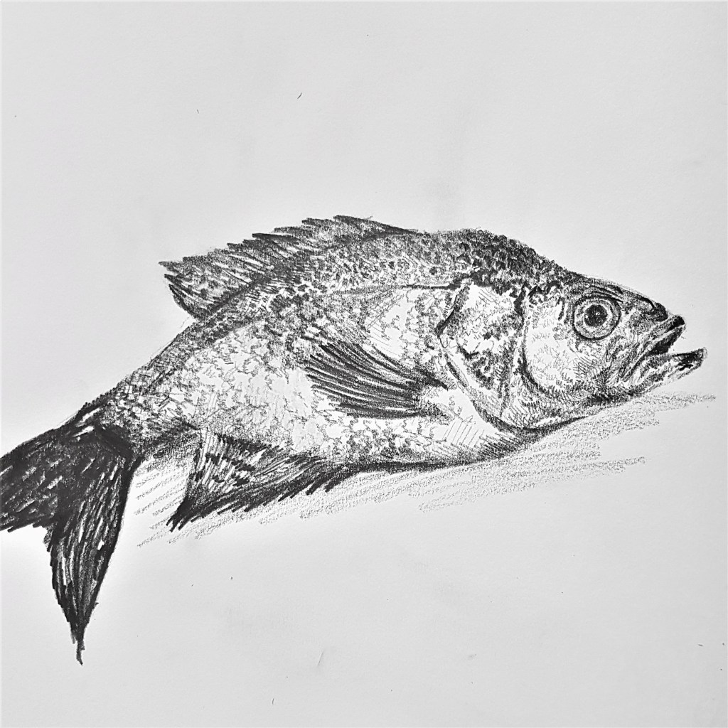
Before starting Exercise 1, I wanted to take some more time to expand on my skills of looking at and capturing natural forms, as my strengths often lie within man made objects. I also wanted to look at how two different mediums help me to capture detail and create atmosphere with natural forms. I wanted to look at capturing a single object before trying it as a group, to build on my compositional skills as well. I began with fish, as they have an unusual shape and texture, that I’m not used to capturing and thought it could be interesting to begin my experiments there.
The start of exploring natural forms
Singular dead fish Pencil in Sketch Book
For this sketch I used pencil and focused on capturing areas of tone in order to provide a sense of texture. A fish is more unusual for a natural form still life with its shiny, reflective texture. In order to try and capture this I left areas untouched and white towards the fishes belly to show where the light was hitting and reflecting. I also used areas of white amongst my use of lines to help show the scaly texture a bit better. I had a lot of fun with this piece and found the shapes interesting and unique compared to what I have drawn before with much more structured and harsh, man made forms.
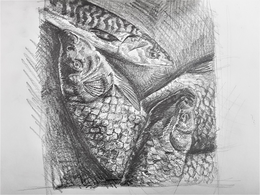
A collection of fish Pencil in Sketch Book
I moved on using fish I sourced from a market for my composition, layering them like I found them in the market, slumping one over another. Using lighting to cast darker shadows in order to emphasise certain textures. I’m really happy with how this turned out with the layered composition and capturing textures. To improve on this and my composition I could try using a bigger variety, like more mackerel, as I love how the stripe detail turned out on the one I did. Furthermore I could look at beginning to introduce colour to my work.
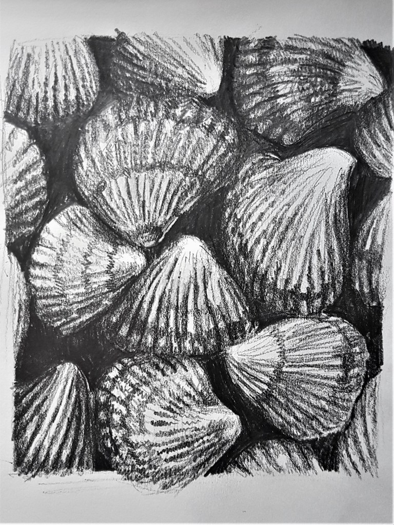
Looking to other forms, shapes and textures
Shell [1]
Collection of Shells [2]
Studying shells from my bathroom Pencil on paper
I moved on to studying shells from my bathroom, starting by studying a single, simple shell. Needless to say I struggled with this shape and texture for some reason. The singular shell sketch [1] did not come out as well as I hoped it would and there is room for improvement. I struggled to capture the detail of the fine lines and grooves affectively as well as the shadows they cast. I did much better with a larger group of shells without such a large heavy focus on one to be perfect. With the dark gaps between the shells in sketch [2] I think it was easier to focus on thick areas of tone rather than details, which worked well to get the basic shapes. I don’t think shells are a subject I’d like to focus on, I prefer softer textured pieces, like food (fish and vegetables) as they hold more intrigue to me and what I can do, as an artist, to present them.
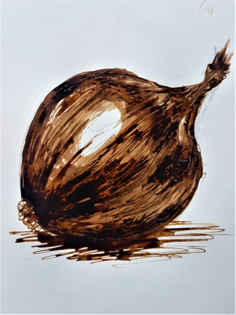
Changing media
[1]
[2]
[3]
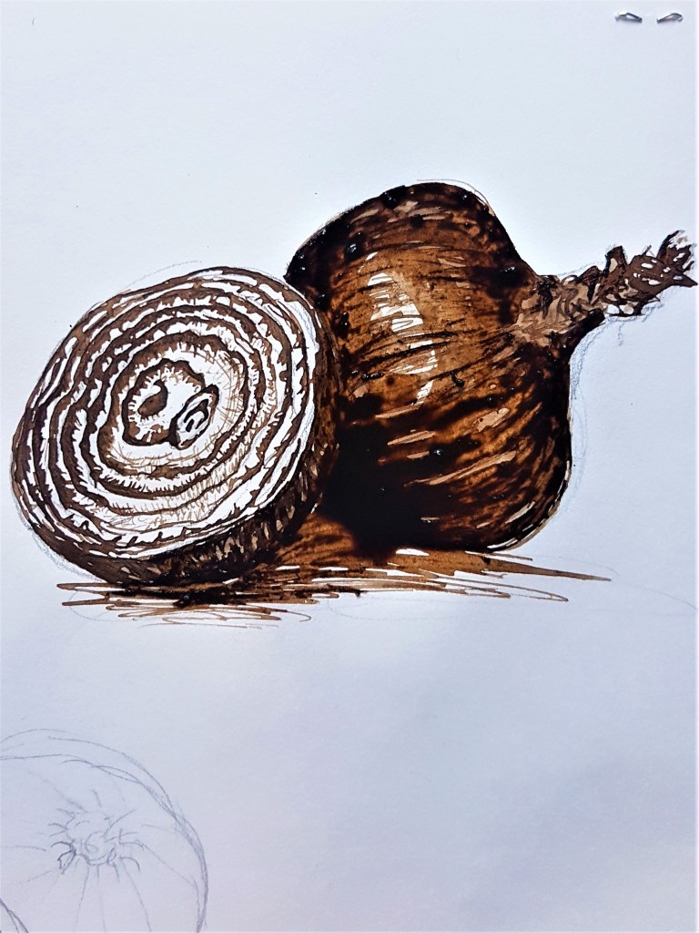
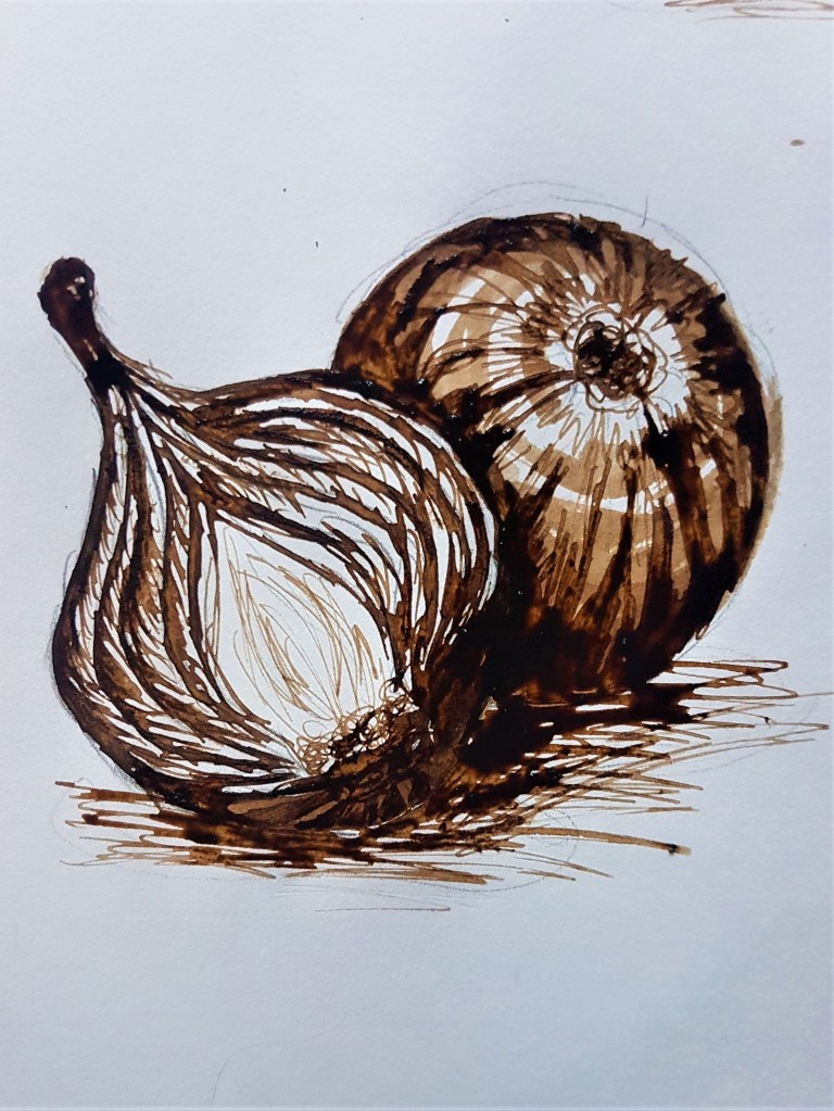
Study of onions, whole and in half Walnut Ink in Sketch Book
I decided to switch up my media again just to experiment with tonal properties and capturing texture. I decided on this lovely walnut coloured ink as it provided more options for capturing tone than black ink, which is much harsher. I am happy with how I captured the texture and reflection of the onions in Sketches [1] and [2], however I think with sketch [3] I need to work on capturing the intricacies of the inside cross sections of the vegetables. the finer lines and how the colour would show up in a monochrome piece like this.
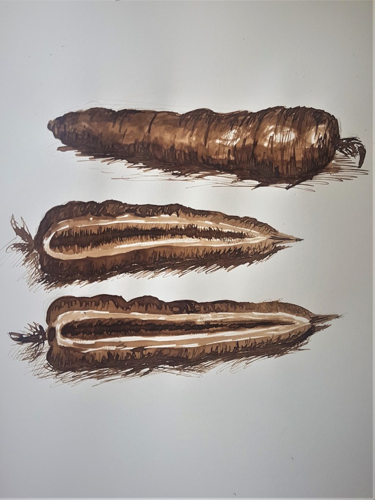
Sketch study of a carrot and its cross section Walnut ink in Sketch Book
Like with my previous attempt at the onions, I am much better at capturing the outside texture compared to the cross section. With my cross section I tried to focus on tonal areas as I couldn’t quite get the lighter areas of detail with the ink, I made it too dark with my wash. Capturing lighter areas is harder with ink I have found, as you can’t erase dark areas if you make them too dark. I could try drawing over with a white gel pen next time, and see what effect that gives me. However I wanted to focus in a lot more on my next exercise, and decided to explore capturing a natural form in colour in my next sketch.
Adding colour
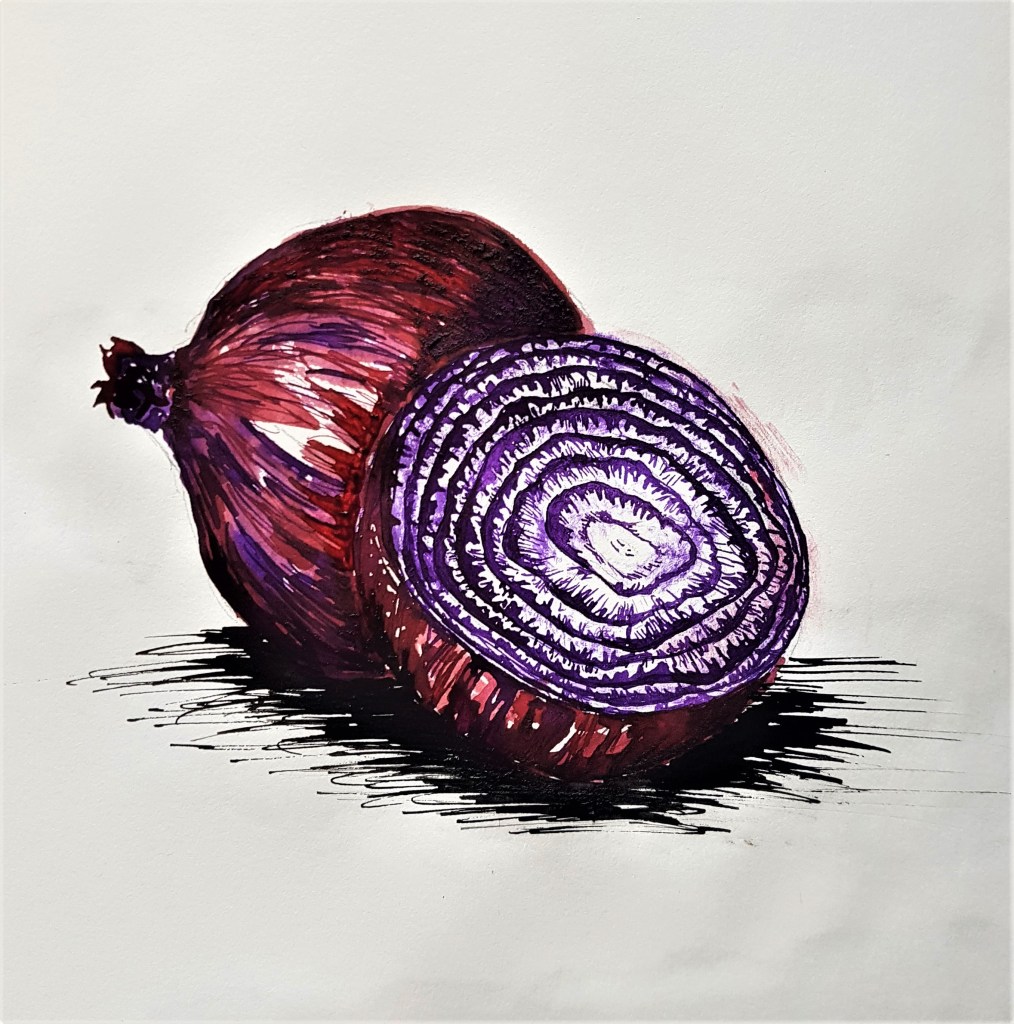
Study of onion and an onion cross section Italian ink in burgundy and violet in Sketch Book
I am happy with how this came out, I think the colours work well to accurately capture a red onions colours. I like how the cross section came out, with adding lighter splodges of purple by dabbing some ink with a tissue. My technique stayed somewhat similar to before with adding washes and layers, waiting for them to dry before going on top again, making a darker layer. I like ink as a medium as it allows me to explore a much more illustrative style into my still life sketches, which I rather like. Moving forward I feel much more confident to tackle the next exercise and start being able to utilise colour into my Still Life sketches. I plan to transfer what I’ve done with this sketch into soft pencil by creating layers of colour overlapping. I’m excited to move my work forward.
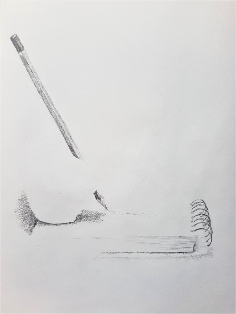
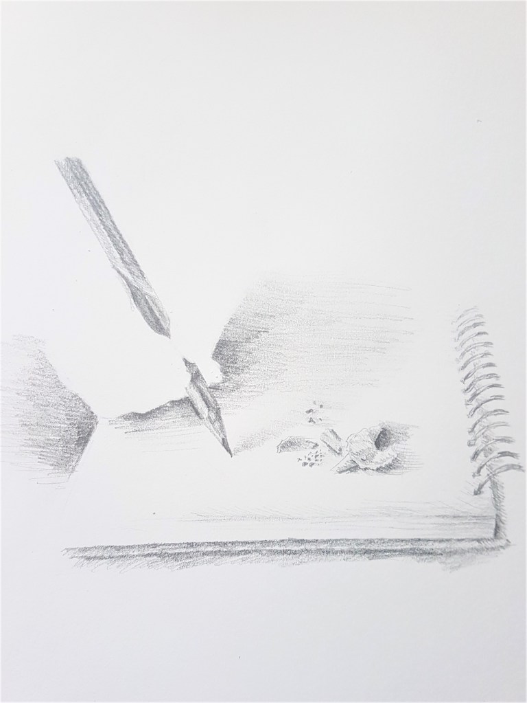
After my previous research into interesting ways to incorporate negative space into composition, I felt inspired and full of ideas, which I could use to make my compositions of Still Life much more interesting and unique. I was really moved by the work of Henrique de Franca and Ileana Hunter and wanted to explore and experiment with incorporating some of their techniques into my work. Firstly, I wanted to explore the techniques of Henrique, and how he builds a composition by only using very little of his paper, and using markings that suggest the rest of his scene. I had the idea of creating a scene of Still Life, a notebook being written in. However I wanted to use as little markings as I could to suggest my composition rather than to have it all exposed as I usually would. I also wanted to play around with Ileana Hunters techniques of removing hands. I thought I could experiment with incorporating hands but taking them out, leaving a negative space. Removing actual life tangled within a Still Life.
First Sketches
[1]
[2]
Pencil Sketches in Sketch Book
I began with some pencil sketches of my original idea, a Still Life scene of a notebook being used, only hinting at the ‘bigger picture’ with my markings. And take it a step further by removing ‘Life’ from my Still Life, by removing the hand, but leaving its presence. I really love my attempt of the notebook in Sketch [1]. I think I captured the minimalistic quality I aimed for and used just enough markings to suggest my Still Life scene without it being too much. I think I hinted at just enough of the notebook to make an effective composition. However in Sketch [2] I feel I incorporated too much of the notebook and could have had a much more striking and minimalistic composition had I kept too more minimal markings as in Sketch [1]. I do prefer the shape of the hand in Sketch [2] as the shape is more clear and shows the grip of the thumb. By adding pencil shavings in Sketch[2] it creates an interesting and fuller composition, however I need to use less shading around the hands to create a much more convincing style and composition. Less is more with this style of composition.
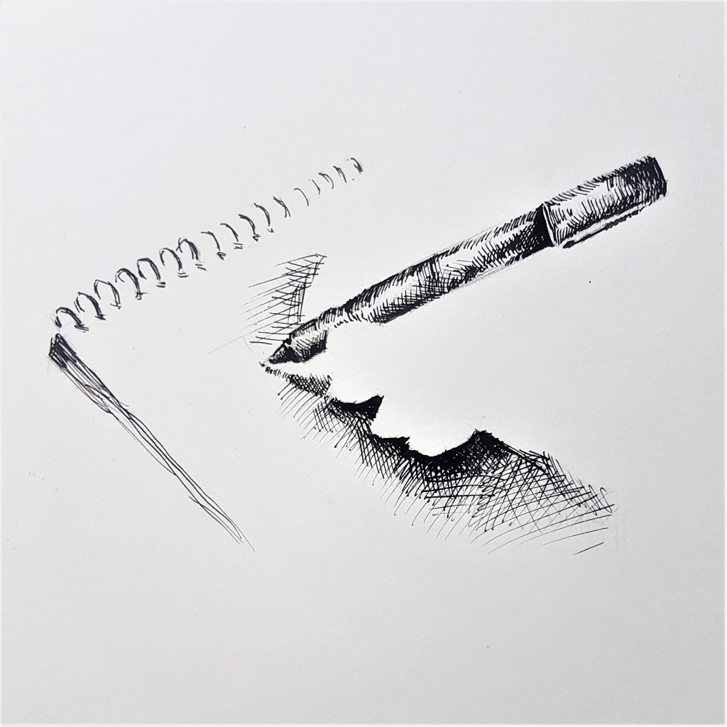
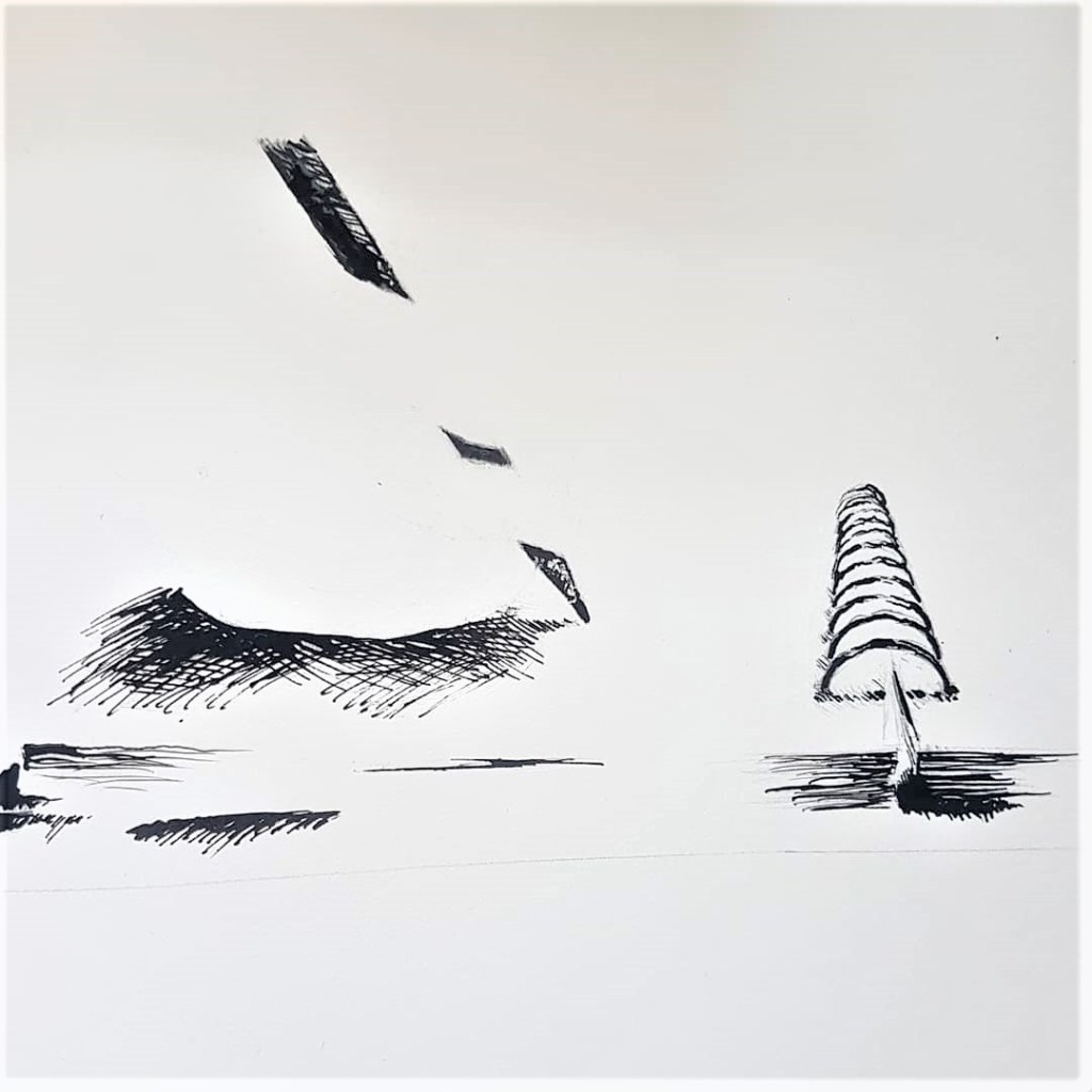
Changing Media
[3]
[4]
Ink Sketches in Sketch Book Ink and Calligraphy pen.
I wanted to explore my idea in the harsher, more permanent medium of ink. I think Sketch [3] captures more of the minimalistic style I want these Still Life sketches to embody. I changed the pencil to a pen to play around with a new more reflective texture, and I much prefer the shine it has and capturing that with my markings. I angled the hand positioning differently and worked with my lighting to cast a shadow to much more effectively show the shape of the hand. For Sketch [4] I tried a similar composition to my original sketches, I made the same mistake as Sketch [2] by showing too much with my markings. I like the look of ink with this minimalistic style and composition, I think it makes a bold and striking look with the use of tone and the bold black marks against the vast white page.
A change of scene
I wanted to try a new subject to focus on with this style and compositional techniques. Hands were a staple with this idea, so I wanted to try hands holding fruit for my Still Life scene. Firstly I explored hands holding fruit while sticking to my pattern of incorporating negative space into the hands.
[5]
[6]
Pencil Sketches in Sketch Book
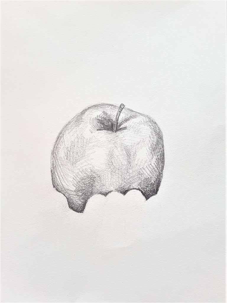
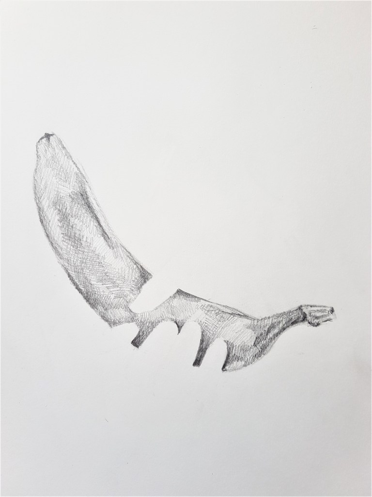
I feel these pieces emulate Ileana Hunters work more than my previous. I’m still sticking to that minimalistic style and I feel the sketches still create interest with the viewer. I feel the focal point is much more straight forward in these sketches as the subject is centre in contrast to my previous compositions which feel quite fussy in comparison. I tried a subtle approach to the hands in Sketch [5] however I feel the low hand placement is distracting rather than adding to the composition. I much prefer my second attempt, Sketch [6] and how the fingers break up the banana. I love the simplicity and the shapes, they work together to create a unique, minimalistic sketch which draws the viewers gaze from contrast created by tone.
Switching it up
Sketch [7] Pencil in Sketch Book
For this experiment, I tried reversing the idea, making the fruit the area of negative space. I love how this came out, I love how the space of grapes is hinted at through subtle shapes, going back towards Henrique’s techniques somewhat. Furthermore, I think the minimalistic style of sketching works great with this idea, I think leaving the centre of the grapes empty of any markings works well, as it draws the eye into the centre for it to expand out onto the hands. I could try and explore this further by filling in the background with the clothes of the person holding the fruit, and leave the fruit completely blank, a space. However I’m not sure if that would work effectively within the style I’m exploring currently, with a minimalistic composition.
Returning to Ink.
I deciding to experiment with one last idea that instead of leaving an area blank to indicate negative space, to rather block it in with solid colour. I thought Ink would be ideal for this experiment, as with black ink you don’t really very visible streaks and w thus would work great with creating a block of colour to fill a shape.
[8]
[9]
Ink in Sketch Book Ink and Calligraphy Pen
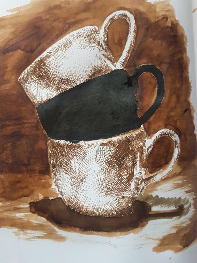
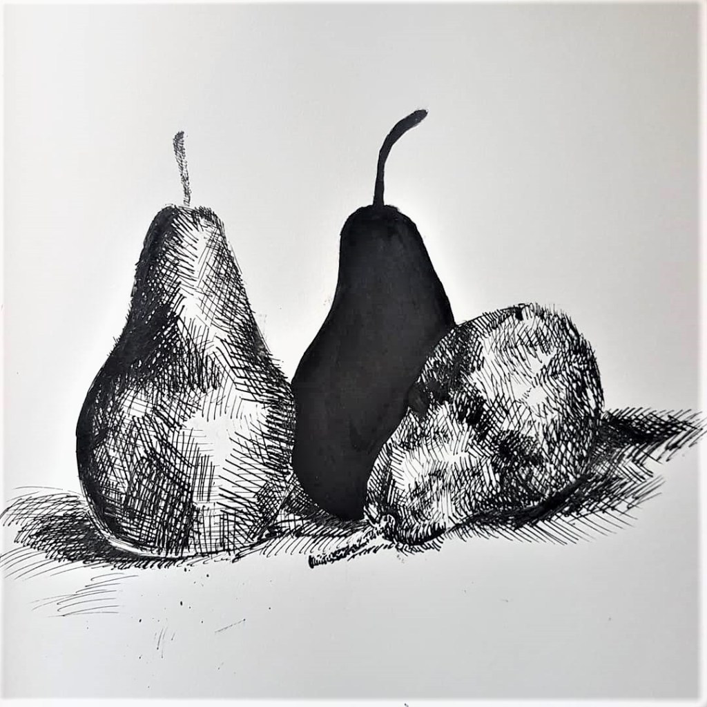
I wanted to begin a focus on a larger group of objects that make up a Still Life, so I began with a set of three teacups. I used brown ink to sketch them in using cross hatching and blocked out the background and floor shadows using a brush. This helped created a much darker atmosphere tonally. I then blocked in middle teacup in black ink. I made the mistake of knocking my sketchbook causing some of the ink and markings to splodge around, so the finished sketch came out on the messier side, however I’m happy with how it came out and the overall look and style. Although it is heavier in tone than my previous pieces, it still hold minimalistic qualities with the blocking in of spaces. For my final sketch, I went back to my roots of keeping a vast white space. I decided to do some overlapping pears as I thought its would be interesting to block out one of them in the middle, and how the shapes would overlap. I think with the contrasting white background, this sketch feels bolder out of the two.
Moving forward.
I found it much easier to suggest three-dimensional form on man made objects, as they have a much clearer structure than the loose rounded, and often more complicated structures of natural objects and forms. The harsher lines and shapes make it easier for me to map our the structures of man made objects, as straight lines and often map out clear areas of tone which help define the 3D structure of the man made form. Changing the composition did also make a change in my approach to my drawing and the way I created form. I ended up shifting my technique when it came from moving from the notebook to the natural forms of fruit, instead of suggesting the form or structure, I ended up drawing the whole shape, whilst still leaving out the hands. I kept to more suggestive lines when I drew the grapes, however they did not suggest detail on the grapes, where as I suggested details in the notebook sketches. I’m really happy with the outcomes of exploring and creating a unique and minimalistic style, that helps me to create striking Still Life sketches and drawings. It needs some fine tuning, but I love the outcomes and can’t wait to create some more that really showcase negative space and composition. I’m glad I took the time to look at other artists to find inspiration but also take the time to really think about a composition and effectively start putting some together that work well.
Whenever you create a drawing of Still Life, you will be incorporating a use of negative and positive space to form the composition and final product of the drawing. Positive space being the main shapes of the composition, filled with detail. The negative spaces usually being the spaces and shapes in-between, lacking in ‘real form’ and detail, but are not void, they still fill the space they take up.
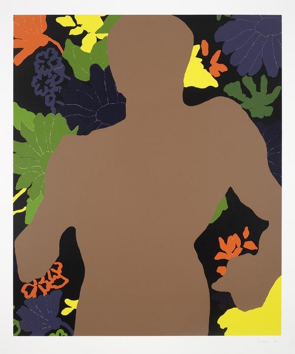
Gary Hume
Gary Hume, Vicious Hume, G. (2010). Vicious. [12 colour Silkscreen printed on 410 gsm Somerset Tub Sized paper] Available at: https://www.artspace.com/gary_hume/vicious [Accessed 20 Mar. 2020].
This first piece I’m looking at by artist Gary Hume is very striking and bold. It’s eye catching with its bright colours and minimalistic approach to shapes and form. His use of composition seems purposeful and well thought out with his placement of the male figure taking up so much space while also void of detail, thus the focus ends up of the flowers in the background rather than the foreground. The figure of the man looks as though he has some weight to him from his posture, he looks heavy and powerful which creates a deep contrast to the flowers behind, as flowers are dainty and delicate. This could be commenting on the relationship between man and nature, how the relationship is not a healthy nor sustainable one. If we look to the description given on Artspace, Hume’s piece is based around the song ‘Vicious’ by Lou Reed, a deep focus surrouding the first lyric; ‘you hit me with a flower’. [1] leading him to focus on ‘the idea of violent beauty.‘ [1] . Looking deeper into the lyrics of the song, it is strongly hinting at a toxic and abusive relationship as expressed in later lyrics; ‘When I watch you come, baby, I just want to run far away You’re not the kind of person around I want to stay’[2] . To me, from what I interpret from Hume’s visualisation of the song, it could be commenting on the relationship between man and nature with the contrast he shows in his work. Looking at current events it is easy to see that the relationship between the two is a toxic one. Man takes and abuses nature, whether it is wildlife or the much bigger issue of the environment. Humanity takes from nature, destroys it all for our own gain, rarely giving back. Man has both a dominating and intimidating presence in nature, this point is driven forward by Hume’s depiction of the mans silhouette and posture, again channelling an intimidating and powerful stance. Hume’s use of colour shows a distant relationship between man and the flowers, with the man being a dull brown, while the flowers contrast this with bright, bold colours. No reds or pinks were used, removing ‘romantic’ colours from the mix, in my opinion to rid the idea of romance between the man and the flowers. Furthermore, contrast is also created through the use of line and shapes. Very little detail is used on the flowers, but it is enough to make a difference between the flowers and the man. The thin lines used to add detail to the flowers help to also create a sense of delicate fragility, a stark contrast to the powerful stance of the man.
Hume’s use of negative space is intentional and executed well, it doesn’t take away with there being an ’empty’ shape but rather adds to the painting both visually and in meaning. It makes you wonder what kind of presence is lost by the figure being absent in a sense. I feel that by not having a specific identity, the man therefore becomes man as a whole. He takes on the identity of the ‘strong’ and ‘powerful’ business men, who are the main abusers of the environment. The absence of a man gives him more of a presence as a group of intimidating men. Men with power. Negative space can play into your themes and help you provide a narrative when executed in a thoughtful manner as Hume has done so here. It has given me something to think about in terms of creating a narrative or supporting a theme in a visually interesting way as I explore Still Life further in my course.
Hunter has a different approach in her use of negative space, using it to frame her portraits, and to create a line in which to direct the viewers gaze. The contrast created from the negative space helps to create a focus on the portrait, and helps to exaggerate the expression. It creates a juxtaposition of what should be a tight closed in space around the face, making it much more open, putting the subjects feelings on full display rather than hiding it, which is what they want to do with their hands. In my work, I could look at using negative space to frame and draw focus to a certain area within my drawings, and how negative space could create a clear focus for what I would like to portray. Furthermore, how I can take a meaning within my drawing and changing it with how I use or fill up the space as Hunter has done, making the hands absent and blend into the space around the face.
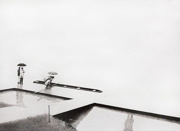
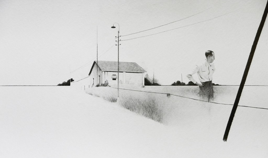
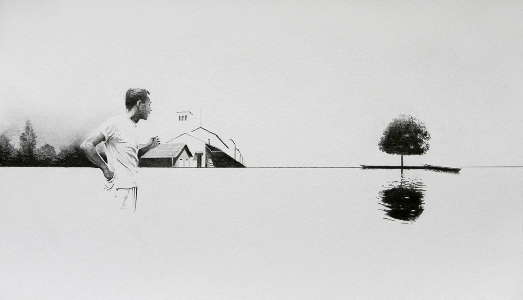
Henrique de Franca creates beautiful landscapes in his Torpor drawing series, where he hints at just enough to give the viewer a sense of where they are and allows their minds to fill in the gaps, constructing beautifully minimalistic pieces. Like Hunter, he relies on tone for detail, but doesn’t use it as heavily, allowing the vast white page to give the spotlight and attention to his markings, as since there are so few each one is important and intentional. They are thoughtfully placed. I love how he hints at the surroundings that aren’t necessarily included, for example in piece [1] the hinting of a persons presence in a reflection in the bottom left but the actual person is no where to be seen. Or in piece [3] how a body of water is hinted at with the reflection of the tree but not physically shown. It creates a feeling of wanting to know more and unfulfillment even though you are looking at stunning sketches. This is done intentionally, perhaps to create the need to explore as he has done and inspire the viewer to go searching for themselves. Or maybe to use their imagination and realise they don’t need every single mark to see what so few can give them. I could look into using fewer marks and focusing on using less to get a narrative and drawing across to my viewers. Making each one purposeful and really looking at the space I have on a page, and how much of that space do I need to take up to spark a reaction from the viewers of my work.
Moving forward…
Looking at these artists and the variety of ways I can use negative space has opened my eyes to the work I can create. I want to think more about the space I take up on a page, and how I fill up that space with my composition and use of shapes. Do I need to fill up the entirety of the space? Can fewer marks create more of an emotional impact within my work? How could I use certain shapes and negative space to frame my work in an effective way like Hunter does? I have a few ideas I want to develop and experiment with after being inspired by these artists I have looked at, and I can’t wait to start experimenting with my composition and style, and develop more as an artist.
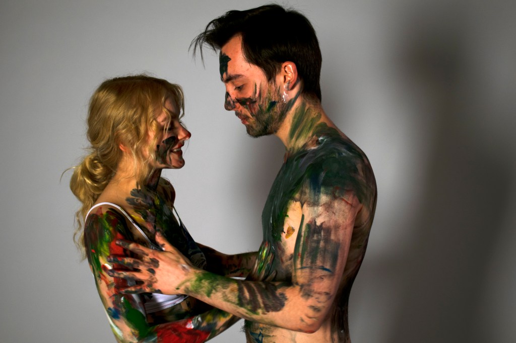
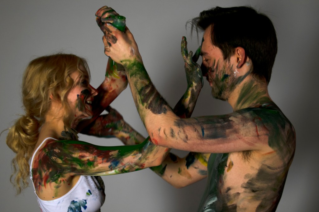
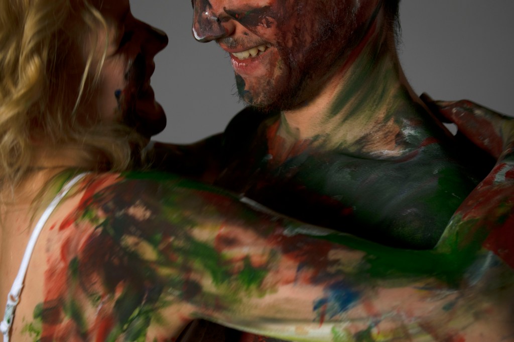
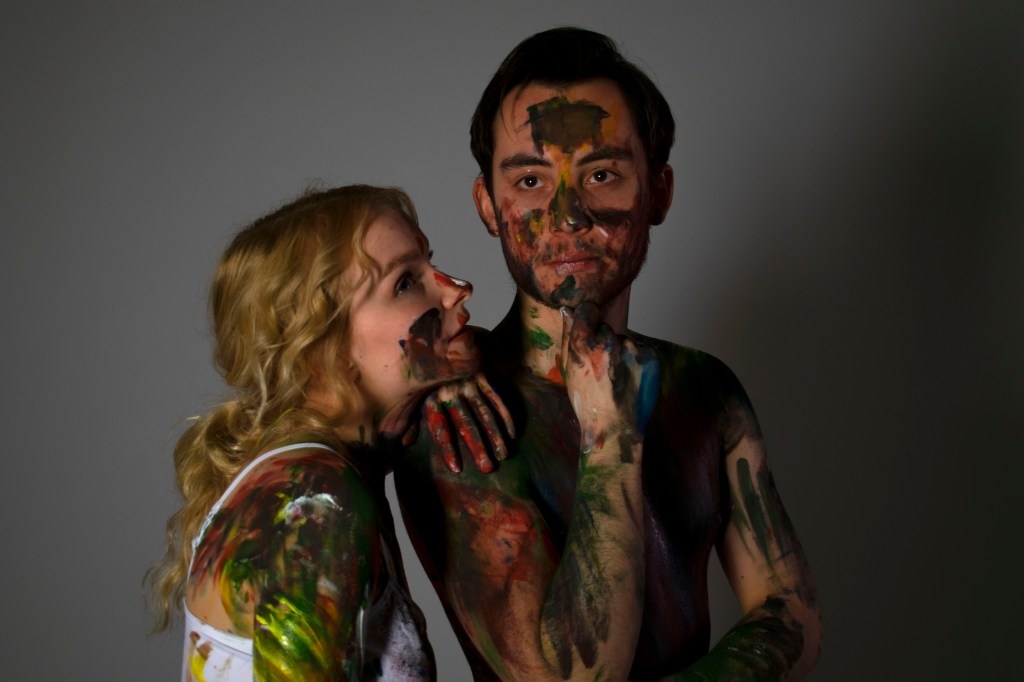
Recently I was fortunate enough to model for Hafsah Jamil on her latest art piece with my partner, Jacob Carter. The work entailed us painting each other, leaving our impressions on the other, in order to define our impressions on our bodies. This stems from and builds upon her previous work on body image and self expression.
The thick layers of paint that she uses in her current work help create a very loose and freeing atmosphere within her body of work. With bold and striking colours applied in such a fluid style, it is hard to look away from her pieces, to me they scream ‘loud and proud’ which fits perfectly into her theme of body positivity and expression. I love her strokes and how they make the paint feel molten and melted into the imagery she creates. Her techniques of palette knifes and making prints are ones I’d like to look into and explore in my own way as my course advances into looking at painting media. Her work has inspired me and has made me think and look much closer at how our drawing and painting techniques advance and emphasise our narratives and themes within our work, and I believe her techniques work hand in hand with her themes very effectively.
Creating Impressions
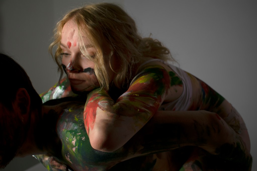
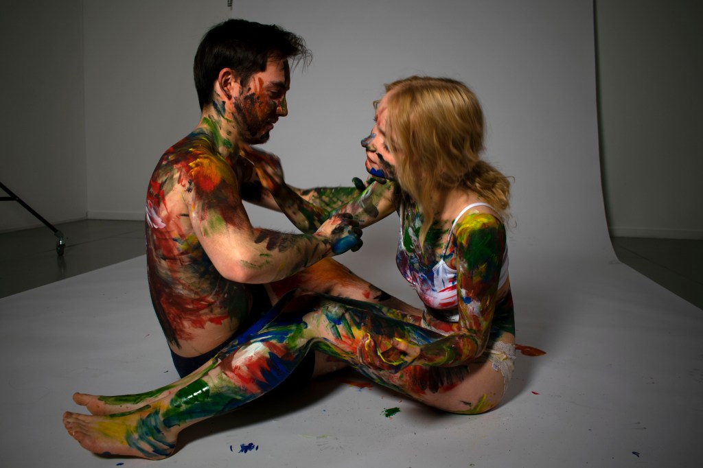
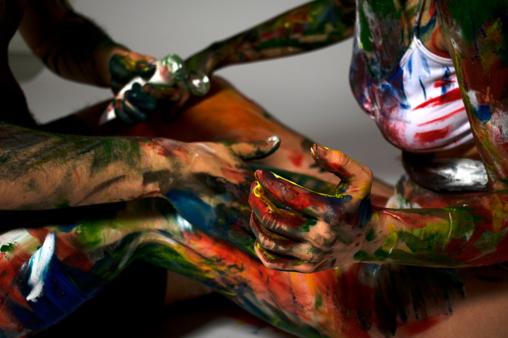
Photo from the shoot, taken by Hafsah Jamil
It was a new and one of a kind experience modelling for Hafsah’s latest work, and also completely out of my comfort zone. I, like many other women, struggle with body confidence, so I arrived at the photography studio feeling both extremely nervous to show so much of my body, but also excited to explore a new practice of painting I never thought to explore before. I also had my amazing partner Jacob to share the experience with, which eased my nerves. Hafsah’s vision for the shoot was to explore the impressions we have and leave on other people, in this case literally, and the focus was on our relationship. How do we feel around one another? How do we affect one another? What are our impressions on one another?
Once we were undressed and exposed, we began painting one another with brushes, this made everything feel formal in a sense, but once Hafsah informed us we could use our hands and be more expressive the nerves began to ease off and we found it much easier to find comfort in each other, and more importantly be ourselves, which is hard with a camera recording us so unprotected and bare. I found that as the painting process went on, I began to feel a lot more confident about myself and my body. Within the shoot it became very evident to me that Hafsah’s theme of body confidence and expression had woken up and became alive as Jacob and I painted on each other.
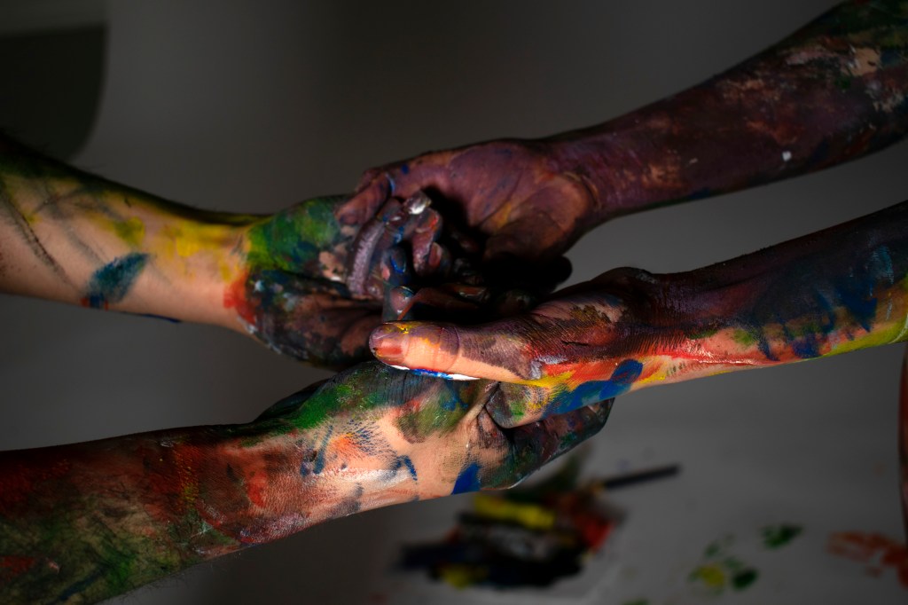
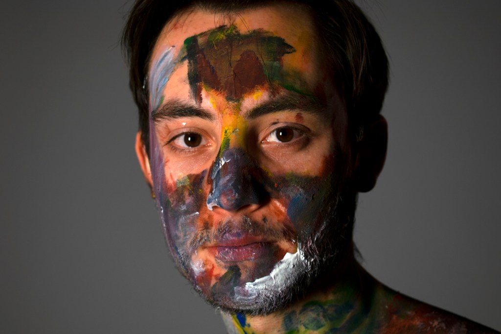
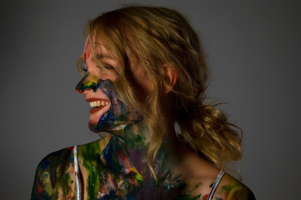
Photos by Hafsah Jamil
As the filming and photography process went on I found, looking back through the pictures, they became very intimate and a reflection of ourselves. Looking through Hafsah’s work it felt like she was holding a mirror to our relationship, our bond and our connection to one another. I love how, without Hafsah’s direct input , we ended up creating similar strokes to the ones she uses in her work prior to this shoot. She captured our essence as a couple while we captured her essence as an artist. We had influence over each other without knowing, which I didn’t think would happen in the process of the shoot. Everyone had an influence on the atmosphere within the artwork.
After seeing the finished products of the shoot, and falling in love with the photos, I was intrigued and eager to learn more about her thought process and inspirations behind her work and themes.
To Hafsah Jamil : How would you describe the piece? What do you want it to say? What are your inspirations?
‘I think the photos and the video are quite playful and fun like your relationship and it’s just meant to show the impressions people leave on one another which I hope it does. It’s meant to show how similarly you react with each other and how you pick up each other’s habits when you spend time with each other. I think Alexa Meade as an inspiration.’
-Hafsah Jamil
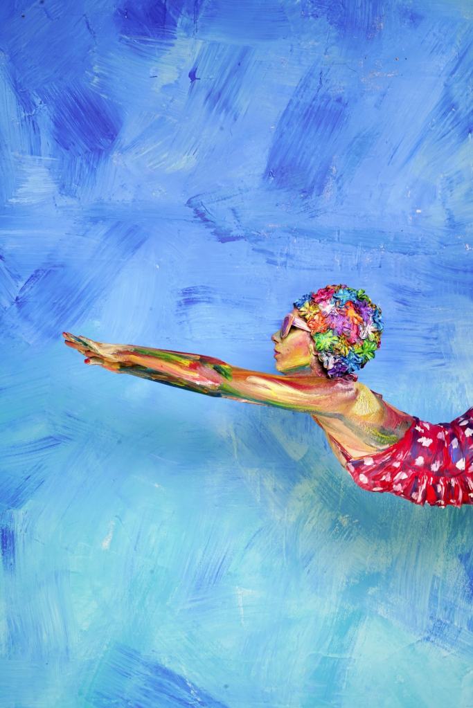
Looking to the inspiration that is Alexa Meade
I was curious to see the inspiration behind some of her work, and immediately upon seeing Meade’s website I could see the similarities between the work.
Alexa Meade’s methods involve painting the environment around the model as well as the model in order to create an immersive experience for the viewer. She uses Bold and vibrant colours to create a somewhat surreal view, that feels like both reality and a dream. I love the effect and atmosphere created by her bold strokes and use of colour, and how at an initial glance from a photograph her work does look like a traditional 2D painting. By painting on a 3D canvas she effectively creates clear layers between the background and the foreground, which one may find difficult to recreate using such thick strokes on a 2D canvas. I think it is clear that Hafsah has taken inspiration from pieces like [3] but has added her own twist to the idea of painting on bodies in this way. As to me Hafsah’s pieces contain a much more intimate and grounded atmosphere, rather than trying to create her own world and environment. Jamil’s work reflects the colourful side of relationships and reality rather than trying to create her own reality, as Meade does. Hafsah took an amazing idea and made it her own, separate from but still loosely connected to the origins.
I’m in love with all the pieces created from the shoot, it’s really interesting to view yourself and a relationship from an outside perspective. As I said before it feels like a mirror being held up to an intimate relationship I share with someone I truly care about, which is what the artist in some ways set out to do. It was an eye opening experience to take a step back and look at my relationship from the Artists eyes and to see what impressions we have on one another and how we can be. It was a wonderful experience to work alongside such a talented artist and to see how her ideas develop and to look into a new art practice I hadn’t considered before.
Still life is a way for artists to experiment and explore their technical drawing skills of capturing a texture, composition or perhaps even a narrative. Still Life can show us an ordinary object and give it new life, meaning and context with carefully thought out compositions, choice of media and execution. As said by Thaneeya on her website; ‘The magic of still life paintings is that they can show us a new way of looking at the ordinary objects around us. Once they are placed into a specific arrangement and then captured in paint, ink, pastel, or any other medium – the objects take on a whole new meaning. They are imbued with a life beyond the ordinary. Their existence becomes recorded in time.’(Art (2014). Art is Fun. [online] Art is Fun. Available at: https://www.art-is-fun.com/still-life-paintings [Accessed 25 Oct. 2019].) . Upon initial inspection of a still life one may assume that there isn’t really a narrative, the piece is simply an observational sketch to show the artists skill. Although this can be the case, there is often a lot of narrative and themes within the context of the piece when you look closer. Why did the artist choose to focus on such objects?
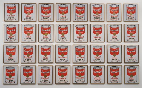
If we look to Andy Warhol’s Campbell soup cans, which were discussed in Thaneeya’s web post, Warhol actually chose to focus on that subject matter because he simply just really loved Campbells soup. As quoted on Masterworks website; ‘his friends suggested he paint the things he loved the most. The result was the iconic Campbell’s Soup Cans, 1962. Warhol said of Campbell’s Soup “I used to drink it. I used to have the same lunch every day, for 20 years, I guess, the same thing over and over again.” ‘ (Masterworksfineart.com. (2018). Andy Warhol Campbell’s Soup, 1968. [online] Available at: https://www.masterworksfineart.com/artists/andy-warhol/campbells-soup.) So here we have this added context of the subject being personal to the artist. This can then be added to the theme of mass production that had clearly sparked his interest and played a role in his production of the 32 Campbell cans. Using projections and working as ‘summarized by Warhol’s famous words: “I want to be a machine.”(Masterworksfineart.com. (2018). Andy Warhol Campbell’s Soup, 1968. [online] Available at: https://www.masterworksfineart.com/artists/andy-warhol/campbells-soup.) Combining this way of work with a personal touch by hand painting all 32 paintings. Creating a personal link between the subject matter and to him as an artist, as well as creating juxtaposition by addressing an impersonal theme such as mass production. Furthermore, with this still life he took the context of something ordinary and made it extraordinary, taking it out of a supermarket and placing it within the art world, under a spotlight. Forever changing its context.
The History of Still Life
But to fully understand the genre of Still Life, and what Still Life could mean and all of the genre’s potential, you must look to its roots. We can see Still Life being used as far back as the Egyptian Period, where the genre was used in funerary paintings, often including; ‘food—including crops, fish, and meat’(My Modern Met. (2018). How Artists Have Kept Still Life Painting Alive Over Thousands of Years. [online] Available at: https://mymodernmet.com/what-is-still-life-painting-definition/.) We could interpret the painting to have cultural significance with what we know about the Egyptian way of life. The paintings could have been a form of offering to the Gods for the deceased to have a better afterlife. We could also interpret these paintings to show off the deceased’s wealth, the imagery depicting the ways of the deceased’s success in farming, or being able to afford fine foods. This can be linked to how paintings commissioned in later centuries were often done to show the wealth of the buyer or sitter. Or we could simply interpret the Egyptian funerary paintings significance as a personal one, as perhaps the imagery was linked to objects or foods personal to them in order to celebrate their life.
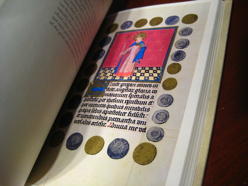
If we look forwards towards the Medieval Period (15th Century) we can see a huge shift to Still Life holding a much more religious value by both the artists and the viewers. As told by Kelly Richman-Abdou on the website My Modern Met; ‘During the Middle Ages, artists adapted the still life for religious purposes. In addition to incorporating symbolic arrangements into depictions of Biblical scenes, they also used them to decorate illuminated manuscripts.’(My Modern Met. (2018). How Artists Have Kept Still Life Painting Alive Over Thousands of Years. [online] Available at: https://mymodernmet.com/what-is-still-life-painting-definition/). Items relating to Christ and Christian values which also held huge symbolic value were often used, items such as ; ‘coins, seashells, and bushels of fruit can be found in the borders of these books’(My Modern Met. (2018). How Artists Have Kept Still Life Painting Alive Over Thousands of Years. [online] Available at: https://mymodernmet.com/what-is-still-life-painting-definition/).
Housing Works Thrift Shops (2009). Hours of Catherine of Cleves. Available at: https://www.flickr.com/photos/housingworksauctions/3217242241 [Accessed 6 Feb. 2020]. Detailed imagery and Still Life fill this book; ‘The Hours of Catherine of Cleves’ from the 15th Century.
The symbolism of coins can relate to how wealth can be found through Christianity, as gold is often linked to divinity, holiness and the preciousness of the Holy Trinity. Furthermore if we look to the Bible for what Gold means, we can definitively see how gold is seen as a precious and holy material as;
‘The Bible says God created the world and the elements within it. Gold is depicted as an asset of value.‘ (Bauman, J. (2017). What Does the Bible Say About Gold and Silver? – Peter Schiff’s Gold News. [online] SchiffGold.com. Available at: https://schiffgold.com/commentaries/bible-say-gold-silver/ [Accessed 5 Feb. 2020].)
“The silver is mine, and the gold is mine, saith the Lord of hosts.”
Haggai 2:8
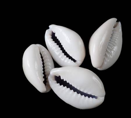
So here we can see that the Gold belongs to the Lord, which could mean any depiction of gold used is a way of honouring Him and the material He has made. ‘Gold and silver are products of God – they are not a creation of man. God designed them to be intrinsically valuable and beautiful, for gold does not tarnish nor corrode.’God created the world and the elements within it. Gold is depicted as an asset of value.‘ (Bauman, J. (2017). What Does the Bible Say About Gold and Silver? – Peter Schiff’s Gold News. [online] SchiffGold.com. Available at: https://schiffgold.com/commentaries/bible-say-gold-silver/ [Accessed 5 Feb. 2020].) Here if we look into the qualities of Gold as a material we can see that it ‘does not tarnish nor corrode’ which can represent a sense of long lasting purity, which holds a lot of value for Christians, as they seek to be pure to show their devotion for God. If we look to the symbolism of the use of shells, we can relate it to fertility and its use in baptism as ‘Fertility is also associated with the scallop shell, as exemplified in ancient and renaissance paintings of Venus, the Roman goddess of fertility and love.’ (Christa’s South Seashells. (2018). Shells as Religious Symbols and the Meaning of Life – Christa’s South Seashells. [online] Available at: http://csseashell.com/shells-as-religious-symbols-and-the-meaning-of-life/) . Cowrie shells are often linked to fertility due to their resemblance of the vagina, and in some cultures are worn to encourage fertility. So when assessing a piece of work or creating your own Still Life objects can hold cultural symbolism or personal symbolism which I should keep in mind going forward with my work, especially as I try to develop assessment pieces. This can help me to form a strong narrative within my work and to also construct themes that I feel are relevant.
The scallop shell is used here to represent the fertility of Venus, a valuable trait in women in this period.
The shape of the Cowrie shell resembles the vulva/ vagina, linking it to the fertility of women in symbolism.
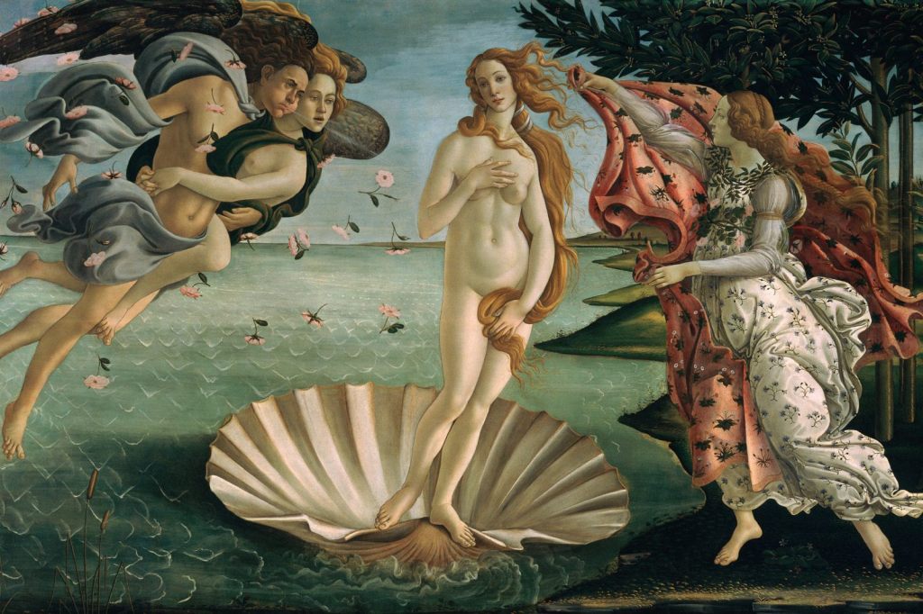
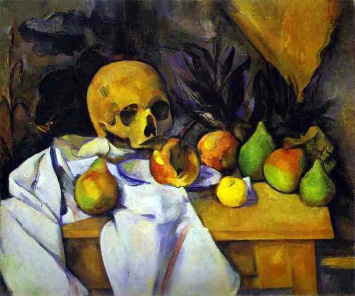
Moving forwards looking more at traditional Renaissance approaches, the symbolic choices within the composition remained, still heavily influenced by religion, however the focus began to shift towards accuracy and skillman ship. Just how real could they portray their Still Life? The genre of Still Life was heavily influenced by Dutch Artists at the time. A popular composition within Renaissance Still Life were floral arrangements. The Dutch Golden Age artists took this concept and ‘took this interest in detailed floral art a step further with their vanitas paintings. Vanitas paintings are inspired by memento mori, a genre of painting whose Latin name translates to “remember that you have to die.” Like memento mori depictions, these pieces often pair cut flowers with objects like human skulls, waning candles, and overturned hourglasses to comment on the fleeting nature of life.’(My Modern Met. (2018). How Artists Have Kept Still Life Painting Alive Over Thousands of Years. [online] Available at: https://mymodernmet.com/what-is-still-life-painting-definition/.) . Thus due to the popular theme of death and what it means, skulls became a popular focus for Still Life Artists. Vanitas differ from Memento Mori Still Life’s as they have more of a focus on the pleasures of the world around us and the arrogance that comes with those, by incorporating wine and musical instruments to flesh out this point of view.
This Flemish Vanitas is brimming with symbolism. The artist incorporated the skull for the classic imagery and symbolic gesture of Vanitas Still Life, to remind the viewer that they too will join the skull one day in their future in death. Although initially melancholy, the skull can be interpreted in a more positive tone, to grab life and live it well, as life is fleeting. This idea is further fleshed out by the symbolism of the candle nearing the end of its use, which emphasises the point of time running out. A similar point is also made by the hourglass with the writing above it reading; “Time runs fast, all youthful grace vanished before one is aware of it.”(LAWRENCE STEIGRAD FINE ARTS. (2014). LAWRENCE STEIGRAD FINE ARTS. [online] Available at: http://www.steigrad.com/flemish-school-a-vanitas-still-life.) The flower is also imagery for the passing of time (with its falling petals) which inevitably leads to death with the writing above it being quoted as; “As the beauty of the flower does not last long, a person also quickly fades.”(LAWRENCE STEIGRAD FINE ARTS. (2014). LAWRENCE STEIGRAD FINE ARTS. [online] Available at: http://www.steigrad.com/flemish-school-a-vanitas-still-life.) . The colour palette and dark tonal qualities help to create an atmosphere completely immersed within the themes of death and time. When studying Still Life and creating my own work, I should keep in mind the theme or atmosphere I want to create, and carefully construct my composition and my choice of objects(And how they link to one another) around those ideas in order to create an immersive experience for the viewer and clear focus within my work.
We can see the return of Still Life in Modern Art, with Artists such as Cezanne exploring the Still Life genre with his series of famous Still Life’s incorporating household objects and in animate objects such as fruit on table tops in his radical style that helped develop a new groundwork leading Artistic change from the 19th century to the 20th.
The accuracy in portraying the scene that was developed from the Renaissance period is still there, but adapted to a more Modern approach and take on the Still Life genre, using a looser approach to detail and strokes, creating a fluid piece that feels alive and breathing as you look at it. The bold use of colour and outlines were very new at the time and define the 19th and early 20th century Still Life period. With the thick layers of colour and tone you feel a sense of the environment, and in a way how the light is moving and dancing around the room. Attention is still applied to the different variety of textures found in the scene such as the porcelain cup and the apples ( How they reflect and respond to the light) and how they contrast to the duller textures such as the table cloth and wooden furniture. Circling back to my introduction, I get a sense that this piece is more a study of his style or a personal scene to him rather than trying to push symbolism or a theme. It’s narrative in terms of the composition of the scene is quite simple, its a sample of life and exploration of style when it comes to his technique and execution. However we can see his exploration of themes in some of his other pieces.
For example in his interpretation of a Vanitas Still Life, he has updated the look to his fluid style and technique, and created a juxtaposition of life and death by incorporating ripe fruit. In some ways changing the context of Vanitas Still Life and what it should traditionally look like and be. Modernising a traditional style and theme, especially with his incorporation of brighter, more vibrant colours which traditional Vanitas wouldn’t use. Although the dark tone is still put to use in his cold background, creating a dark atmosphere still, but also creating an interesting contrast in his composition with the foreground. We can see a clear shift in the colour palettes used by the 16th century to the 19th-20th century Modern Artists, and similar experimentation also occurs within Picasso’s work. We can also see the incorporation of a brighter colour palette in the piece by Andy Warhol I discussed earlier. It is clear that the 20th century opened up to more exploration with Still Life, technique and style.
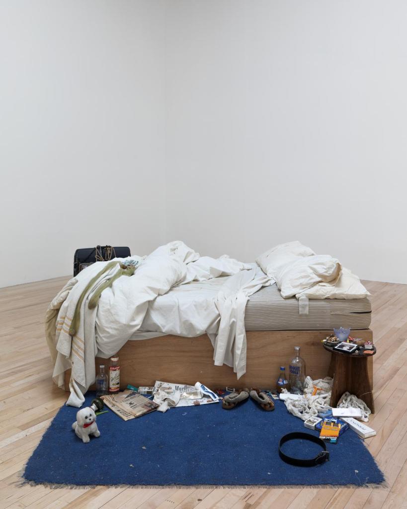
However within the 21st Century, Still Life as a genre has been split into many varieties of style. Firstly I shall look at an incredibly experimentive attempt at Still Life by Tracy Emin.
Here we see a direct and blunt attempt at Still Life, as it is literally a scene, no drawing or painting, a literal slice of Emin’s life. Here we get a glimpse into the narrative of her life and how she lives, looking at the mess surrounding the bed including empty alcohol bottles, one can assume its not healthy nor happy. The desired effect is for the piece to look messy and not have much thought put in, the composition is very effective in showing a messy dysfunctional scene. The ideas and themes (themes of substance abuse and mental illness) fit into a personal experience, the viewer is made to feel uncomfortable seeing something so personal and private as a bedroom, especially one left in such a brutally honest way. Emin really pushes the boundaries of what art and Still Life can be and the piece has even been debated over whether it can really be considered an art piece. I think its an interesting and unique approach, but not one I would like to consider for myself as an Artist, in terms of how I’d like to experiment with my skills and ideas.
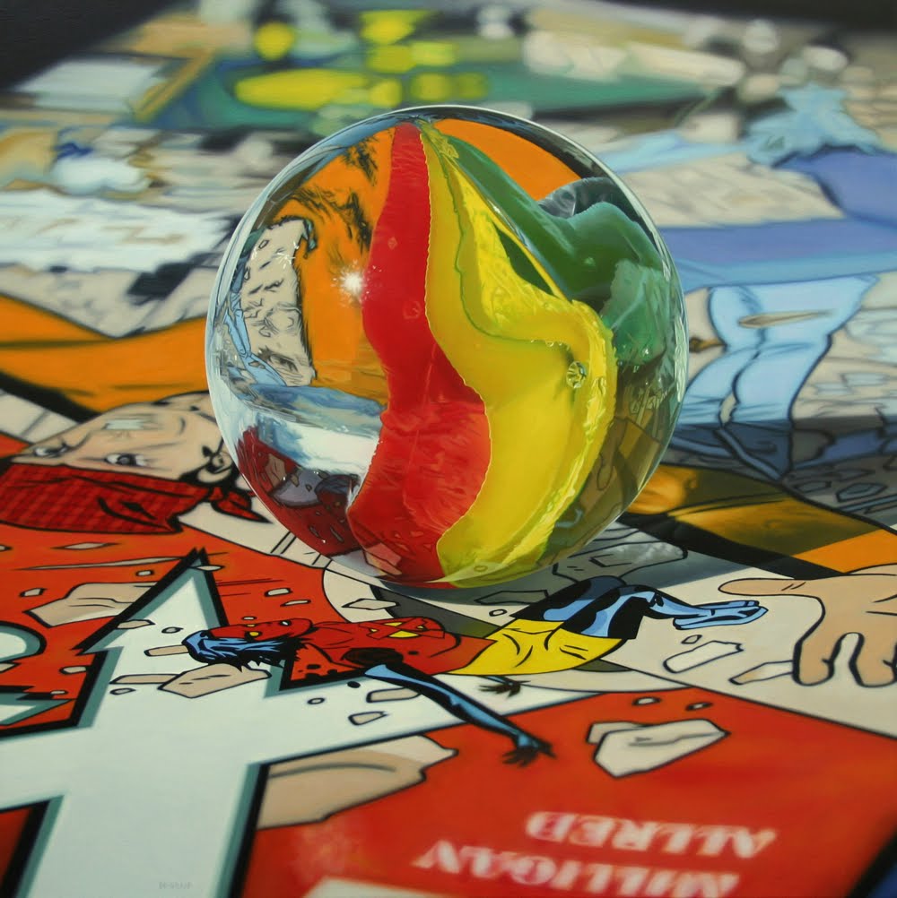
Another very common contemporary approach to the Still Life genre is hyper realism. Taking a mundane modern object and giving it extreme detail, and similar to what Warhol did, taking the ordinary and making it extraordinary. As summed up by Kelly Richman-Abdou; ‘Much like the pieces that inspire them, these high-definition paintings prove that even the most mundane objects can be made into masterpieces.’(My Modern Met. (2018). How Artists Have Kept Still Life Painting Alive Over Thousands of Years. [online] Available at: https://mymodernmet.com/what-is-still-life-painting-definition/.) Upon first inspection these paintings are often assumed to be photographs, but offer a new depth to the reality they capture, as Katie Hosmer sums this up as; ‘The artist focuses on every extreme detail to create realistic depth in layers of crisp reflections. With a steady hand and a strong vision, he produces a new reality based on his own imagination.’(My Modern Met. (2013). Hyperrealistic Still Life Paintings Filled with Layers of Detail. [online] Available at: https://mymodernmet.com/jason-de-graaf-hyperrealistic-still-life-paintings/ [Accessed 6 Feb. 2020].) I would love to experiment and play around with realism in my drawings and work, however I don’t think I could reach the level of hyper realism that some artists can. But I’d love to develop my skills and see how far I can push my drawings into hyper realism, and with that create a new sense of reality within my work.
Evidently, when it comes to my work and thinking about what I’d like to create in terms of Still Life for my course, I have a lot to consider. Looking back to Thaneeya’s website, developing Still Life includes a vast amount of symbolism, themes that must be thought about carefully for my composition, as; ‘The objects chosen for a still life painting often have a special meaning, either on a personal, cultural, societal, religious or philosophical level. The themes surrounding the artwork often provoke introspection and reflection in the viewer. The way that the objects are depicted can evoke a wide variety of emotions, depending on their arrangement, as well as the lighting, color choice, and handling of the paint. These are all things to take into account when viewing a still life artwork. They are especially important to consider when you are creating one.’(Art (2014). Art is Fun. [online] Art is Fun. Available at: https://www.art-is-fun.com/still-life-paintings.) . I have to look for deeper meaning in what I want to purvey within my work, how personal do I want it to be? And what kind of reflection do I want to evoke from the viewer? From observing Modern Artists like Cezanne and Picasso, it is clear need to think about my use of colour, technique and medium, as they can have a significant effect on the feeling/ emotions of my work and could potentially add new context to any theme or narrative I am developing within my work. I am excited to start immersing my self in Still Life and exploring my ideas to see what I can create.
After receiving feedback from my tutor I have identified areas on which I can improve my work as whole as well as how to improve further on my techniques, composition and layout and quality of my work on my blog.
First of all, I need to take my time when photographing my work for my blog, putting in the extra time or even waiting a day for good lighting when photographing my work to put on my blog. This can massively improve how my work is perceived online.
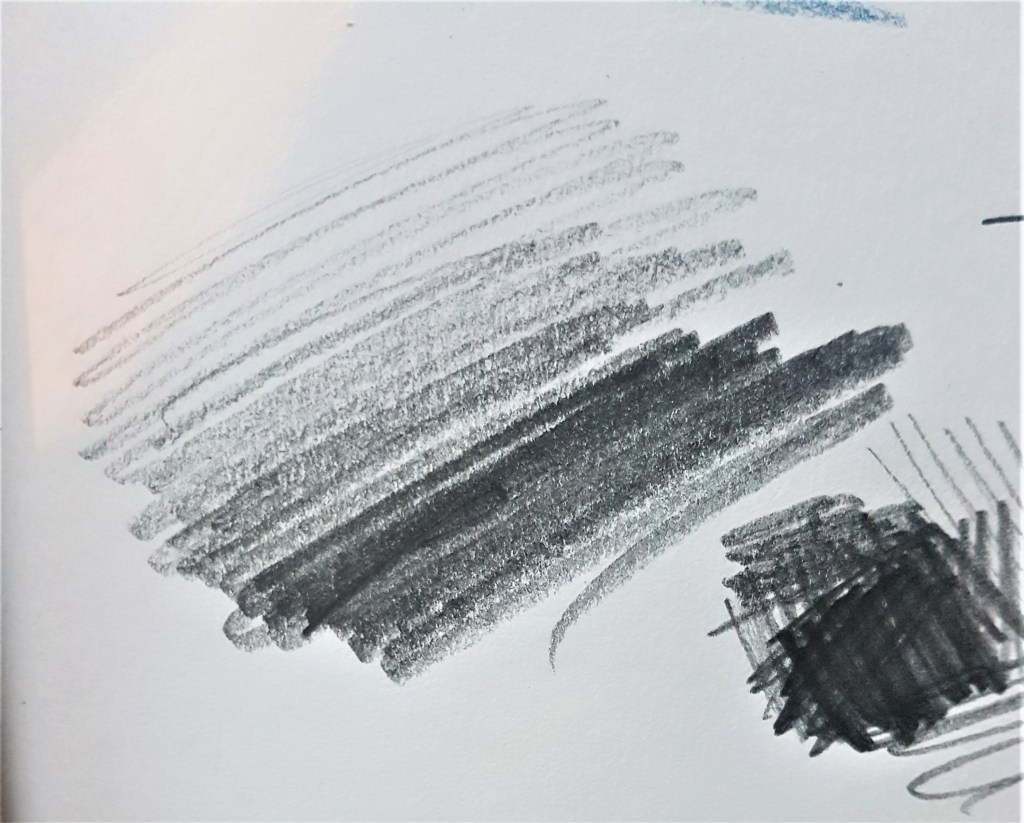
Furthermore I should draw more confidently in my strokes, rather than a wispy way, leaving lots of un-necessary markings while drawing. I should opt for fewer, bolder strokes rather than using many trying to get the curve of a drawing right. I should also experiment more with my pressure when drawing, and seeing how that creates tone.
Furthermore, I should branch out and explore ideas and themes in broader ways, showing I have thought about numerous ways of achieving an outcome or idea with various techniques and mediums. I should experiment more with and doing such produce more drawing showing my exploration of ideas. Moving forward with my work I will keep this all in mind.


