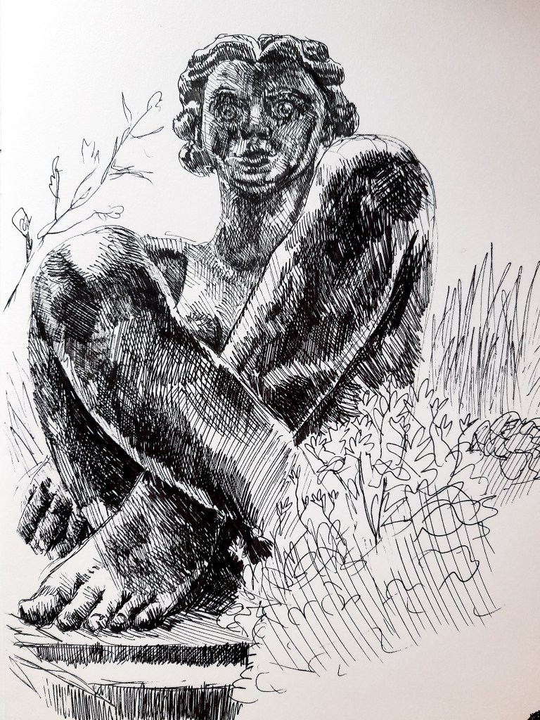
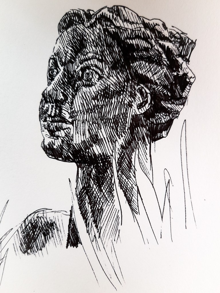
I focused on two statues in Birmingham for this exercise. Firstly I looked at this peculiar statue that sits in the (was) fountain outside of the BMAG, it is now filled with plants instead of water, creating an interesting scene around the statue.
Drawing 1- Front facing
Drawing 2- Close up from the side
Fine liner in A3 sketchbook
I found the composition of the statue unique and stylised. It’s not like the average statue you would find sitting around Birmingham, with stylised facial features and body proportions. The light came from her right side and created interesting shadows on her legs and cast a sharp line on her foot which I thought looked good for my drawing. I personally don’t like the style of her facial features, but it was a change of pace from the very realistic approaches practically everywhere else in Birmingham. She is a very big statue and I feel my first drawing really captures that. I focused on tone to help show the size of the statue and the smooth shape of the stone used. There wasn’t much texture but there were areas where the stone colour was darkened or lightened and worn, from being outside. The texture was smooth but the lightened and darkened stone allowed me to play around with my use of tone. In my second Drawing I focused on a close of of her face from a different angle. It allowed me to capture the angled approach to her hair, it was that detailed other than angular shapes with some streaks to show locks of hair. I quite liked the approach as it wasn’t too complicated and fit with the simplified style the artist has gone for with this piece. I still prefer the first Drawing I did as it shows the body and more of the style of the Artist with his approach to the body, thickening and lengthening limbs, and shows more of her size. I am happy with these drawings, to improve I could spend more time on the surroundings of the plants and the city-scape behind her, but I wanted to keep the focus on the statue for this exercise. I think this is a composition I might want to explore in my assessment piece. But it doesn’t allow me to show off angular perspective so much as a focus on a building would.
Fine liner pen sketch in A3 sketchbook
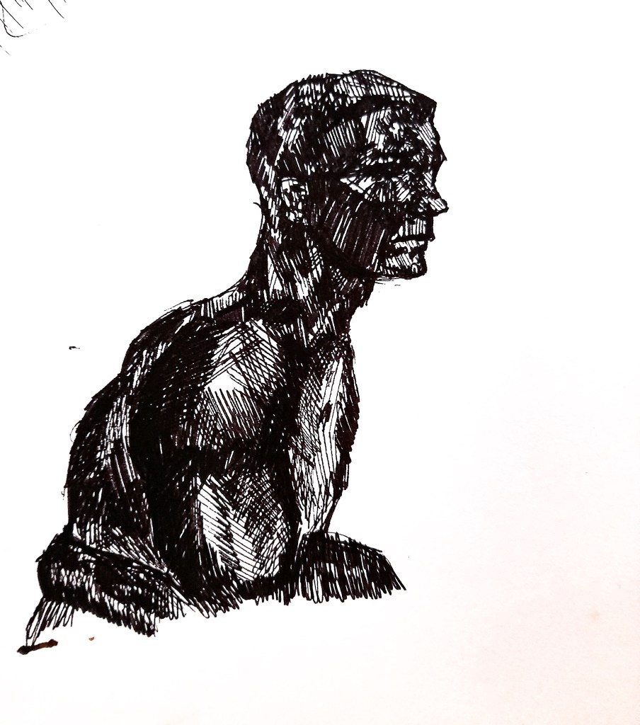
This statue is smaller than the first one I looked at at and is more level with me, I’m not looking up to it as much as I was with the previous statue. Compared to the previous stone statue, he was a glossy and black statue, with added a natural darkness to him compared to the grey, mid-tone stone from before. This all meant I could draw him from a level angle and really play around with tone to show the darkness of the material but also the shiny highlights from the glossy material which were fun to capture. He had quite sharp features on his face, which cast lots of interesting shadows. His arms were more rounded and allowed me to still capture an interesting highlight which was more rounded due to his muscles. I limited the tone initially to shapes of light and dark before using my crosshatching to blend it out and feel much more natural and real.
I found this statue much more interesting to depict, I loved approaching the natural dark tones and the the contrast of the shine from the glossy material. My forte is definitely portraiture so i felt more at home drawing this than my previous exercises with capturing a vast view of landscapes. I would like to perhaps explore capturing a statue for my assessment piece but this statue will not fit as there are no natural elements in the surrounding area to fit into the assessment criteria. I enjoyed capturing statues in this exercise and seeing my use of pen as a medium improve. I think I could experiment with pen and ink for my assessment piece, using pen to define the foreground and slowly bring in ink to help add depth with the middle ground and background. I can explore this idea with some preliminary sketches before deciding on what to do.
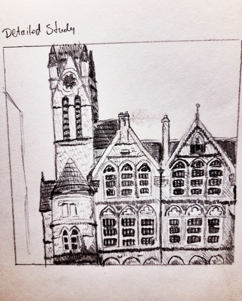
For my townscape I decided on Birmingham, and ended up at the Ikon gallery. Since the exercise asked me to focus on a specific building, I decided that the architecture of the gallery’s exterior was perfect and sat down to begin sketching.
1. Sketchbook Drawings
Drawing 1- Detailed study
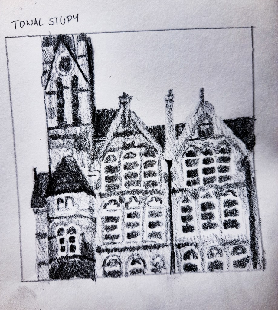
Drawing 2- Tonal study
Pencil drawings in A3 sketchbook
I focused on a small areas above the entrance which showed the roof line and the windows. I love how this looks and it helped me get to grips with depicting the architecture. It was heading to the evening, so the sun was getting low and casting interesting shadows onto the round turret at the entrance. I found this building to be interesting, lots of details and windows, I wanted to explore a complicated building for this exercise to really test my skills and hopefully improve. I think I prefer my tonal approach to this drawing as it captures more texture with the 3B pencil and the grain of the paper.
3B pencil sketch in sketchbook
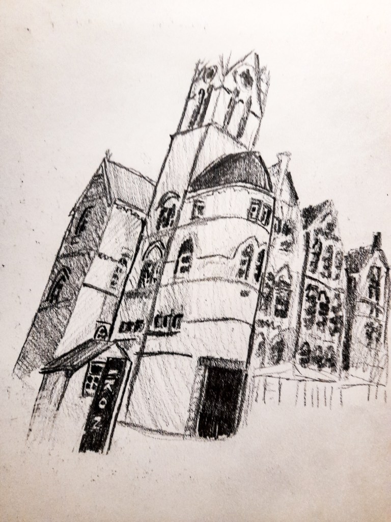
I tried a new angle with this quick 10 minute sketch, I was limited from angled to choose from due to the tight space around the gallery. I kept a focus on line with this drawing in order to focus on getting accurate proportions with my drawing and I think I have achieved that. I was happy with how this came out, but I preferred the focus from the front, where I could capture all of the details and the layout of the windows. I think it was more interesting and i wanted to explore that composition with ink.
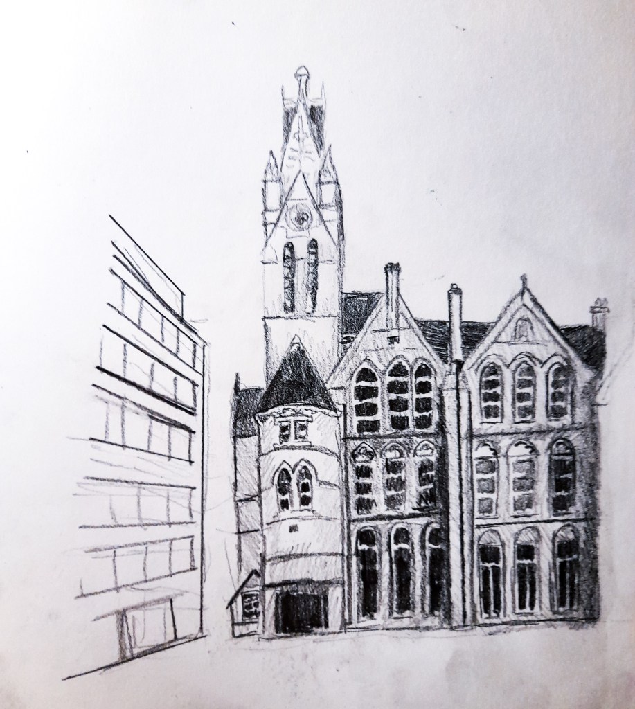
2.Study of a townscape using line
3B pencil study in sketchbook using line.
Since the layout of my chosen composition didn’t work well horizontally and was a tall composition, I stuck to one page for this study rather than two. I used line and focused on the shapes and proportions. I still applied tone to the main focal point of the Ikon gallery, and kept the other building in my composition very simple and basic showing the lines that made up its basic composition but no more. I thought this would help to showcase and depict the surroundings while not taking away from where I wanted the focus to be. I only kept to drawing the buildings, but I feel I could have added more detail and texture in the surroundings, especially the courtyard at the front with the gravel. I didn’t at the time to keep the focus on the buildings, but I feel this could have helped create a more interesting and dynamic drawing. I know for my final piece, I want to explore this composition but keep the focus higher, like in my original 10cm square drawings, but I would like to try and include the building on the left, and experiment with keeping that in minimal detail compared to the main building.
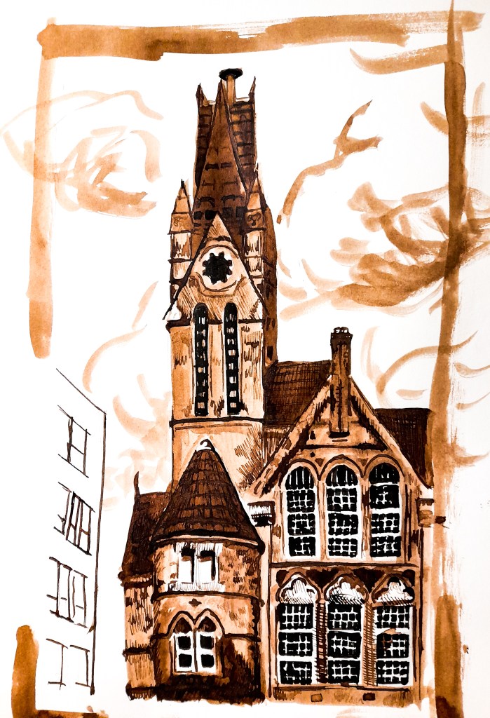
3. A limited palette study
Drawing in walnut and black ink.
For my tonal palette I experimented with sepia tones, using browns, and black ink to draw. I used walnut ink for my brown tones, layering the ink for darker browns. Black ink for the darkest shadows and to add fine details, and I used the absence of ink on the white paper to add in white highlights. I knew the white window frames would be where I would want to have these highlights and so I left them blank. By layering the brown I was able to capture the texture of the roof and some of the brick work. I am happy with how the main building of the gallery came out, however I do not like my minimal approach to the side building. In hindsight I could have improved this by layering the browns to add some depth, as it looks too basic and has no depth and takes away from the drawing as a whole. To improve, although I wanted the focus to be on the main building, I shouldn’t have taken this much away from the side building. I should apply some attention to the tonal value as this just doesn’t work well at all. I think the loose approach to the clouds works quite well to develop a dynamic background that also works well with the gallery and drawing as a whole.
Moving forward
I struggle with developing townscape compositions and this is something I need to work on and improve on. I tried a stylistic approach and it needs some work to progress to something more visually stimulating, I want it to be much more immersive and to do that I need to capture the rest of the environment perhaps at a larger scale, in a range of tone to build up a believable and interesting space.
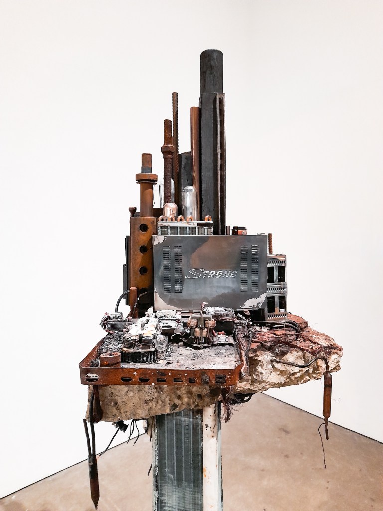
The Czech Artist with his new exhibition at the Ikon Gallery, offers insight to the World around us by recycling old pieces of disposed technology (lights, circuit boards, wires and cables) in order to create a new vision of the world we live in. Some of his work having mythical or surreal elements, like a talking raven or ‘Nervous Trees’, made exploring the exhibition so much fun. However, I won’t be looking into those aspects of the exhibition today, I wanted to look at a select few pieces within this exhibition that look more closely at the depicting an Urban Environment and city-scapes that relate more to my current body of work for Part 3 of my Drawing module.
Piece 1
Piece 2
Piece 3
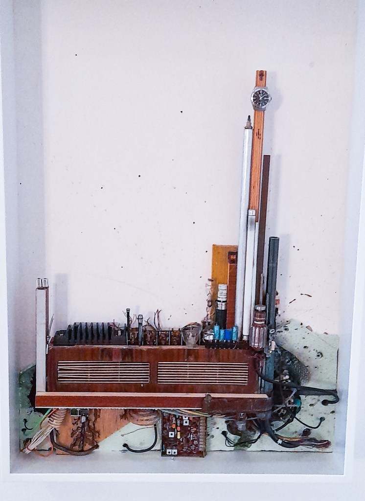
Drawings-2007-20 Framed ‘drawings’ using recycled pens, wires and metals and expanding foam.
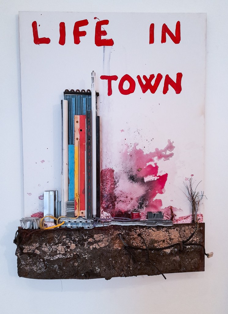
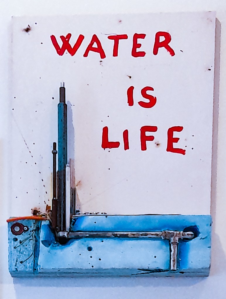
The first three pieces I picked out here were the first ones I saw in this adventure of an exhibition. They depict city scapes and buildings using recycled materials and lots of wires. One of the unique areas where Kintera stands out is his use of recycled materials to depict scenes. The vast majority of what makes up his work is recycled materials that can’t serve their purpose anymore, and Kintera gives them a beautiful new meaning by using them as art and to make his art. His depictions of city-scapes and buildings are unique not only due to what they’re made out of, but also due to how Kintera also focuses on whats underneath the city. A city isn’t just what we can see, its the invisible parts that we aren’t always aware of, like water lines, sewage pipes and electricity which reaches us and connects us underground. When we think of a city we think of the buildings we can see, not the aspects underground that make cities function and work, which is a unique take by Kintera I haven’t seen many or any landscape artists focus on. These pieces are so interesting to me as he has dissected the Urban Landscape to show us aspects of city structures we don’t always think of, and show their importance. The 3D aspects of these pieces, by using wires add so much depth and texture, you find yourself staring for a long while picking out each object he uses whether its a broken phone, wires or an old motherboard.
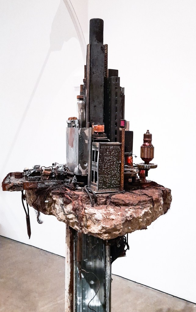
Neuropolis-2020 Wall sculpture made from recycled materials
Here we can see a direct advancement from the framed pieces I looked at first. He’s moved on from looking at one city building to looking at a city silhouette, a slice of a bigger scene. This piece shows how we’re all connected by these wires, pipelines architecturally but also by the technology we use. We can all find an item we can relate to that is used in this piece. For me and my boyfriend (who accompanied me to this exhibition) we both found and bonded over an old camera that was repurposed in this piece. We are all connected by technology and the internet but also by the design of our towns and cities. Again Kintera uses wires and 3D objects to add layers of texture and perspective to his work. He uses the texture of different materials, like indents and parts of a computer board to act as windows and building textures, there is a lot of detail to unpack when you’re close and personal with his work, which adds so much investment and intrigue to the viewer.
Tower of unsustainable development- 2020 Sculpture made from recycled materials
As I moved throughout the exhibition I could see the advancement of his ideas and how he progressed from previous pieces. I loved looking at this piece and found how the longer I stared the more I could identify and recognise. It adds a layer of interest to the viewer to recreate structures we recognise with old nostalgic objects we have discarded long ago, old cameras that we have outgrown due to the advancement of technology. It shows us how we are advancing at such a fast rate with technology we don’t think of what to do with older pieces which we don’t value anymore. Kintera looks at giving value back to these discarded objects and comments on how we should think about an old piece of technology before we send it to landfill site. Can it be recycled? Can I find a new use for it? Can I use some of the pieces its made of for something else? It also shows us how we have gotten where we are from this technology, out cities are made from all this technology we deem useless now. So is it really useless if it has gotten us to where we are now?
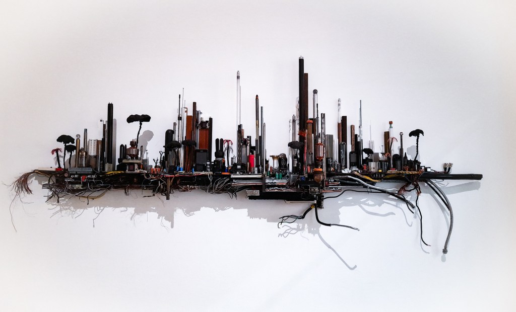
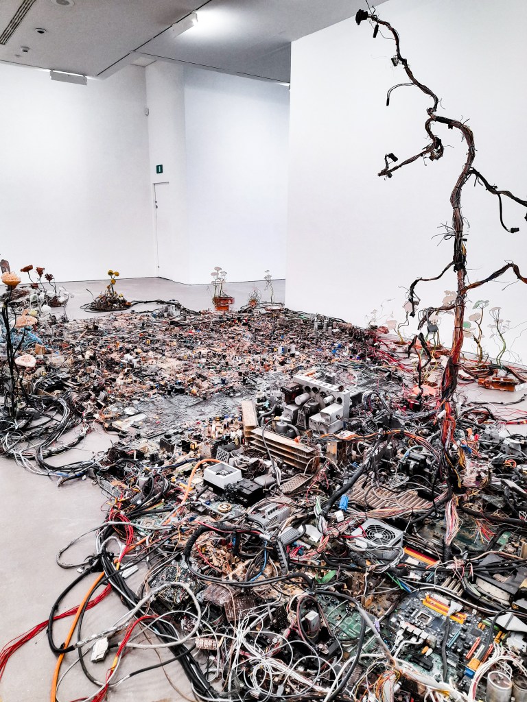
Postnaturalia-2016-17 Large model of a city made from recycled materials.
Finally we can see this growth and ideas fall into place with the final piece I will look at, this huge model city made again from recycled materials. I love how you can see his thought process and journey of ideas advance as you progress through the exhibition. There is so much to unpack visually that I found we stayed here the longest, exploring this vast city like a city in a foreign country. Familiar yet different, it was exciting seeing how he explored different landscapes with different recycled materials. Fields made from flat, green circuit boards. Cities made from old computer pieces and hardware, which depict buildings and skyscrapers from how he organises his composition. Wires connect the different cities and landscapes, joining them all together. Wired trees are present showing the need for nature, but also the absence of it in a modern and technologically advanced society. His work contains juxtaposition by showing a sci-fi, technological advanced society but made up of discarded technology that’s old and serves us no purpose anymore. From the title: ‘Postnaturalia’ we can tell that this is a city depicted after nature. There is no need for it yet we long for it. It comments on how we rely on technology more than we rely on the environment, and although we value technology, we discard it and disregard it the way we do with our natural environment.
I haven’t enjoyed an exhibition as much as I have with this. I highly recommend this to anyone with an interest in art. It was insightful and deep as well as being playful. The work was visually stimulating and it has made me think about my approach to landscapes and how there is so much more to explore and take into consideration. How my materials can help change or add new meaning to my work. I am so glad I visited and have had my mind opened to new possibilities and ways to explore landscapes and city-scapes. How I can create my own medium and explore new ways to create and ‘draw’ outside of traditional media. ‘The end of fun’ is definitely insightful, deep but also ,ironically, a whole lot of fun.
One Artist whose work has really stuck out to me is John Virtue, I love how messy and abstract his work first appears and then how the modern landscape of London begins to form the longer you look.
His work has a historic feel to it while also remaining new and fresh, with his black and white approach to his paintings they feel reminiscent of lithographs and ink press prints used throughout history. This makes sense with his main influences being Turner and Constable and his references to ‘the Dutch and Flemish landscapes of Ruisdael, Koninck and Rubens.’[1] . Traditional approaches to landscapes helps him to create unique depictions of the modern, fast changing environment of cities in the present.
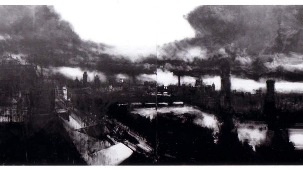
By working in solely black and white, it is clear his focus isn’t necessarily on the landscapes but rather light, and how catches and plays with the shapes of London. This piece of his works so well to show the industrial cityscape along the Thames, his use of ink and no colour give it an industrial vibe. His choice of medium and how dirty it looks when combined with the white acrylic suggests within his work, how dirty and polluted London is. Many contemporary Artists and their approach to the ‘Urban Environment’ often highlight the dirtiness of urban landscapes compared to the beauty of the natural landscapes historical Artists often depicted. There is a cleanness to nature, and a gritty dirtiness to an urban landscape. With industrialisation of cities comes pollution, with people comes dirt and litter. Contemporary Artists are not afraid to highlight and focus on the harsh reality of how unappealing and dirty modern and urban landscapes are. An Artist I looked at when first looking at landscapes also highlighted this within his paintings.
George Shaw keeps a focus on urban environments within his stunning pieces. They showcase housing estates, often filled with litter, graffiti and not the most scenic areas. They are filled with low income families and aren’t visually appealing or seen as beautiful. We can see this in Shaw’s work, but I feel he also discretely does the opposite. The absence of people creates a lonely but tranquil atmosphere within his work. He adds a sense of beauty, often absent in artwork looking at urban environments, by looking to areas and aspects of our daily lives that we often overlook. The care and attention to detail he applies to scenes we see everyday and overlook as we rush about our lives adds so much to the mundane, it makes it worthy of being looked at when we don’t bother to.
It’s hard to capture beauty and interest in views we are so familiar with, George Shaw and John Virtue both offer insights to these scenes with their work. They showcase the reality of how dirty city landscapes are but they also show the beauty of these landscapes in their own ways. Virtue’s attention to tone shows us that we should look more at the city around us and find light in the dark, good in the bad, and really look at the view, as there is more than meets the eye. Shaw, shows us that beauty can be found in the mundane if we take the time to look and see what we normally wouldn’t pay attention too. To capture the modern landscape as a contemporary artist is to highlight the reality of our environments but also show the sublime beauty and from the attention and care they have took of capturing a view like that, which every British person has seen and is familiar with. That familiarity with a cityscape is what helps the viewer and the artist identify with one another.
Moving Forward
As I begin to look at cityscapes and the landscapes of a modern environment I should really take into consideration these Artists and their approaches. I should look at how the historical artists have captured the beauty of traditional and natural landscapes and how contemporary artists apply this with modern approaches to a more gritty and urban landscape. I want to, as mentioned before, look into ink and lookign at John Virtue’s style and applying it to my work. I want to keep a big focus on tone and how light interacts with a scene, this can be done best with a black and white colour palette which I have been exploring so far in pen. I would like to branch this out and maybe combine pen and ink to really explore an urban landscape for myself as an artist. I could also take into consideration George Shaw’s approach and look at everyday aspects of city life and the environment and capturing that rather than a greater scene. I could use that focal point to really capture the more subtle aspects of a city scene that go overlooked. I want to capture Birmingham in the next few exercises looking at a townscape as it is where I have really developed and grown as an Artist and is a place I am very familiar with.
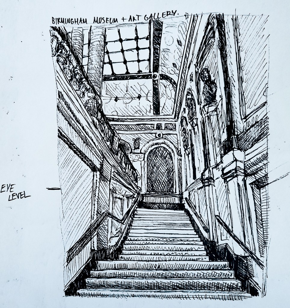
20 minute sketch of the interior entrance of the Birmingham Museum
For my interior view although asked for a rug in the exercise, I was eager to try this complicated view I came across when visiting the BMAG. I thought that with all the lines present in the view it could be good to try for this exercise. I began by doing all the basic proportional lines, the lines and angles for the stair way, the walls, columns and ceiling. I then went in adding the shapes to different areas such as all the rectangles for the individual stairs and lines for the wall and ceiling details before going in with cross hatching to apply tone to the sketch. I can see on the wall to the right hand side that the lines are not as parallel as they should be. The walls were hard with all of the different lines and panels in their design and were difficult to start off with. As this was a quick, live sketch I didn’t have a ruler on me to ensure that my lines would be straight and accurate, and that is something I should build upon. I should use tools like a ruler to make sure my drawings perspective and line work are accurate to help make a more accurate drawing. But I am happy with this as a first attempt. I like the composition of the piece, with the focal point being the stairs which guide the viewer eyes up to different areas of my drawing. Initially when drawing I guesstimated where I thought my eye line was, but after getting home and using a ruler and pencil to see where the parallel lines line up I can see that they all meet on the same line and my eye line is actually a little bit higher than I anticipated it was. But it was interesting to see how the lines all met up with a ruler and that I had gotten the jist of my proportions and perspective right. I found that by narrowing the drawing down to basic lines before going in trying to capture the detail it helped me to create a more proportionally accurate drawing which helped me to depict a much more dynamic drawing with good perspective.
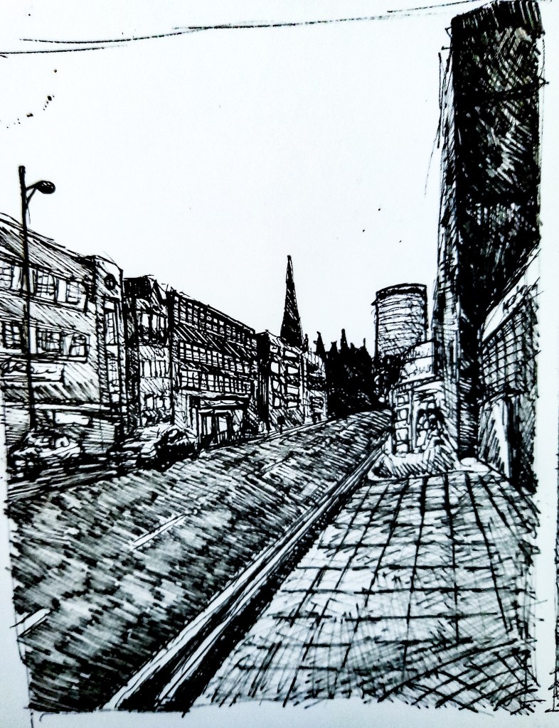
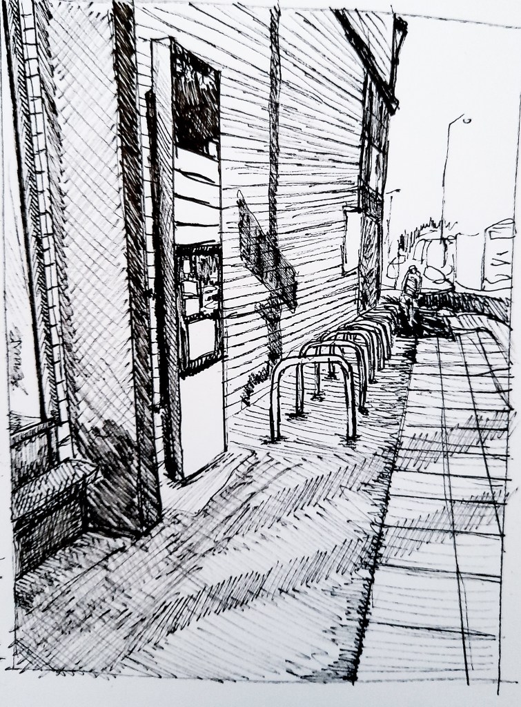
Angular Perspective- Buildings
Drawing 1
Drawing 2
Live pen sketches in A3 sketch book.
I really enjoyed looking at perspective here and wanted to practice capturing a townscape scene since it has been quite difficult for me so far, so I made two attempts. Like before I began with basic line work before trying to capture any details which helped me with creating accurate proportions, before going in with cross hatching to add more tone and detail to my drawings. I am happy with the outcomes and can see that my drawing skills with townscapes are improving. When I got home I took out a ruler to measure the lines and marked in my eye line and saw that the vanishing points met off the page for Drawing 2 but met within the drawing on Drawing 1, which was interesting to see how the different angles and how close I was changed this. A challenge in this exercise however was capturing the business of a town scene. The drawings were done in Birmingham so it was incredibly busy. In Drawing 1 I captured two cars driving towards me which was difficult since they were moving fast but I used tone to block in the basic shape of the cars. In Drawing 2 I was lucky that the road wasn’t as present in the piece but people walking by were, I manged to capture the rough shape of someone walking away from us towards the top right of the drawing. It was difficult to capture a bustling street for the first time but it was exciting to try and pick out what aspects of the changing scene to keep within my drawing and what changes to ignore. I kept this relatively simple for these drawings but I would like to try this again and really capture the fluid, changing scene of a city.
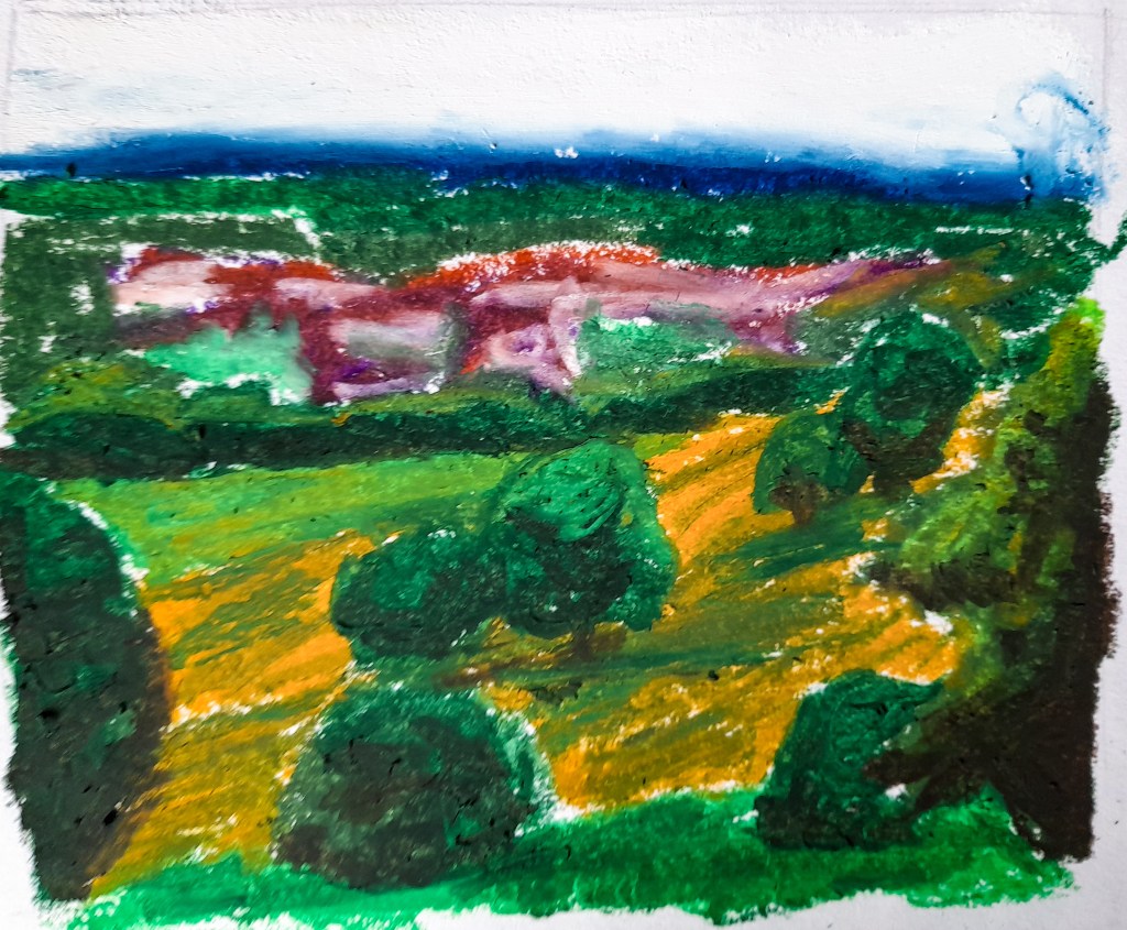
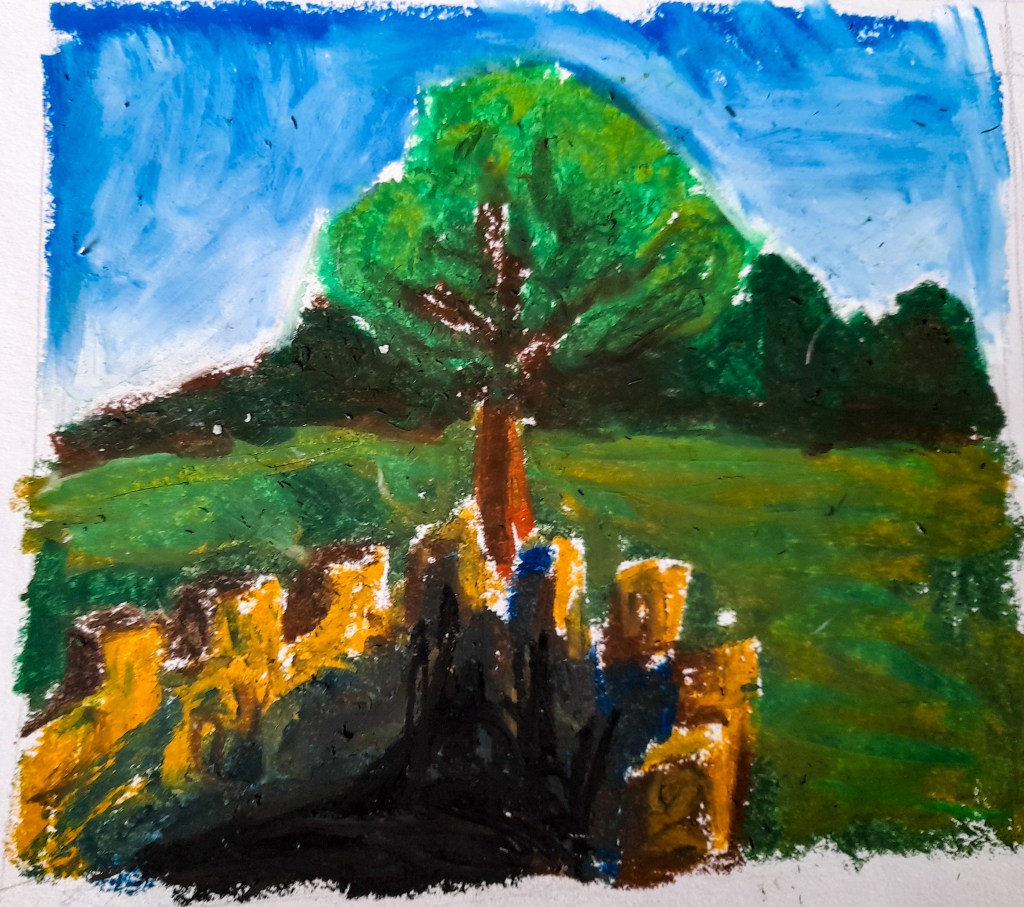
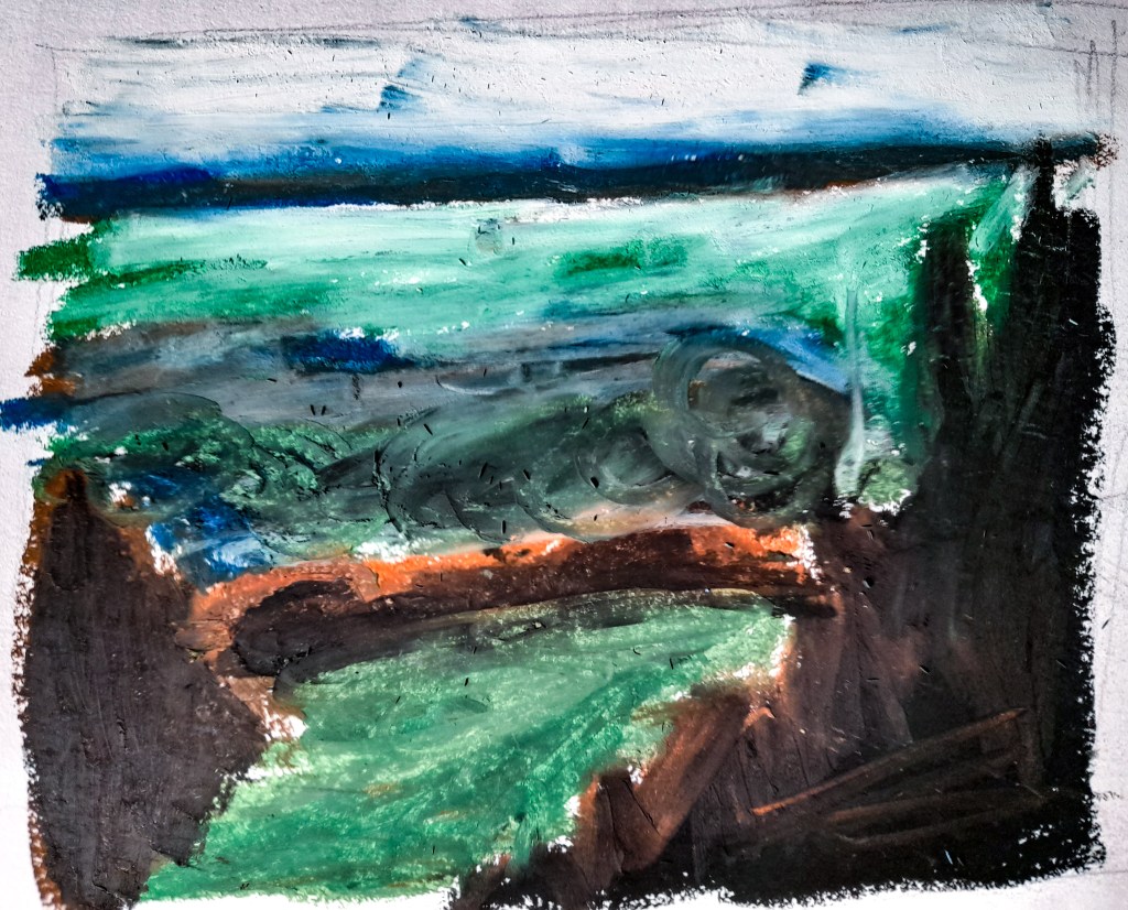
Aerial or Atmospheric Perspective
Drawing 1
Drawing 2
Drawing 3
Oil pastel live drawings of the Lickey Hills in A3 sketch book
Since for this exercise I would be tackling a vast view from above, I decided to switch up my medium and use oil pastels to try and tackle these aerial and atmospheric perspective sketches. For my location I chose the Lickey Hills as they are quite high up and from the top of the hills you can see out over the outskirts of Birmingham into the horizon. I went early in the morning in order to catch how the morning sun would cast shadows over the environment. For Drawing 1 I chose a spot that overlooked some fields into a town. I blocked in my colours inspired by the more historical Artists I looked at but also by Nicholas Herbert and how he blocks in colours. I still wanted to have some level of detail and used colour blocking with my oil pastels to show how the light and shadows made up the trees that were closer by. For the houses I used a red toned brown, purple and white and blended them together to form a shape that could depict them effectively to show what they are from a distance. I limited my use of detail as I branched further out into the distance as the exercise suggested to help show and depict a vast distance. Out of the three drawings I think this one worked best, with the colours and the composition, its more interesting than the other two views I tried to depict.
For Drawing 2, I looked at the view from above when standing in the little castle on top of one of the hills. It wasn’t as aerial a perspective as the view point from Drawing 1 but I thought it was a view I could still explore well for this exercise. Again I blocked in colour to show tone and to make up the drawing as a whole. I used blues and blacks for the shadows within the castle which I think worked quite well but I wasn’t as happy with the composition. It didn’t come out as expansive as I had hoped it would.
For Drawing 3 I really went in on the style influence from Nicholas Herbert, and went for quite an abstract approach with blocks of colour as well as blending it all out as I reached the horizon. It’s not too clear that its a landscape and comes across more abstract than I would have liked, but I am glad that I experimented more with this style. It’s helped me figure out what works with oil pastel and my colour palette as well as new ways I can approach a large composition and view like this.
Moving Forward
I found these exercises helped me in capturing a scene and looking at the bigger picture as a whole, and how to properly develop a busy scene with lots of angles. I am happy with how a lot of these live sketches came out, and although I didn’t like what I did with the third exercise, I’m glad I tried to be a bit more experimentative and look at a new style and medium and how I can approach something as difficult as perspective within this style. It was a complete change to my pen drawings but I know that a more monochromatic style is what I’d really like to focus on for Part 3. I would like to test out ink and look at stylising my work in a way that would fit into my developed style so far. I think looking more into John Virtue’s work and incorporating some elements of his work into mine may help me advance improve when looking at townscapes and landscapes.
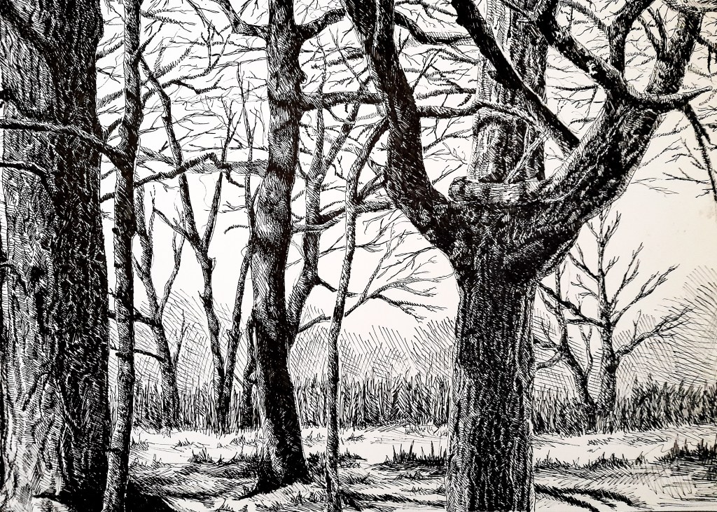
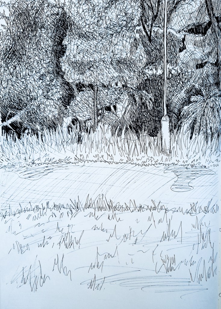
For this exercise I wanted to build upon my last exercise and really explore that scene of the woodland and trees again. I wanted to improve my perspective skills and I thought the composition worked really well to establish a foreground, middle ground and background and I wanted to work on my drawing skills and get that perspective and the dimensions of the drawing completely accurate this time. I re-visited the photographs I took as well as my drawing and got to work.
Fine liner drawing on A3 cartridge paper.
It is clear to see that my attention to tone and texture has greatly improved compared to my first attempt at this drawing. You can see the highlight of bumps and shapes that weren’t present in the first sketchbook drawing, furthermore the twists and shapes of the bark texture on the trees, including knots, are way more visible and easier to make out and identify and add more realism to my drawing. Importantly for this exercise, I feel I better established the foreground, middle ground and the background more effectively. The grass and ground closer to the viewer contain more shadow and detail, and as it moves out, further away, you can see how the light is more open in that area, compared to how lots of shadows are cast by the trees in the foreground. I think that this is an area I vastly improved upon compared to my first sketch, the shadows of the trees seem to make more sense. However I feel I did worse on the long grass in the background, it became very repetitive and like a pattern rather than long grass that is random and feels real. I think that aspect of the drawing makes it feel more flat, but it is still more dimensional and effective overall than my first attempt. One part of the background which I feel I had improved upon is the shadows of the trees which are further out. I kept to my approach of blocking in the shape as to not over-complicate the drawing since there is already a lot going on in terms of my markings, I feel I made it darker and more noticeable but not too dark that it takes away from the view. I stuck with my initial idea of not including foliage, removing it, to keep the focus on the branches and the tree’s notable the texture and the tone. I wanted a big focus on the light and how it interacts with the environment and the texture of the tree,s and I feel this helped establish the different areas of the drawing (foreground from the middle ground to the background). As talked about in the exercise description, I feel I have established a sense of space that wasn’t quite present in my previous drawing which adds so much dimension and visual interest to the piece. I feel I followed the exercise guidelines well, depicting a lot of detail towards the front of the drawing and decreasing this as the landscape goes further out, until a blocked in shape of the tree line is all that remains. I feel that I could have done better at this when it came to the long grass, as the ground begins to show less and less shadow and detail and the long grass introduces detail again with how I approached that part of the drawing. I should have kept this in mind and tried a different way of depicting the long grass so it fit in better with the landscape as a whole. Maybe I should have tried blocking that in as well as the distant treeline to make it fit and blend into the background to improve on my first attempt. However I am happy I can identify this issue now if I couldn’t during the drawing process.
As I move forward onto looking at perspective in more detail, I should take on board where I went wrong in this drawing and look to improve on this as I look at this aspect of drawing in more detail. Loosing detail as I go further into the middle ground and background is key to making an effective drawing that establishes both space and perspective. I could try and introduce colour and see how that can affect my approach to landscapes and perspective as well as trying to improve with my current medium of pen. I also want to try mixing my medium of pen and explore ink, and look at a more expressive way of depicting a landscape as John Virtue does. Although I have a lot to work on and this exercise has helped me highlight the areas I do need to work on, I am happy to see a clear improvement in my skill and my drawing technique with pen.
I think that you can learn a lot and discover new things about Art and approaches to Landscapes by comparing different approaches and how they have changed through history. I found my recent Artist Research looking at historical and contemporary approaches was useful in seeing how art styles vary and differ as time and art progressed, and it will be useful to really compare how, and what techniques are prevalent and where areas of focus have switched and changed with Artists approach to landscapes.
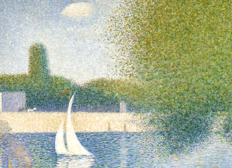
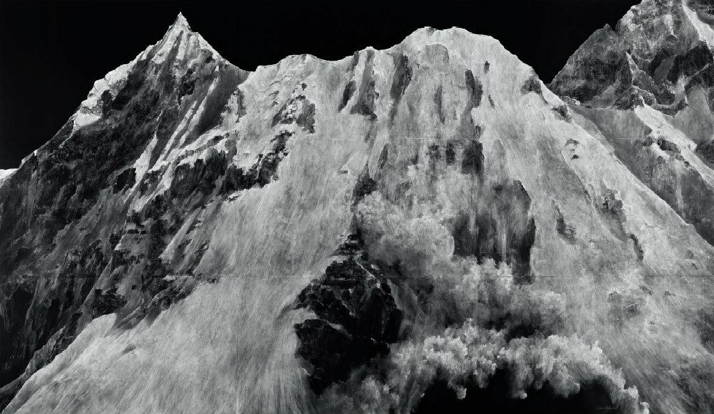
Initially it is clear that historical interpretations of landscapes, particularly from the impressionist movement, tend to involve lots of bright, pastel colours, and soft marks to make up the landscape, which holds a romanticised feel and vibe to many 19th century landscapes. I do like the approach and the gentle approach and care many of these Artists, some I’ve looked at before, have towards landscapes. Seurat’s work is a love letter to the landscapes he depicts, portraying the beauty he finds in the world around him, compared to the harsher depictions modern Artists opt for. The time consuming approach he took, being the pioneer of pointillism, shows a fondness and a joy for the landscape he depicts, compared to the harsher, monochromatic approach Dean and many contemporary Artists use. Dean’s odd choice in medium (chalk on a chalkboard) helps her to create a texture similar to the rough rocky mountains she depicts in her ‘Fatigue’ series. It is something that I would lean towards in terms of inspiration and the direction I want to head in with my drawings and work on landscapes. Her goal seems very orientated in capturing the rough, ruggedness that mountain ranges hold, she wants to capture realism and accuracy in her depictions, compared to Seurat’s landscape which seems to be about creating a feeling rather than accuracy. His approach seems dreamlike, and wanting to depict an ideal place to be; somewhere warm and scenic a pleasant stroll through a park. The opposite of showing the harsh and cold terrain of a mountain range.
The drawings seem to hold different purposes, which can reflect a more serious approach from current artists, and wanting to depict reality when it comes to landscapes. Artists from the past, specifically 19th century artists within the impressionist movement, want to create more of a feeling and and emotional reaction from their audience, usually a pleasant one. I could take this into consideration and really think about what I want an audience or viewer to gain from my work. DO I want to create a specific feeling of like happiness or stress, or go for a depiction of reality which is a common theme of contemporary Artists.
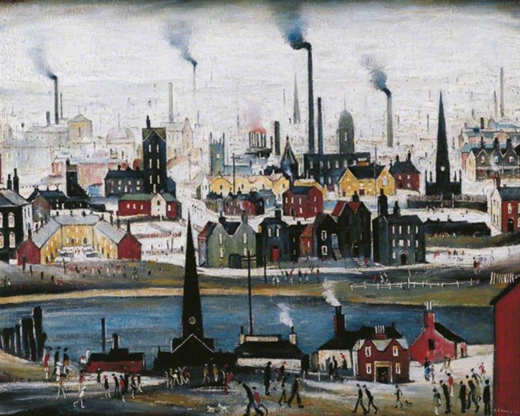
Both of these approaches to landscapes have a similar subject matter of an industrial cityscape with wildly different approaches. Lowry goes for a primitivism approach with a very naive/childlike style, which simplifies the view and uses colours to evoke a feeling from the viewer. Which is similar to Virtue’s intention with his work. Both showcase a city scene as a dirty, polluted landscape, we can see this in Virtues work as the black used looks smoggy and dirty in some areas. Virtue’s approach to a landscape is quite expressive but still captures realism in his use of tone where as Lowry focuses more on showing the whole picture with his child like style and approach. Historical 19th century Artists again opted for a stylised way of presenting landscapes compared to a much more gritty and realistic approach used by many contemporary artists.
I do not like Lowry’s style personally, but I can appreciate it and its uniqueness. I feel my style does fall into the more contemporary styles I have looked at so far, but I do love the impressionist approach to landscapes. Maybe that is something I could explore with colour and oil pastels moving forward but I feel within the drawing module and Landscapes I prefer the more contemporary approach with a focus on tone, texture and a sense of realism. Looking to the past and to the current has given me ideas I want to play around with but also encourage me to move forward in confidence with what I’d like to do with my current ideas and medium choice. Comparing Artists was useful in seeing how stylised certain historical Artists were and what key elements are looked at and focused on by Artists working today. It’s given me lots of ideas and contextual knowledge that I can utilise and think on as I progress with my work and skills.
Looking through my studies so far, one aspect of Landscapes I really enjoyed and wanted to take further was tree’s. I really love capturing the shape of the trunk and the branches, and it was something I could develop my skills of tone and texture with. Looking at my research of Vija Celmins, I did want to develop my use of texture and capture a woodland environment that had real texture and didn’t feel flat. I wanted to be more in depth with light and tone and how to effectively capture that in a landscape environment. I decided to find a wooded landscape would be easy for me to show and differentiate the foreground, middle ground and background in a drawing. But also showed an interesting view with light casting lots of shadows.
Drawing in fine liner 0.5 pen in A3 Sketchbook
I settled on this view, which had the light casting shadows which created an interesting use of tone combined with the texture of the tree bark. I also liked the composition of the trees, some being far back while others being up close , it helped provide a sense of dimension within my drawing and made it visually much more interesting. When I reached the background I didn’t want to over complicate the view and used basic cross hatching to depict the body of trees further back. I am happy with this attempt and how it shows my development of perspective within a natural landscape. I like my attempt at grass in the middle ground, but it does not completely flow within the picture, especially the shadow of the tree on the ground, that needs some work, but I am happy with how my skills have developed to show a sense of perspective. I left out the foliage as I really wanted to focus on the capturing the trees shapes and building on my skill of capturing texture and tone on complicated natural forms. I feel the winter look that came from this works well to create an immersive atmosphere that has more personality than had I tried to keep the foliage. I especially like how the branches grow and intertwine with one another at the top of the page and adds interesting detail and pattern to my drawing. My medium of pen really pushed me to focus on my mark making skills and drawing technique. Every line and mark matters and I cannot rub it out once it has been put down, so I had to think carefully about my use of tone, and areas of light and dark to make this piece come together. I layered a lot of crosshatching, focusing on small areas at a time to get the texture right on the trees. I am happy with the out come of my approach to tone, I think it helped define the texture of the trees and provide a lot more detail, I have definitely improved there.
I think that this is a scene I would like to come back to, and explore, and get all of the details finer and much more accurate. I took some photo’s to before I started drawing on the scene in case I wanted to revisit this image again for a more intricate and defined drawing that i could take my time to get right and proportionately accurate. I think this view provides a lot of dimension with the composition and layout and allowed me to take the time to build up on skills which I was inspired to do by recent Artist Research, such as Vija Celmins attention to detail and looking at my monochrome palette and seeing how to develop it further which I was inspired by Nicholas Herbert’s pieces to do so. I think a scene like this could would well with ink, especially if I continued exploring my monochrome palette. I think I did well with this exercise and found a scene with interesting shapes and features that really appealed to me and helped further and hone my drawing skills. Moving forward I would like to continue looking at pen a bit more and advance myself into looking at a messier, less controlled medium like ink and explore different affects and ways to approach tone and texture in a landscape, specifically how to effectively capture light and dark to create a visually stimulating drawing.
Inspiration can be found and worked into my work as inspiration, and you can find that both in historic works and contemporary works. I can see what techniques worked for different Artists and how they could apply to me and my approach to landscapes.
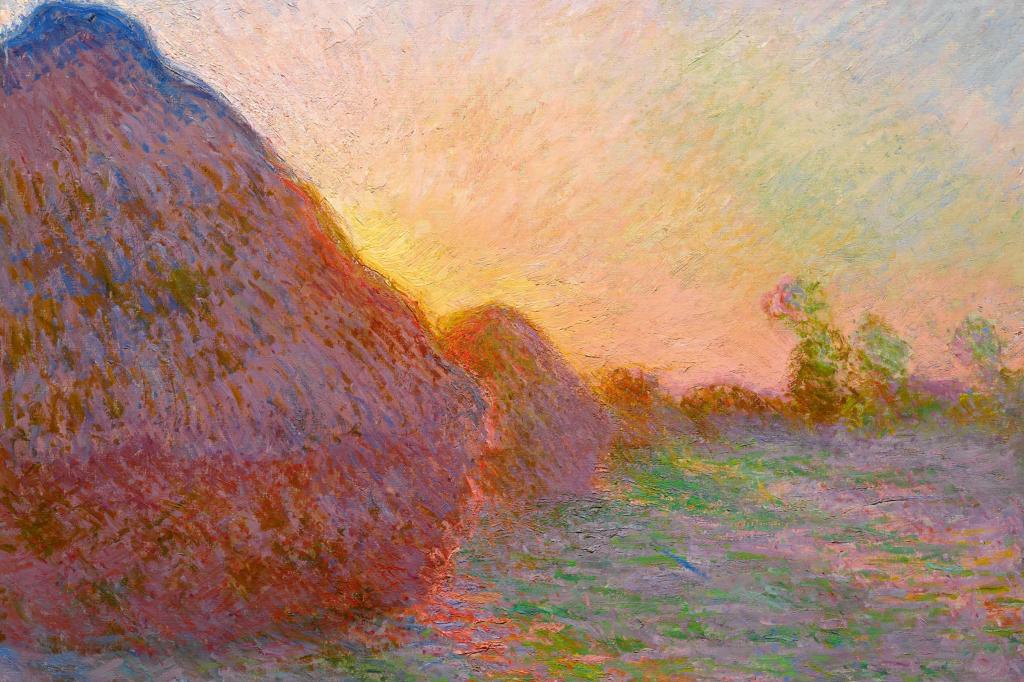
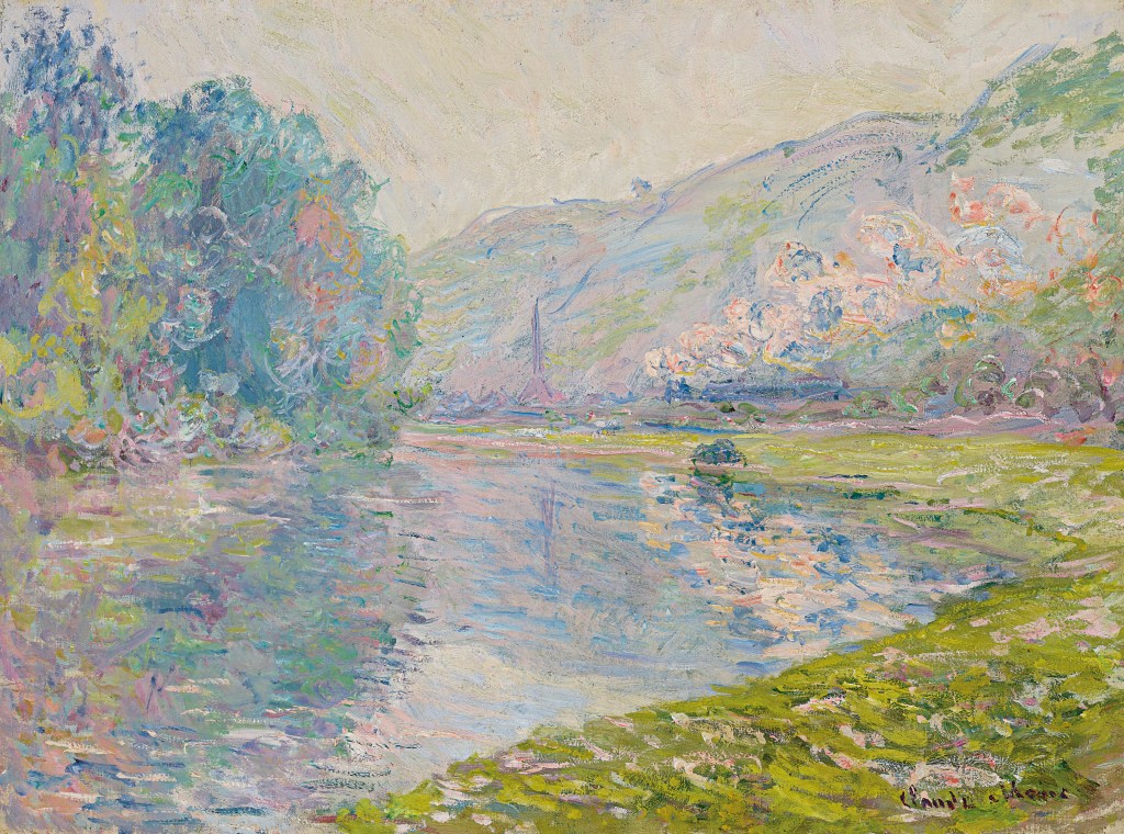
Monet’s impressionist approach to landscapes creates a dreamy atmosphere that enchants the viewer. The thick strokes create a hazy effect which can be quite soothing to look at. His approach to mark making is messy but meaningful, every stroke adds something to the piece. His colour palette works well to push a soothing feeling onto the viewer as all the colours are harmonious and work together rather than contrast. We can see this in both Painting 1 and 2, the blues, greens and purples all work together to gently depict a scene. In Painting 1 we do see a contrast between some orange and blue tones, but its not harsh or distracting, it helps emphasise the light. If I go on to introduce colour into my landscapes I could think about using a harmonious colour palette that is soft and gentle rather than a contrasting one that may be harsher on the eye. Furthermore, it is clear from his preference of painting the same landscapes at different times in the year and different times of the day, that light was his ‘true subject’. Maybe I could take this approach to looking at light in a scene rather than the scene itself to really bring my landscapes to life and provide a more interesting atmosphere within my work. I really enjoy looking at woodland areas filled with trees, I could apply a new focus onto the lighting rather than the scene and see how my landscapes form that way, especially with how the light interacts with the bold textures on the trees.
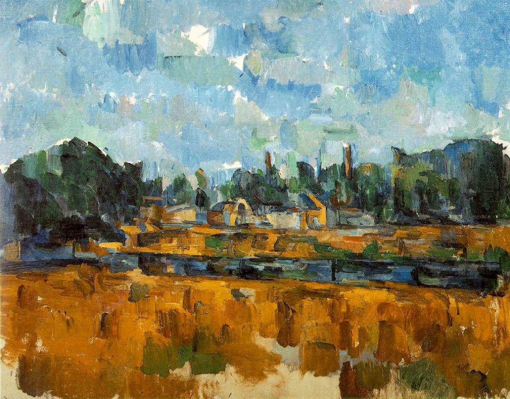
Cezanne has, again, an impressionist approach to his landscape here, using colour to interpret the landscape rather than line, leaving us with a messy yet atmospherical approach to this summer scene. It’s bold and something I could attempt to replicate with oil pastels. I do love the impressionist style when it comes to landscape as it adds to the feeling of being their and the fluid movement of the wind and water rushing through the scene. His colour palette also works well to sell the scene to an audience, with his use of blues and cool greens which boldly contrast the bright, warm yellows he uses to depict the the fields surrounding the river and small town. I could try this within my own work, really focus on colour and tone rather than line to depict my landscapes, as it clearly creates an interesting and visually stimulating scene. I love the colour block sky and how it creates this sense of a patchwork blanket of colour within the piece. I think I should try and branch out and explore colour a bit more within landscapes and how to effectively use it to depict my work.
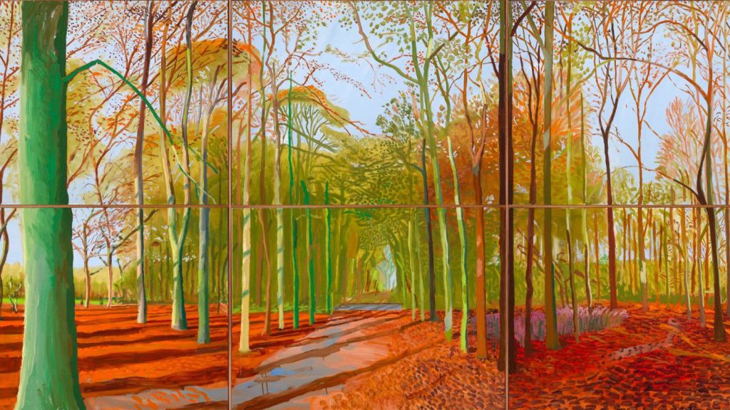
Hockney, best known for his paintings of pools has branched out to exploring the British landscape. In this change of subject matter his medium has also changed to a digital approach, beginning with drawing on his i phone and advancing to an i pad. He says that he can work much faster with a digital medium in order to capture his scenes. This can be extremely useful considering how fast weather, lighting and nature can change. His newer pieces focus on spring but I am drawn to this piece from 2006 which he brought to life again in a digital medium. I love the colours and use of line, especially the line work used to show the shadows cast by the trees at either sunrise or sunset. The use of orange tones helps inform us about the time of year, early autumn, which we can see from the oranges used to show the leaves on the ground but also from the light green, showing that a lot of foliage and signs of summer are still lingering. The use of line and blocked colour help define the foreground and middle ground from the background which can be difficult. I could again, replicate this style by using oil pastels and focusing on blocking in areas of colour as well as line to create a dynamic and bright landscape. The style does remind me of something you could find in a children’s story book but it still remains a visually stimulating piece for all ages.
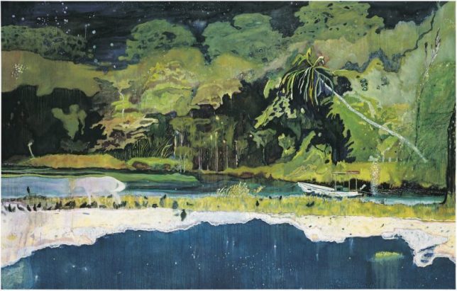
Peter Doig’s work does not focus on realism but rather the expression of nature, often feeling surreal with starry skies over looking forests. Similar to Cezanne, he blocks in the the landscape with colour rather than a focus of detail and line and the outcome is very immersive. He often creates very dark paintings in contrast to what I have looked at so far, and its very unique. In this particular piece it feels a bit like a collage due to his approach to perspective, with different areas, like the sea, not quite fitting into the perspective of the rest of the piece. This is further accentuated by his depiction of animals and people, who feel very two dimensional and flat compared to the rest of the painting. I could again look at the use of a colour palette here and how it helps add to an immersive and surreal landscape, something from a dream, and how my colour palette can affect the style of my pieces and what they convey.
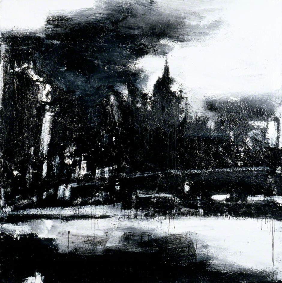
I really like the contrast with this piece compared to the other landscapes I have discussed so far. The focal point here isn’t the townscape but rather light and how it interacts with the scene. Initially it looks rather abstract, but the closer you look the more things seem to make sense and the view of London begins to form and reveal itself to the viewer. A mix of media is used here to create something starkly different to the usual landscape and the lack of colour adds to the industrial vibe one gets from London, rather than the soft colours and marks used to depict a natural landscape. This seems quite a harsh application of paint and ink which fits the harsher, industrial landscape of a modern city. This piece takes me back to Part 1, with mark making and how significant an effect it can have on drawing or painting. As I transition from landscapes to townscapes in part 3 I could really begin to think about how my mark making can affect my drawing, and take it into a completely new direction, perhaps to an even more expressive way of depicting my view.
Nicholas Herbert
Herbert, N. (2017). Landscape L1019, Field Sloping Down to a Line of Trees, The Chiltern Hills. [Mixed media on paper] Available at: http://www.nicholasherbert-drawings.co.uk/ [Accessed 23 Sep. 2020].
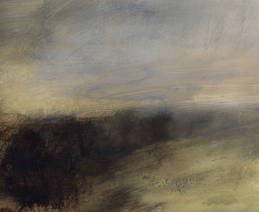
Again, this contemporary approach has a unique take on landscapes, compressing the composition to something very simple and easy to take in. I love how free and loose the marks are and it shows how fluid landscapes can be when you’re there in the present, with the wind and weather constantly moving the scene around. The Artist does really well to capture this in his pieces looking at the Chiltern Hills. Even though it is very abstract you can still make out the slope of a field leading to trees and the gloomy sky from above, his colour choice works well to effectively present a landscape with such an abstract approach. It’s not a piece or approach I necessarily want to replicate or use within my work as I advance as an Artist in Part 3, but I can still learn from his approach the importance of colour selection and mark making and how that can influence the viewer. His work is quite loose and abstract but still informs the viewer of what they need to know, that they are looking at a landscape.
Moving Forward
Moving forward I want to explore colour and how that can affect how I present a landscape but also I intend to stick with my monochromatic approach and explore what I can do with that. I really love John Virtues work, how it remains simple yet complicated and sparks conversation with its composition and unique style. That is something I would love to look into, maybe going back to using inks and exploring how I can use that medium to best represent my work and my composition. My focus on a monochrome palette means I have to apply extra care and detail to my tone and composition as that will be where the focus lies. I should expand my mark making skills and explore how I can best use my marks to create a visually stimulating landscape/townscape.
This exercise should help me to see how drastically my view/drawing can change from just shifting my view, and will help me really think about my composition and point of view when approaching a landscape drawing.
North
15 minute sketch facing North
I started with the North point of view, facing down a path and past a pub into some wooded areas. I feel my perspective has improved with this sketch, but I still lack skill in depicting a building with a realistic perspective. The building takes away form the drawing, making it feel very flat in comparison to other areas, which has made me feel disapointed and unhappy with this piece. But now I know that is an area I really need to focus on. From my last exercise I really struggle with presenting buildings with an accurate perspective, but hopefully with time and practice this issue can be fixed. I like my approach to the grass, it is minimal and effective, it adds to the environment and isn’t too distracting, and works well within the 15 minute time limit on the sketch. I built up the confidence to add a blocked in shadow of trees to add to the layers of the background which works extremely well with my choice of medium. I can see my skills really developing with using a pen for such a broad scenes, both tonally and with perspective as well.
South
15 minute sketch facing South
I turned the opposite direction and began sketching the other side of the path. This path was more complicated as it twisted and turned around all of the trees and shrubbery, but I could see improvement with how I capture perspective with paths. The minimal approach to grass works really well here and allows me to emphasise the shadows in the background and middle ground even more. I’m also really happy with the light tone I used to show the puddles on the path, I feel it really adds to the atmosphere of the drawing. My use of tone also improved, I like how the shadows under the big oak tree work really well to add dimension into the landscape and split up the two fields. I think I could have done more with the sky, but it was a very white, cloudy sky, but I should have tried to maybe add some light shadows to add some subtle texture there.
West
15 minute sketch facing West
The curve of the page in the photograph distorts the perspective of the path here, but I still could have made it straighter regardless. I could have done better with my use of line, for example you can see the line I use to mark out the path and the grass I draw over it doesn’t hide it, and it doesn’t look the best. I like my used of tone in the trees to really depict where foliage of different trees end and begin. I like how the lamp post stands out, but I feel it would look better had I used a ruler to make the lines straighter and much more accurate. I think my attention to tone on the path works well, especially contrasting the dark foliage behind it, but I feel the grass in the fore ground could have been approached better, it looks very repetitive and there is not much attention to detail to make it really work. I clearly spent most of the 15 minutes working on the foliage. It doesn’t help that this isn’t as broad a view as the other two sketches, its very close to the the background. This highlights to me that a viewpoint being too close or too far away can make or break a drawing, my composition is finding that balance within my viewpoint of being too close and too far, to find a view that works perfectly.
East
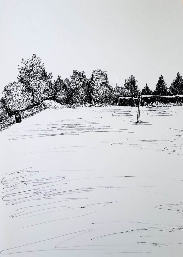
15 minute sketch facing East
With my previous sketch being too close to work well for the 15 minute time limit, this viewpoint is too bare. I tried a different approach to the grass this time, using thin scribbly lines to show the tone of the field, rather than trying to depict all the blades of grass. I like the outline of the trees and my use of tone there, I feel as the trees got closer along the left hand side, I still should have kept it relatively dark. I think my depiction of a bin on the left ruins the sense of perspective, as it doesn’t really work and it isn’t drawn the best in relation to everything else. The field goals add a point of interest, but would work better within the composition if they were more centre and clear, for the viewer to focus on on. The two goal posts blend into each other because of my point of view, so if my perspective were to move they could position better on the field.
Moving forward
This exercise really helped me to focus on the importance of my point of view and how my angle and perspective of a landscape can change the narrative and the scene drastically. Moving forward I need to pay attention to my space, and find that balance within the composition where the scene works best and and has a clear focal point and view that works well for what I want to present to my viewer. I need to know what I want, if I want to depict a lot of texture, I should get a closer view, like in the West sketch. If I want to depict an interesting and broad landscape I should go for a viewpoint like in the South sketch, which can separate easily into different sections ( fore ground, middle ground and background) in order to add layers and perspective in order to create a dynamic and interesting point of view . I need to work more on my use of perspective when it come to man made landmarks and structures, such as buildings and paths. This should come with practice as I move through the other exercises.