Energy

For this exercise I put on some music and had my model dance around the room. It was very similar to musical statues, I would wait for the movements to become natural and not so forced (As this was a very awkward task for him to do), when I found him creating interesting moves I would stop the music, letting him know to hold the pose for 2 minutes, before starting the music again. This helped to create a natural sense of movement that wasn’t forced, which is what I wanted for my composition of the body in this exercise.

Sketch 1
Charcoal on A3 paper

With this first pose, the body is somewhat skewered from the movement and rapid drawing. Tone isn’t very present as the drawing is all about the use of line and how it can depict movement. With the lack of tone I feel the proportions look a bit odd, although they are accurate, the hand and arm look a bit too big for the body, even though that was how they were as the arm was extended. I should have put more thought into not only how my use of line can show movement, but the movement of shadows and tone as his body changes positions. My lines captured the basic shape of his body but also the gesture of him, leaning and moving forward. I didn’t do too well at capturing the beginning of his legs. There is much to improve upon in how I capture movement in this exercise.

Sketch 2
Charcoal on A3 paper

This drawing came out even worse than the last. With the models knees bending, his back arching and his arms waving around, it was difficult to create a strong sense of a line of balance or a central axis. This is my least favourite of the three drawings that I did. With such little time to draw the pose and such a complicated stance with a lot going on it was hard to accurately capture. There’s some weight to the pose but the detail, tone and sense of realism isn’t there. The arms don’t quite fit and make the sketch look awkward and wrong.

Sketch 3
Charcoal on A3 paper

I think that this is definitely the best drawing I have done out of the set, and I am happiest with this one. The posture and sense of weight is present throughout the body. I think I capture the arms really well and their sense of movement. My use of lines also captures the shape of his back really well. The legs look a little off, and I could have worked on them a bit more to really get a sense of the movement throughout the entirety of his body. You can see his posture twist through his chest and hips, his movement is almost like he is swinging a punch. I love my use of line with the charcoal here, it works well, loose like flowing water. I kept to quick, rapidly drawn lines to help create a sense of movement, short and quick to mimic his dance moves at the time and I think it works quite well.

This exercise has shown me that my use of line can help depict atmosphere and sense of energy and dynamic movement within a drawing. A body is living, breathing and moves a lot. I should show this in my drawings. The bets way to do this is my use of line. Will my choice on medium allow me to do this effectively ( I think oil pastels could potentially work quite well for this), and how should I approach my technique to drawing line. What approach to line will best represent the position, posture and stillness/movement of my model. These are things I need to keep in mind for drawings moving forward.

Essential elements and Stance

Exercise 2- Essential elements

For this exercise I was to draw 6 different poses, each in 10 minutes, very similar to an earlier exercise. I set up a light to the side to create shadows and tone from the curves and shape of my models body, which worked quite well. I had him take up a variety of poses on the bed to get a better look at his body and proportions as so far my focus has remained around the waist up.

For my first 3 drawings, I looked from a side view, level with my model. You can see that my light source comes in from the right corner of the room, casting dark shadows over the shape of his chest. It was hard in the last two to create an accurate side profile with such a short amount of time to capture everything else in the scene, especially his body. I think my use of tone adds a sense of weight. I think there is also a sense of 3-Dimensional form but there is still a bit of flatness to my sketches here, and I think that may be due to the lack of tone within the surroundings. I think I did well at capturing the models central axis, and how his body works with that. The proportions are accurate and work well to present an accurate depiction of my models body.
I think to improve on these I should look at developing more of the surrounding environment of the model to help show their weight and presence in the drawings environment.

With these three sketches, I looked at changing my perspective to something more aerial, looking from above. With this point of view I get a new look at how the light cascades over his body. I think in these three sketches, I was able to depict a sense of weight to the body much more effectively, possibly due to the viewpoint of looking down on the model. I think my fourth drawing here shows the best sense of a pose. It has weight to it, you can see the heaviness of his arms and posture as he holds them up. Again I feel all of my sketches show an accurate portrayal of his proportions, and with my sixth sketch, I found I had a bit more time to explore the surrounding environment of the model, and sued tone to shoe his weight more effectively resting upon the bed. With my fourth sketch there was an obvious gesture away from the central axis with the models arms and shoulders leaning away from his body. I feel I identified this within my sketch with how I used line to present the arms, and tone to show the shadows highlighting this movement in his body.

This exercise was useful to further my experience of depicting the body and its posture. Tonally, I feel I am improving on how I depict the body in different poses, and I feel my drawings are getting more and more accurate as I go through the exercises. MY proportions are doing great, but again I feel I should experiment with my use of tone and what medium will best present the model and the body with my style of drawing. I feel my depictions of the body are greatly improving, showing weight and posture with my use of tone effectively.

Stance

Moving away from looking at more relaxed positions of the body, with this exercise I look into stance and how to accurately depict the body standing, even how the body twists as the model leans against a wall. For this exercise I switched up my choice of medium to a fine liner pen, sticking to a familiar monochromatic theme but trying something more permanent than a pencil and bolder in some ways.

For my first two poses, my model went for more ‘posey’ stances than natural ones. With my first sketch, I looked for the line of balance. You can see where about the line is placed within the body, from the skull through the spine. His feet were good to draw, as they were separated and therefore spread out the weight of his stance. You can see this clearly in my quick sketch I feel. In the second sketch, you can see that with his chosen stance all the weight is shifted onto his right foot (the straight leg). The line of balance can be seen to shift through to the hip of the leg holding his weight. I am happy with how I portrayed this.
With my depiction of tone, I used line to help create a sense of light and dark around his body. I feel the loose lines work well to convey tone on his body but not so much on his face. The face, I find, is quite delicate and difficult to portray when not the main focus of the sketch. Especially working on a short time frame, the bold pen lines confuse and add too much detail to an already very detailed part of the body. With the body, I think used enough line to create a good depiction, without overdoing it.

For these final two poses, a more relaxed stance was chosen by the model. I gave him a book to hold and relax him up from the previous ‘posed’ stances he took on before. With his shoulders much more relaxed we see the line of balance and shift of weight has landed on his left shoulder and right foot. His left shoulder due to him leaning on a wall, and his right foot due to him relaxing his left leg. The central axis is fairly straight, with the line of balance keeping to his spine and shifting slightly to his right hip and down his right leg. Throughout this exercise I have kept my proportions accurate. Again with these two sketches, my tone is good on the body but a bit confusing on the face. I feel the final sketch best depicted his face and likeness.

These exercise were really helpful for me to take the time to focus on more than what I see but also what lays behind the scene and inside the body. Finding a line of balance and a central axis is key for me not only to depict accurate proportions but to create a sense of reality to a drawing. Without a sense of gravity and weight to a body, it feels off and abnormal. Showing this weight within a posture interacting with the scene around the model can aid a drawing in feeling real, that the person is real and has an effect in the environment of the drawing. Pen was for capturing the body, but not so much the face, at least from a distance. So I do not think that this is an ideal medium for me to work with when looking at the human form. I feel oil pastels will work great for portraying a more dynamic scene with movement, which may work well for project 5. Working large for the next exercise, which does look at movement, sticking to charcoal may work better for now. I am happy with my progress and can’t wait to see how I improve as I develop my skills of capturing the human figure.

Basic Shapes

To create a portrait you must recognise the shapes that make up the body. A sphere for the head, cylinders and squares. I wanted to look into the shapes of the body, and combine it with more practice of foreshortening.

HB and 6B pencil on A3 paper

With this first drawing I stuck to a medium I am most comfortable with and used cross hatching to develop some tone. I began by building up the body in basic shapes. The torso, where I started, was a square that due to the position of the model became a twisted quadrilateral. A cylinder neck and obviously a sphere for the head. The arms and legs, again to me, were rectangles of sorts which I had to curve out as the drawing progressed. The foreshortening I used within the composition creates a shape itself, almost a triangle that draws the viewers gaze to the head of the model. The legs spread out in opposite directions which draws the gaze in. This gaze then follows up the torso, twisting around to reach the neck and head. Drawing the chair helps me to identify the proportions and see if everything fits in correctly. I’m really happy with this piece, I think the proportions are accurate and the tone is effective. I would like to try, further down the line, watercolour pencils using water to blend out the cross hatching.

Thick lead on A4 paper

For this piece, I went down a similar route for my choice of medium, using a thick stick of lead. This allows me to work with a charcoal like medium without as much mess. In this position by my model a triangle is formed with the whole body again but due to the angle he is sitting at it is more of a right angled triangle. The torso is more square in this drawing as it isn’t twisting to the side.
A sense of measurement is made through the surrounding objects, the book shelf and the mirror behind, which create more of a sense of space than the previous drawing. The bookshelf adds to the models gaze, which has a sense wondering about it. There is a thought process and a clouded mind within his face. This could be as he is looking into the distance rather than at the viewer.

Oil Pastel on A4 paper

For this drawing I got a bit more experimental with my drawing medium. I used bright colours with oil pastel for a more stylised drawing than one focused on realism. It allowed me to be a lot looser and focus more on my use of lines than tone. The background furniture, again, created a sense of space and proportion for the body to relate to, it helped me get his sizing and proportions right in relation to the chair and area around him. A triangle shape is again formed in this piece, that draws the viewers gaze to the head. However the shape takes place within the models arms rather than his legs. A triangular shape is formed separately in his legs due to him crossing his foot onto his knee, but it remains separate from the head. The torso shape can be seen to be more definitively as a square in this drawing. The shapes that make up the body are more easily seen do to the focus on line over tone. I think since this piece is larger than my previous oil attempt, it works a lot better, so an even larger scale could work more effectively.

I should experiment with colour as I move forward as it adds a lot of life and vibrancy to a drawing. Identifying shapes in the body really helps me to place the proportions and create an accurate depiction of the body and this exercise really helped me to focus on that and I got great, improved results. I should practice a variety of positions in a variety of media to really improve myself further.

Foreshortening

What I really want to do with capturing the body is to depict a body that feels real but also is compositionally interesting. Looking into foreshortening I was able to rethink what makes an interesting composition and explore angles that add interest and style to the approach of drawing the body.

25 minute sketch,
Pencil on A4 paper.

For my first look at trying a foreshortened composition I looked at myself in the mirror laying on my bed. I did it naked in order to really look at the shapes of the female body, since I haven’t been able to get a female model. The angle makes the drawing quite dramatic as the proportions have been changed to a skewered perspective. It adds a line of focus, drawing the viewers gaze in from the enlarged foot, to the chest.
The composition serves a purpose of creating a line from the foot to the face directing the viewer.

John William Waterhouse

Saint Eulalia exhibited 1885 John William Waterhouse 1849-1917 Presented by Sir Henry Tate 1894 http://www.tate.org.uk/art/work/N01542
Waterhouse, J.W. (1885). Saint Eulalia. [Oil on canvas] Available at: https://www.tate.org.uk/art/art-terms/f/foreshortening [Accessed 2 Dec. 2020].

In this piece by John William Waterhouse, the foreshortening angle begins at her head rather than the feet, the line of her body is unique, twisting to the side. As quoted on the Tate site foreshortening can ‘ produce an illusion of projection or extension in space[1] which the artist does do. The viewers gaze is drawn to the the woman, lying on the floor, the gaze follows the line of her body and is shown where to look next, her feet pointing to the rest of the unfolding story in the scene. Her body composition serves a purpose of directing the viewer where to look next, something I should really consider with the poses I depict. Can I show more with my model, and how can I use their body best to create a narrative, or guide the viewer. The painting is beautifully executed and the colour palette is simple and brown but works well to tell a grim narrative.

Otto Dix

Dix, O. (1927). Liegende auf Leopardenfell (Reclining woman on a leopard skin). [Oil on panel] Available at: https://museum.cornell.edu/collections/modern-contemporary/20th-century-painting/reclining-woman-leopard-skin [Accessed 2 Dec. 2020].

This piece is not as exaggerated as the one previous with the angle, but still shows an example of foreshortening. The model leans forward, her elbow and knee at the center of the image, upfront, as the rest of her limbs stretch away. An extension of the space she takes up. Its a unique angle and the painting is rather intimidating with the models somewhat harsh, direct contact. The body does somewhat direct the viewer, though it is not as clear as the previous painting as all the limbs extend into different directions, but the arm propping up the models head does draw a line of focus to her face. The bold red lipstick also helps to draw the viewers gaze. This composition feels a lot more intimate as the model is up close to the viewer, she is unescapable as she is in the center taking up the vast majority of the painting. Her cold stare combined with the dog in the background does create an air of hostility, the viewer may feel their presence is unwelcome by the woman, but the piece is also brimming with sexuality and desire.

Moving Forward

This exercise/ research has got me to really think about my composition, will it serve a narrative, will it direct the viewers gaze. Capturing the human form is more than depicting a body, it is using the body, to tell a story of direct the line of the viewers gaze. Foreshortening will be a useful tool to have in emphasising certain formal aspects of a drawing, areas of body parts I want to highlight or creating a line to follow. Furthermore, if I want to create a strong narrative within a piece of work, the body can help direct and assist this. The foreshortening can create an emphasis on the body, highlighting a theme, perhaps of sexuality and intimacy. There is a lot to think about with my compositions and foreshortening can assist with my visual language as an artist.

References

Saint Eulalia- John William Waterhouse- Waterhouse, J.W. (1885). Saint Eulalia. [Oil on canvas] Available at: https://www.tate.org.uk/art/art-terms/f/foreshortening [Accessed 2 Dec. 2020].
[1]- Tate (n.d.). Foreshortening – Art Term. [online] Tate. Available at: https://www.tate.org.uk/art/art-terms/f/foreshortening.
Reclining Woman on a Leopard Skin- Otto Dix- Dix, O. (1927). Liegende auf Leopardenfell (Reclining woman on a leopard skin). [Oil on panel] Available at: https://museum.cornell.edu/collections/modern-contemporary/20th-century-painting/reclining-woman-leopard-skin [Accessed 2 Dec. 2020].

A longer study

After exploring a more relaxed pose with a series of quick studies I was ready to branch out and look at producing a longer study. I talked previously of combining wet and dry mediums and I decided I wanted to try this in this exercise. I started with a quick pencil sketch, and took the time to get the shapes and proportions right. I decided on a sitting position for my composition that allowed my model to show off more of their body (legs) which I didn’t get to explore as much with the previous reclining position I looked at.

Sketch with watercolour
A3 paper

I used watercolour to add a layer of colour that could help emphasise and support the coloured pencils I planned to draw over it with. This way, I hoped the white paper from underneath wouldn’t show up as much and help to create a more vibrant layer of colour on top of the drawing. I used peachy skin tones, as well as blue and crimson to show off the cooler colours that were present with my model that day. The overcast sky outside made for a more cooler toned room which reflected into the models skin. Using a little green mixed into some of my colours helped create a much more natural skin colour in some areas, while in others I wanted the bold blues and pinks to be dramatic with my use of colour.

Layered coloured pencil over the original watercolour sketch

I think the pencil on top added a lot more clarity and defined detail and I really like how it came out. I think my favourite part of the drawing is his hand and how I captured the range of shadows cast by his knuckles and front lighting. I think I definitely improved at capturing a face but I feel I need to work on it a bit more to get a real, 3D face that really fits into the environment.
I think I did well capturing the body and the pose, it was something a little different to my previous quick sketches, and I think it’s interesting and works well, I just wish I picked a pose with more of the chest showing, as I love the curves and shapes of the torso with drawing. I feel the body does look to hold weight in the drawing, the orange pillows help emphasise his presence within the image. You can see them curve and crease as he leans on them, showing his presence, his body has an effect on his surroundings which I do like. However with all the cool tones, I feel the orange pillows may be out of place in terms of colour, although that is true to the composition and view I had, the colours just don’t seem right. Maybe I should have exaggerated the surrounding colours of the white bed sheets or picked different coloured pillows. I should experiment with lighting, by using a lamp I could bring out warmer colours which would match better than the cooler colours brought out by the natural lighting.
I feel for the most part my proportions are accurate, one area that does stand out to me though is the models left arm. It looks a bit off, but I feel that’s down more to my use of colour than the proportions being incorrect. With how I approached the shaded fore arm I think I affected its place in the body and how it fits into the rest of the arms and body. I should have been more careful and watched how I depict and area of the body that is more shaded and contains more shadow than the rest of the body, as it can alienate it from the body rather than work realistically within the drawing.

In terms of my choice of medium, I did like exploring the layering of dry over wet mediums but feel this idea needs refining with my skill. It can be improved upon. I would like to explore an alternative but similar medium with some of my future drawings, using watercolour pencils to sketch, and blending the sketch with water for a more refined and well blended finished drawing. I could also try looking at perhaps oil pastel for a larger scale piece or experimenting more with ink, layering it to produce an effecting drawing of the human form. Again larger scale would be ideal for this.
This exercise has given me a lot of ideas about to create a composition with my models, I should look at capturing the broader aspect of the body, as I did keep a focus on the waist up for the past few exercises.
I could also look at taking a different route to realism and maybe look at more stylised ways of capturing the body, like the work of Egon Schiele or Picasso’s cubist approaches.

Quick Studies

Quick studies allow me to really understand the shapes that make up the form of the body. It’s useful to understand the basics and proportions that make up the body and building up my drawing skills. For the first part of this exercise I was worried about drawing within a two minute time frame. I’m a bit of a perfectionist and this is initially felt like no time at all, until I started drawing.

2 minute charcoal sketches

Charcoal on paper
2 minute sketch

I had my model relax on a bed, partially covered by some loose fabric. I thought it would make for a relaxed pose that would make for a great composition. For this first piece I struggled with the 2 minute time frame, but I got used to this as I continued throughout the exercise. I began from the chest and branched outwards. Using line, I formed his chest and arms, leaving the head for last. I also branched out to drawing some of the surroundings to fill the space, and make him feel like he is in a space of his own. This first attempt gave me a good idea of how fast to draw and where to maintain my focus in the drawing. It was good fun and really helped highlight what sort of shapes I need to draw to depict his body.

For my second and third drawings, I think I got too close to really explore the body shape and how the neck and head really fit in. His head looks a little too big, but I can assure you my model does have a rather larger head (Not shaming him, he has a nice head). think I improved on my final two drawings, the body shape feels cohesive and the proportions look accurate. I really enjoyed working with the shapes of the arms and torso, how they fit together and and bend and move. The arms play a part in the torso shape, whether he is stretching out his chest by reaching out his arm or relaxing his hands onto his belly, I love drawing out the curves that make up those shapes and is something I’d love to explore in more detail. I found I enjoyed working with the limited time frame and seeing what I can create in a limited amount of time.

10 minute sketches

I found I enjoyed the 10 minute sketches more than the 2 minute ones. It was too long a time frame where I over worked a drawing. I was still loosely sketching at a fast pace, but I had more time to accurately depict the body proportions, and also his facial proportions as well. 2 minutes clearly was not enough time to make it clear who my model is. I decided to do 5 sketches to really explore different poses before going for the larger sketches in different mediums. I wanted to really get to grips with capturing my model in charcoal first before moving on. I went for a thinner charcoal stick this time to really be able to show the finer side of it.

Drawing 1
10 minute sketch, charcoal on paper

My first drawing is definitely an improvement from the 2 minute sketches, but a lot of work still needed to be done to really improve. The face, although is better than my attempts within a 2 minute time frame, still needs work. Since I was working with an almost side profile, it wasn’t the easiest to accurately capture in a 10 minute time frame. I am however really happy with how his body came out. I think I got the proportions accurate with his arm and chest, but I am unsure about how well I did with capturing his legs peeping out of the blanket at the bottom. I had more time to create a sense of place with the background, capturing a lot of the bed, though I feel I may have slightly squished it in. I really like what I managed to do with my use of tone, I think it really brings the composition together.

I really love how these came out, and I think you can see my skills adapting to the time limit, capturing more and maintaining a focus on the body before looking to the face and surroundings. I love the fluid style of drawing I have used in order to depict what I need to in a short amount of time. The rushed shading adds character and a personal touch to the drawings which I rather like.

I think I really got to grips with this exercise and drawing within a limited timeframe. I also love how these 10 minute sketches came out. I think my final sketch I missed out some shading in the arm pit which is a shame, and since I drew live there’s no reference image to go back to to fix it. It is something to keep in mind moving forward, I should take a step back once in a while to take a look at how the bigger picture is forming, something which I didn’t think to do with racing against the clock. At this point I felt ready and I wanted to try switching it up and see how I would manage tackling these poses in different media. First, I wanted to try toned lead and see if I could make a more interesting drawing, while sticking to a similar drawing medium.

10 minute sketch
Tonal lead (browns and blacks), on A3 paper

I really like how the different colours work together in this piece. I think it makes for a more immersive drawing. The browns work well with the grey lead I used for the model, I think it really helps to highlight and draw in the viewers focus on my model. By using browns, the planes and shapes of the body are accentuated. I noticed through my drawings my model has lines that make up his chest which help me to identify the shape much better while drawing (a cross shape [t} ) . This cross shape also helps to identify which way his torso is positioned, whether he is stretching or relaxed.
I had become rather stuck on using dry, pencil mediums so I wanted to also have a go drawing with something more fluid. I think a fluid medium would work great for depicting dynamic movement. I decided on using walnut ink as it is great for layering and building up a sense of tone as well as being a strong medium for line.

Walnut ink on A3 sketchbook paper.

I think with this drawing I was able to create a great sense of environment that felt connected with the body, however I do think my bed railing could improve, but the pillow looks great leaning on the model. I think the layering of the brown ink works well showcasing the tone and curves of the models torso and I’m really happy with how it came out. I used a thick amount of ink for outlining the shapes of his arms and body to really identify the shapes I was working with and I am happy with how that looks too. The face isn’t the best, the detail could use a little work, but hopefully without a 10 minute time frame this shouldn’t be such an issue. With the loose, fluid properties of ink it’s hard to control for finer details when rushed or against the clock.

I enjoyed these exercises and feel I have gained a better understanding of the shapes and planes of the body, and how to capture them, but also the importance of the surrounding environment. It adds depth to the drawings and a sense of reality. You can relate to an action taking place in an environment, I feel its harder to relate to a body or person depicting in a white blank space, as in life we are always surrounded by an environment, a blank space adds distance from real life and real experiences. With my intent to romanticise the body rather than objectify, I want to create an intimate closeness with my model and this can be emphasised and created with a relatable environment.
Furthermore, in terms of my media, I wanted to try and combine fluid mediums with dry. I thought that blocking in colours with watercolour, and going over top with coloured pencils could help eliminate the white spaces that often appear under pencil shading and help create a more vivid drawing with my use of colour. This will allow me to really experiment with my use of colour as I feel I stick to a ‘safer’ monochromatic palette a lot. It might be time for me to break that.

The nude- What it means to be naked.

I really love being able to draw the body and capture the unique qualities that the human form can provide in comparison to still life and landscapes. The human form is so personal to us all, we can relate to depictions of the body and I feel we feel much more emotion for this subject matter compared to still life and landscapes. Drawings of the human form depict experiences, desires and something personal that can draw out a lot of emotion and relation from the viewer. The space between the viewer and these drawings/paintings is filled with emotion and understanding. There is a certain beauty to the human form that landscapes or still life can’t achieve.
This doesn’t just lie in the human aspect of these depictions, but also the historical context behind the human form. I love that there is always so much more to these drawings because of the context. What it means to be captured as a naked woman and a naked man adds so much depth that I love to unpack when observing such pieces. As a woman there is so much I can identify with my modern experiences as a female in historical paintings of women. How they are objectified and vilified for their femininity. The shaming of a woman from a masculine point of view. And these experiences cannot be applied to that of naked men, who are admirable in their paintings in contrast to the shaming and objectification of naked a woman.

Ways of seeing- John Berger

John Berger explores these ideas of the depiction of men and women in art and how different they are in his book ‘Way’s of seeing’.

‘the social presence of a woman is different in kind to that of a man’

A mans presence in paintings is usually linked to power, what power he has, the power he has over people. Men are to act in contrast to women who are to be seen. They are a sight. To be surveyed as Berger says in his writings. The viewpoint of women in the majority of classical paintings is masculine, it is how they are to be and are perceived by men. In turn how women view themselves and their value is defined by an internal masculine view. I feel this is still present, a lot of women hold an internal misogynistic view of what women should be by how they appear to men. As said by John Berger:
‘men act and women appear’.
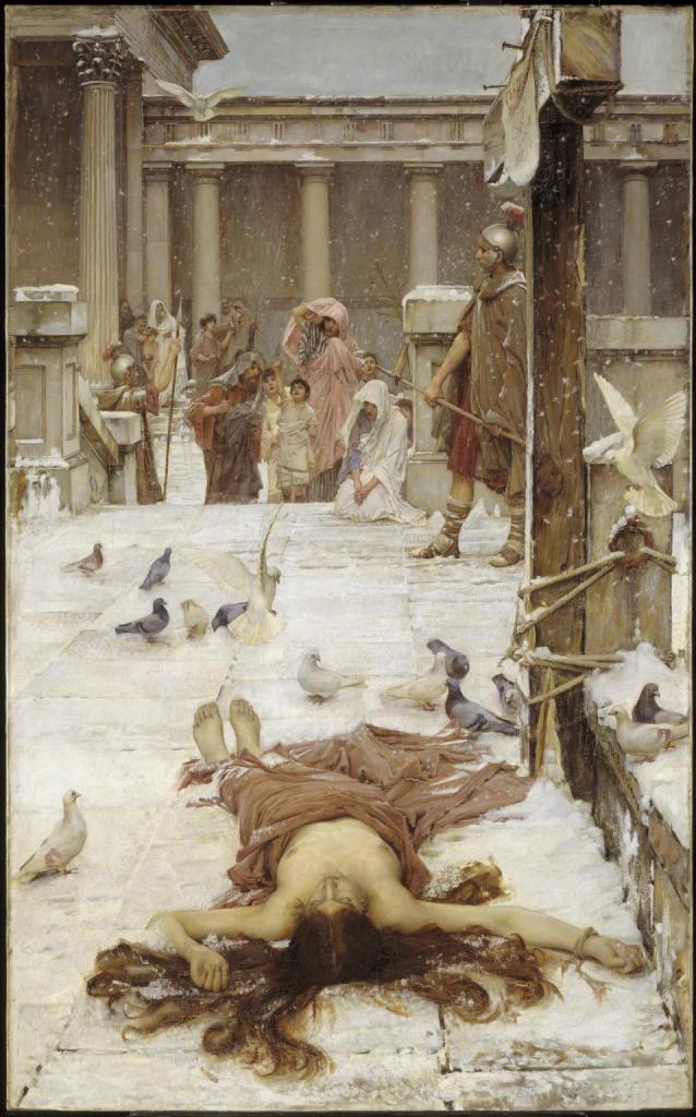
Through many European nude paintings we can see ‘women have been seen and judged as sights’. We can see this with women making eye contact in paintings, acknowledging we can see her nakedness.

Tintoretto (n.d.). Susanna and the Elders. [Oil on canvas] Available at: https://en.wikipedia.org/wiki/Susanna_and_the_Elders_(Tintoretto) [Accessed 18 Nov. 2020].

She acknowledges her nakedness by acknowledging the viewer. It takes away her innocence in a sense, making her accountable and to blame as she is aware.

Tintoretto (n.d.). Susanna and the Elders. [Oil on canvas] Available at: https://en.wikipedia.org/wiki/Susanna_and_the_Elders_(Tintoretto) [Accessed 18 Nov. 2020].

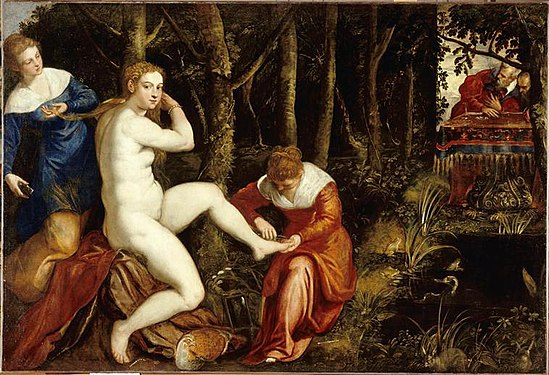
In this second version by Tintoretto we can see Susanna’s use of a mirror, ‘thus she joins the spectators of herself’ ‘The mirror was often used as a symbol of the vanity of woman. The moralizing, however, was mostly hypocritical.’
‘you painted a naked woman because you enjoyed looking at her, you put a mirror on her hand and called it vanity , thus morally condemning the woman whose nakedness you had depicted for your own pleasure’.
Women are to be judged, objectified and used by men for pleasure and enjoyment. If a woman is to do the same to herself she is also shamed. It was an extremely sexist time, but some of that still lingers in present society.

The Nude: A new perspective- Gill Saunders

In this book, I was able to look at examples of nudes throughout time. We can see the progression from classical nudes to more modern approaches from the 20th century. The context does change, but I feel the objectification of women will always remain.

Kiff, Ken; Man Greeting Woman; Arts Council Collection; http://www.artuk.org/artworks/man-greeting-woman-63705
Kiff, K. (1965). Man greeting woman. [Oil, tempera and gesso on board] Available at: https://www.artuk.org/discover/artworks/man-greeting-woman-63705 [Accessed 18 Nov. 2020].

In this piece we can see that the man is depicted as guilty and to blame for his advances on the woman. He is red, an aggressive and sexual colour. The woman lays innocent and misinterpreted. ‘She offers a lipsticked mouth, conventional signifier of desire/ availability, but her expression is anxious and apprehensive’ .As Gill Saunders points out, it shows a turning point in depicting the relationship between depicted naked men and woman, showing the man as the aggressor and harasser, ‘we are alerted to the undercurrents of sexual dominance and harassment lurking in all social interaction between men and women.’ The woman is no longer the sole blame of her nakedness and the male gaze. The man is responsible for his misinterpretation, not the woman for her solely being naked.

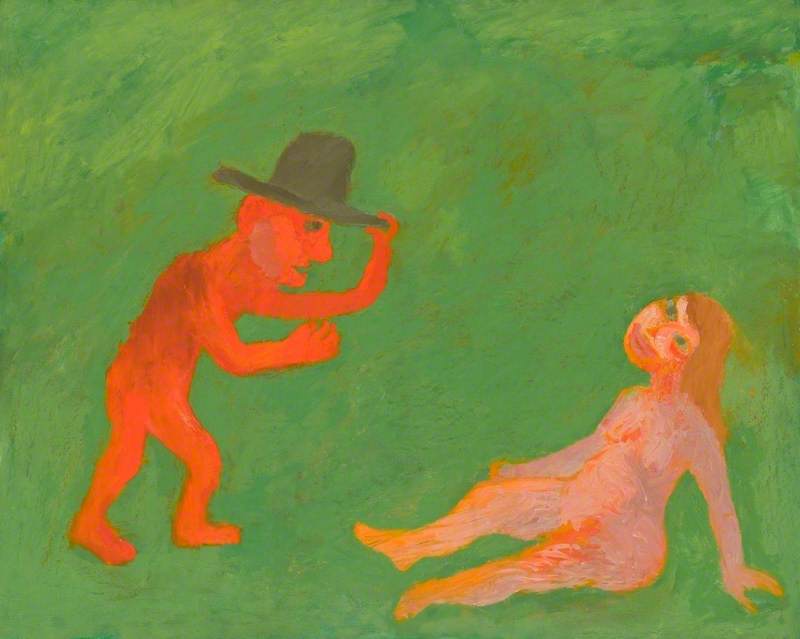
As time has progressed so has the interpretation of the nude, but the subject became much more controversial. We can see in Kiff’s piece that the child like nature of the drawing adds a disturbing quality to the piece, as the content is so adult. Like you’ve walked in on an inappropriate situation.

Hilton, R. (1963). Dancing Woman December. [Oil and charcoal on canvas] Available at: https://www.tate.org.uk/whats-on/tate-st-ives/exhibition/seeing-new-roger-hilton/roger-hilton-exhibition-guide/roger-1 [Accessed 19 Nov. 2020].

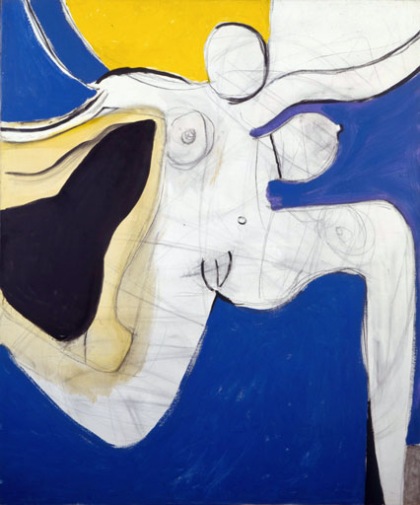
In this next piece by Roger Hilton, we see the body of the woman celebrated in a lively and exciting way. As Saunders describes in their book, the painting ‘celebrates her sexuality without being either a threat to the male or an overt invitation.’ , The woman is not so condemned as such in certain artworks from the 20th century, but the fetishization and objectification is still very present. By adding anonymity and taking away the females identity, the artists reduce women to an object, again as explored by John Berger, the female is reduced to a sight. Gill Saunders explores this idea also, saying ‘anonymity runs through the tradition of the female nude’, ‘Again and again the male artist reduces the female model to an object, to ‘it”.
Although some work has made progress on condemning women for their bodies, the women portrayed are still subject to being a sight for male pleasure.

Recent approaches to the female nude

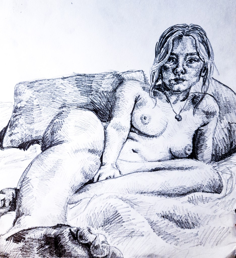
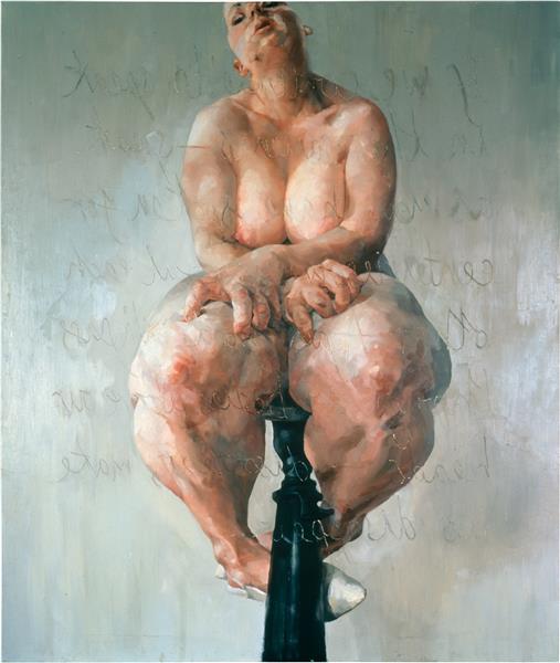
I find that in recent approaches to the nude, they have remained honest, brutal and not so sexual, but the reality of the body. We can see this more in female artists such as Jenny Saville, whose depictions of the female nude feel real and not glamourized. There is a lot of heavy emotion present in her viewers who can see the bodies presented as bodies and not objectified or necessarily desirable.

Saville, J. (1992). Propped. [Oil on canvas] Available at: https://www.wikiart.org/en/jenny-saville/propped-1992 [Accessed 19 Nov. 2020].

We can see this shift, especially from a female perspective, the the female body is not always desirable, attractive or fitted to the male gaze. Sometimes a body is just a body. The skillmanship in her painting is beautiful but the body is not. She has created an uncomfortable and what could be considered a grotesque view of the female body. It is something real and weighted in emotion. The space between the viewer and the painting would be thick with thought and judgement of the female body. Yet there is this relation and understanding between female viewers of this piece. With the context that this is a self portrait and her form is skewered to look larger (due to the artists inspiration of obese women in America) I can relate as a woman who struggles with my perception of my body, how I feel it is never good enough or slim enough. This is a real experience for many women, and it is a fresh take on the female form with the insight and gaze of a woman, rather than the fetishization of the male gaze.

Moving forward

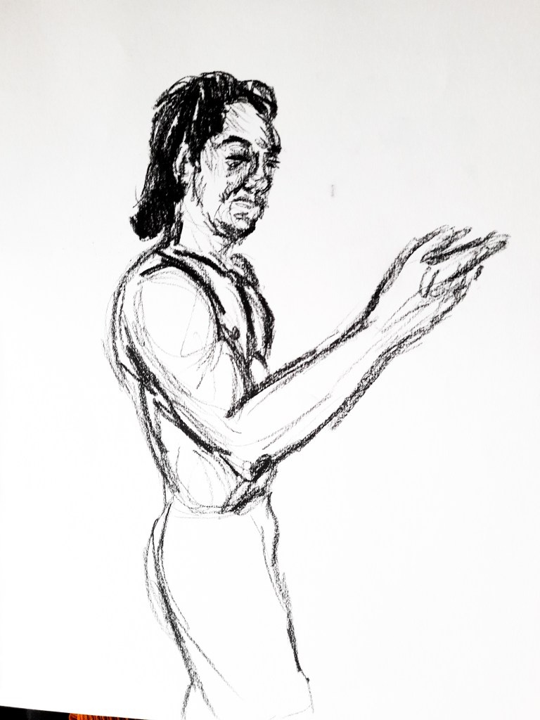
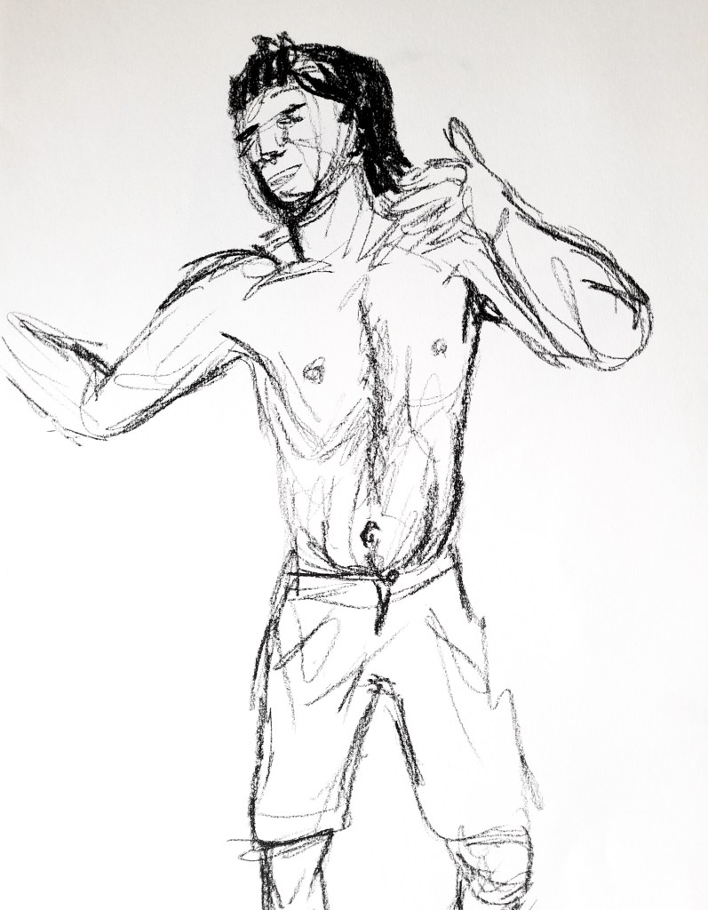
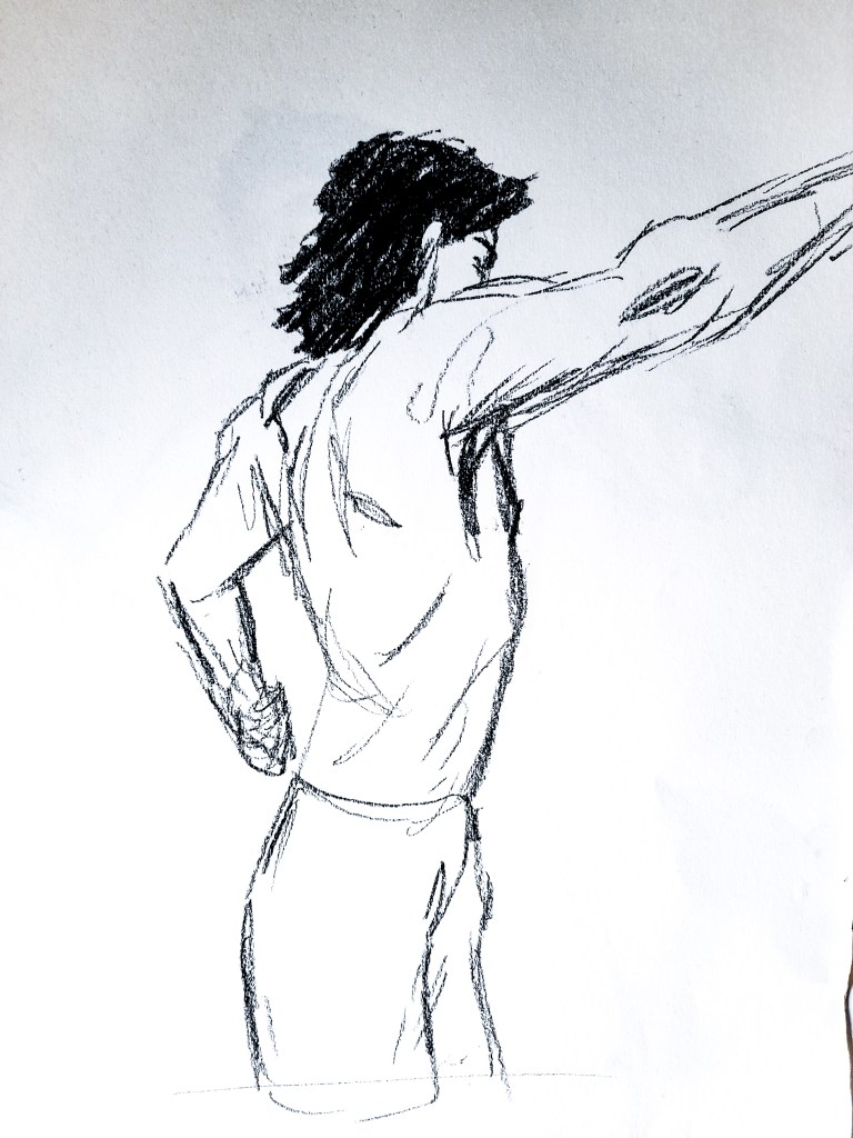
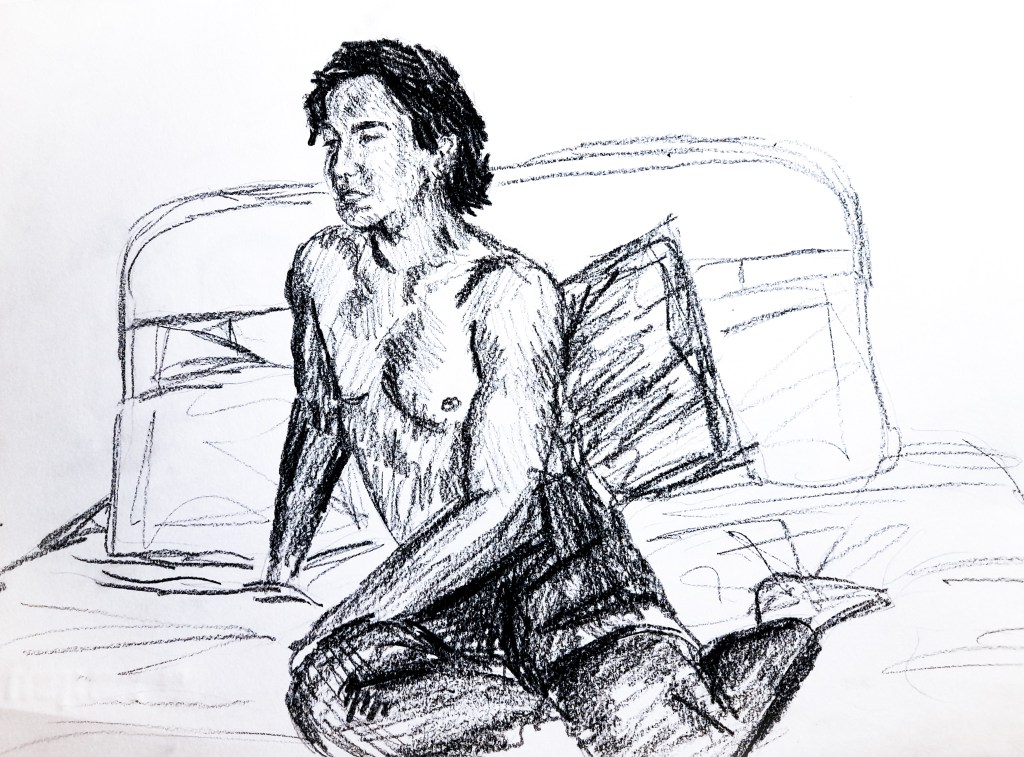
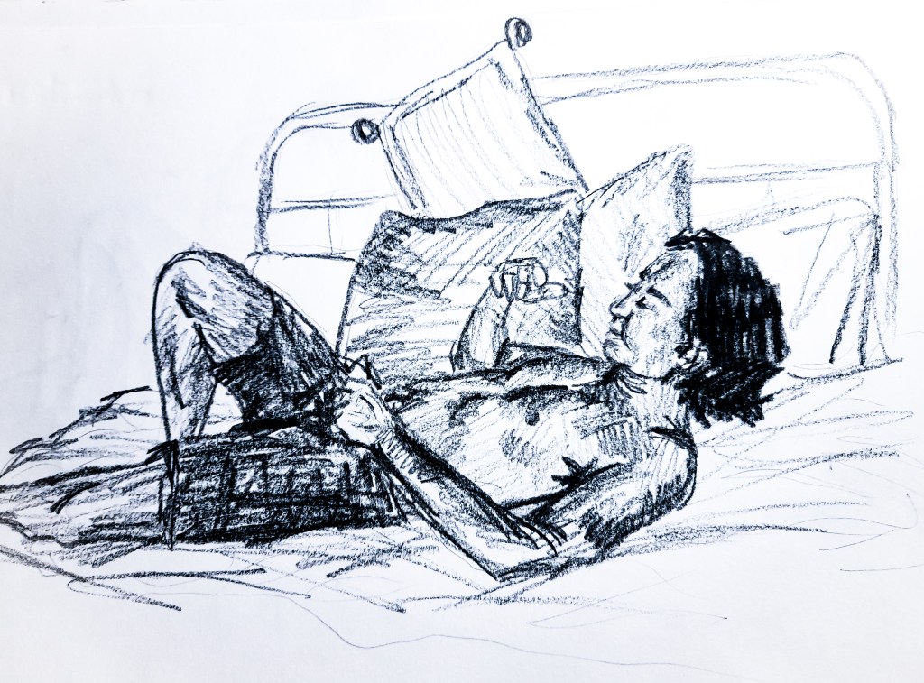
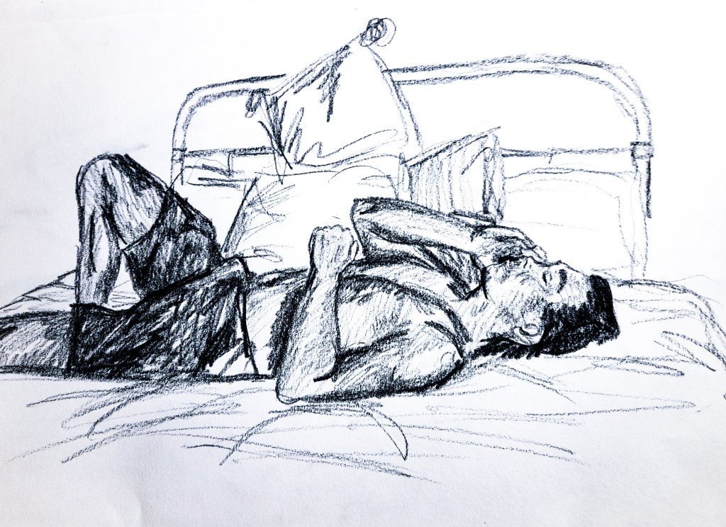
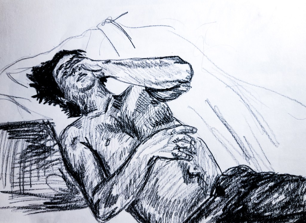
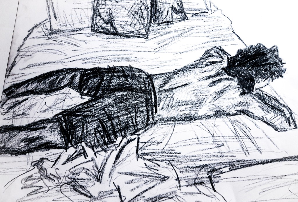
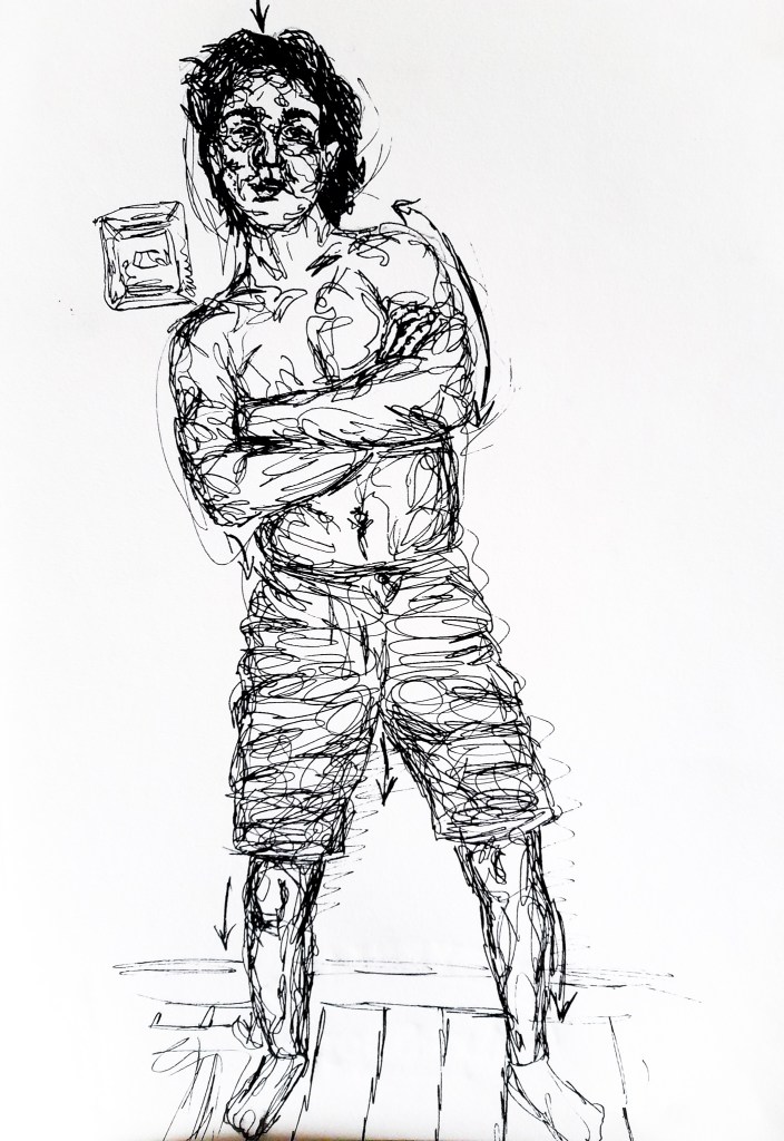
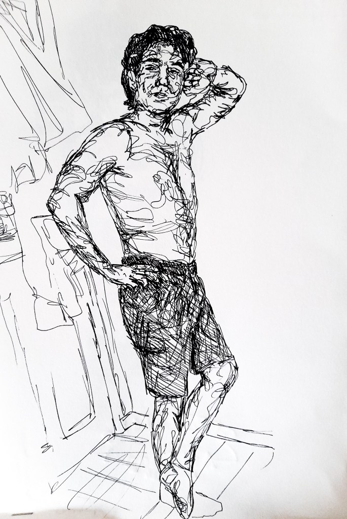
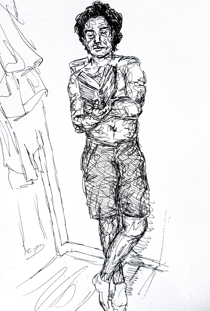
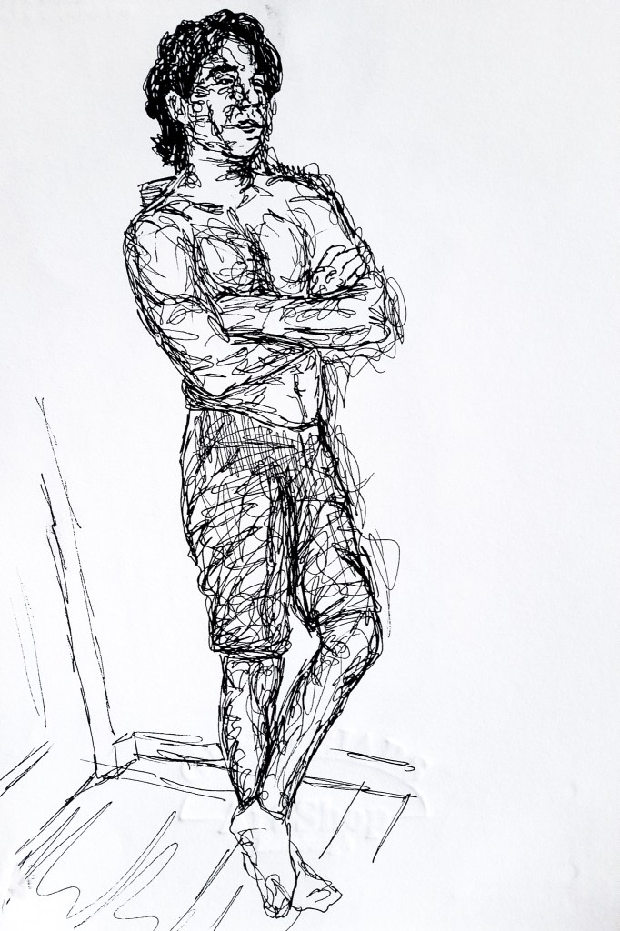
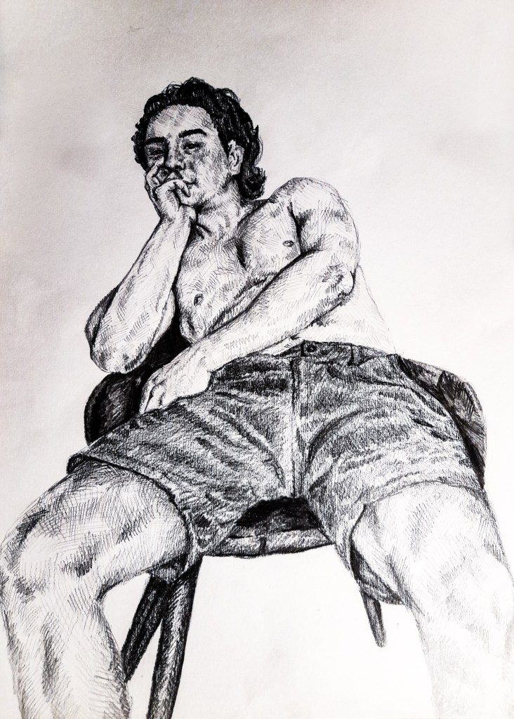
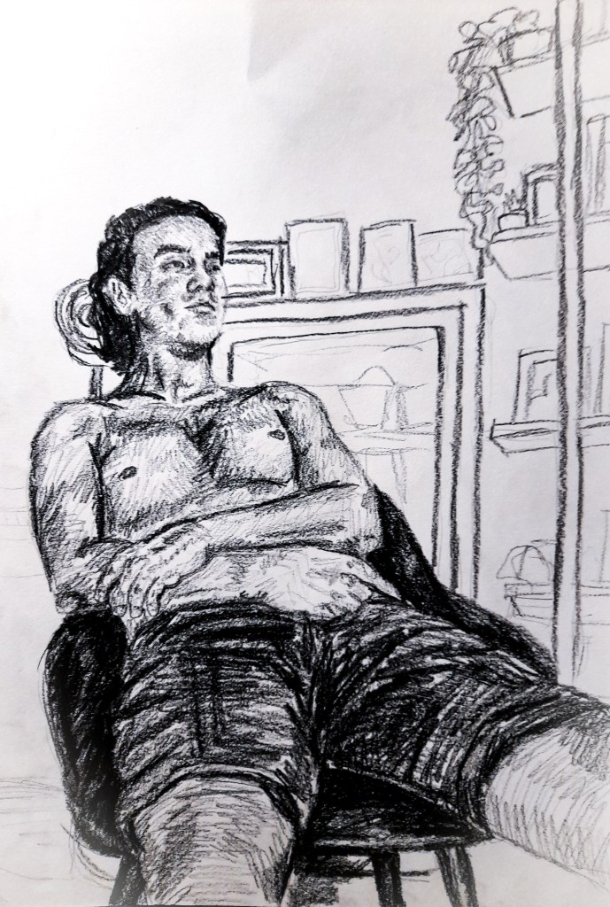
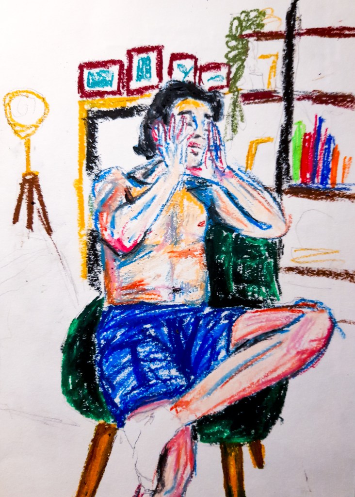
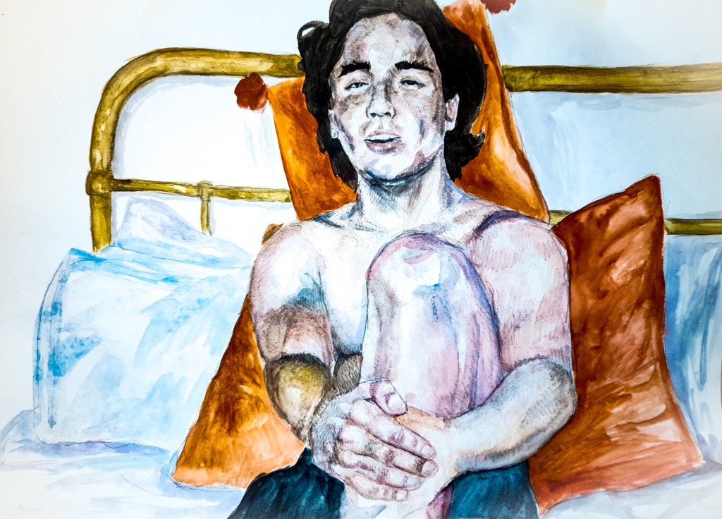
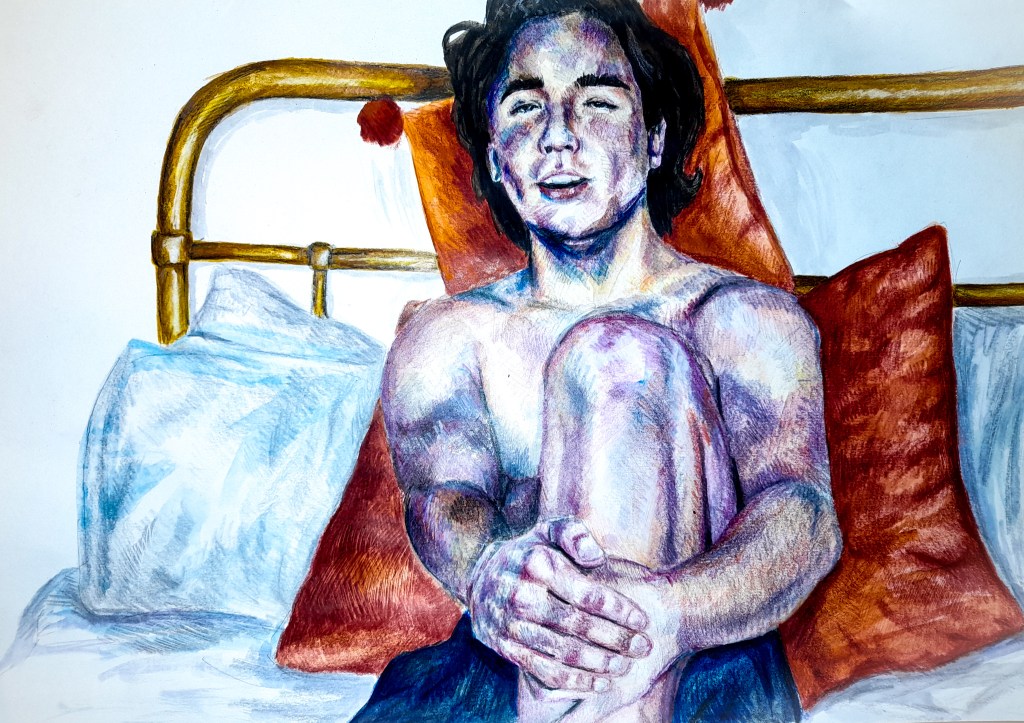
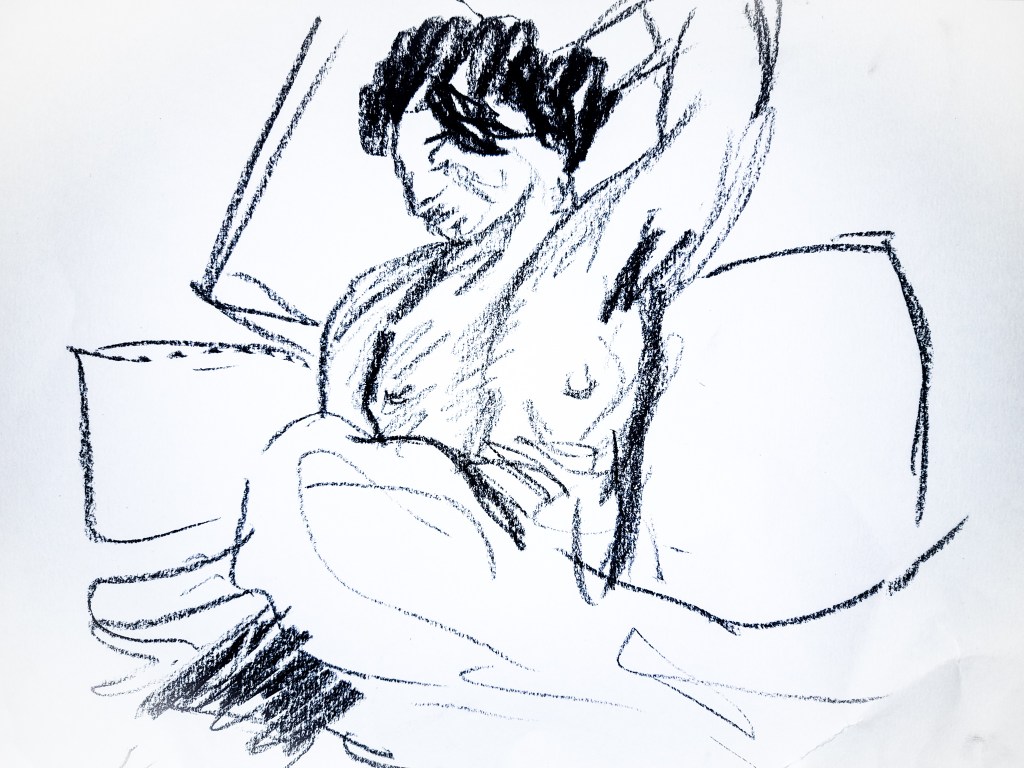
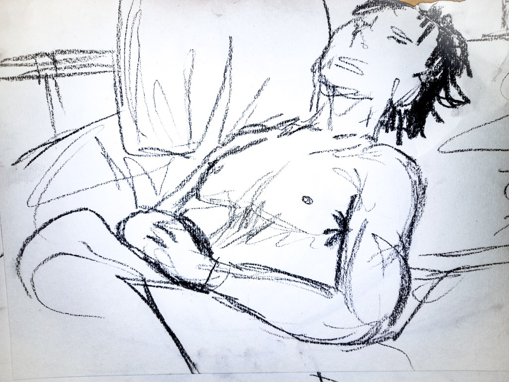
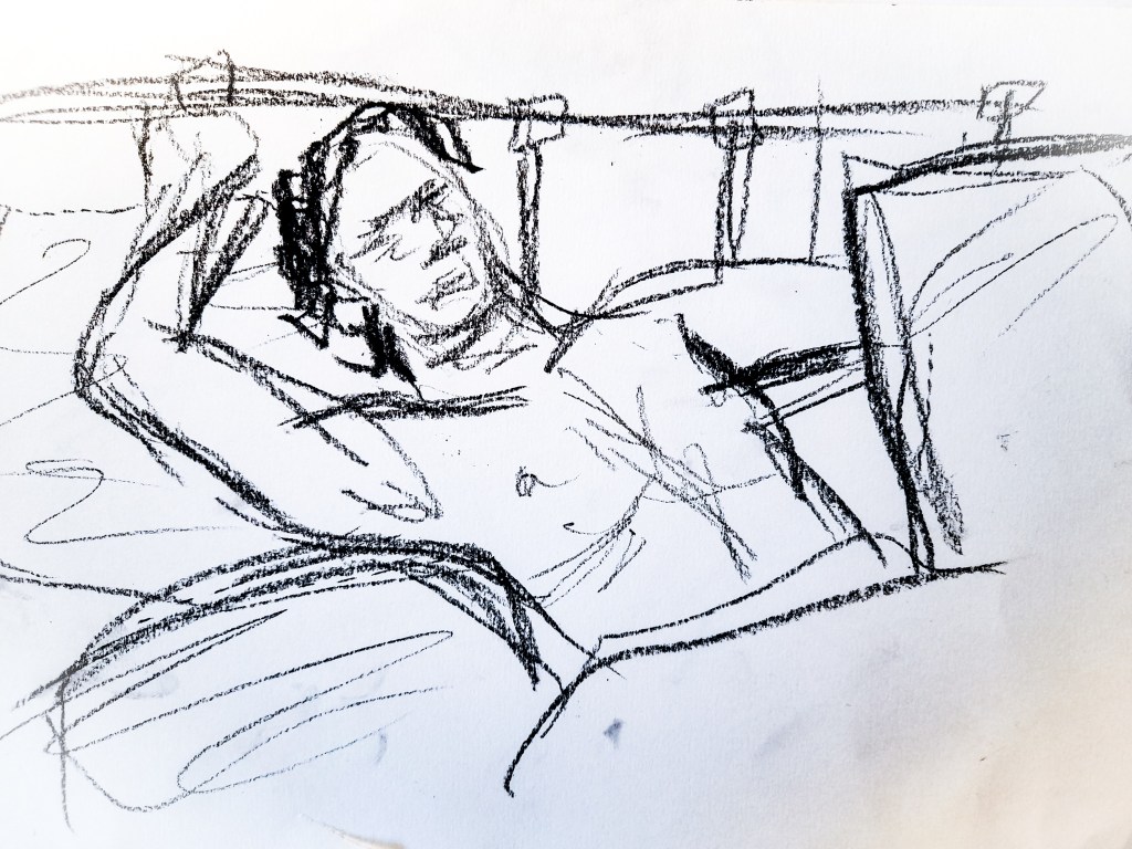
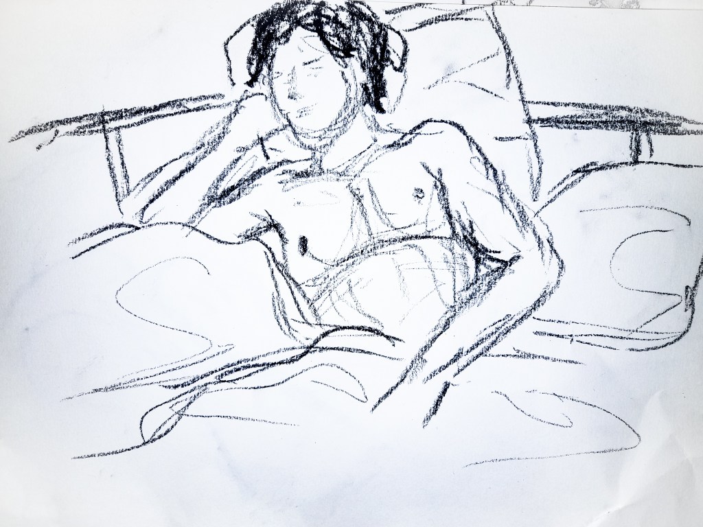
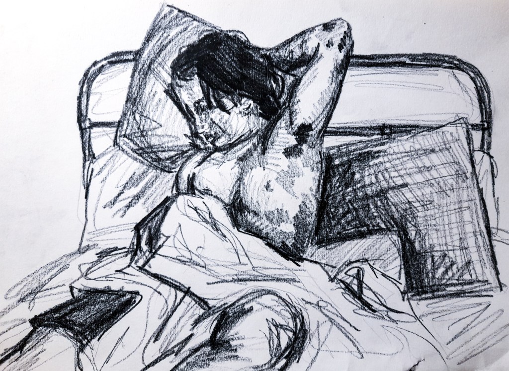
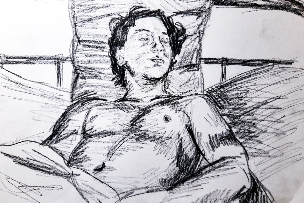
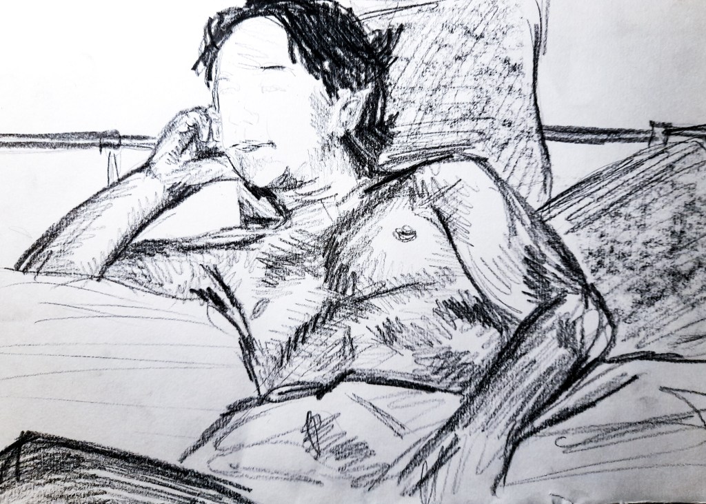
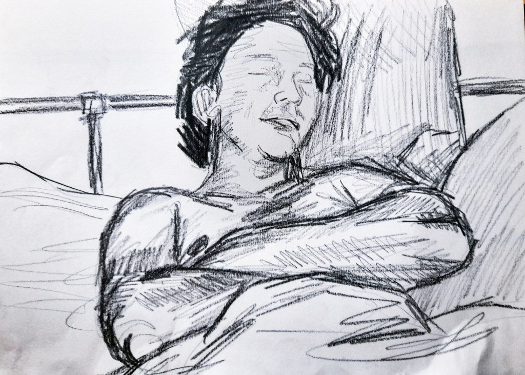
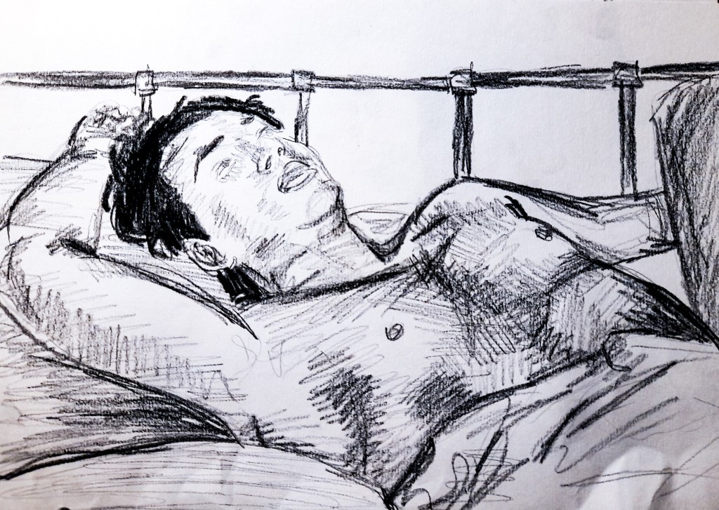
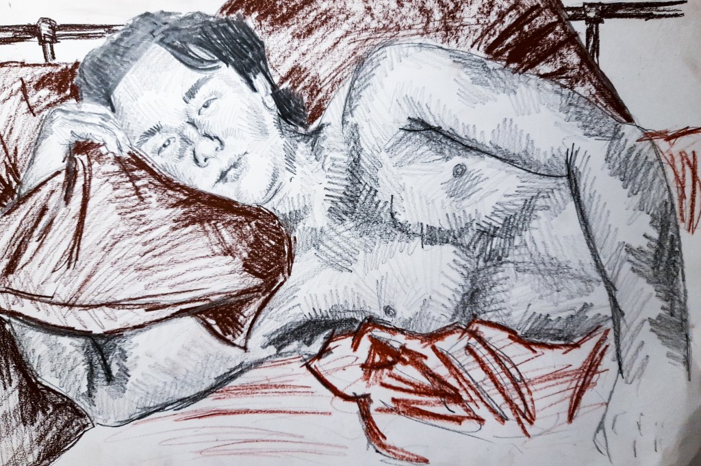
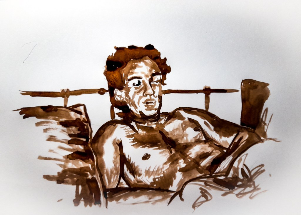
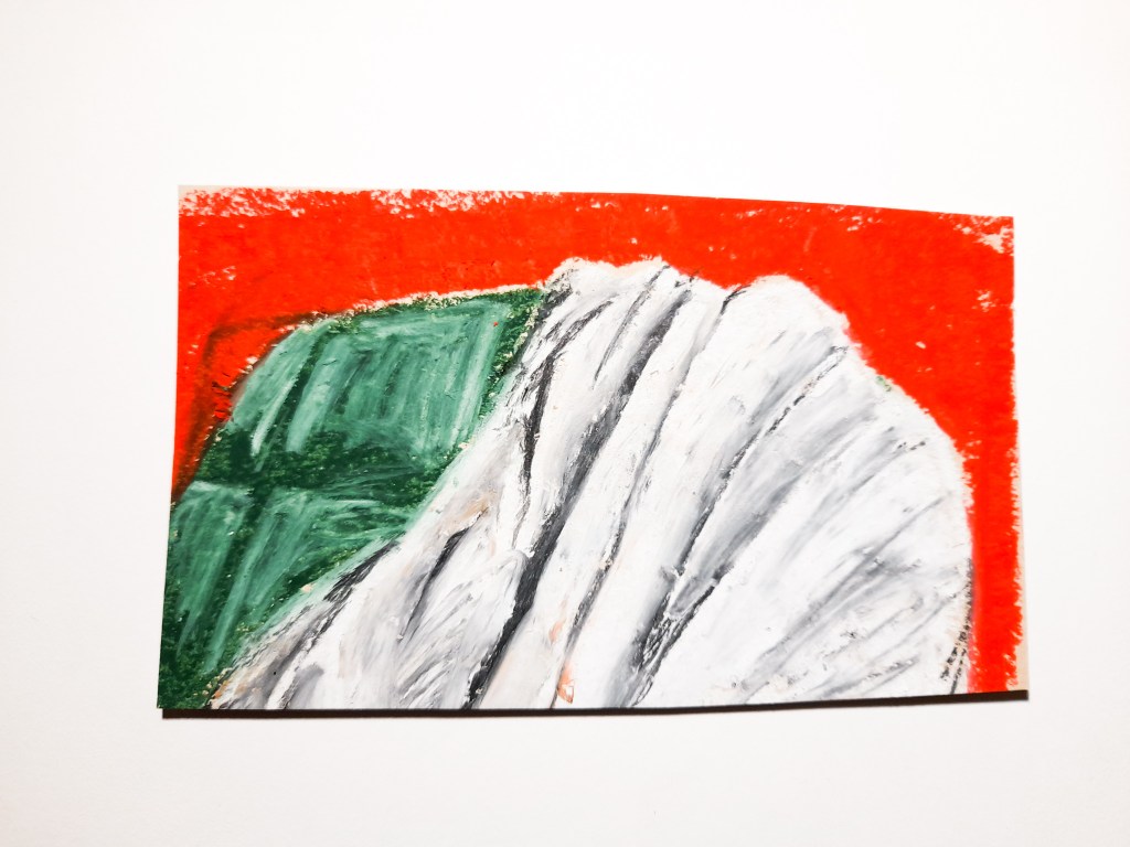
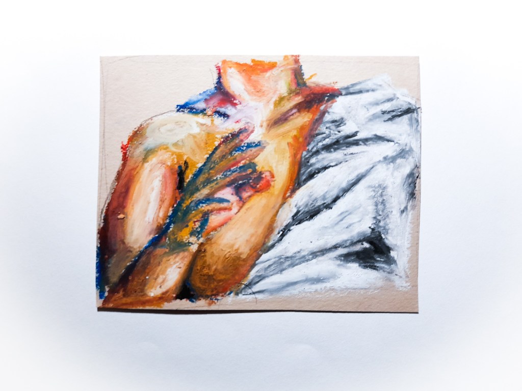
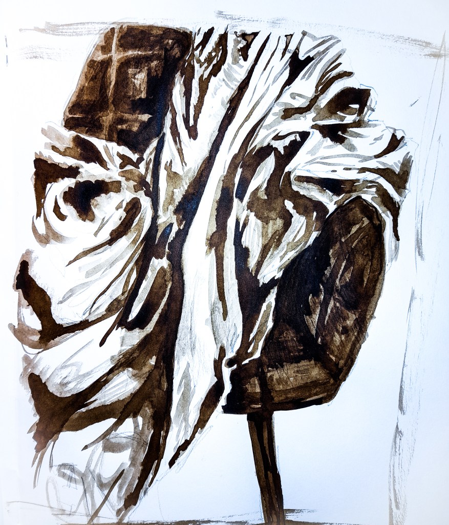
Looking at what I want to achieve in this Part of the Drawing 1 module, I think there is a lot of inspiration and ideas to work with here. I need to think about what I want to say about the body with my work, do I want to objectify or present empowerment. Question the objectification of women? I would love to touch on those ideas if I had a female model to work with for Part 4, however I am working with a male model (restricted due to Covid). Therefore I want to look at creating a feeling of comfort and intimacy between the viewer and the model. To romanticise the male body, to present it as it is, and not as something powerful, but something real. I want to form a relationship between the viewer and the model. I want to fill the space between the two with emotions and warmth. I should look at what colours and medium would work best to do this but also play around with the composition of my model, what would best create this atmosphere of warmth, understanding and comfort.

References:
Ways of seeing, John Berger- Al, E. (2008). Ways of seeing : based on the BBC television series with John Berger. London: British Broadcasting Corporation.
Susanna and the Elders- Tintoretto (n.d.). Susanna and the Elders. [Oil on canvas] Available at: https://en.wikipedia.org/wiki/Susanna_and_the_Elders_(Tintoretto) [Accessed 18 Nov. 2020].
Susanna and the Elders – Tintoretto (n.d.). Susanna and the Elders. [Oil on canvas] Available at: https://en.wikipedia.org/wiki/Susanna_and_the_Elders_(Tintoretto) [Accessed 18 Nov. 2020].
The Nude: A new perspective, Gill Saunders- Gill Saunders (1989). The nude : a new perspective. Cambridge: Harper & Row.
Man Greeting Woman- Kiff, K. (1965). Man Greeting Woman. [Oil, tempera and gesso on board] Available at: https://www.artuk.org/discover/artworks/man-greeting-woman-63705 [Accessed 18 Nov. 2020].
Woman Dancing December- Hilton, R. (1963). Dancing Woman December. [Oil and charcoal on canvas] Available at: https://www.tate.org.uk/whats-on/tate-st-ives/exhibition/seeing-new-roger-hilton/roger-hilton-exhibition-guide/roger-1 [Accessed 19 Nov. 2020].
Propped-Jenny Saville- Saville, J. (1992). Propped. [Oil on canvas] Available at: https://www.wikiart.org/en/jenny-saville/propped-1992 [Accessed 19 Nov. 2020].

Fabric and Form

Exercise 1- Drawing fabric using line and tone

I began these exercises thinking back on drawing techniques I have learned so far and how to apply them to a material contrasting what I have looked at before. Fabric can be loose and flowing, which is the opposite of everything I have really looked at so far. I was nervous to tackle something so drastically different to everything I have drawn before. I used 5B and 6B sketching pencils in order to have thick, dark and loose lines within my drawing, it would help me to focus on my use of line and tone.

Line Drawing with 5B pencil in A3 sketch book

I made huge error with my use of composition and ended up with a drawing leaning over to the next page, which was quite annoying, but it made me aware of where to start on my drawing for the tonal sketch. Rookie error. I used a 5B pencil to have bold lines so I could get to grips with the shape of the fabric, where it folds and to point out the main creases. It was useful to get to know the rough shape of the fabric before working on my next drawing going into more detail. I found I quite enjoy the looseness of the fabric and was excited to move onto looking at the more tonal and detailed aspects of the sheet.
I liked the contrast between the sturdiness of the chair and the loose fabric, but also how the space in the chair is still present by how the fabric folds and fills up the floor of the space in the seat. I think this will become a lot more obvious as I move on to look at this composition tonally.

Tonal Drawing with 6B and 5B sketching pencils in A3 sketch book.

I really enjoyed this drawing and I love how it came out. I love the contrast between the texture of the chair and the fabric and I think I really captured the shape of the fabric. For this part of the exercise i used crosshatching to capture the areas of tone and the the shapes of the shadows cast by the fabrics folds and creases. The light comes in at an angle with casts lots of shaded areas, but is still quite bright overall. I think had I used a more controllable light source, like a lamp in a dark room, I could have created a tonally interesting drawing with a mysterious atmosphere. The dark green, velvet chair really stands out against the fabric. The contrast between the quilted fabric of the chair and the loose white sheet works well to show off the different textures of the two materials and helps to push the focus on the white sheet. I think I captured the bulky, gathered body of the sheet as it is rather bunched up but also how it is a thin loose fabric that falls delicately off the chair. I think to move forward with fabrics as I go into more detailed drawings I should look at blending out my cross hatching for a more defined drawing than a sketch. But for a 15 minute exercise I am happy with my outcome today.

A variety of close up sketches using a variety of 3B to 6B pencils

For the next part of exercise 1 I kept my focus on my use of pencil and used a variety of drawing pencils, combining them to see how the different thickness and blackness helped me to capture the fabric. In wide areas of the fabric, areas with fewer creases I leaned towards using thinner 3B to 4B pencils, which helped create a more balanced and less intense tonal area. When things got darker, so the chair peeking through or areas with lots of shade and creases I used 5B to 6B pencils to really capture and emphasise these areas. I liked how these came out but I feel I could have been more experimentative. I want to look at more mediums, I feel oil pastel could be great at capturing loose materials like fabric, ink could also be interesting, especially walnut ink and how I can layer it for tone. So although I am happy with the outcome, I spent a lot of time getting used to capturing fabric in one medium and I would like to revisit this exercise with oil pastels and walnut ink before moving on to Project 2. Furthermore, since these were quick sketches between 5 to 10 minutes, I kept to a lot of cross hatching, and I think for tackling more serious pencil drawings I should start to look at blended these areas out.

Exercise 2- Emphasising form and cloth

A4 Drawing , pencil on paper

For this live drawing, I opted for a smaller A4 sketch book to capture the moment and the model. I had him sit naked in order to keep a focus on his actual body and the fabric covering him. The chair is hardly in the composition which worried me at first, as I thought it might make the drawing look odd, but I came to like the finished result. It was almost as if my model became the chair and the fabric was sitting on him. He became inanimate and the fabric became living, taking up space on him. I think I struggled with capturing the fabric on his shoulder, it’s quite spread out but I think you can still make out the shape of his arm underneath, it helps that his other arm is exposed and leaning in to interact with his hidden hand.
Towards the center of the drawing the fabric bunches up and doesn’t really show his shape and form underneath very well which isn’t the best but helps me to focus on how to lay out and direct the model and the composition of my live study next time around. I think my favourite thing that I have captured in this drawing is his legs. His ‘manspreading’ stretches out the fabric towards the bottom of my drawing, letting it drape quite nicely between his legs. You can see the shape of his knee in the bottom left crease which helps depict his legs as the chair legs, in a strong stance.
I am happy with how this came out, I didn’t capture the fabric as well as I did in exercise 1, so I wanted to try again but in a closer viewpoint.

A4 drawing, pencil on paper

With this closer composition I ended up with a rectangle of the models upper torso, split in a diagonal line between his body(skin) and the fabric, which gave me a bit of both to work with and look at in this quick sketch. I think my favourite part is his arm/hand, I feel it draws in the viewers gaze and becomes the focal point of this sketch. I think I used line well to really capture the shape and gesture of his arm and hand, resting on his face. It adds interest to the composition. With this closer angle I was able to capture more of the intricacies of the fabric. The curves and angles. You can just see the shape of his arm, however with this close of a view I wasn’t able to completely focus on how the fabric reacts to the the more drastic shapes of his body, such as his leg spread out underneath the fabric. But I was able to look at how it rests on top of his body without the sharp shapes of his limbs. I think oil pastels could work brilliantly to capture his body and the fabric, however I am unsure whether I will be able to capture the detail of his face with such a rounded and soft medium. Ink might be better for capturing those sharper details.

Moving forward

Moving forward I think its time I got a bit creative with my approach and take my time to really explore different mediums and how they can capture the human body and how fabric reacts to it. Oil pastels, as I have mentioned, I think would be great for capturing the gesture of the body as well as the loose fabric. It would be ideal for a softer approach. Ink could be a good option for capturing both the softer aspects of the fabric and the sharper aspects and details of the creases and body. I’d like to go back and explore these ideas before moving on to Project 2. However I am happy with my progress so far and I like what I have produced in these exercises.
I should also read into the context and ideas behind studying the form. The different approaches to both the male and female form. This is also something I want to really look at and delve into for Part 5 and looking at producing my own work with my own ideas. So research into these areas will be useful not only for the current Part 4, but also for my progress with my own work as an Artist for Part 5 with the personal project.

Mixing up my media

I went back to this exercise to really experiment with what effects I could achieve with oil pastels and walnut ink.

I am really happy with the first drawing of a chair. I think I got quite close to resembling the fabric with the oil pastel. I blended it out with the white but I think I’ve got a bit of a way to go before being able to really show the fabric, as it does look quite flat. I made a mistake with outlining the shape of the chair which you can see with the top left of the drawing and so I used a bright red to create a background to mask the error. I am quite happy with how it came out, it makes the green chair pop and really highlights the subject matter.
With my second drawing, the fabric draped over the body, again I feel the fabric depiction needs some work with this medium. I enjoyed working with colour to create a skin tone, its exaggerated, quite saturated, but I rather like how it looks. I think it would work better if it was blended more, for a smoother look. I was working on a smaller scale with this drawing so this might be easier to achieve on a larger scale drawing.
I like the effects of oil but I am not sure if its for me. I think I’d like to explore a wider ranger of media and possibilities when it comes to Drawing in Part 4.

Sketch with walnut ink on paper

I really liked how this turned out, when it comes to drawing I really love a monochromatic palette. I don’t know how well ink will translate to capturing facial features, but I think it works really well in capturing the fabric on the chair. I think ink could work well capturing a fluid, in motion drawing. Someone moving fast, as the wet medium could translate that effectively. I think exploring a wide range of mediums could be useful in me developing a style for this Part. I think I’m very particular about capturing realism and I should explore more stylistic approaches to capturing the body that maybe don’t fit into depicting something as I see it, but perhaps how I feel it, the emotions behind the drawing. I could try being more expressive as I explore different mediums and what they can offer in terms of capturing the body.

Reflecting on Feedback

I enjoyed working through Part 3 and looking at landscapes, even if the subject matter is far out of my comfort zone. Sticking to a monotone palette and limited mediums helped me to concentrate on the subject matter and how to get that right. As I progressed further into the exercises I should have began branching out in these areas more and looked into getting more experimental. For my assignment piece I explored combining two similar mediums, a fine liner pen and ink, which worked well but I should have looked into how to really create a scene effectively with combining these mediums.

I was able to get a bit more creative when I was looking at Project 2 Exercise 1 and how I can depict clouds. I looked at a variety of mediums and I should have explored that further and carried it through into the other exercises instead of holding back. I am happy with my use of pen in this module though, I think I have greatly improved in that medium especially when depicting trees up close. I struggled with foliage as it is quite a vast and complex thing to capture, especially in an effective manner.
With my use of pens, as suggested by Hayley, I should have looked more at how I can use this medium more effectively, such as using a variety of pen nibs to add more depth in my drawings. And also look at introducing colour within this medium as well.
Looking at broader scenes would have been ideal to consider other mediums or becoming more experimentative with my use of fine liners. I think exploring ink for these vast scenes earlier on would have been good for me, and also oil pastels. I did try these in some later drawings briefly, but I think for a larger scale drawing they would have proved very useful.

In my feedback I am always happy to hear how I do well with my Artist Research, but I think I can improve an look through more sources such as books and perhaps interviews to really strengthen my knowledge. This could lead me to have a better understanding of some Artists, styles and themes. I am interested into looking more at the themes and concepts of art and narrative in my Part 4 with John Berger’s ‘Ways of seeing’ . Looking forward to Part 5 I know I’d really love to explore on portraiture and the female body and ‘Ways of seeing’ can offer lots of powerful insight into that as well as looking just at Artists work. Looking at contemporary Artists along side historical is vital to really develop my themes and narratives as I love to combine a traditional approach with modern themes. I found that looking at Modern Art, although it can be wild and different, far from traditional drawings, I can still take lots of inspiration from this and apply concepts and ideas to my own work. I want to try and look at more exhibitions and how viewing art in person can give it new context. Although this may be hard to achieve with lockdown restrictions.

Again, I should really experiment with a variety of mediums to really explore what i can capture and create with my work. I could explore non traditional mediums but also all the ways I can use traditional mediums. Considering portraiture is something I am very confident in, I don’t think I should have any trouble with exploring a variety of mediums for this section of Drawing 1.
I should look at a variety of styles to really immerse myself in exploration. One of my favourite Artists is Edward Hopper and how he creates immersive scenes with people, but I could also look to more simplified styles like Cubism, especially when tackling more complicated exercises like groups of people.

I know that I need to explore more with my mediums and take time to really explore ideas. I’m excited to move into Part 4 not only for drawing but also for researching and developing my ideas and themes further.

Assessment

For my assessment, I had to include both a building or man made objects to apply what I have learned about perspective, as well as natural forms too. This was a struggle to find in a place like Birmingham but I settled on the statue in front of the Birmingham Museum and Art Gallery. The statue provided a great focal point with lots of detail, while being surrounded by modern buildings and structures as well as a lot of plant life.

Preliminary sketches

As you can see, I considered another point of view in front of the BMAG as well before settling on a previous view point I had looked at. The first sketch just didn’t seem to provide enough greenery for the composition. I liked how sketch 2 provided a variety of areas, greenery, structures and a unique centre focal point of a stylised statue. I tested out mixed media and combing my use of a fine liner pen and ink to create a detailed view that fades into the softer medium of ink, that draws the viewers gaze to the centre on the main focal point of the statue. I really liked how this looked and couldn’t wait to test this idea out on some A2 paper.

The Assessment piece

Fine liner pen and walnut ink on A2 white paper

I really liked how this piece came out and is one of my favourite pieces I’ve produced in Part 3. I love the contrast I was able to create between an incredibly detailed statue and the hazy soft approach to the surroundings, I think it works well, especially with the limited palette I chose to focus on in Part 3. I feel the detailed approach to the statue draws in the viewers gaze and soft background and foreground help to create an immersive atmosphere. I debated whether to go in with my fine liner pen again on top of the ink, but I glad I didn’t as I feel this works well, anymore detail could be distracting and take away from the piece rather than add to the drawing and the atmosphere. I wanted to show the business and diversity Birmingham has, with the busy bustling high street and office buildings behind, the beginning of the the classic architecture of the museum in the top right but also the serene areas that you can find, which are filled with plants. This drawing informs the viewer of what Birmingham has and I find its a unique view. This area is usually quite busy, with people rushing past not caring to look around. I’m glad I took the time to look around and find such a diverse view.

With my use of tone I think I was able to successfully capture my composition in a way that is intriguing, its not too much for the viewer. The use of walnut ink allows me to still layer and apply dark areas of tone, but adds a warmth and depth I might not have been able to capture as effectively with black ink. I struggled to differentiate my use of tone to establish a difference between the foreground and the background, I think I achieved this but barely. Perhaps I could have found a finer brush to draw in more details on the plants in the foreground to help differentiate the different aspects of the depth and view. I think to improve I should definitely take the time to think more about how to establish a foreground and background that aren’t drastically different, but not too similar either. I want to be able to find that balance and that is something I should focus on moving forward.

I know that landscapes and city-scapes are not my forte and I can definitely improve in this area, but I think I have progressed and the exercises have helped me to improve on skills and ideas on capturing such a vast and difficult subject matter. I am proud of my outcome and I think I can see the improvement from when I first started Part 3. I think I would like experiment with colour as I work through Part 4, but I am glad I took a lot of time in Part 3 to focus on a more monochromatic approach within my drawings. I also spent a lot of time drawing with a pen which is quite out of my comfort zone and I am definitely much more comfortable with this medium now. I feel by keeping a simple monochromatic approach helped me to really grasp and develop my drawing skills on landscapes. I did enjoy some of my oil pastel approaches but I feel to really capture distinctive details like the bark on a tree, pen has really helped me to achieve that.
One aspect I really struggled with was my use of line when approaching building structures, and although I feel I have definitely improved on that, I feel I still need to practice this more.

Moving forward

Moving forward to looking at portraiture, a subject matter I am much more comfortable with, I feel I can really start expanding my use of media and really explore with colours and and different drawing mediums. I want to get really experimentative and branch out and develop my drawing skills more, especially with using colour. I am excited to move forward and watch my skills develop even further.

Design a site like this with WordPress.com
Get started