I am glad to see that with Part 4 I have really progressed with my work and skills. I really enjoy working with the paint like qualities of oil pastel, something which I explored as I expanded my use of media in the Part. I think taking some of my tutors feedback of using thinners to really mold the paint like quality of the pastels is definitely something I can look into as I progress into my personal project while continuing to look at portraiture. I should also limit my palette, my tutor suggested not using so much white and look for more natural skin tones to work with than using harsher colours like white and black. My tutor also suggested applying painting skills to my drawings, introducing more watercolour and perhaps acrylic paints within my drawings to build up my skills ready for my next course, Practice of Painting.
I was planning to look at the female body in more detail and context for my personal project, however my tutor talked about the male body being depicted in art, there are very few paintings of nude men, perhaps because they aren’t as sexualised or objectified as the female body, so perhaps that is a topic I can build up to, hopefully with my model once lockdown restrictions are eased up. So for now that is a very limited option for me, which isn’t great as I really wanted to expand upon my portraits with my model for my Personal Project as well as looking at my own body.
I want to look at women and empowerment. How do I paint my body without being objectified, sexualised or for a male viewer to feel entitled to me. Is it even possible when everything about women is sexualised and judged. I want to romanticise the experience of the body, male and female, create a vulnerable but safe space within the portraits I create. My tutor praised some of my sketches of my model where he had a hint of a smile, showing a relaxed, comfortable but vulnerable position. So maybe that is a start to develop these vulnerable but comfortable portraits, that don’t feel harsh or sexualised? I have seen a lot of feminist Artists take an approach of ’empowering’ portraits that graphically depict the female body, but I am not sure that is a direction I want to go in. It is harsh and paints the body in a grotesque light (such as the work by Jenny Saville) rather than highlighting a more natural and warm approach, an approach I would prefer to depict for the female nude.
I have a lot of ideas, and can’t wait to build upon the skills I have developed in Part 4 for my Personal Project.
Assignment Four
I have been looking over the work I have built up in Part 4 and looking to them as preliminary drawings. I have also been looking at all of the different mediums I have been using to figure out what work best for each of the required figure studies. I have really enjoyed experimenting with different mediums and combining them within Part Four, especially oil pastels.
Figure study using line
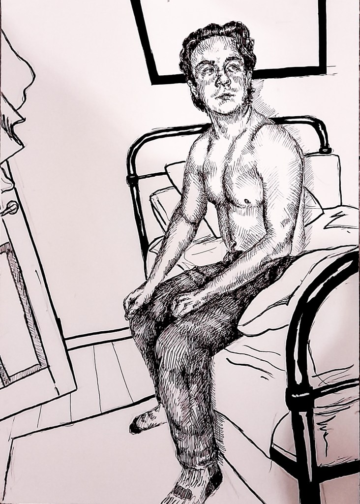
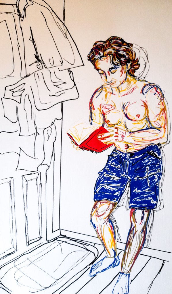
For the first Figure Study, which looks at a seated model using line. The directions suggested the model be seated in a chair, I played around with my own idea of my final seated composition and thought to try and create a narrative within my drawing. I sat my model at the side of a bed and had him look off to the side, it suggests a story, that something is happening out of view. It reminds me a lot of the work by Edward Hopper, how his work often reflects a narrative playing out sometimes out of view of the painting but the painting but this narrative is shown through the person being painted and their reaction. For my medium I used a fine liner pen and a black paint marker, to create bold lines that make up the drawing. I really liked how this drawing came out and is probably my favourite of the three, even though I expected it to be my least favourite.
I used a fine liner to sketch out the details of the human form before going in with the paint marker. I find that this can make the environment feel disorientating and helps emphasise the human form of my model rather than take away. I really like the effect of the contrast between the mediums and how the simplified background came out. It’s almost like taking a real person and throwing them into a cartoon environment. The lines arent very straight as I wanted a perplexing, odd environment but it might have worked better had I used perfectly straight lines and a ruler. I also think I have drawn the hairline a bit too high and it throws the likeness off a bit.
Overall I am very happy with how this piece came out especially since I love working with tone over line. I think my use of line and crosshatching did add a nice amount of tone as the lighting wasn’t that dramatic.
Figure study using tone
I love how the skin came out in this piece however the facial features are definitely off which I’m quite sad about. While the head has a lot of dimension the facial features just look really flat, so I have to work on building that up. Parts of the background feel quite flat as well, so I feel I struggle with adding dimension when it comes to working in colour, something I should push myself to do more to build up that skill. I do love the warm colour palette I worked with in this drawing, they all work well together and aren’t contrasting. I did shine a light on him from a slight angle in order to cast light across his chest for an interesting range of tone, of course with window light as well. I really enjoyed blending the soft pastels together to form tone around the body, I think my choice in colours work extremely well for the models skin tone, but I definitely need to work on the details and dimension of my figures.
Portrait using line and tone
For this piece I went for a smaller scale drawing to create a sense of intimacy within the drawing. I chose a pose that was similar to a previous quick sketch I have done. I looked through to decide on what kind of pose I wanted to work with and felt this one created a closeness and intimacy. It created a warm feeling. I decided to keep my medium choice simple this time and opted for a mechanical pencil. This allowed me to create a lot of tone through cross hatching and building up layers of pencil work. It was hard to play around with the lighting too much as it was a bright day, but I do like the softer tone than anything too harsh.
I think I would maybe like to go back and experiment further and create more assignment pieces for assignment four. I thought I would be happy with my ideas, but I feel that the last two studies could have been better and more creative. I wanted to look at using mirrors and reflections, and also more dramatic lighting. It has been hard to arrange for sittings with Covid, so I may want to revisit this with my model again when I have the chance. I am just not happy at all with my last two drawings. I want something more dynamic but still natural. I want my drawings to feel dimensional and that the forms within them have weight within the surroundings which I feel I have failed at here. So I think revisiting these assignments when it is safe to do so with my model would be ideal.
Portrait from memory
For this exercise I wanted to go with a more stylistic approach than aim for something realistic as the outcome is bound to be odd. I chose to work with my POSCA Paint Markers again as they’re bold and will make great lines, as I wanted the focus to be on line. I chose to find some ones face on my trip to Tesco’s and it was going to be difficult as with Covid a lot of people have their faces covered. However I found a man in the parking lot packing his car with groceries without his mask on and did my best to remember his likeness.
Not my most exciting drawing ever, but it was fun to be a bit more loose and not worry so much about being exact. I remember the man was quite skinny, with a long face, no facial hair with his hair short and ruffled from the wind. It’s quite hard to make a portrait of someone you’ve never met and know nothing about. I can’t work in his personality because I have no idea what it is. The bright colours over compensate for a personality I do not know in a way. I feel that this isn’t a portrait to me. It doesn’t show who he is or what he does. It doesn’t tell us anything about him other than he has a long face and is skinny.
However this exercise has made me think more about what to include in my work to create an effective portrait. With their expression and pose, my use of colour and medium. These can all tell a story about a person and I want my portraits to say more. I know the person I am working with so I want my portraits to express him accurately.
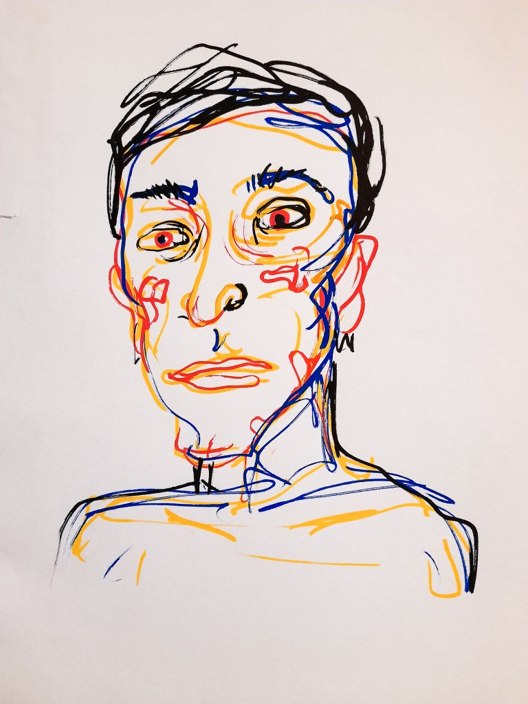
My own head
I find it hardest to draw myself. I struggle to identify with the features on my face and drawing from a mirror where my position is always slightly changing also proves quite difficult. It also doesn’t help that I hate the way I look.
Quick Studies
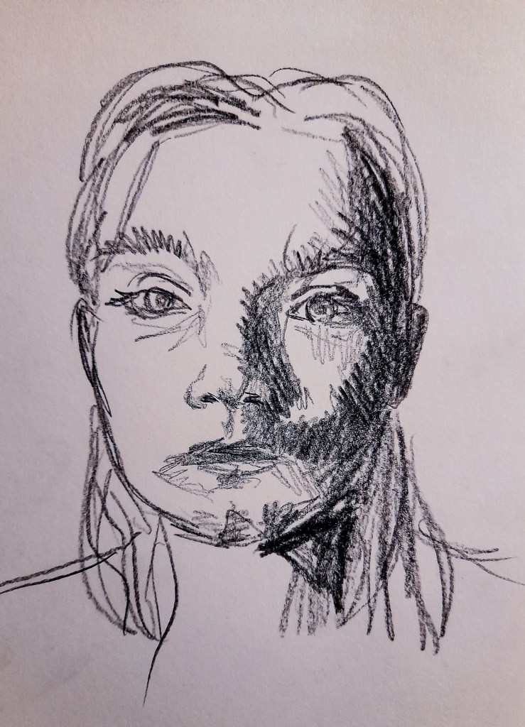
Lead stick on paper
I began looking in the mirror for my quick studies, adjusting the light as I began each drawing. Changing the position of the light also had the ability of changing how big certain features of my face looked, especially my nose. The lighting also added angles to my face. I kept the pose of looking straight forward to ease myself into an exercise I was finding very difficult to do. This exercise has also helped me to notice how big my eyelids are. After the quick sketches I decided I wanted my first pose to be with simple lighting looking slightly to the side, a simple way to a difficult task.
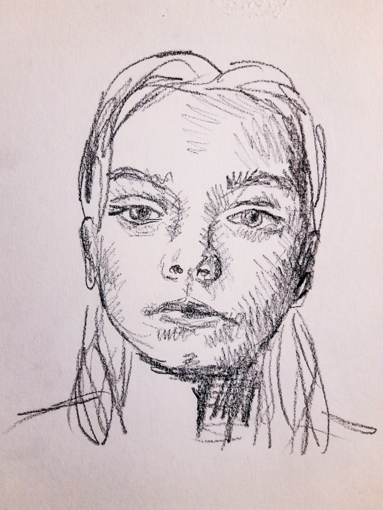
Self Portrait One
For my first drawing, I tilted my head up slightly and turned to the side, but not by a lot. I think I got the facial proportions fairly accurate but I feel the bridge of the nose lets the drawing down, it doesn’t quite work and is probably where I drew in slightly different angles as my head moved as I sketched. The mechanical pencil allowed me to add finer detailed with the tone, but would also be easier for me to correct a mistake. I think the mechanical pencil didn’t work so well for the eyelashes as the bottom eyelashes were very subtle and have ended up blending in with my cross hatching for the tone underneath the eyes. But looking in a mirror with the drawing helped me to see the proportions were accurate, I was particularly worried the eyes may be off as I do have a rather wide interocular distance, but the drawing seemed fine in the reflection.
I am quite happy with how this came out and felt ready to correct my mistakes on my next drawing but also approach it in a bolder way than just a mechanical pencil. I wanted to adjust the lighting to something harsher so I had a lot of tone to work with.
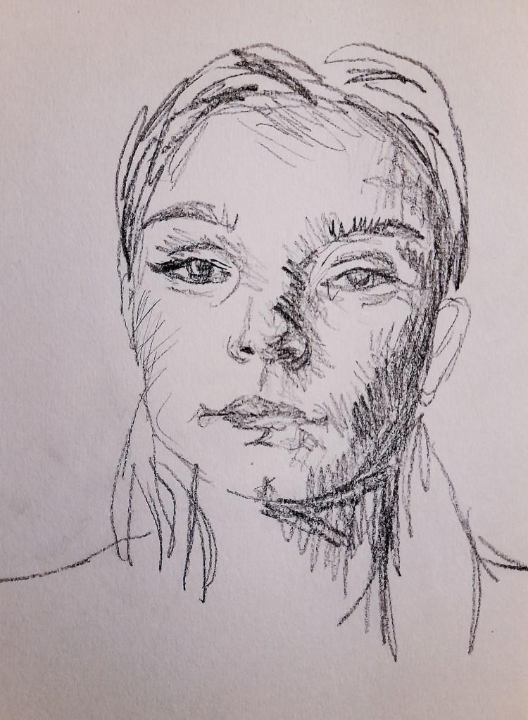
Self Portrait Two
My face looks a lot different here to me, probably due to the drastic change in lighting. This has allowed me to play around with a black paint marker to work in a harsh, dramatic tone to the drawing. The big areas of dark tone made my eyes look further apart, and looking in the mirror with the drawing confirmed this, but my attempt at the bridge of the nose was a lot better with this drawing attempt. I love the result of my right eye as I was able to include the highlights that were present in the eyelashes making for a more realistic depiction, however the left eye looked a lot more cartoony and bad with the fine liner. I think I may have made those lashes a bit too long. I’m really happy with the outcome of my nose, I feel my use of tone is very effective here. I think the mouth also works rather well but appears a bit slanted compared to the rest of the facial proportions. So while I have improved with this drawing I have also made a few more errors.
I have found this exercise quite difficult, I do not enjoy sitting for myself. The exercise was useful in building up my live drawing skills and helped me to think more about lighting and poses for my drawings. It also helped me to think about how different mediums can help with different aspects of a drawing. The paint marker was useful for the vast areas of dark tone on the face. I’m looking forward to considering the lighting and poses for my assignment pieces which I am excited to tackle.
Facial Features
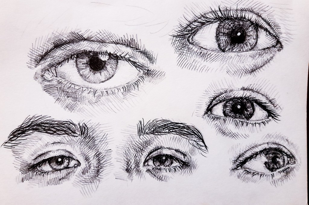
I began with the eyes, sketching out the basic shape and used cross hatching to add tone, curving the lines to add dimension and shape with my use of tone. I liked playing around with the reflections in the eyes and adjusted my light source with my model to get some interesting reflections.
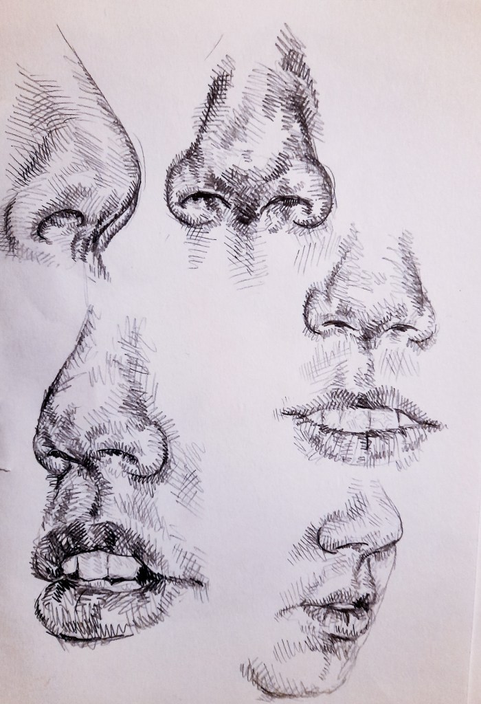
For me when I draw a face, I usually start with the nose, as its in the center of the face, if I can get the nose right, the rest of the facial features can then fall in the right spots. Again I curved my crosshatching to depict the shape of the nose. For the mouth I try not to outline the lips and use shading to show the start of the lip colouration. I think the bottom two attempts depict my models mouth the best as I built up the areas around the mouth to help better show how it fits into the face. You can also see where I started to look at the chin. Since I was using my model as reference, his chin is very round and there isn’t much detail to it.
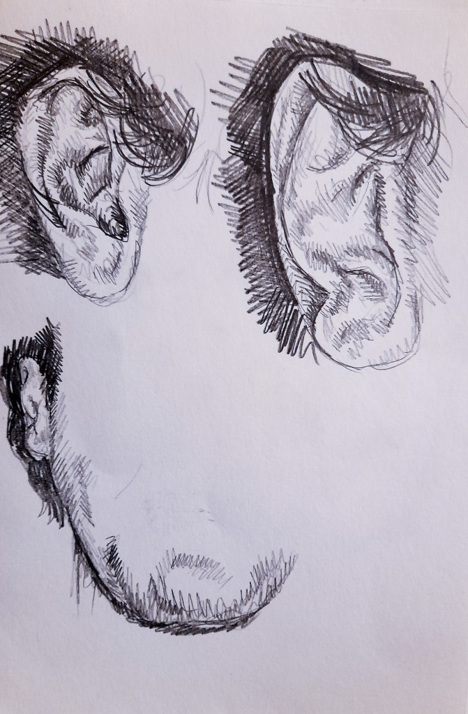
As you can see from the bottom drawing, the chine is rounded and simple. I did look at his ears from 3 different angles, and the shape is quite complicated. I think my best attempt is the top left, it shows the details and the bone structure of the ear a lot better than my other attempts. I’ve been using a mechanical pencil for all the sketches as its thin and precise and works well to show tone and detail through cross hatching. After completing the many sketches of the many features that make up the face, I felt ready to tackle the head as a hole.
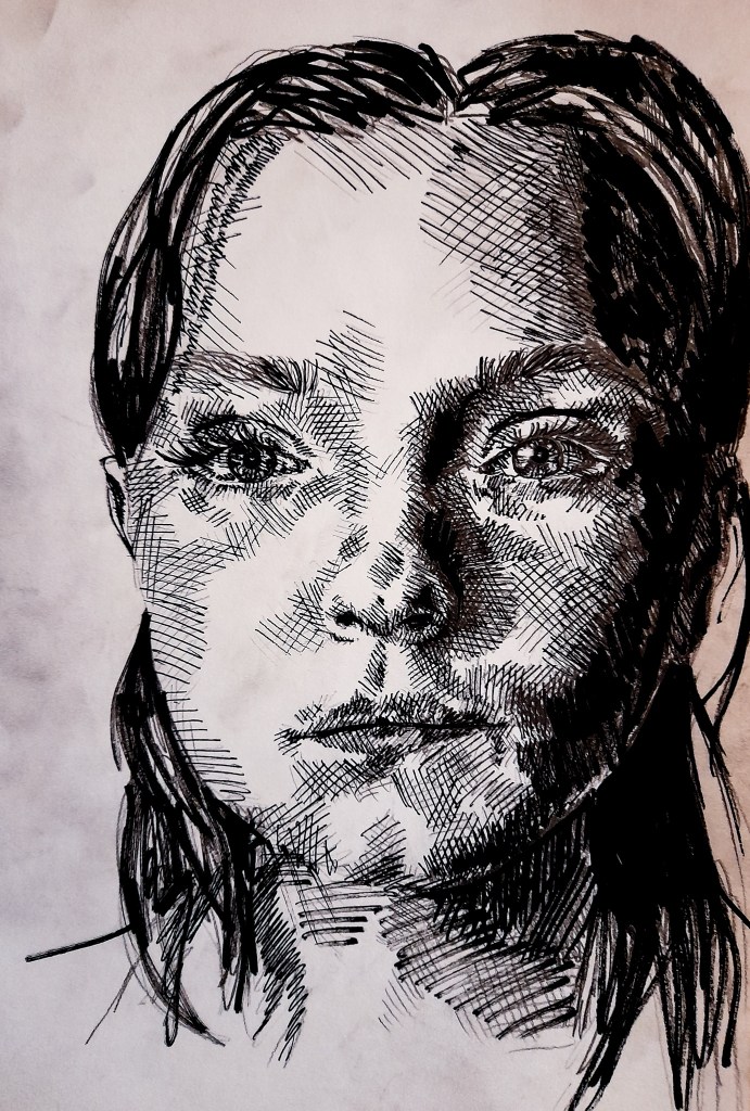
The Head
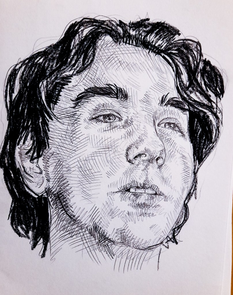
I kept to a smaller scale with this study and began with a mechanical pencil to draw in all the details. I began with the nose, as I said earlier, its the center of the face. If I get the nose right I find all the other features fall into place. I curved my lines with the shape of the face to help add some dimension to his face. I moved onto the eyes which aren’t as soft as I would have wanted them to be, I feel in this study I have made them look more outlined than tonal. This might be due to the small scale, quick sketch. I moved onto the mouth which I am rather happy with, I used tone to develop the colouration of his lips, and avoided outlining them. When it came to the hair, I switched up my media to a pencil lead stick to more effectively depict his dark hair, leaving some areas white for highlights. I think I captured the shape and size of the head fairly accurately, and feel all the facial proportions are correct. I wish I captured his eyes better but that allows me to improve with my next drawings. I found this exercise useful to really sit down and think about the shapes and tone of the face. I usually struggle with drawing mouths and found that my technique has drastically improved with working on this exercise. Taking time to center my focus on one feature at a time than the whole picture helped me to develop more skill at capturing the features of the face.
Self Portraits through History
Van Gogh
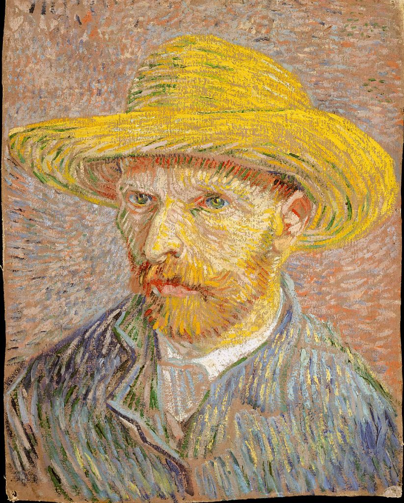
This painting is beautifully done with the use of line, the lines used in each part of the painting flow in their own direction and are moving with one another and against lines from other areas of the portrait. His colour choice is bright but not too much, and contrast nicely. Your gaze is drawn immediately to the bright yellow of the hat and move down to his face and then to his blue coat. The impressionist strokes work so well and could be a style I could use with my oil pastels on toned paper. The use of tone is soft, not too harsh at all, and works to create a somewhat delicate looking portrait. The pose is simple but the eyes are very telling, to me they show a lot of hurt and thought. Van Gogh sat for himself the most of the time and ‘Became his own best sitter’ [1] From the context of his self portraits, there is often a sense of loneliness within the work. I should look at the context of my sitters and drawing myself to add more depth or themes within my drawings.
Rembrandt
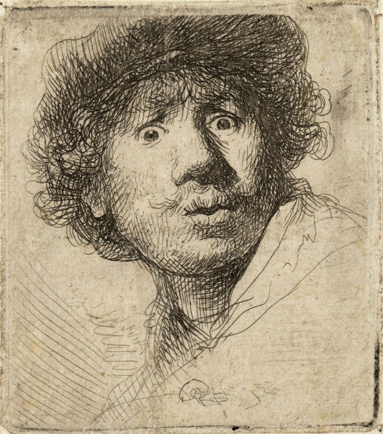
This piece is in an entirely different style to Van Gogh, using crosshatching in order to create harsh, dramatic tone across the face. This is a style I could look at when producing portraits that look a lot at the use of line, which could be done with a fine liner or ink. The pose is an interesting one, as most self portraits from this time period would tend to be serious, Rembrandt looks as if he is posing and making a funny face. It looks a bit fearful, like he has been spooked, but stands out as an iconic self portrait throughout art history. This drawing is actually an “example of a tronie; an unconventional style of portrait in which people were depicted with exaggerated facial expressions, and often in costume.” [2] . These were done at the time to be humorous, but Rembrandt also made a habit of using himself as his subject as this helped him become a recognisable figure within the artworld at the time as a lot of his work contained self portraits. So self portraiture to him was a form of self advertising.
Tracey Emin
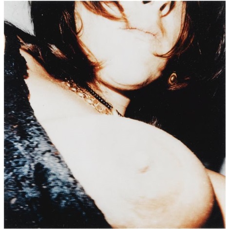
This self portrait is probably the most contemporary one I will look at and was done as a photo. There is a lot of tone in this piece as the image is over-exposed, most likely from the camera flash, create lots of bright areas and very dark areas. The pose is quite different as it only has a focus on the bottom half of her face and her exposed breast. Showing a lot of her self but not so much her physical identity. This fits within the context of her other work, all looking at her identity and experiences without necessarily looking at her face, for example her piece looking at her messy bed. I think tis a unique and modern approach that looks at how technology is used in our present times to express ourselves and out identity through selfies and photographs. A theme I could look at for perhaps my personal project and the view of myself.
This piece fits into that ideal male gaze of wanting a woman sexually but not intellectually, she gives the male viewer a look at her breasts but not her face.
Lucien Freud
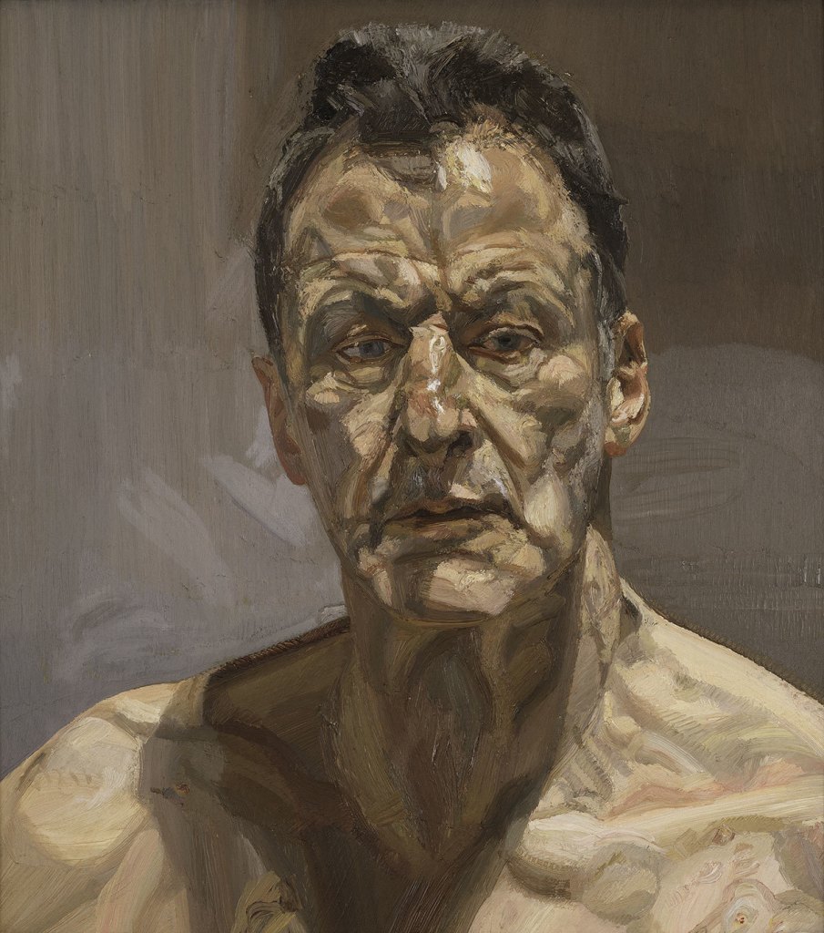
This piece by Lucien Freud is stunning. I love his technique with blocked in shades of skin tone that make a sea of perfectly captured skin tone. The lighting composition works well as he is lit from above casting interesting shadows down his face and body. The pose is very nice as well, as Freud looks deep in thought and contemplation. There is something very peaceful about this piece and I am in love with his technique. It is something I could hopefully emulate with my current drawing technique of layering oil pastels over water colour. Again, for one of my final assessment pieces, I could look at pose and the positioning of lighting in order to create an interesting and moving piece.
References
Image 1- Van Gogh – Van Gogh, V. (1887). Self-Portrait with a Straw Hat (obverse: The Potato Peeler). [Oil on canvas] Available at: https://www.metmuseum.org/art/collection/search/436532 [Accessed 9 Jan. 2021].
Quote [1] – (Metmuseum.org. (2020). [online] Available at: https://www.metmuseum.org/art/collection/search/436532.)
Image 2 – Rembrandt – Rembrandt (1630). Self-portrait with beret, wide-eyed. [Etching on paper] Available at: https://www.myddoa.com/self-portrait-with-beret-wide-eyed-rembrandt-van-rijn/ [Accessed 9 Jan. 2021].
Quote [2] – Daily Dose of Art. (2018). “Self-portrait with beret, wide-eyed” by Rembrandt van Rijn. [online] Available at: https://www.myddoa.com/self-portrait-with-beret-wide-eyed-rembrandt-van-rijn/ [Accessed 9 Jan. 2021].
Image 3 – Tracey Emin – Emin, T. (2001). Self portrait. [C-print] Available at: http://www.artnet.com/artists/tracey-emin/self-portrait-NlxYBnHyYFYXgg_k5o2SVw2 [Accessed 9 Jan. 2021].
Image 4 – Lucien Freud – Freud, L. (1985). Reflection. [Oil on canvas] Available at: https://www.royalacademy.org.uk/exhibition/lucian-freud-self-portraits [Accessed 9 Jan. 2021].
The Face
Graham Little
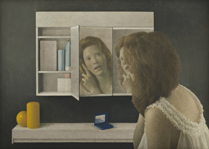
This first artist I am looking at, Graham Little, works beautifully here to portray the face in such a unique way. He uses his composition to display the woman’s face in numerous angles with mirrors and it works brilliantly. I think its a unique and interesting take on the composition of face and how we can explore her beauty from different angles. I should really think about my approach to the composition of the faces I draw, like incorporating reflections to suggest themes or to create an interesting composition for a portrait.
His technical approach to the face feels quite soft and delicate, no harsh colours or lines are used, its very blended with a pastel, light skin tone. And this approach contrasts nicely with the modern, sharp décor of the scene. All of these bold colours such as black and a bright yellow contrast well with the soft delicate white and peach tones used on the girl. Every choice of colour feels intentional to highlight the face of the girl. This is further pushed by the composition where her face, forward facing, is present in the middle mirror in the centre of the painting drawing the viewers gaze in. The use of colour in her face is blended well, not blocked in, and makes for a very real feeling face.
Elizabeth Peyton
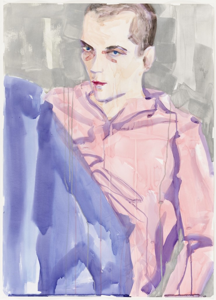
In this piece, Peyton approached with similar pastel colors for the skin, but her technique makes the piece look very different from Graham Little’s work, as blocks in tone and the features and shapes of the face. I like the idea of blocking in tone with colour, but I do not like how simple and lacking in detail the face is. It is not a stylistic choice I particularly like, however a softer colour palette might be ideal for looking at skin tones and the face.
Johannes Vermeer
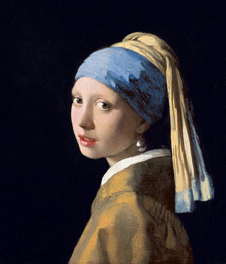
This historical approach to a face is very similar to the techniques used in the first painting I looked at, very soft colours blended together, however Vermeer has used interesting lighting to add a dramatic flair to his piece, as the light casts big shadows across the face. It’s made me think about how I should pay more attention to the lighting and playing around with casting shadows across my models face for a more interesting drawing tonally. The composition is rather simple with a plain black background for the shadows to blend into which keeps the focus solely on the woman and her colours. When leaving my backgrounds plain, which I have done often so far, I should look into what colour to leave them instead of just white, as something darker like black may work even better.
I want to create interesting drawings of people, and to to do that not only do I need to think about my technique and colour palette but also my composition and the lighting. If I choose to have a background I want it to interact with the model, like the first painting did and play a part in enhancing the portrait. I’d like to look at playing around with reflections more, especially with the female body, and play around with the themes of vanity that John Berger discussed, but I might save that for Part 5 with my personal project. I should look at colouring my plain backgrounds with a colour that will enhance or contrast with the other colours of the piece. There is a lot I can experiment with here.
References
Image 1- Untitled (Reflections) – Little, G. (2014). Untitled (Reflections). [Gouache on paper] Available at: https://www.alisonjacquesgallery.com/artists/26-graham-little/works/13704/ [Accessed 7 Jan. 2021].
Image 2- Daniel, Berlin – Peyton, E. (1999). Daniel, Berlin. [Watercolor and synthetic polymer paint on paper] Available at: https://www.moma.org/collection/works/38717 [Accessed 7 Jan. 2021].
Image 3- Girl with a Pearl Earring – Vermeer, J. (1665). Girl with a Pearl Earring. [Oil on canvas] Available at: https://en.wikipedia.org/wiki/Girl_with_a_Pearl_Earring [Accessed 7 Jan. 2021].
Image 4-
The Underlying Structure of the Body
The underlying structure of the body is so interesting, historically it combined science and art to create some beautiful drawings, and can make for some interesting artwork within the contemporary art scene.
Leonardo Da Vinci
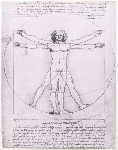
This piece by Leonardo Da Vinci is one of the first drawings to come to mind when thinking of a historical artist with a focus on the structure of the body. His work is crucial and iconic, as he found a deep interest in the body and spent many hours looking at and dissecting dead bodies. He looked at measurements and proportions of the body, which can be seen in his many studies and drawings in ink.
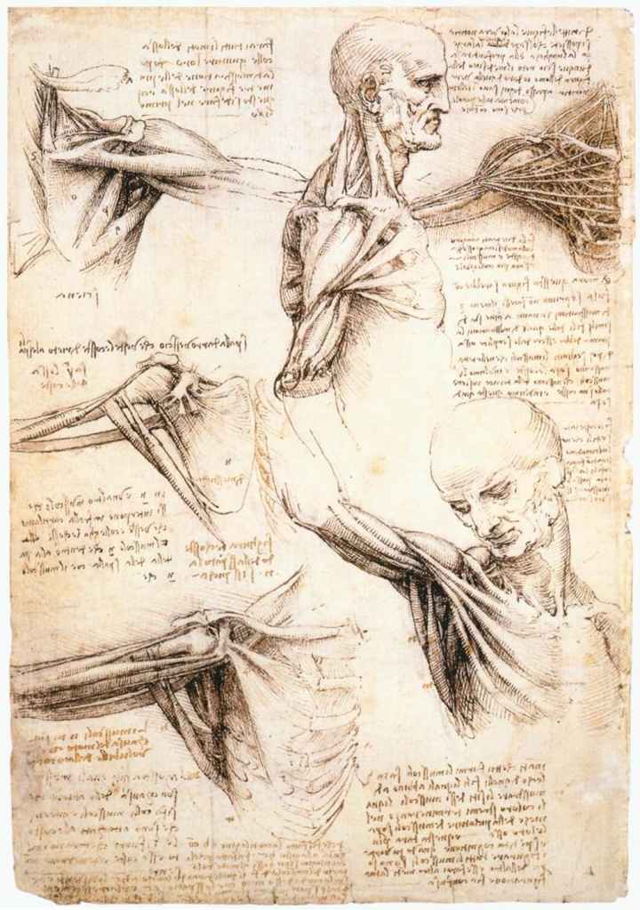
I love the use of tone in his studies, everything is accurate and has a sense of dimension to it. The cross hatching for tone is immaculate. You can see how the body works and connects, nothing feels out of place, everything is proportionate. Looking at these drawing helps you to understand the spaces inside the body and how they are taken up, this knowledge will help you to build accurate tone and body structure within your drawings.
Michael Reedy
Michael Reedy has a very interesting and unique drawing style of dissecting the bodies he looks at. It combines the beauty of the exterior body with medical imagery of the interior and an essence of a cartoon style.
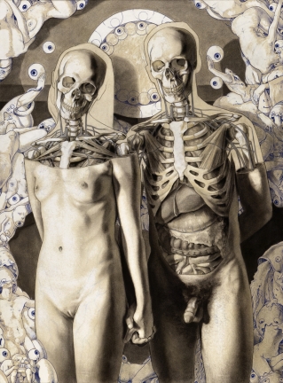
This piece is stunning with the monochromatic palette that helps to keep a focus on tone. We also get a glimpse of the exterior but also how the space within it is filled. The bodies have a weighty presence and the dissection helps add to that. We can see the close bond between the two figures as they hold each others hand but they are given anonymity from the placement of the dissection. The choice to keep the woman’s breasts on display may show a sexual relationship between the two of their bodies as their sexual organs are shown, but their faces are covered to hide who they are, so this could lead the viewer to believe this to be a secret affair or infidelity, where they must hide their faces from the world. The cartoon illustrations that linger in the background add to the focus on the body, all of the eyes may link back to the idea of a secret affair, people wanting to see the truth but unable to see who they are.
This artist shows that you can combine the traditional study of the human form with the structural approach to create interesting themes and ideas surrounding the body.
I think there is a lot to take away from looking at these two artists and how the historic practice can still be utilised in order to create interesting and unique work. Looking into the structural aspects of the body as well as looking at the previous exercise has helped me to think about the body and how the space within is occupied, how it twists and turns and all connects together, good knowledge of this visually will allow me to create a more accurate and weighted presence of the human form. I should think about what is within when looking into how tone takes shape over the skin and how limbs should look within the compositions I create with my model.
References
Image 1- Vitruvian Man – Da Vinci, L. (1490). Vitruvian Man. Available at: https://www.britannica.com/biography/Leonardo-da-Vinci/Anatomical-studies-and-drawings [Accessed 6 Jan. 2021].
Image 2- Anatomical studies of the shoulder – Da Vinci, L. (1510). Anatomical studies of the shoulder. Available at: https://theconversation.com/leonardo-da-vinci-revisited-how-a-15th-century-artist-dissected-the-human-machine-112399 [Accessed 6 Jan. 2021].
Image 3- Once removed- Reedy, M. (n.d.). “‘Once removed.’” [Drawing, mixed media, painting] Available at: https://www.medinart.eu/works/michael-reedy/ [Accessed 7 Jan. 2021].
Image 4- She knows how to use them – Reedy, M. (n.d.). “‘She knows how to use them.’” [Drawing, mixed media, painting] Available at: https://www.medinart.eu/works/michael-reedy/ [Accessed 7 Jan. 2021].
Three Figure Drawings
For my three figure drawings I really wanted to play around and experiment with a lot of different mediums and look at how I can use them and combine them for a great portrait.
For my first study, I tried out a new medium, POSCA Paint Markers, which are bold, intense paint markers. I looked at using numerous colours to create an interesting affect.
Pose One- Standing
For this piece I wanted to explore how I could effectively use line to create an interesting portrait. I love the paint pens and how they can be applied with one another. I kept the background simple, like a colouring book in order to place the attention onto my model. I think it is an interesting attempt but could be developed further, perhaps by layering different mediums on top to make the drawing feel ‘fuller’. Perhaps thin layers of watered down ink for shadows and more tonal value within the piece. In terms of the structural drawing, I feel the proportions are accurate, feedback from my tutor made me note that the proportions could looks off due to my model being on the shorter side, but I feel I have done well to accurately depict his body here and I feel all the measurements add up well. The drawing style I chose feels rather basic and minimalistic, its not my favourite and if I were to return to this for a focus on line, I would like to layer a variety of mediums on top to make it feel fuller and more intricate.
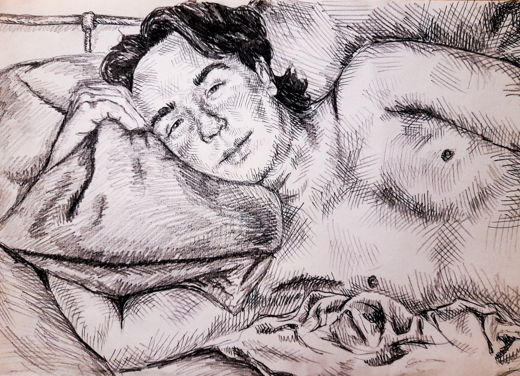
Pose Two- Seated
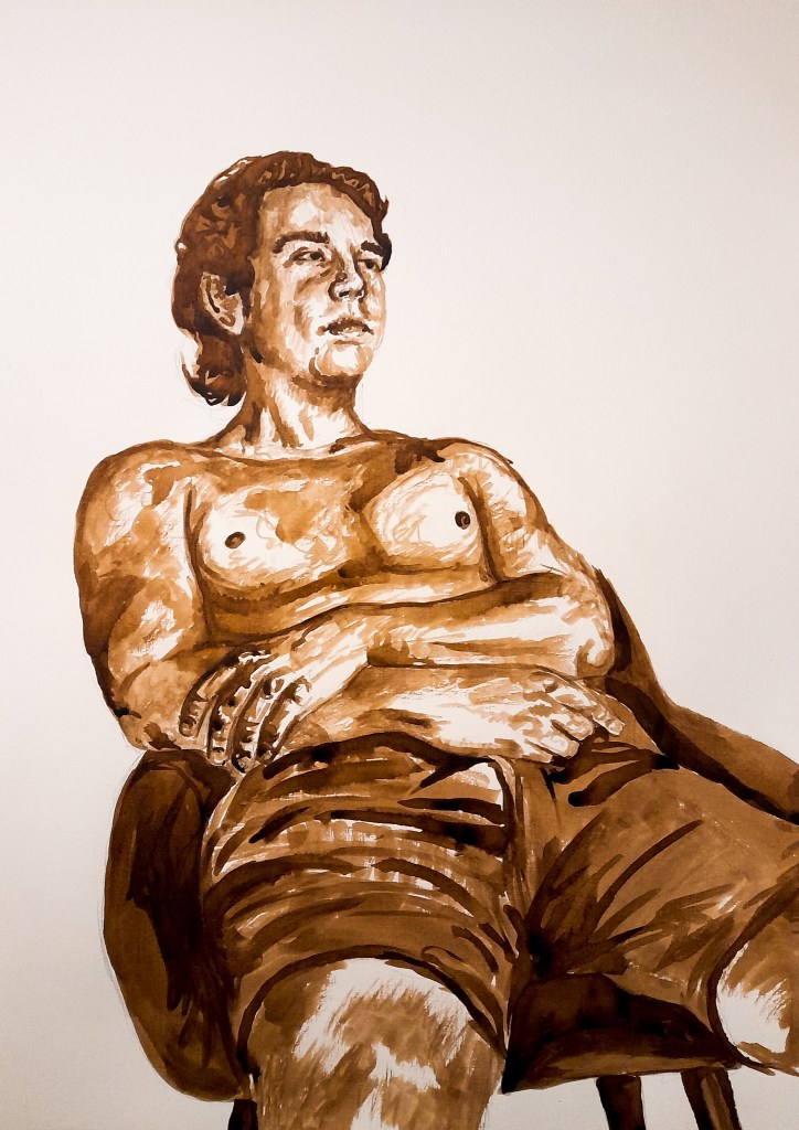
For this drawing I wanted more of an emphasis on tone rather than line in order to reach out and explore other drawing approaches. I left the background plain as I loved the contrast of the dark tonal portrait against the stark white background. It took a lot of layers to get some of the areas so dark, and again I feel the proportions are accurate. I think the face could have been better and more detailed and the hair should have been darker. But I am happy with this approach. For the next piece I wanted to look again at combining mediums for a fuller, richer drawing. I liked the effect of ink and watercolour and so for my next piece wanted to look at a watercolour base and layering other mediums on top.
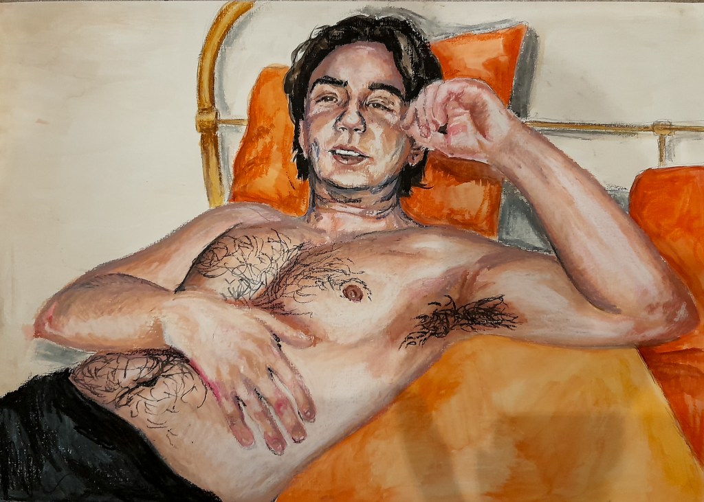
Pose Three- Lounging
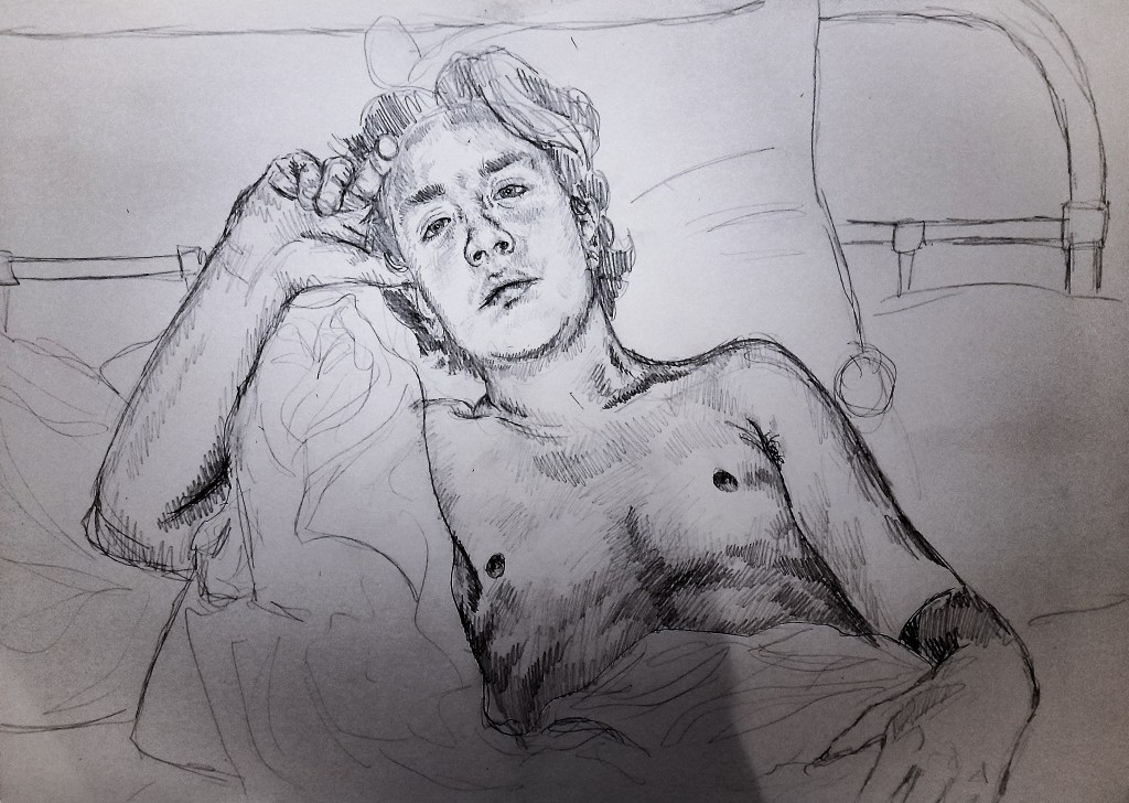
Pencil Sketch 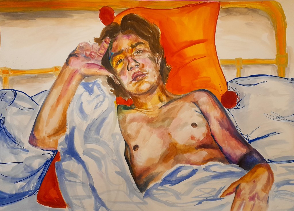
Watercolour layer
I began with a pencil sketch of the position my model and I settled for, before moving on to adding a layer of watercolour. I emphasised the saturation of the colour in places to make for a vibrant and eye catching study. I played around with the POSCA Paint Markers and how they could fit in, I used them to outliner parts of the background such as pillows and the bed frame. I thought about what medium to layer on top for the final touch of detail, I thought of using coloured pencils like my last attempt but decided to try layering oil pastels instead.
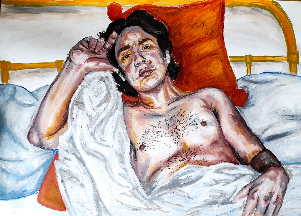
I absolutely love how this came out, I love how the colours blended together and how it looks like a painting. I love how the oil pastel colours grounded the over saturated colours of the watercolour layer and made everything feel a lot more weighted and heavy within the drawing. The new colours add life and reality into the piece. I liked the composition of how he is resting but making eye contact with me, it adds an intensity and makes the piece feel more personal. I feel my use of oil pastel on the pillows and white sheet added some weight to the background as well, the image flows and the background doesn’t feel separate to the model which I am very happy about. I actually love how this piece came out and is probably my favourite that I have produced so far on the course. I want to look into combining the mediums of watercolour and oil pastels more in the future as I think it produced a wonderful piece, especially for the depiction of my models skin tone.
Working through these drawings and thinking on my previous exercise and artist research of what lies underneath the skin of a body definitely helped to portray the body accurately and have the bodies presence feel real and weighted within the drawings. It helped me to create strong poses that have weight to them and helped in connecting all of the limbs together to form a real, accurate body within my drawings. Not only was I able to think about the body in more depth and accuracy but I was able to branch out and explore different mediums, and I will certainly be utilising the idea of combining watercolor and oil pastels again, I think the results from that combination have been beautiful so far. I want to look more into what mediums to combine to create a drawing utilising line in a strong and effective way as one of the assignment pieces will have a focus on my use of line. I am happy with how Part 4 has advanced my knowledge and skills.
The structure of the human body
Understanding the parts that make up the body is useful to putting the pieces together in an accurate and proportionate way. Knowing the different ways the joints can move and the bones underneath can help me to accurately depict the body as a whole or separately.
Pencil in A3 sketch book
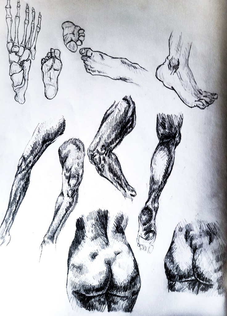
I began by looking at the feet, firstly the structure with the bones. Then the shape. Before moving to study the ankles, legs and hips. I studied images both off of Google but also from a book, ‘Nudes’ by Daniel Maidman, which looks at studies of the body. I can see how the parts fit into shapes and certain measurements, like the length of toes compared to one another and where the ankle is positioned.
Pencil on paper
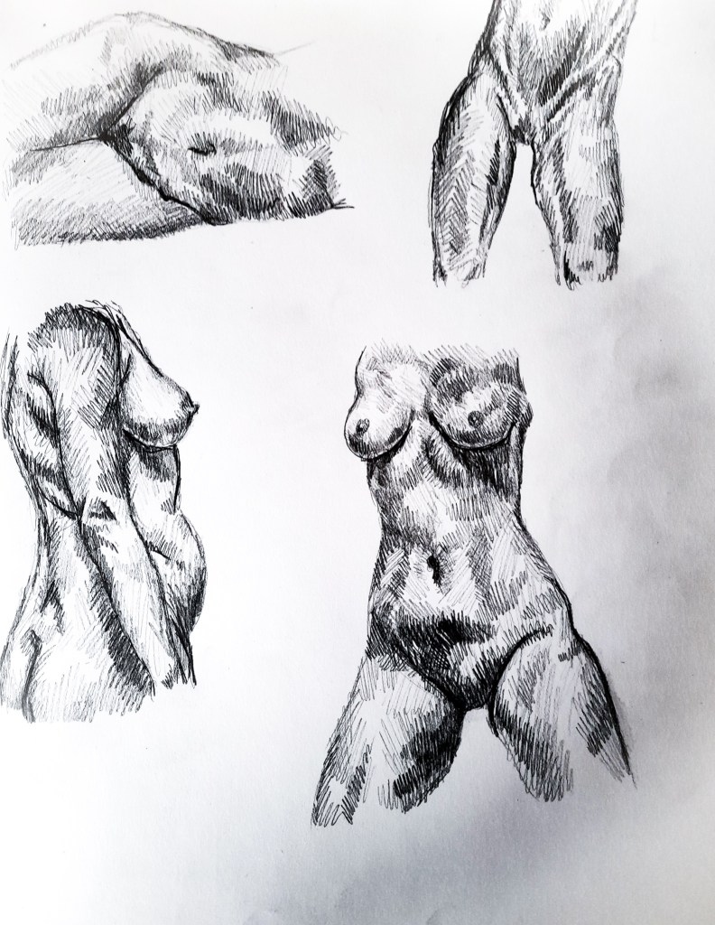
On the next page I began looking at the thighs, how they connect to our hips and waist, and how the torso is formed. I am happy with how these came out but the top right drawing looks disproportionate and inaccurate. I chose to focus on the female torso as I haven’t had much chance to look at it with my model being male. I wanted to look at the natural curves and bumps the female body often has with help from the studies from Maidman’s book on the nude. I enjoy drawing the female torso as there is a lot more going on tonally with the shadows that are cast from the breasts, the way light affects each breast differently.
Pencil on paper
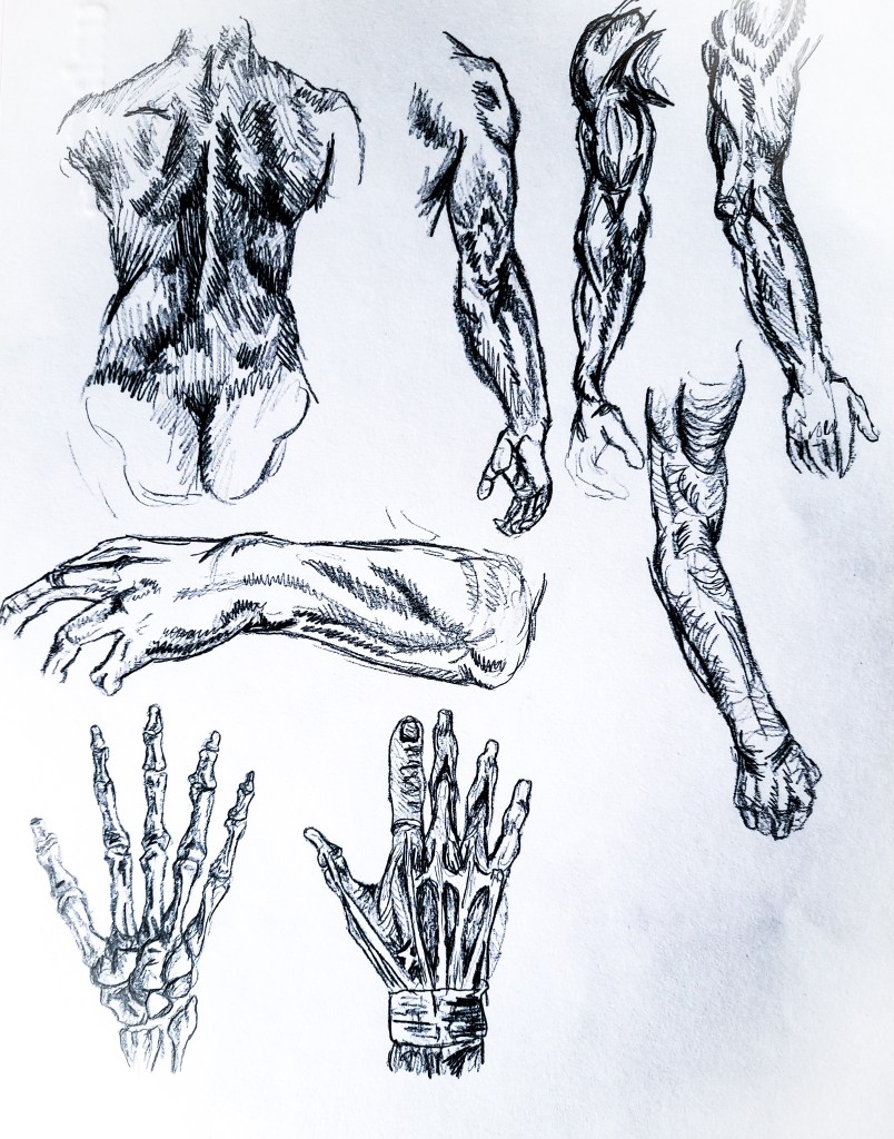
For these drawings I looked at the other side of the torso, the back, then to looking at the shoulders, arms and hands and those parts of the human figure all connect. You can see the shading of where certain muscles are on the back and the arms, and the proportions. I looked at the lengths of fingers, how the middle finger is always the longest and where the other fingers fall in length, this is useful to know for drawing hands. Looking at the bone structure of the hand helped me to identify where the knuckles should be which can sometimes be a bit tricky.
Pencil on paper
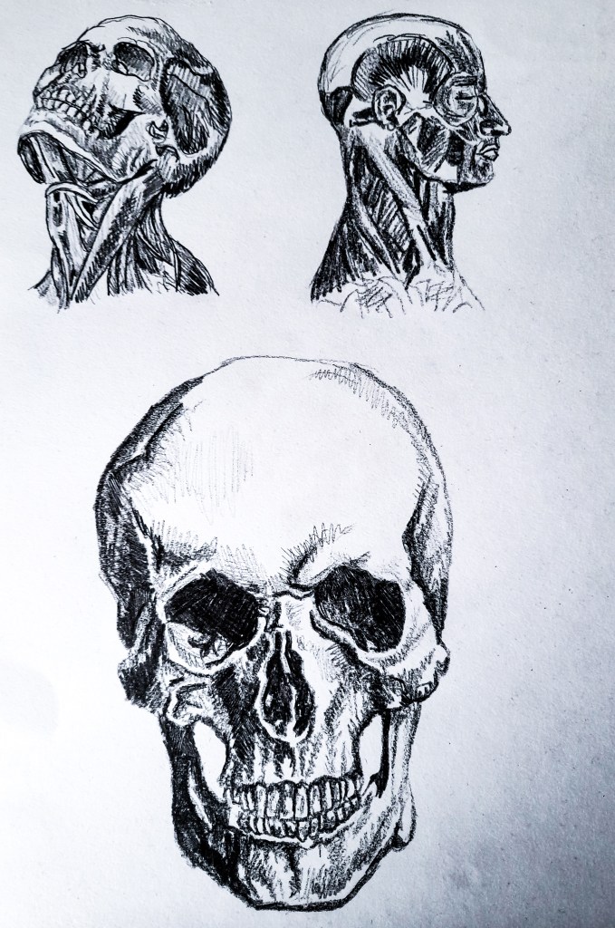
For the final sketches I looked at the neck and head, I chose to focus on the structures that make them up underneath the skin. The top two sketches were very useful in looking at how the head connects to the neck, a vital part of a drawing as this connects the two important parts of a portrait, the head to the body.
Understanding the body and its many parts is crucial for creating an accurate and proportionate depiction of the human body. Body parts for different people don’t all look the same, my model for instance is a tad short so his leg proportions may not look like a 6ft mans legs proportions. But there are rules that are generally the same for many people, for instance toe and finger lengths, the ratios of limbs. But having a good general understanding, which this exercise helped me develop, will help make tackling drawing the many bodies out there a lot easier.
References
Nudes, by Daniel Maidman- (Maidman, D. (2017). Nudes. [online] California, USA: Griffith Moon Publishing, p.120. Available at: https://books.google.co.uk/books/about/Daniel_Maidman_Nudes.html?id=TTzGtAEACAAJ&source=kp_book_description&redir_esc=y [Accessed 11 Dec. 2020].)
