I had a few modeling sessions to explore this and setting them up took work and time. I found a different model to work with for my first experiment to try a fresh new face. It would give me some new facial features to get my head around, as I was getting used to Joe’s (my previous model) facial features. So I thought it would be interesting to look at my friend, Jay’s, sharper facial structure.
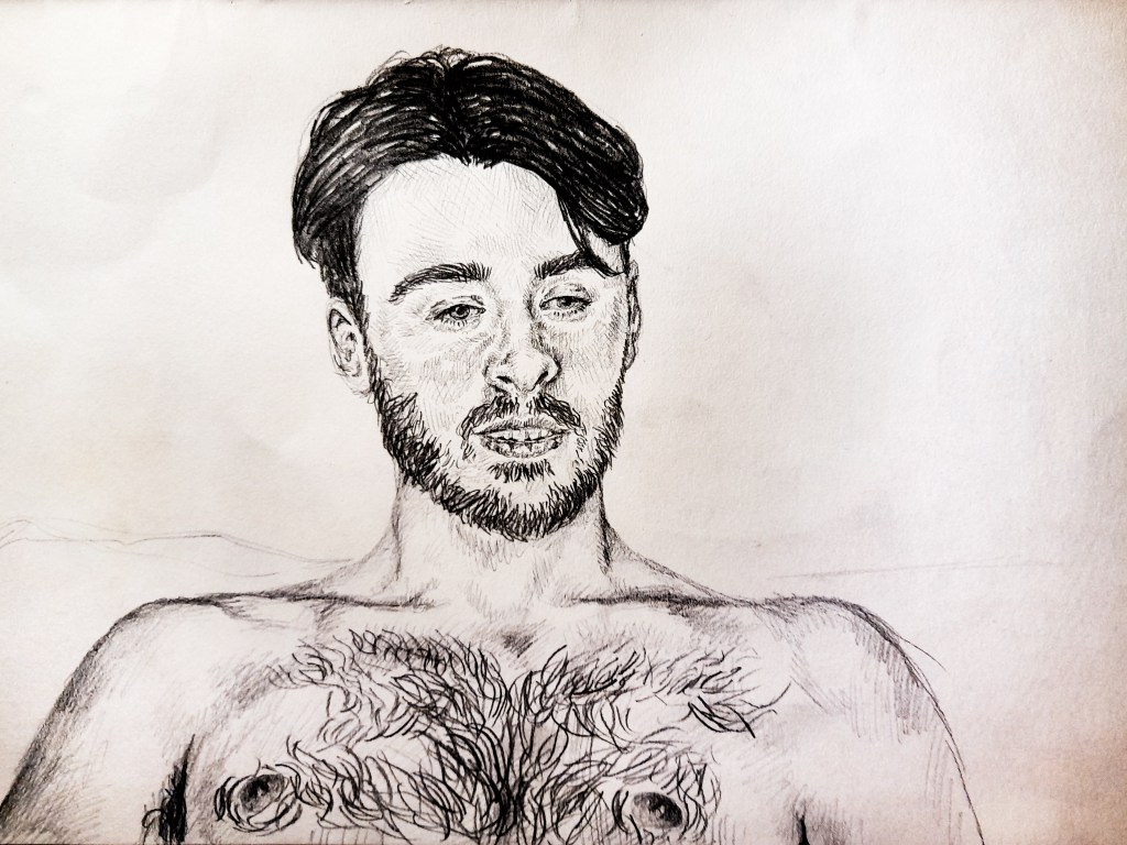
I began with a pencil drawing, a medium I’m used to, as I looked at capturing a face I haven’t before. And I really like the result. Jay’s face is very different to Joe’s so it was interesting trying to capture his distinct, sharp features. I decided as I moved on to trying out a new medium for this project, a sharp and bold medium could suit capturing his bold facial structure quite well.
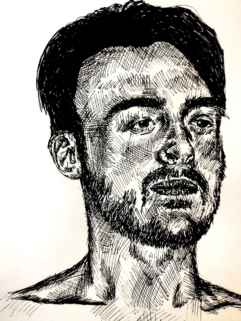
I think I achieved the bold look I was going for and I think it works well for my models face here. Although I think it looks good, I don’t think it fits into the vibe and style I want to go for, and what would work best with what I want to create. Something softer like gouache would be ideal. But I do want to keep some of the lines from my original sketch, to emphasise the drawing aspect rather than the paint.
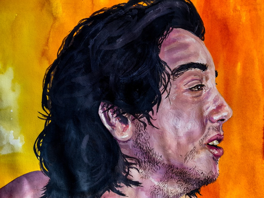
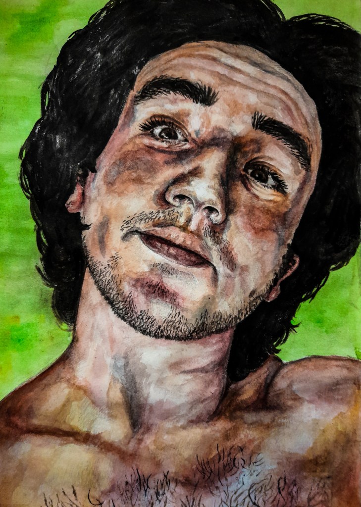
For this piece, I began with a pencil sketch before coating it in a layer of orange watercolour paint. This would be the base for capturing my models warm skin tone, the orange colour would peak through the pink and blue gouache paint to create a balanced skin tone. I like the thick effect of gouache paint, however it doesn’t allow for the original pencil work to shine through at all. I also think I need to practice at effectively blending all the different skin tones so the finished effect isn’t so blotchy. The eyes could have been executed in a more delicate way to achieve a more real look. It’s something I’d have to work on to use effectively on a assessment piece. But the softer approach the medium provides creates a more friendly comforting style to the piece which works much better than the ink.
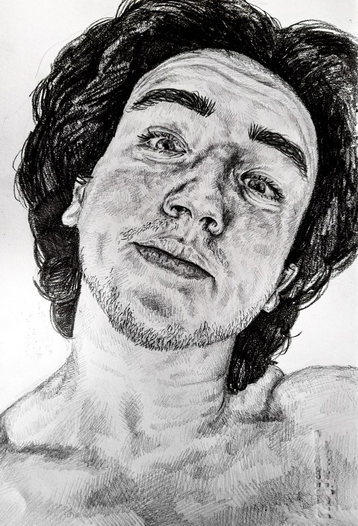
For this next experiment I began with a very detailed drawing of a headshot of my model. Using HB for the skin and finer details and 6B for the thick, dark hair. I really love the detail I was able to capture with this drawing. I chose a closer head shot to allow myself space to practice the facial features as I would be working on a larger scale for the assessment piece. Again I think his facial expressions add so much character and fun to the drawing.
What I like about this is it allows the original drawing to shine through. Unlike the gouache it doesn’t cover up the pencil work but adds to it. This attempt also looks a lot more realistic than my gouache attempt. I began with my placement of shadows using a dark blue to lay this down before going at the skin with skin tones as a hole. I left areas without paint for highlights and used a thin brush to add finer details and shading where needed. I love how this came out and was going to be my choice for my assessment piece no doubt. Thinking about how to approach the background with the bed and sheets, I thought gouache could work well there being thick and bold. I wouldn’t need too much detail and being a slightly different texture and consistency it could emphasise the portrait rather than take away.
Without a doubt watercolour was going to be the best choice moving forwards. Now all I had to do was decide what position out of the few I looked at would work best.
