Exercise 2- Essential elements
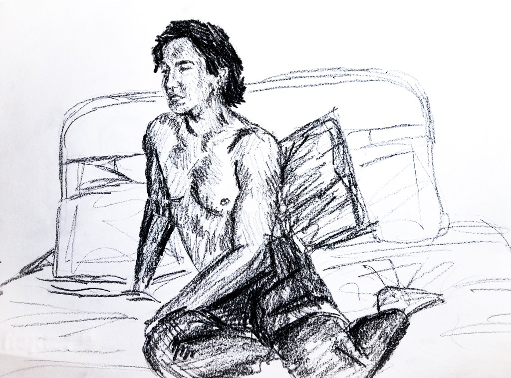
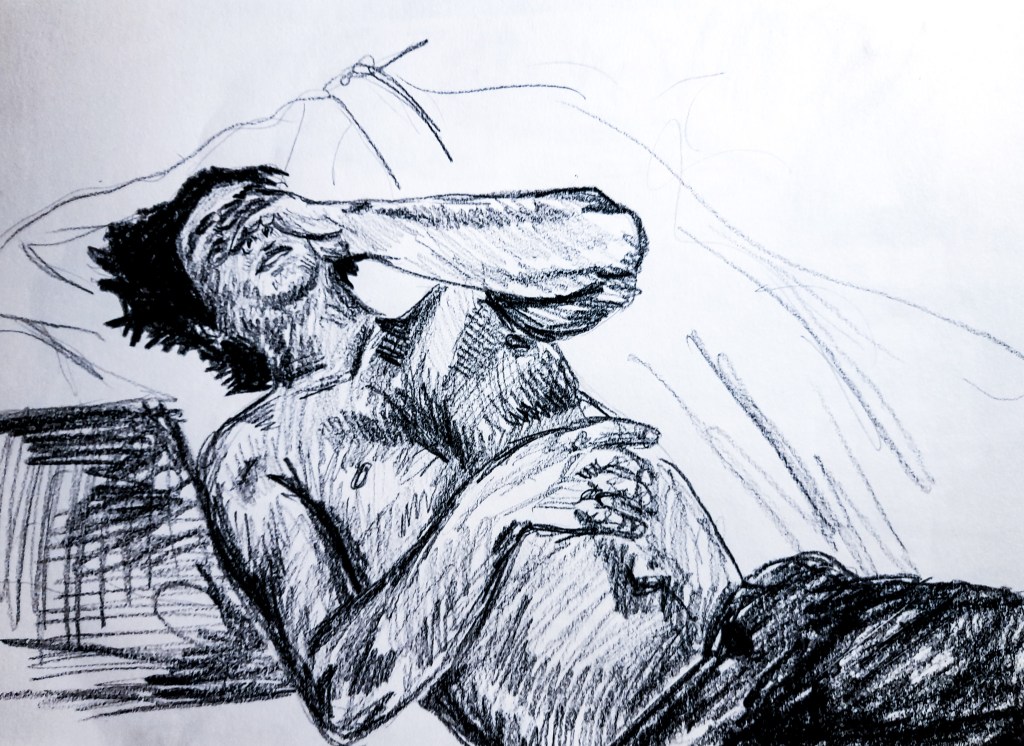
For this exercise I was to draw 6 different poses, each in 10 minutes, very similar to an earlier exercise. I set up a light to the side to create shadows and tone from the curves and shape of my models body, which worked quite well. I had him take up a variety of poses on the bed to get a better look at his body and proportions as so far my focus has remained around the waist up.
Lead on A4 paper
For my first 3 drawings, I looked from a side view, level with my model. You can see that my light source comes in from the right corner of the room, casting dark shadows over the shape of his chest. It was hard in the last two to create an accurate side profile with such a short amount of time to capture everything else in the scene, especially his body. I think my use of tone adds a sense of weight. I think there is also a sense of 3-Dimensional form but there is still a bit of flatness to my sketches here, and I think that may be due to the lack of tone within the surroundings. I think I did well at capturing the models central axis, and how his body works with that. The proportions are accurate and work well to present an accurate depiction of my models body.
I think to improve on these I should look at developing more of the surrounding environment of the model to help show their weight and presence in the drawings environment.
4 
5 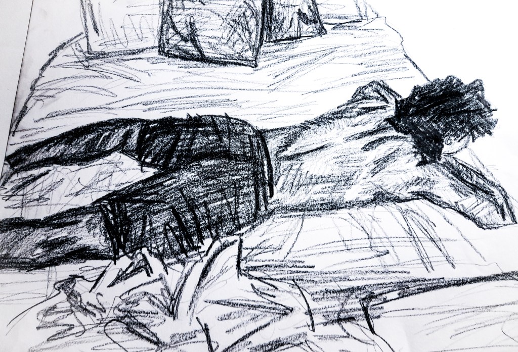
6
Lead on A4 paper
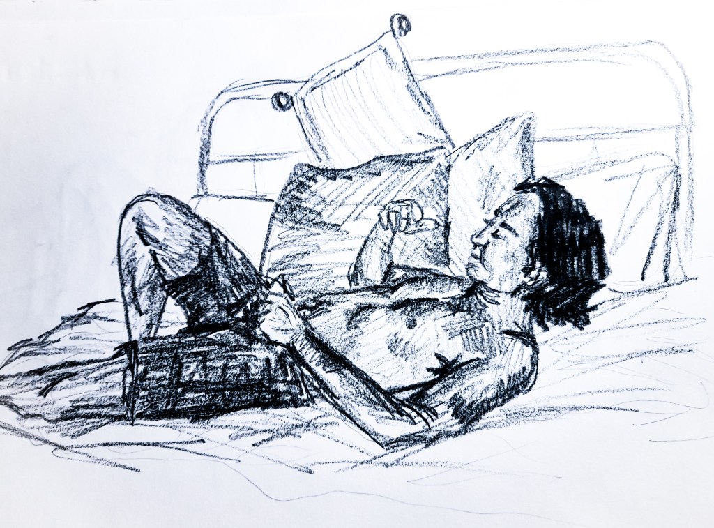
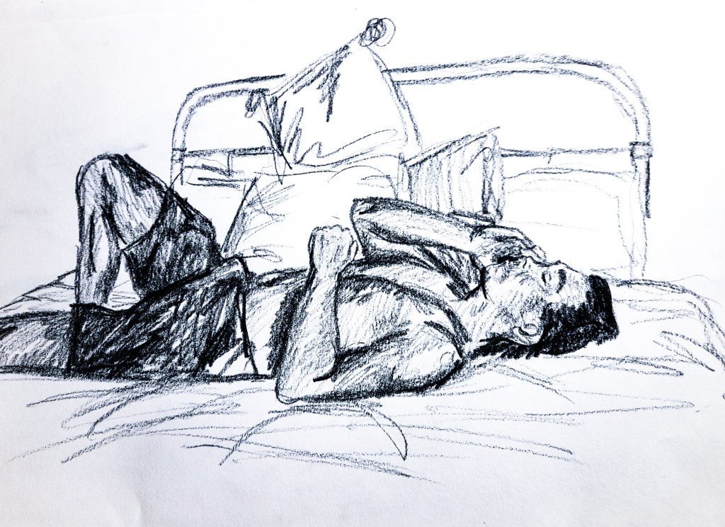
With these three sketches, I looked at changing my perspective to something more aerial, looking from above. With this point of view I get a new look at how the light cascades over his body. I think in these three sketches, I was able to depict a sense of weight to the body much more effectively, possibly due to the viewpoint of looking down on the model. I think my fourth drawing here shows the best sense of a pose. It has weight to it, you can see the heaviness of his arms and posture as he holds them up. Again I feel all of my sketches show an accurate portrayal of his proportions, and with my sixth sketch, I found I had a bit more time to explore the surrounding environment of the model, and sued tone to shoe his weight more effectively resting upon the bed. With my fourth sketch there was an obvious gesture away from the central axis with the models arms and shoulders leaning away from his body. I feel I identified this within my sketch with how I used line to present the arms, and tone to show the shadows highlighting this movement in his body.
This exercise was useful to further my experience of depicting the body and its posture. Tonally, I feel I am improving on how I depict the body in different poses, and I feel my drawings are getting more and more accurate as I go through the exercises. MY proportions are doing great, but again I feel I should experiment with my use of tone and what medium will best present the model and the body with my style of drawing. I feel my depictions of the body are greatly improving, showing weight and posture with my use of tone effectively.
Stance
Moving away from looking at more relaxed positions of the body, with this exercise I look into stance and how to accurately depict the body standing, even how the body twists as the model leans against a wall. For this exercise I switched up my choice of medium to a fine liner pen, sticking to a familiar monochromatic theme but trying something more permanent than a pencil and bolder in some ways.
Fine liner on A4 paper
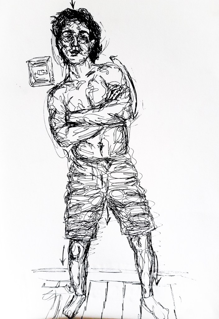
For my first two poses, my model went for more ‘posey’ stances than natural ones. With my first sketch, I looked for the line of balance. You can see where about the line is placed within the body, from the skull through the spine. His feet were good to draw, as they were separated and therefore spread out the weight of his stance. You can see this clearly in my quick sketch I feel. In the second sketch, you can see that with his chosen stance all the weight is shifted onto his right foot (the straight leg). The line of balance can be seen to shift through to the hip of the leg holding his weight. I am happy with how I portrayed this.
With my depiction of tone, I used line to help create a sense of light and dark around his body. I feel the loose lines work well to convey tone on his body but not so much on his face. The face, I find, is quite delicate and difficult to portray when not the main focus of the sketch. Especially working on a short time frame, the bold pen lines confuse and add too much detail to an already very detailed part of the body. With the body, I think used enough line to create a good depiction, without overdoing it.
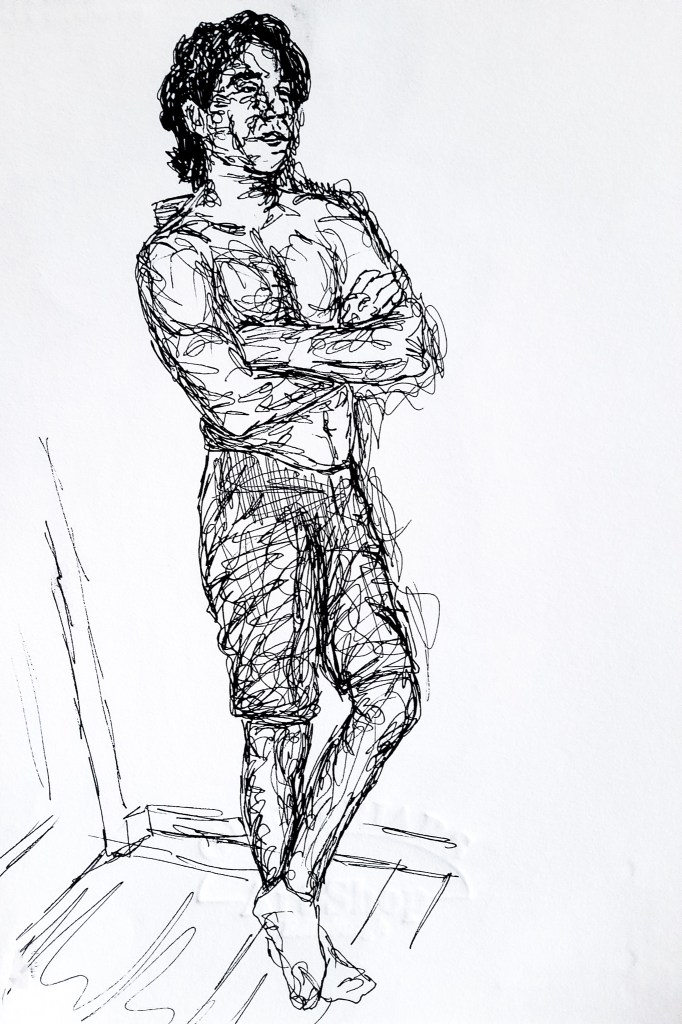
Fine liner on A4 paper
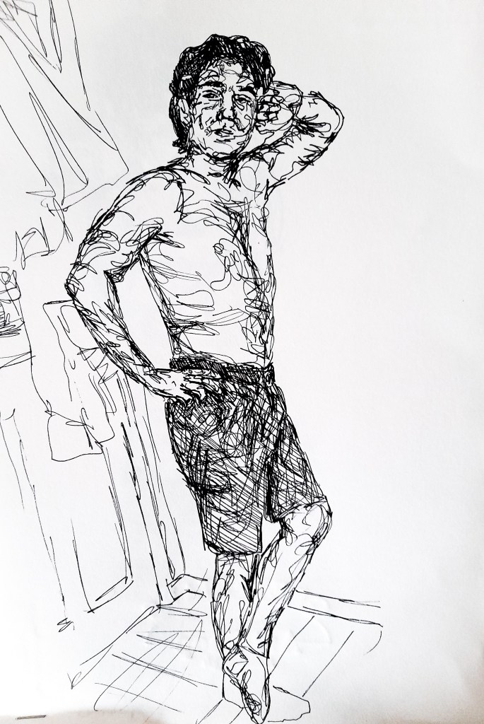
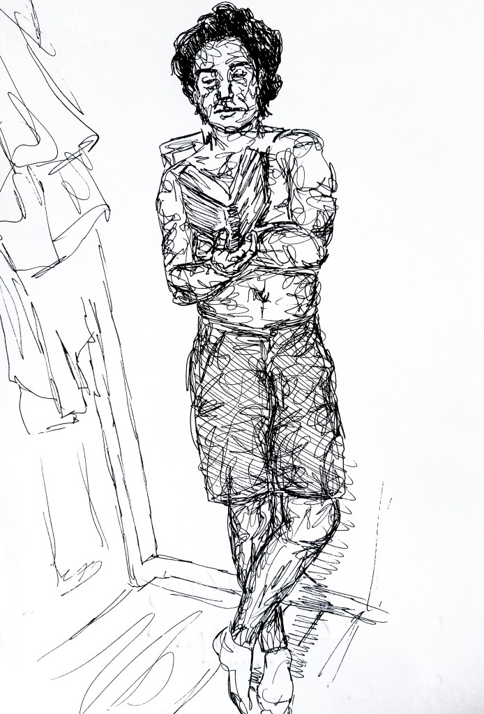
For these final two poses, a more relaxed stance was chosen by the model. I gave him a book to hold and relax him up from the previous ‘posed’ stances he took on before. With his shoulders much more relaxed we see the line of balance and shift of weight has landed on his left shoulder and right foot. His left shoulder due to him leaning on a wall, and his right foot due to him relaxing his left leg. The central axis is fairly straight, with the line of balance keeping to his spine and shifting slightly to his right hip and down his right leg. Throughout this exercise I have kept my proportions accurate. Again with these two sketches, my tone is good on the body but a bit confusing on the face. I feel the final sketch best depicted his face and likeness.
These exercise were really helpful for me to take the time to focus on more than what I see but also what lays behind the scene and inside the body. Finding a line of balance and a central axis is key for me not only to depict accurate proportions but to create a sense of reality to a drawing. Without a sense of gravity and weight to a body, it feels off and abnormal. Showing this weight within a posture interacting with the scene around the model can aid a drawing in feeling real, that the person is real and has an effect in the environment of the drawing. Pen was for capturing the body, but not so much the face, at least from a distance. So I do not think that this is an ideal medium for me to work with when looking at the human form. I feel oil pastels will work great for portraying a more dynamic scene with movement, which may work well for project 5. Working large for the next exercise, which does look at movement, sticking to charcoal may work better for now. I am happy with my progress and can’t wait to see how I improve as I develop my skills of capturing the human figure.
