Exercise 1- Drawing fabric using line and tone
I began these exercises thinking back on drawing techniques I have learned so far and how to apply them to a material contrasting what I have looked at before. Fabric can be loose and flowing, which is the opposite of everything I have really looked at so far. I was nervous to tackle something so drastically different to everything I have drawn before. I used 5B and 6B sketching pencils in order to have thick, dark and loose lines within my drawing, it would help me to focus on my use of line and tone.
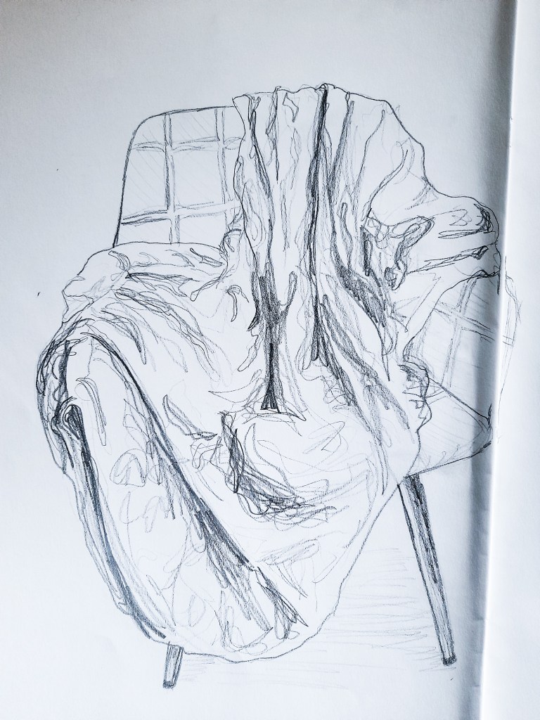
I made huge error with my use of composition and ended up with a drawing leaning over to the next page, which was quite annoying, but it made me aware of where to start on my drawing for the tonal sketch. Rookie error. I used a 5B pencil to have bold lines so I could get to grips with the shape of the fabric, where it folds and to point out the main creases. It was useful to get to know the rough shape of the fabric before working on my next drawing going into more detail. I found I quite enjoy the looseness of the fabric and was excited to move onto looking at the more tonal and detailed aspects of the sheet.
I liked the contrast between the sturdiness of the chair and the loose fabric, but also how the space in the chair is still present by how the fabric folds and fills up the floor of the space in the seat. I think this will become a lot more obvious as I move on to look at this composition tonally.
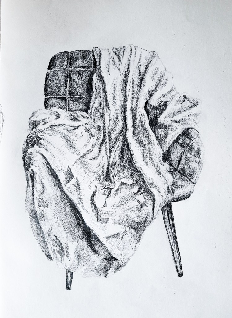
I really enjoyed this drawing and I love how it came out. I love the contrast between the texture of the chair and the fabric and I think I really captured the shape of the fabric. For this part of the exercise i used crosshatching to capture the areas of tone and the the shapes of the shadows cast by the fabrics folds and creases. The light comes in at an angle with casts lots of shaded areas, but is still quite bright overall. I think had I used a more controllable light source, like a lamp in a dark room, I could have created a tonally interesting drawing with a mysterious atmosphere. The dark green, velvet chair really stands out against the fabric. The contrast between the quilted fabric of the chair and the loose white sheet works well to show off the different textures of the two materials and helps to push the focus on the white sheet. I think I captured the bulky, gathered body of the sheet as it is rather bunched up but also how it is a thin loose fabric that falls delicately off the chair. I think to move forward with fabrics as I go into more detailed drawings I should look at blending out my cross hatching for a more defined drawing than a sketch. But for a 15 minute exercise I am happy with my outcome today.
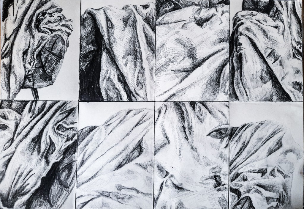
For the next part of exercise 1 I kept my focus on my use of pencil and used a variety of drawing pencils, combining them to see how the different thickness and blackness helped me to capture the fabric. In wide areas of the fabric, areas with fewer creases I leaned towards using thinner 3B to 4B pencils, which helped create a more balanced and less intense tonal area. When things got darker, so the chair peeking through or areas with lots of shade and creases I used 5B to 6B pencils to really capture and emphasise these areas. I liked how these came out but I feel I could have been more experimentative. I want to look at more mediums, I feel oil pastel could be great at capturing loose materials like fabric, ink could also be interesting, especially walnut ink and how I can layer it for tone. So although I am happy with the outcome, I spent a lot of time getting used to capturing fabric in one medium and I would like to revisit this exercise with oil pastels and walnut ink before moving on to Project 2. Furthermore, since these were quick sketches between 5 to 10 minutes, I kept to a lot of cross hatching, and I think for tackling more serious pencil drawings I should start to look at blended these areas out.
Exercise 2- Emphasising form and cloth
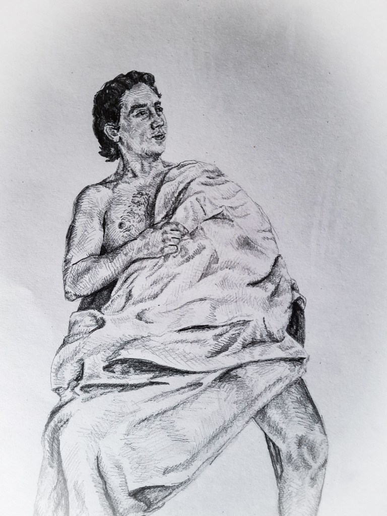
For this live drawing, I opted for a smaller A4 sketch book to capture the moment and the model. I had him sit naked in order to keep a focus on his actual body and the fabric covering him. The chair is hardly in the composition which worried me at first, as I thought it might make the drawing look odd, but I came to like the finished result. It was almost as if my model became the chair and the fabric was sitting on him. He became inanimate and the fabric became living, taking up space on him. I think I struggled with capturing the fabric on his shoulder, it’s quite spread out but I think you can still make out the shape of his arm underneath, it helps that his other arm is exposed and leaning in to interact with his hidden hand.
Towards the center of the drawing the fabric bunches up and doesn’t really show his shape and form underneath very well which isn’t the best but helps me to focus on how to lay out and direct the model and the composition of my live study next time around. I think my favourite thing that I have captured in this drawing is his legs. His ‘manspreading’ stretches out the fabric towards the bottom of my drawing, letting it drape quite nicely between his legs. You can see the shape of his knee in the bottom left crease which helps depict his legs as the chair legs, in a strong stance.
I am happy with how this came out, I didn’t capture the fabric as well as I did in exercise 1, so I wanted to try again but in a closer viewpoint.
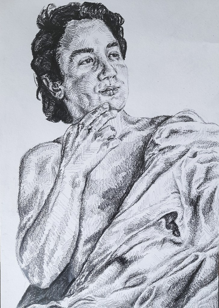
With this closer composition I ended up with a rectangle of the models upper torso, split in a diagonal line between his body(skin) and the fabric, which gave me a bit of both to work with and look at in this quick sketch. I think my favourite part is his arm/hand, I feel it draws in the viewers gaze and becomes the focal point of this sketch. I think I used line well to really capture the shape and gesture of his arm and hand, resting on his face. It adds interest to the composition. With this closer angle I was able to capture more of the intricacies of the fabric. The curves and angles. You can just see the shape of his arm, however with this close of a view I wasn’t able to completely focus on how the fabric reacts to the the more drastic shapes of his body, such as his leg spread out underneath the fabric. But I was able to look at how it rests on top of his body without the sharp shapes of his limbs. I think oil pastels could work brilliantly to capture his body and the fabric, however I am unsure whether I will be able to capture the detail of his face with such a rounded and soft medium. Ink might be better for capturing those sharper details.
Moving forward
Moving forward I think its time I got a bit creative with my approach and take my time to really explore different mediums and how they can capture the human body and how fabric reacts to it. Oil pastels, as I have mentioned, I think would be great for capturing the gesture of the body as well as the loose fabric. It would be ideal for a softer approach. Ink could be a good option for capturing both the softer aspects of the fabric and the sharper aspects and details of the creases and body. I’d like to go back and explore these ideas before moving on to Project 2. However I am happy with my progress so far and I like what I have produced in these exercises.
I should also read into the context and ideas behind studying the form. The different approaches to both the male and female form. This is also something I want to really look at and delve into for Part 5 and looking at producing my own work with my own ideas. So research into these areas will be useful not only for the current Part 4, but also for my progress with my own work as an Artist for Part 5 with the personal project.
Mixing up my media
I went back to this exercise to really experiment with what effects I could achieve with oil pastels and walnut ink.
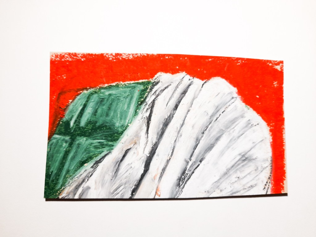
Oil pastel on paper.
I am really happy with the first drawing of a chair. I think I got quite close to resembling the fabric with the oil pastel. I blended it out with the white but I think I’ve got a bit of a way to go before being able to really show the fabric, as it does look quite flat. I made a mistake with outlining the shape of the chair which you can see with the top left of the drawing and so I used a bright red to create a background to mask the error. I am quite happy with how it came out, it makes the green chair pop and really highlights the subject matter.
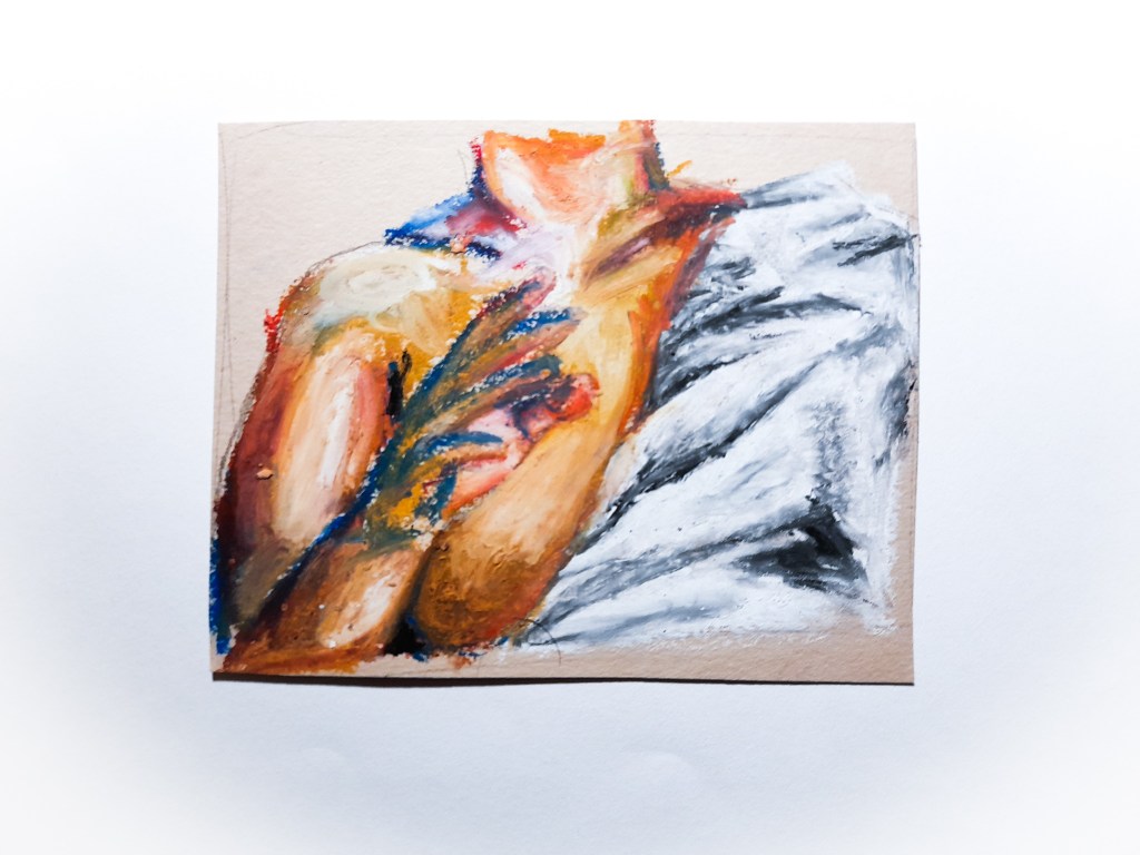
With my second drawing, the fabric draped over the body, again I feel the fabric depiction needs some work with this medium. I enjoyed working with colour to create a skin tone, its exaggerated, quite saturated, but I rather like how it looks. I think it would work better if it was blended more, for a smoother look. I was working on a smaller scale with this drawing so this might be easier to achieve on a larger scale drawing.
I like the effects of oil but I am not sure if its for me. I think I’d like to explore a wider ranger of media and possibilities when it comes to Drawing in Part 4.
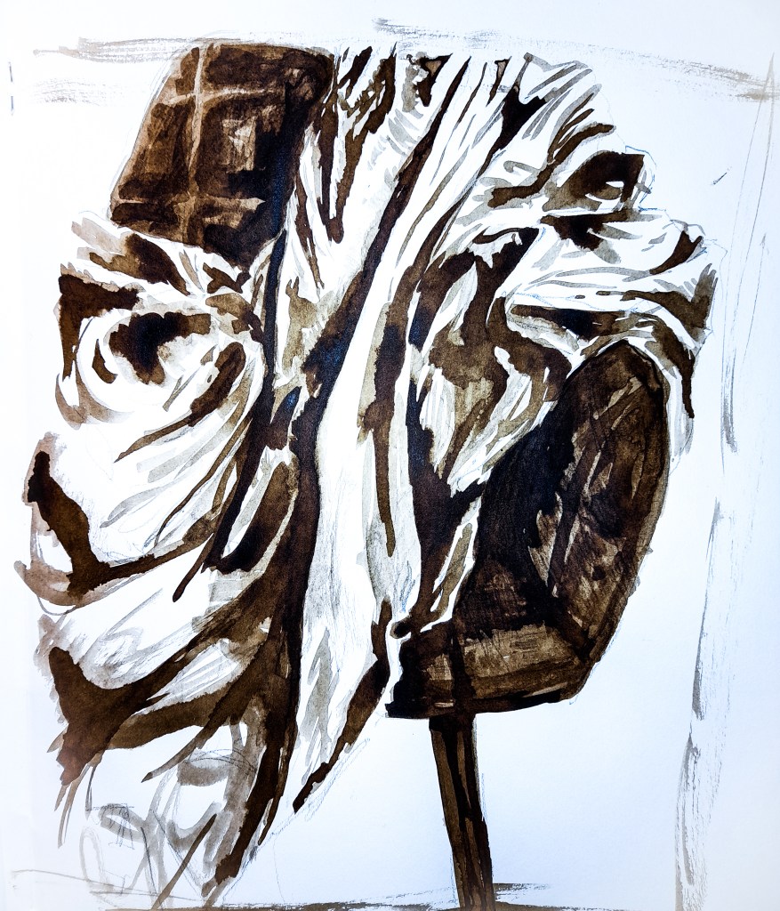
I really liked how this turned out, when it comes to drawing I really love a monochromatic palette. I don’t know how well ink will translate to capturing facial features, but I think it works really well in capturing the fabric on the chair. I think ink could work well capturing a fluid, in motion drawing. Someone moving fast, as the wet medium could translate that effectively. I think exploring a wide range of mediums could be useful in me developing a style for this Part. I think I’m very particular about capturing realism and I should explore more stylistic approaches to capturing the body that maybe don’t fit into depicting something as I see it, but perhaps how I feel it, the emotions behind the drawing. I could try being more expressive as I explore different mediums and what they can offer in terms of capturing the body.
