I focused on two statues in Birmingham for this exercise. Firstly I looked at this peculiar statue that sits in the (was) fountain outside of the BMAG, it is now filled with plants instead of water, creating an interesting scene around the statue.
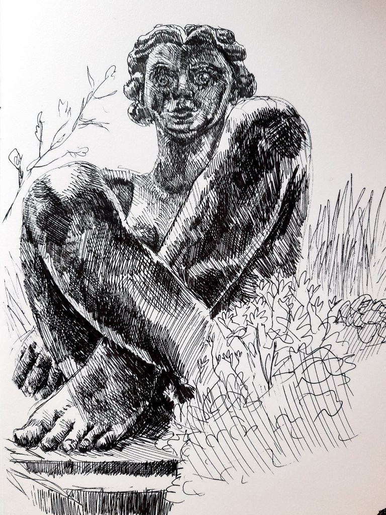
Drawing 1- Front facing 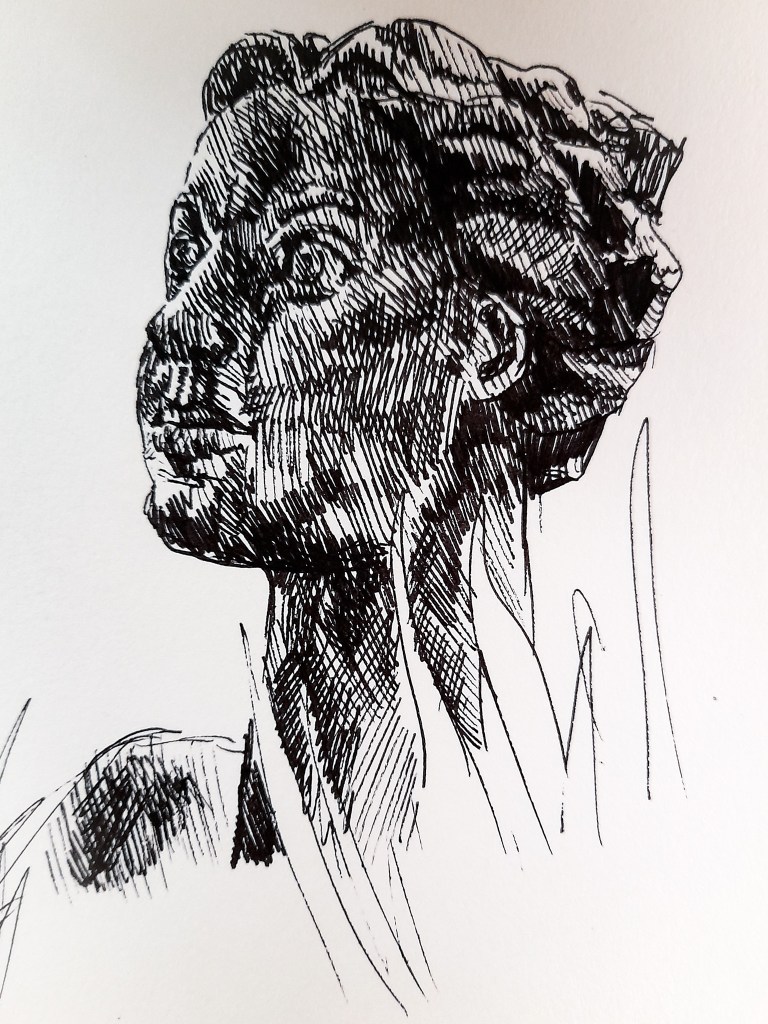
Drawing 2- Close up from the side
I found the composition of the statue unique and stylised. It’s not like the average statue you would find sitting around Birmingham, with stylised facial features and body proportions. The light came from her right side and created interesting shadows on her legs and cast a sharp line on her foot which I thought looked good for my drawing. I personally don’t like the style of her facial features, but it was a change of pace from the very realistic approaches practically everywhere else in Birmingham. She is a very big statue and I feel my first drawing really captures that. I focused on tone to help show the size of the statue and the smooth shape of the stone used. There wasn’t much texture but there were areas where the stone colour was darkened or lightened and worn, from being outside. The texture was smooth but the lightened and darkened stone allowed me to play around with my use of tone.
In my second Drawing I focused on a close of of her face from a different angle. It allowed me to capture the angled approach to her hair, it was that detailed other than angular shapes with some streaks to show locks of hair. I quite liked the approach as it wasn’t too complicated and fit with the simplified style the artist has gone for with this piece. I still prefer the first Drawing I did as it shows the body and more of the style of the Artist with his approach to the body, thickening and lengthening limbs, and shows more of her size. I am happy with these drawings, to improve I could spend more time on the surroundings of the plants and the city-scape behind her, but I wanted to keep the focus on the statue for this exercise. I think this is a composition I might want to explore in my assessment piece. But it doesn’t allow me to show off angular perspective so much as a focus on a building would.
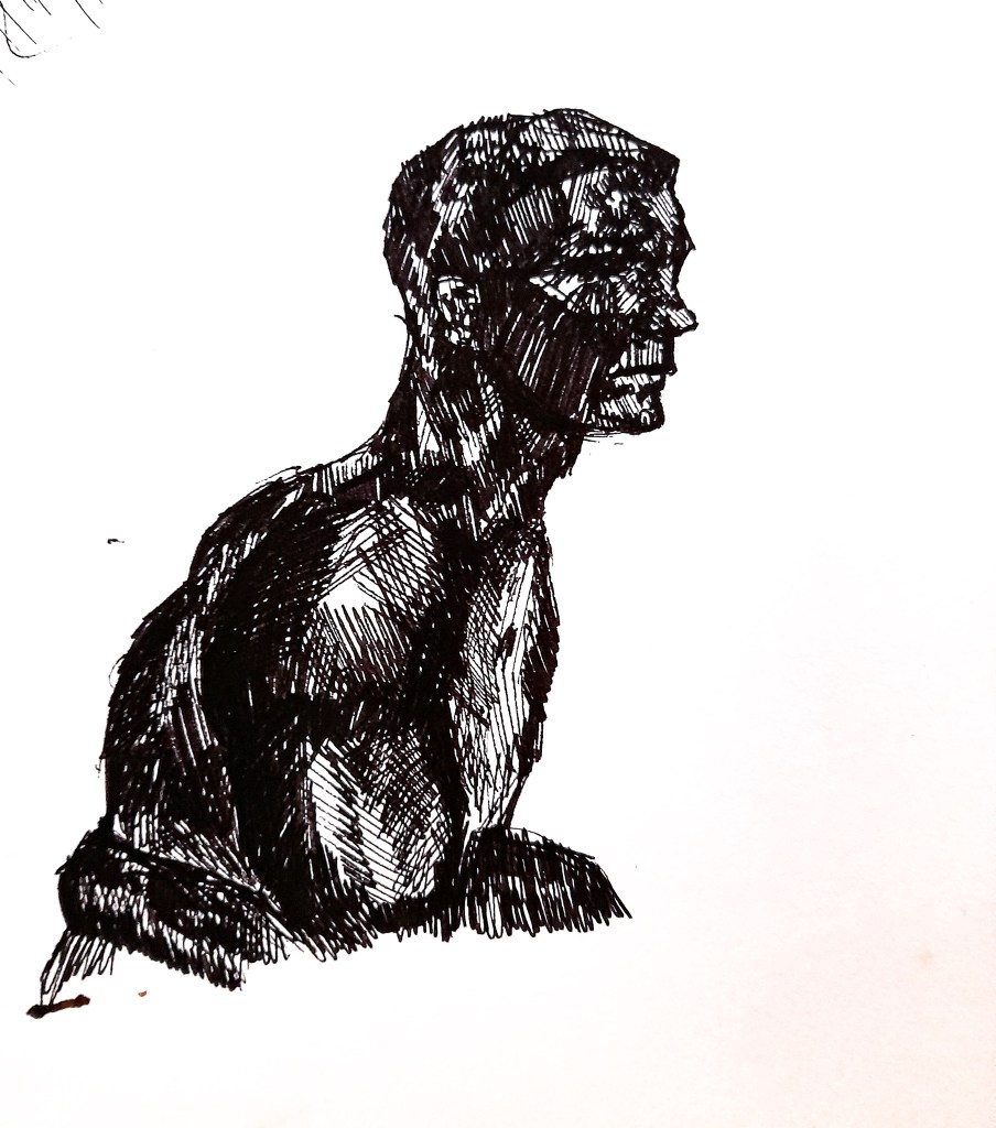
This statue is smaller than the first one I looked at at and is more level with me, I’m not looking up to it as much as I was with the previous statue. Compared to the previous stone statue, he was a glossy and black statue, with added a natural darkness to him compared to the grey, mid-tone stone from before. This all meant I could draw him from a level angle and really play around with tone to show the darkness of the material but also the shiny highlights from the glossy material which were fun to capture. He had quite sharp features on his face, which cast lots of interesting shadows. His arms were more rounded and allowed me to still capture an interesting highlight which was more rounded due to his muscles. I limited the tone initially to shapes of light and dark before using my crosshatching to blend it out and feel much more natural and real.
I found this statue much more interesting to depict, I loved approaching the natural dark tones and the the contrast of the shine from the glossy material. My forte is definitely portraiture so i felt more at home drawing this than my previous exercises with capturing a vast view of landscapes. I would like to perhaps explore capturing a statue for my assessment piece but this statue will not fit as there are no natural elements in the surrounding area to fit into the assessment criteria. I enjoyed capturing statues in this exercise and seeing my use of pen as a medium improve. I think I could experiment with pen and ink for my assessment piece, using pen to define the foreground and slowly bring in ink to help add depth with the middle ground and background. I can explore this idea with some preliminary sketches before deciding on what to do.
