Parallel perspective- An interior view
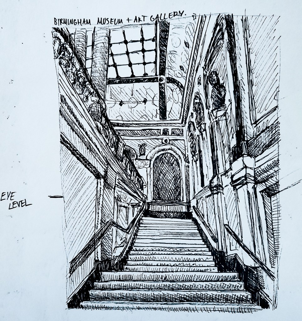
For my interior view although asked for a rug in the exercise, I was eager to try this complicated view I came across when visiting the BMAG. I thought that with all the lines present in the view it could be good to try for this exercise.
I began by doing all the basic proportional lines, the lines and angles for the stair way, the walls, columns and ceiling. I then went in adding the shapes to different areas such as all the rectangles for the individual stairs and lines for the wall and ceiling details before going in with cross hatching to apply tone to the sketch. I can see on the wall to the right hand side that the lines are not as parallel as they should be. The walls were hard with all of the different lines and panels in their design and were difficult to start off with. As this was a quick, live sketch I didn’t have a ruler on me to ensure that my lines would be straight and accurate, and that is something I should build upon. I should use tools like a ruler to make sure my drawings perspective and line work are accurate to help make a more accurate drawing. But I am happy with this as a first attempt. I like the composition of the piece, with the focal point being the stairs which guide the viewer eyes up to different areas of my drawing.
Initially when drawing I guesstimated where I thought my eye line was, but after getting home and using a ruler and pencil to see where the parallel lines line up I can see that they all meet on the same line and my eye line is actually a little bit higher than I anticipated it was. But it was interesting to see how the lines all met up with a ruler and that I had gotten the jist of my proportions and perspective right.
I found that by narrowing the drawing down to basic lines before going in trying to capture the detail it helped me to create a more proportionally accurate drawing which helped me to depict a much more dynamic drawing with good perspective.
Angular Perspective- Buildings
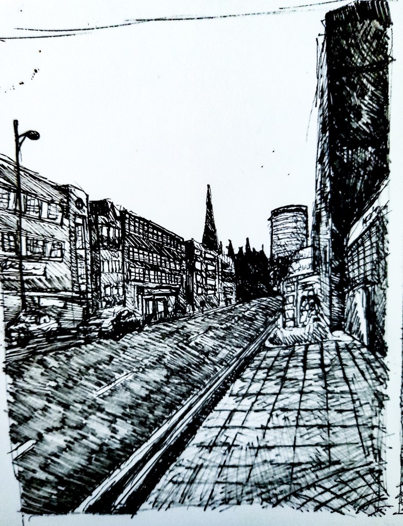
Drawing 1 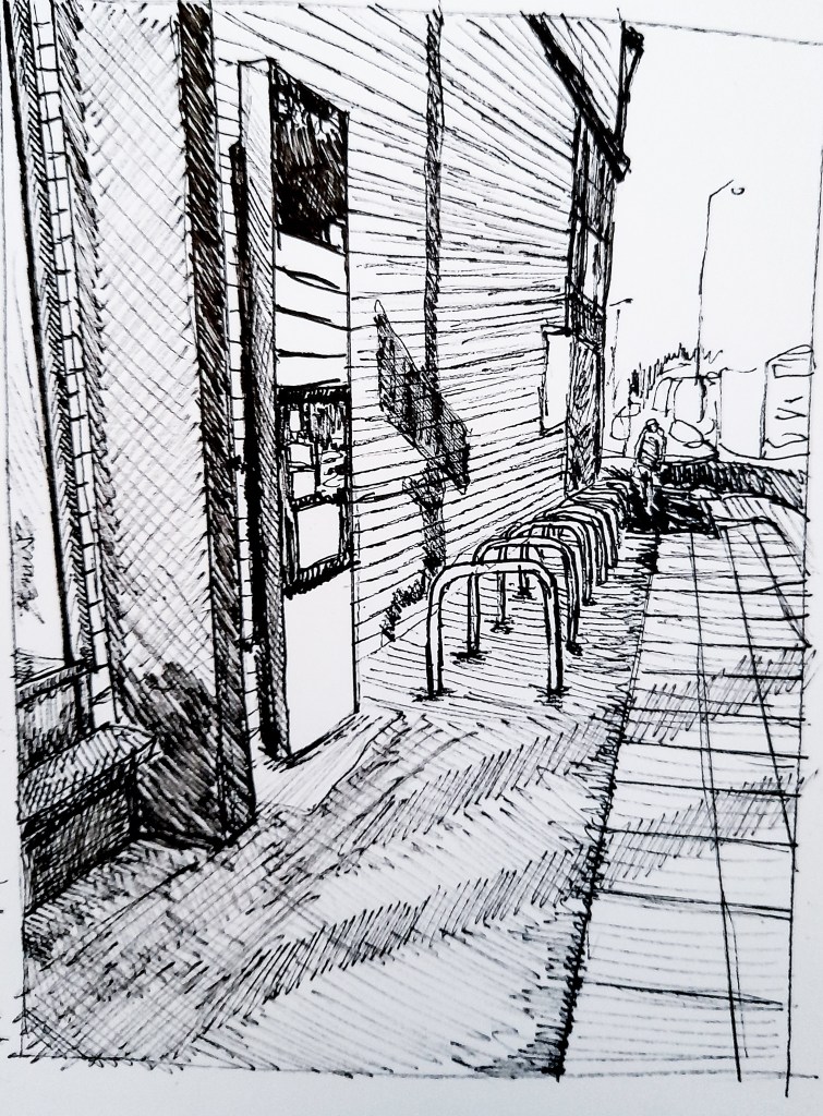
Drawing 2
I really enjoyed looking at perspective here and wanted to practice capturing a townscape scene since it has been quite difficult for me so far, so I made two attempts. Like before I began with basic line work before trying to capture any details which helped me with creating accurate proportions, before going in with cross hatching to add more tone and detail to my drawings.
I am happy with the outcomes and can see that my drawing skills with townscapes are improving. When I got home I took out a ruler to measure the lines and marked in my eye line and saw that the vanishing points met off the page for Drawing 2 but met within the drawing on Drawing 1, which was interesting to see how the different angles and how close I was changed this. A challenge in this exercise however was capturing the business of a town scene. The drawings were done in Birmingham so it was incredibly busy. In Drawing 1 I captured two cars driving towards me which was difficult since they were moving fast but I used tone to block in the basic shape of the cars. In Drawing 2 I was lucky that the road wasn’t as present in the piece but people walking by were, I manged to capture the rough shape of someone walking away from us towards the top right of the drawing. It was difficult to capture a bustling street for the first time but it was exciting to try and pick out what aspects of the changing scene to keep within my drawing and what changes to ignore. I kept this relatively simple for these drawings but I would like to try this again and really capture the fluid, changing scene of a city.
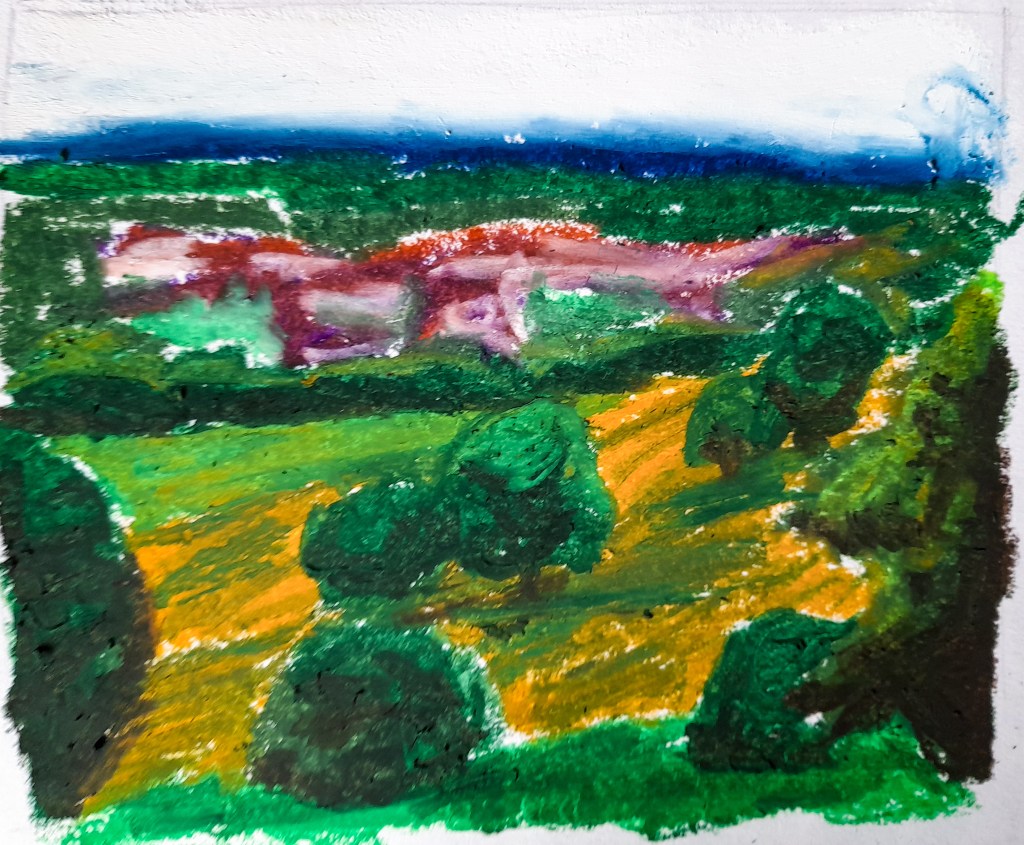
Aerial or Atmospheric Perspective
Drawing 1 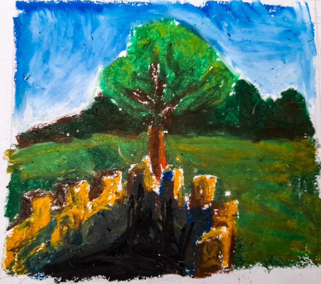
Drawing 2 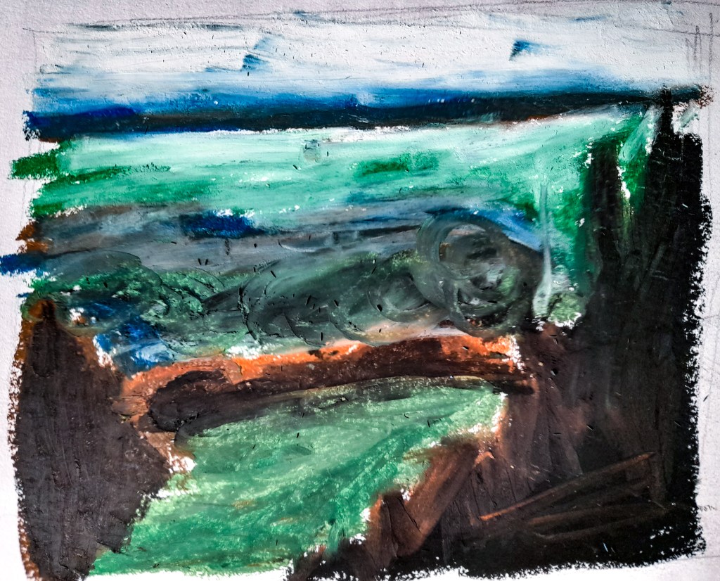
Drawing 3
Since for this exercise I would be tackling a vast view from above, I decided to switch up my medium and use oil pastels to try and tackle these aerial and atmospheric perspective sketches. For my location I chose the Lickey Hills as they are quite high up and from the top of the hills you can see out over the outskirts of Birmingham into the horizon. I went early in the morning in order to catch how the morning sun would cast shadows over the environment.
For Drawing 1 I chose a spot that overlooked some fields into a town. I blocked in my colours inspired by the more historical Artists I looked at but also by Nicholas Herbert and how he blocks in colours. I still wanted to have some level of detail and used colour blocking with my oil pastels to show how the light and shadows made up the trees that were closer by. For the houses I used a red toned brown, purple and white and blended them together to form a shape that could depict them effectively to show what they are from a distance. I limited my use of detail as I branched further out into the distance as the exercise suggested to help show and depict a vast distance. Out of the three drawings I think this one worked best, with the colours and the composition, its more interesting than the other two views I tried to depict.
For Drawing 2, I looked at the view from above when standing in the little castle on top of one of the hills. It wasn’t as aerial a perspective as the view point from Drawing 1 but I thought it was a view I could still explore well for this exercise. Again I blocked in colour to show tone and to make up the drawing as a whole. I used blues and blacks for the shadows within the castle which I think worked quite well but I wasn’t as happy with the composition. It didn’t come out as expansive as I had hoped it would.
For Drawing 3 I really went in on the style influence from Nicholas Herbert, and went for quite an abstract approach with blocks of colour as well as blending it all out as I reached the horizon. It’s not too clear that its a landscape and comes across more abstract than I would have liked, but I am glad that I experimented more with this style. It’s helped me figure out what works with oil pastel and my colour palette as well as new ways I can approach a large composition and view like this.
Moving Forward
I found these exercises helped me in capturing a scene and looking at the bigger picture as a whole, and how to properly develop a busy scene with lots of angles. I am happy with how a lot of these live sketches came out, and although I didn’t like what I did with the third exercise, I’m glad I tried to be a bit more experimentative and look at a new style and medium and how I can approach something as difficult as perspective within this style. It was a complete change to my pen drawings but I know that a more monochromatic style is what I’d really like to focus on for Part 3. I would like to test out ink and look at stylising my work in a way that would fit into my developed style so far. I think looking more into John Virtue’s work and incorporating some elements of his work into mine may help me advance improve when looking at townscapes and landscapes.
