Inspiration can be found and worked into my work as inspiration, and you can find that both in historic works and contemporary works. I can see what techniques worked for different Artists and how they could apply to me and my approach to landscapes.
Monet
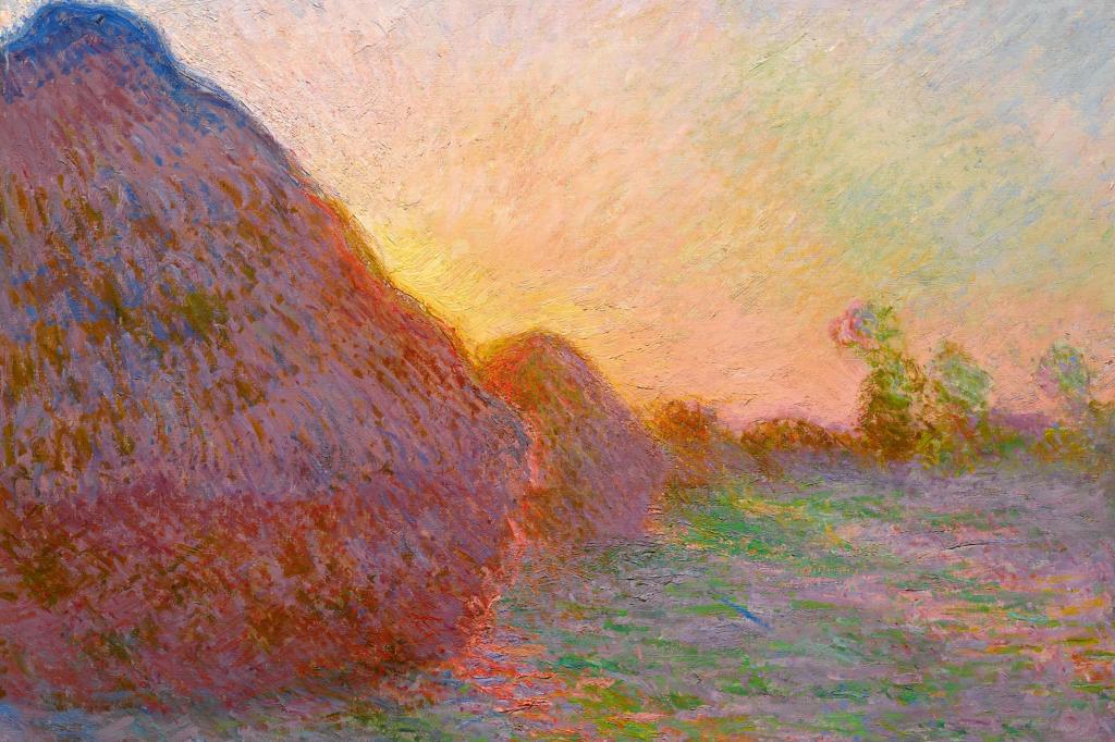
Painting 1 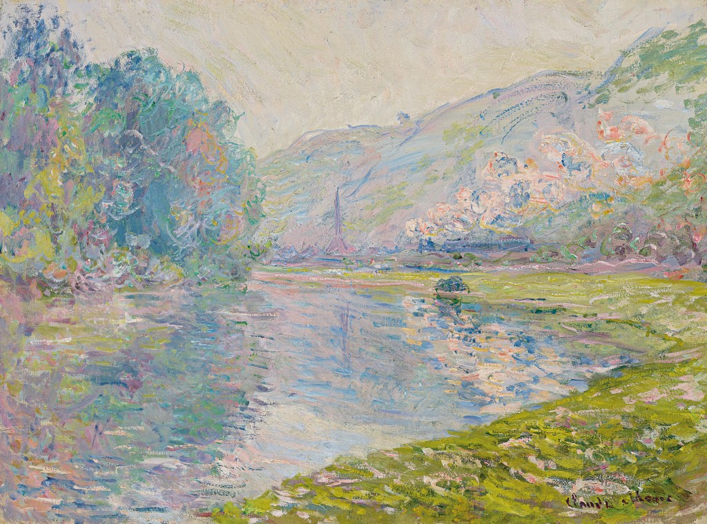
Painting 2
Painting 2 – Monet, C. (1890). Le train à Jeufosse. [Oil on canvas] Available at: https://www.christies.com/lotfinder/Lot/claude-monet-1840-1926-le-train-a-jeufosse-6233780-details.aspx [Accessed 21 Sep. 2020].
Monet’s impressionist approach to landscapes creates a dreamy atmosphere that enchants the viewer. The thick strokes create a hazy effect which can be quite soothing to look at. His approach to mark making is messy but meaningful, every stroke adds something to the piece. His colour palette works well to push a soothing feeling onto the viewer as all the colours are harmonious and work together rather than contrast. We can see this in both Painting 1 and 2, the blues, greens and purples all work together to gently depict a scene. In Painting 1 we do see a contrast between some orange and blue tones, but its not harsh or distracting, it helps emphasise the light.
If I go on to introduce colour into my landscapes I could think about using a harmonious colour palette that is soft and gentle rather than a contrasting one that may be harsher on the eye.
Furthermore, it is clear from his preference of painting the same landscapes at different times in the year and different times of the day, that light was his ‘true subject’.
Maybe I could take this approach to looking at light in a scene rather than the scene itself to really bring my landscapes to life and provide a more interesting atmosphere within my work. I really enjoy looking at woodland areas filled with trees, I could apply a new focus onto the lighting rather than the scene and see how my landscapes form that way, especially with how the light interacts with the bold textures on the trees.
Cezanne
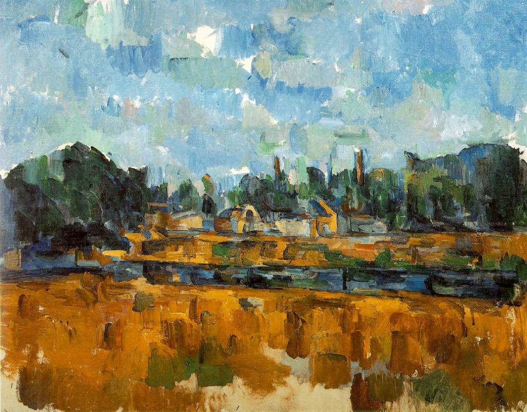
Cezanne has, again, an impressionist approach to his landscape here, using colour to interpret the landscape rather than line, leaving us with a messy yet atmospherical approach to this summer scene. It’s bold and something I could attempt to replicate with oil pastels. I do love the impressionist style when it comes to landscape as it adds to the feeling of being their and the fluid movement of the wind and water rushing through the scene. His colour palette also works well to sell the scene to an audience, with his use of blues and cool greens which boldly contrast the bright, warm yellows he uses to depict the the fields surrounding the river and small town.
I could try this within my own work, really focus on colour and tone rather than line to depict my landscapes, as it clearly creates an interesting and visually stimulating scene.
I love the colour block sky and how it creates this sense of a patchwork blanket of colour within the piece.
I think I should try and branch out and explore colour a bit more within landscapes and how to effectively use it to depict my work.
Hockney
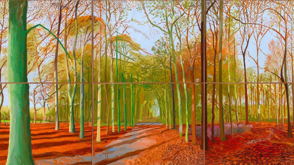
Hockney, best known for his paintings of pools has branched out to exploring the British landscape. In this change of subject matter his medium has also changed to a digital approach, beginning with drawing on his i phone and advancing to an i pad. He says that he can work much faster with a digital medium in order to capture his scenes. This can be extremely useful considering how fast weather, lighting and nature can change. His newer pieces focus on spring but I am drawn to this piece from 2006 which he brought to life again in a digital medium. I love the colours and use of line, especially the line work used to show the shadows cast by the trees at either sunrise or sunset. The use of orange tones helps inform us about the time of year, early autumn, which we can see from the oranges used to show the leaves on the ground but also from the light green, showing that a lot of foliage and signs of summer are still lingering. The use of line and blocked colour help define the foreground and middle ground from the background which can be difficult.
I could again, replicate this style by using oil pastels and focusing on blocking in areas of colour as well as line to create a dynamic and bright landscape. The style does remind me of something you could find in a children’s story book but it still remains a visually stimulating piece for all ages.
Peter Doig
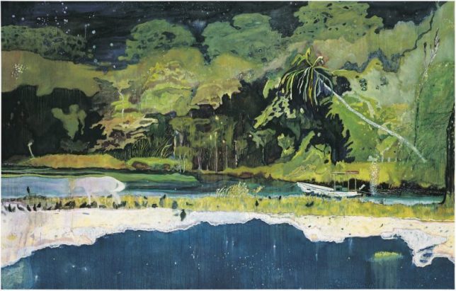
Peter Doig’s work does not focus on realism but rather the expression of nature, often feeling surreal with starry skies over looking forests. Similar to Cezanne, he blocks in the the landscape with colour rather than a focus of detail and line and the outcome is very immersive. He often creates very dark paintings in contrast to what I have looked at so far, and its very unique. In this particular piece it feels a bit like a collage due to his approach to perspective, with different areas, like the sea, not quite fitting into the perspective of the rest of the piece. This is further accentuated by his depiction of animals and people, who feel very two dimensional and flat compared to the rest of the painting.
I could again look at the use of a colour palette here and how it helps add to an immersive and surreal landscape, something from a dream, and how my colour palette can affect the style of my pieces and what they convey.
John Virtue
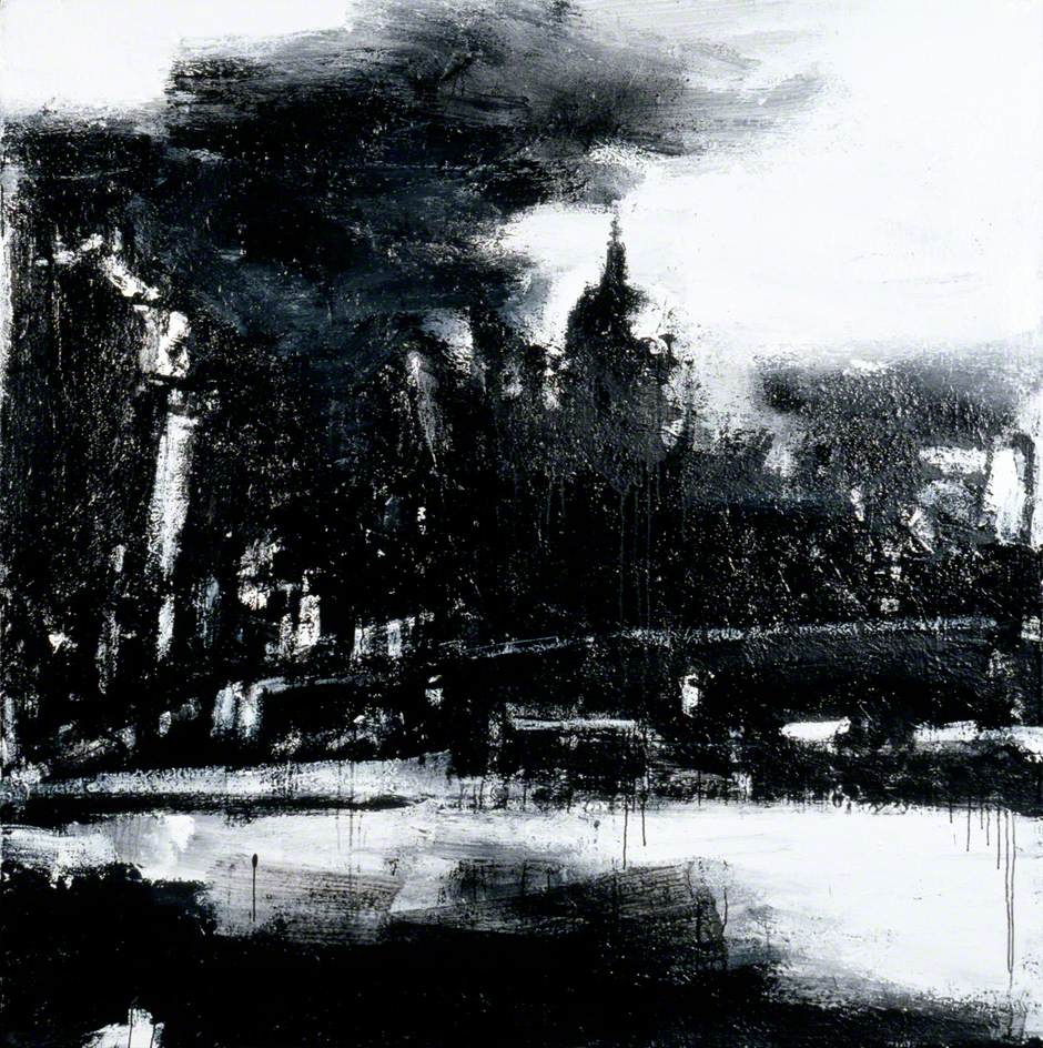
Virtue, J. (2003). Landscape No.664. [White acrylic, black ink, shellac & emulsion on canvas] Available at: https://artuk.org/discover/artworks/landscape-no-664-29490 [Accessed 23 Sep. 2020].
I really like the contrast with this piece compared to the other landscapes I have discussed so far. The focal point here isn’t the townscape but rather light and how it interacts with the scene. Initially it looks rather abstract, but the closer you look the more things seem to make sense and the view of London begins to form and reveal itself to the viewer. A mix of media is used here to create something starkly different to the usual landscape and the lack of colour adds to the industrial vibe one gets from London, rather than the soft colours and marks used to depict a natural landscape. This seems quite a harsh application of paint and ink which fits the harsher, industrial landscape of a modern city.
This piece takes me back to Part 1, with mark making and how significant an effect it can have on drawing or painting. As I transition from landscapes to townscapes in part 3 I could really begin to think about how my mark making can affect my drawing, and take it into a completely new direction, perhaps to an even more expressive way of depicting my view.
Nicholas Herbert
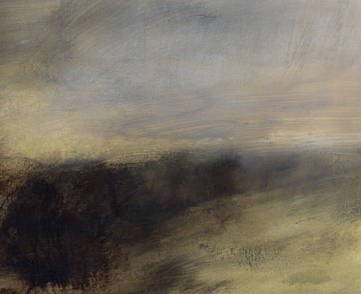
Again, this contemporary approach has a unique take on landscapes, compressing the composition to something very simple and easy to take in. I love how free and loose the marks are and it shows how fluid landscapes can be when you’re there in the present, with the wind and weather constantly moving the scene around. The Artist does really well to capture this in his pieces looking at the Chiltern Hills. Even though it is very abstract you can still make out the slope of a field leading to trees and the gloomy sky from above, his colour choice works well to effectively present a landscape with such an abstract approach.
It’s not a piece or approach I necessarily want to replicate or use within my work as I advance as an Artist in Part 3, but I can still learn from his approach the importance of colour selection and mark making and how that can influence the viewer. His work is quite loose and abstract but still informs the viewer of what they need to know, that they are looking at a landscape.
Moving Forward
Moving forward I want to explore colour and how that can affect how I present a landscape but also I intend to stick with my monochromatic approach and explore what I can do with that. I really love John Virtues work, how it remains simple yet complicated and sparks conversation with its composition and unique style. That is something I would love to look into, maybe going back to using inks and exploring how I can use that medium to best represent my work and my composition.
My focus on a monochrome palette means I have to apply extra care and detail to my tone and composition as that will be where the focus lies. I should expand my mark making skills and explore how I can best use my marks to create a visually stimulating landscape/townscape.
