I approached this exercise the same way I did looking at tree’s. Areas of tone, light and dark. The texture of clouds are unusual, very soft and different to other natural textures found in natural environments. They are also very hard to replicate and I tried various methods while tackling the difficult task of drawing an accurate representation of such a texture.
Method 1- Light on dark.
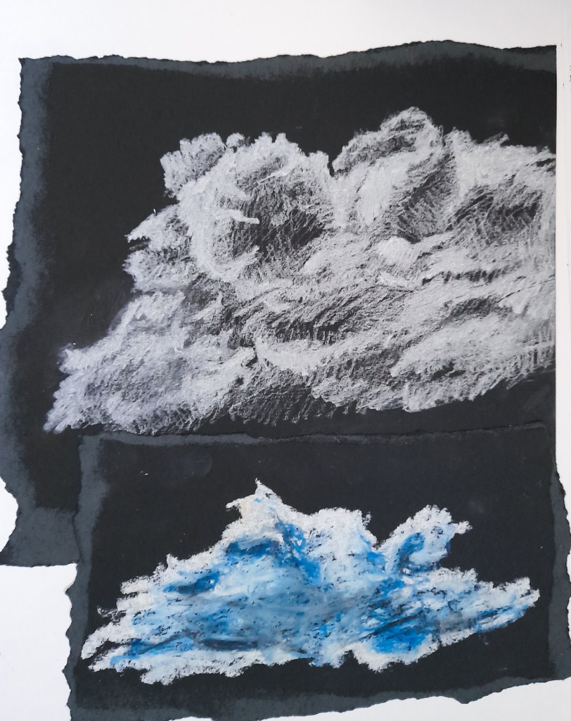
Drawing 2 (Bottom) – White and blue oil pastel on black paper
For my first attempts, I focused on the lighter areas of the clouds, and hoped that this approach would best highlight the soft texture I wanted to imply on paper. I think I did well in showing areas of tone and the shadows of the cloud in Drawing 1, however it wasn’t quite there in realism. I narrowed this down to the lack of blending, as my pencil lines are visibly clear, and are quite sharp with my use of line. I think that my first attempt isn’t bad for a sketch and its clearly a cloud.
I decided to try a softer approach and blend my areas of tone in my second drawing, by changing my medium to oil pastels. Oil pastels were easier to blend, and I used blues to help highlight the shadows. I think I captured the highlights best at the top of the cloud, the areas of light and dark are clear but still blended to create a soft, cloud-like texture. I think I lose this in the middle where the areas are mixed and not well defined. I think more clear highlights of white were needed to help define the cloud. To improve on this, I should take time to really evaluate the areas of tone, and blend my colours accordingly. I blended too much in the centre, however I think this is a more accurate attempt than my previous one, and shows a more realistic approach to the soft texture of a cloud.
Method 2- Ripping paper
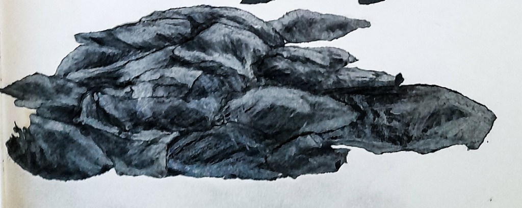
When sticking in my previous drawing, I noticed that the ripped edges of my black paper had an interesting effect, and created a soft layered texture, similar to a cloud. I wanted to look into this further and explore this new idea I stumbled across. I began by ripping up some pieces of black paper, and organising it into a cloud-like shape, having the lighter areas created by the rips facing upwards to create a highlight. I thought that the black paper looked a bit too dark and I went in with a white pencil in order to try and create a highlight for it to look more like a cloud.
This worked well to add highlights and depth to the ‘sketch’ and create a more 3D effect than a 2D random collage. The white pencil definitely helped to make this more of a cloud. I am happy with how this came out but it didn’t end up with that soft, cloud texture I was hoping for, but it does look like a cloud. Maybe in a mixed media piece this could work well, especially with white paper and combined with my previous oil pastel attempt. However for the detailed sketches that I’m exploring with Part 3, I don’t think this is something that could work moving forward.
Method 3- Red pencil
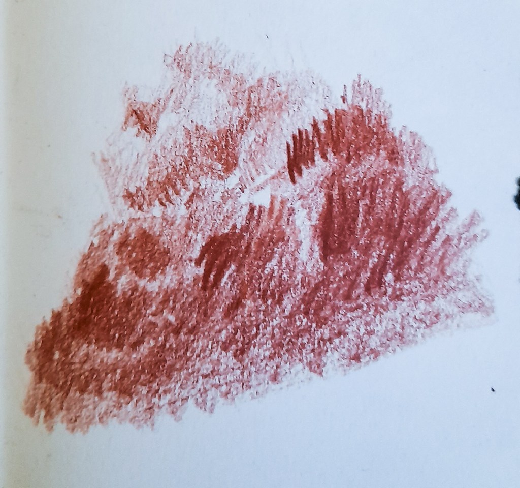
Drawing 4 
Drawing 5
I went back to a more traditional approach, this time on white paper. Using tonal pencils, I picked our a warm brown/red colour for a neutral, tonal colour palette. I think tonal pencils could work well for a varied colour palette while also not being too much.
The pencil was very soft and easier to blend, but I still had the problem of my strokes and lines being visible and creating a harsher approach than a softer one. I like how it came out, the shapes and areas of tone being present in my drawings (my second attempt of ‘Drawing 5’ coming out much better than ‘Drawing 4’). I feel this could have came out more effectively had I lightly shaded in the sky, and left the tops of the clouds completely white for that bright highlight that clouds have. I could keep this in mind for my future approaches to a sky in my landscape drawings. I think I definitely grasped the shapes of clouds in ‘Drawing 5’ as ‘Drawing 4’ came out as lump rather than a cloud.
Moving forward
I am happy with this exercise, however I clearly can improve in my drawings of clouds. I think this is something I can work on as I move through more exercises and will pick up with lots of practice. I would like to eventually do a drawing within Part 3, looking at tonal drawing and using that neutral brown colour palette along side blacks and whites. I think that could have a very interesting affect and create an atmospherical drawing. I would like to continue using a fine liner for now as well and really develop my skills with that drawing medium I’m not quite yet used to, and really explore how it can create an aesthetic drawing style. I should sit down and really look at textures, and maybe take a closer look like Vija Celmins does in her work, somewhere down the line.
