Before starting exercise 3 and my assignment, I wanted to spend some time looking at other artists and their approach to domestic interiors. Their focus in the piece, how they use their composition and choice of medium and what the work reflects to the viewer of the scene and what the artists could be trying to say and portray within their work.
Paul Heaston
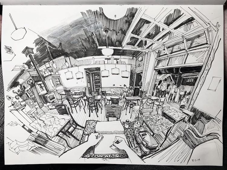
Heaston, P. (n.d.). N/A. [Fountain pen on paper] Available at: https://mymodernmet.com/perspective-drawings-paul-heaston/ [Accessed 13 May 2020].
Paul Heaston has a classic yet unique style when it comes to his interior drawings. His composition works hand in hand with his point of view, showing the entirety of his surroundings when he draws, you get that experience of being sat where he’s sat and turning your head to look at everything. It somewhat resembles what a fish eye lens would capture and is very effective for creating an immersive experience for the viewer.
Furthermore his use of line is so effective at capturing the tone and texture of his surroundings, while remaining, again, relatively simple as a technique. He builds up layers of lines, spacing them out or closer together in order to capture tone, and changing the straightness of his lines to create texture, curving them to create the wooden effects as seen on the benches next to him in the scene.
He has a very modern and contemporary aesthetic to his drawings, reflected by his sleek and simple technique of drawing lines and his choice of perspective and medium. It’s stunning to look at, crowded but not distracting. His composition also creates a focus in the centre with how he fades out his drawing as he reaches the edges of the page, it draws the viewers gaze inwards and towards where he is sat drawing, also due to the skewered perception.
His black and white colour palette also helps to create a minimalistic vibe within his work, I feel adding colour would over complicate his style. Examining further, his work is quite relaxing, it’s not too intense and creates a ‘chill’ and relaxed atmosphere and mood overall.
I think moving forward in my own work, I could look into using these techniques of line in order to create detailed but simple drawings. I think this is something I could look at for part 3 of this module, translating this technique for interiors into one for exteriors, as I wanted to experiment more with oil pastels for my last exercise and possibly for my assignment. Looking at later projects too, I would love to experiment with a similar medium, a fountain pen, I love the effect of the lines it creates and the simplicity.
Cecelia Rappaport
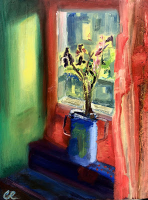
Reference [2]
This piece focuses on a closed off corner of the room, a smaller scale interior piece, but it caught my eye due to the looseness of the medium she used, it relates to my current work and use of oil pastels which I’d like to look at more. Rappaport chose to focus on the window and the light it lets in which works so effectively with her choice in medium, oil paint, as she blocks it in so simple and effortlessly. The colour choice is rather peculiar as none of them seem to go together, creating a lot of contrast but still remaining simple with 3 main colours of green, red and blue, with the creamy, yellow accent colour for a highlight. The piece gives off quite an ambient and calm mood despite the harsh colours. The red throws me off a little, as its such an intense colour that in a way juxtaposes the calmness of the setting. With the lonely setting, it could also be depicting isolation and loneliness, being separated from the outside world, which has since 2020, become a very relevant topic.
I think I can take influence from her loose colour blocked style of drawing, in order to create a sense of atmosphere within my work. I think I could potentially create some interesting textures and use of tone. I think this is a style I could incorporate into my use of oil pastels in order to create a more vibrant, put together interior. I don’t think I’ll use colours that harsh and distracting, but I would like to try being bright, in a realistic, believable way, and create a sense of an atmosphere and narrative, that may not be defined in telling a story but rather setting a scene, as Rappaport does so here.
Moving forward, I would like to take aspects I liked from both artists. Heaston’s dynamic approach to the point of view is something I’d like to incorporate into my composition, but not as wide (or fish eyed). I’d still like a realistic approach to my proportions. Furthermore, I’d like to combine this composition approach with a similar medium style to Rappaports work. I think this could make for an atmospheric drawing that would really draw in my viewers.
References
[1]Paul Heaston Artwork-Heaston, P. (n.d.). N/A. [Fountain pen on paper] Available at: https://mymodernmet.com/perspective-drawings-paul-heaston/ [Accessed 13 May 2020].
[2] Cecelia Rappaport Artwork- Rappaport, C.C. (2018). Window Light. [Oil paint] Available at: http://dailypaintersabstract.blogspot.com/2018/10/contemporary-still-life-painting-floral_5.html [Accessed 13 May 2020].
