Exercise 4
For this exercise, my goal was to create an image in a singular colour looking at both natural and man made objects. I decided to keep a focus on the pandemic, looking at toilet paper, a mask and a plant positioned near a sink drain.Keeping in line with my drawings from the previous exercise. I liked the look of my minimalistic composition and decided to get to work. Beginning with further exploration on oil pastels.
First attempt- Oil pastels
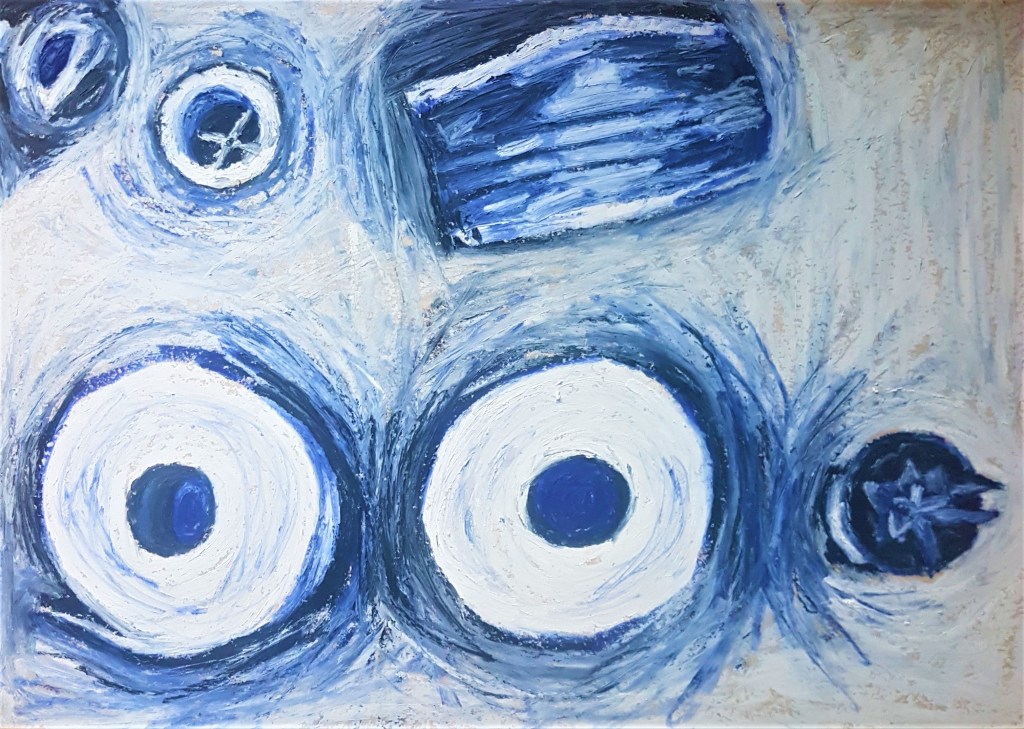
I used an elevated position for my composition in order to focus on minimalistic shapes that fit into the minimalistic style and composition I have opted for in this drawing. I chose the colour blue as it’s a cold colour and fits into the impersonal, medical theme I was aiming to achieve. I liked the expressive loose marks that oil pastels gave me, and found it easy to blend tones together and highlight shapes. I really liked the texture, it looks quite paint like while still holding qualities of a drawing medium. The only difficulty I really encountered in this drawing was how fast my pastels were wearing down, so moving forward with this medium I should look into ways I can move the product around as to not waste so much. I could look at blending it out with rubber brushes and also experiment with how that technique could affect the outcome and how I blend and work my colours and tones together. I found this medium worked well to produce a monochrome piece and was easier for me to work with as an artist, if I made a mistake it wouldn’t be obvious as I can cover it up by going over it with more pastel. However if I made a mistake with ink such as a drip or applying too much, it will be noticeable and not easy to cover up. I think ink can still be an effective medium, but pastels worked much better here for a much softer and looser approach to a Still Life.
Second Attempt: Ink
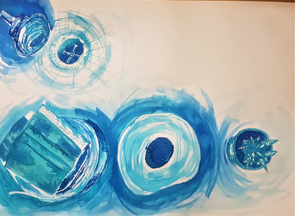
For this second attempt, I used a similar composition, but tried the mask on top of the toilet paper in order to make a wider negative space within my composition which I found I preferred as the space feels less cluttered and planned, it simmers out the focus from left to right which I think works well. I think I could have created more of a contrast with my tone, I think the piece as a whole is a bit too light and I could have layered up my ink for a darker colour or went in with some black ink as well. I think I focused too much on what I did previously and used a lot of wash instead of focusing on the media and its strengths. I should have went for a more illustrative style that works well with this media like I have done in the past, I got caught up trying to recreate the style I achieved with oil pastels rather than trying to be a bit more experimentive.
I think th3e washes worked well for conveying the more subtle tone of the shadows cast by the objects, however for the objects themselves I should have used more crosshatching and lines to make them stand out and more detailed. I definitely prefer my first attempt and working with oil pastels, and I shouldn’t have tried to replicate the same style in my second drawing.
Moving Forward
I found this exercise interesting , as I have already explored a monochrome palette before in previous exercises, and I feel these didn’t come out as great. I think working a darker colour such as brown makes it easier to layer and add tone and detail, where as the blues I worked with were a lot lighter in comparison. I learned further about oil pastels and how to use them, but as I said earlier I need to explore other options of using them so they don’t wear down so fast. I did enjoy the process of blending the pastels together to create areas of tone and being a lot more loose and free with my strokes. I think moving forward I need to keep in mind what media I use and how I should use it. What works best? What style will work better with the textures and techniques I can use and create with the media I have chosen. As I feel I could have done more with my use of ink. I liked my composition choice this time, I think it worked well and maintained a very simple feel, so I feel I have progressed further in that area.
