Exercise 1- Still Life using Line
For this exercise I ended up with two attempts as I felt my first attempt didn’t quite work with what was asked in this Exercise. I focused too much on the tonal elements rather than my use of line.
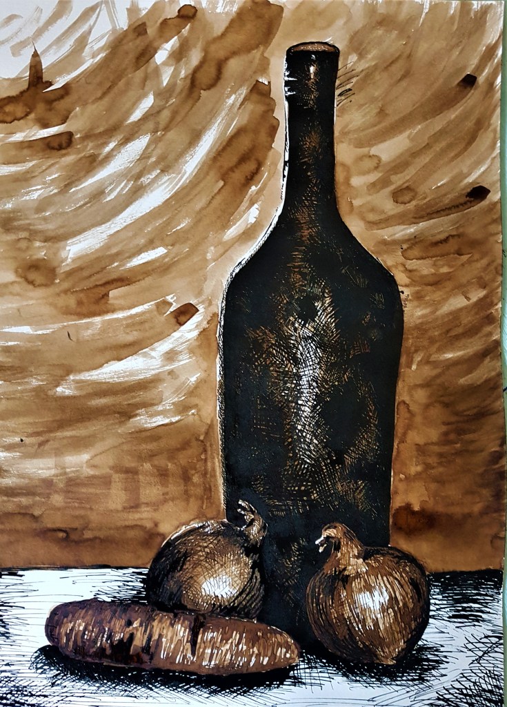
For this drawing, I chose objects similar in function and story, for example food and drink. I based my composition on one of the ideas for composition I came up with on Project 2. My aim with the composition was to build up height with the objects and have the viewers gaze follow it up. I used a long, dark bottle to fit with this concept and also to contrast with the smaller items in front. Since I went with a monochrome palette with strong shadows in my composition I thought it might be hard to distinguish between the different objects, so I used black ink and layers of ink washes in a walnut ink before using a lot of lines to add in detail. I began with using light washes of my walnut ink, layering them up somewhat for a bit of blocked in tone. I went in darkest on the bottle. As my Still Life reference for the bottle was incredibly dark I decided to go straight in with my black ink to capture this, building up my cross hatching to capture very faint reflections on the bottle as well as the dark tone. I used a similar technique on the onions and carrot, however using my brown ink to add the first few layers of cross hatching on top of my ink wash before adding the final details with black ink. I think looking back, I could have used more lines to define the carrot a bit more and solidify what it is. For my background I kept it simple to keep the focus on my Still Life objects, I created contrast by making the table white and using black ink to define shadows and tones.
I’m happy with how it came out however, this exercise asked me to focus on my use of line and relating objects to the background, which I feel I did not do well enough. The background is bare and simple and only relates to the objects with the monochrome colour scheme and washes of ink and cross hatching. I wanted to try again sticking closer to the given guidelines and see if my composition improves but to also give a bigger focus on my use of line.
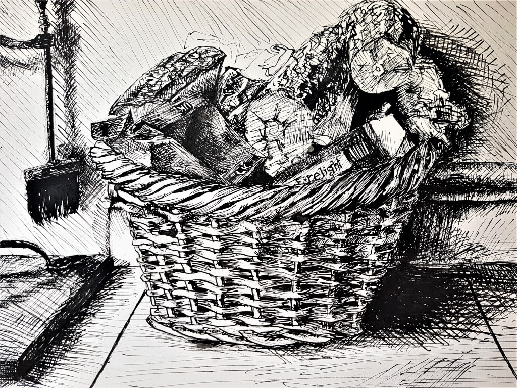
For this piece I told a story with my chosen Still Life focus, a basket of wood and fire lighters, and the side of a fire place, blending the purpose of the focal objects with the background. It relates. I relied only on my black ink cross hatching to depict the objects and tone and I think it worked well. I enjoyed using my lines to capture the pattern and texture of the basket, and also the shadows cast by the light. I altered my technique when it came to applying texture to the wood, using squiggles rather than straight lines, in order to show an uneven log texture. I kept my viewpoint straight ahead, so perhaps in later exercises I should consider looking from different and more unique angles and see how that changes my composition style.
I think I have good use of line on individual objects but struggle relating them to the background, often leaving my drawings feeling flat rather than immersive. I would like to work on my use of depth, which may involve attempting a much more dynamic background that feels natural to the focal objects rather than separate. I feel my use of tone does help somewhat with adding depth between the foreground and background, but I need to work at portraying this in a more effective and believable way. I found some difficulties in using only line in my second attempt as it is much more finnicky to portray a darker atmosphere within the piece. In order to effectively portray tone I find it easier to also incorporate techniques outside of line, such as in my first drawing with washes, in order to create a much more realistic scene, instead of a more illustrative style. But I do find a lot of my drawing strengths with my use of line and cross hatching.
Exercise 2- Still Life in tone using colour
For this exercise I found I had to switch up my technique to a much more fast paced stroke style of drawing. I worked very fast and scribbly in order to keep the piece ‘spontaneous and energetic’ as the brief asked.
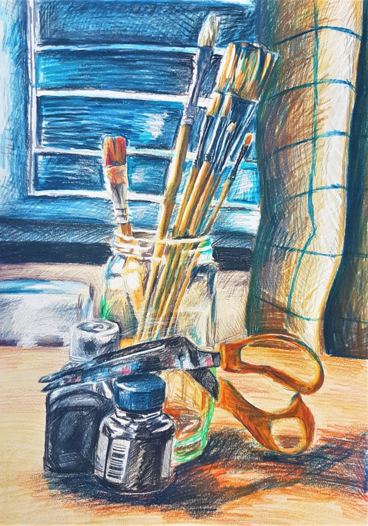
I was happy with how this piece came out and so didn’t do any further attempts. I started by blocking out the tone before layering colours over one an other to get a fuller, more vibrant piece. I love the overall loose feel from my fast strokes and scribbles, emphasised by the many layers of colour. Like my previous coloured pencil piece from Project 2, I think layering blue tones over warmer tones as shadows works really well, and I’ve captured a rushed, energetic feel within my work.
I find the background feels much more dynamic this time around and has a lot of depth to it, it works hand in hand with the focal objects rather than feeling more separate. I think this style and medium of coloured pencils works really well to capture a Still Life scene effectively, however it is a lot more time consuming than my previous mediums. I think the colours work really well to add a sense of depth and bring everything together. I found that working solely with tone rather than focusing on line, creates a much smoother drawing, with not as much detailed texture, though I found this worked well with the metal and glass textures that I chose for this Still Life. It affected my method as I was shading in big blocks of colour rather than taking my time to plan out lines to best shade an objects, but I do like the end result, I think it works well together.
Moving forward
I would like to experiment with my use of colour and composition further, I want to effectively use the two to create better quality drawings. I think moving on into future exercises I should think strongly about the two, especially my use of background in order to create more interesting and dynamic Still Life pieces, that include a sense of depth within the environment. To do this, I will think much more carefully about my composition and the angles I draw from, and experiment with different media in order to show colour and tone effectively within my work.
