After experimenting with line and capturing detail or groups of natural objects with ink and pencil, I decided to move forward to exercise 1, and look at spending more time, and adding colour, something I haven’t quite done with Still Life so far.
I began by setting up a Still Life, using natural forms that I have previously looked at, and some I haven’t before. After settling on my choice of vegetables for my Still Life, I positioned them into place and looked at them from various angles before deciding on what angle I will draw from.
The process
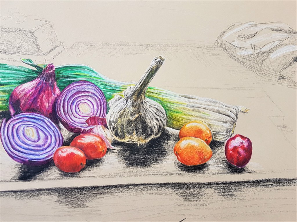
I decided to use toned paper, in a slightly beige colour, so I could make my highlights pop. For my composition, I layered the vegetables, the smallest in front, in a curve (crescent shape) in order to draw the gaze into the centre, the garlic. By highlighting the underneath of the garlic, I think I made it really pop out against the shadows, and really made it an area to focus on for the viewer. I layered colours on top of one another with cross hatching to add tone and vibrancy to the vegetables. I kept the background loose and monochrome to keep the focus on the vegetables and their composition. I like the detail I managed to get on the vegetables, but I think I need to experiment more with how I present my backgrounds. Do I show everything with detail, or create contrast with the clarity between the foreground and the background? Moving forward into my other exercises, this is something I would like to keep in mind.
Reflection
With project 2, I found it very useful in terms of looking at what media I use, and what effects I can create with them. I found it challenging to use coloured pencils at first, and very time consuming, however I found the end result to be detailed and vibrant, and a medium I would like to look at using again, to explore what other drawings I can create. I also looked at new techniques with media I have previously used a lot. I looked into doing light washes with ink to get a base for tone, before going in with cross hatching to build that tone up further. Furthermore, adding black ink, whether its to a monochrome brown sketch or a coloured ink sketch, really helps to add in fine tonal details to my sketches and drawings.
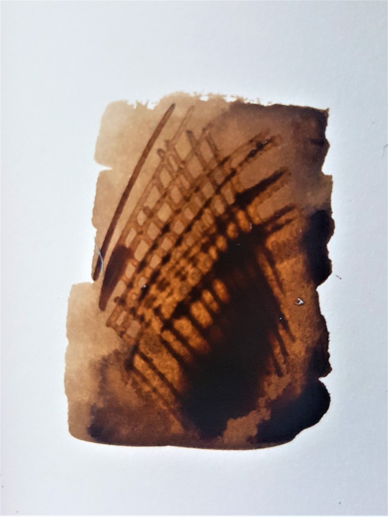
[1]
Layering ink washes, and then cross hatching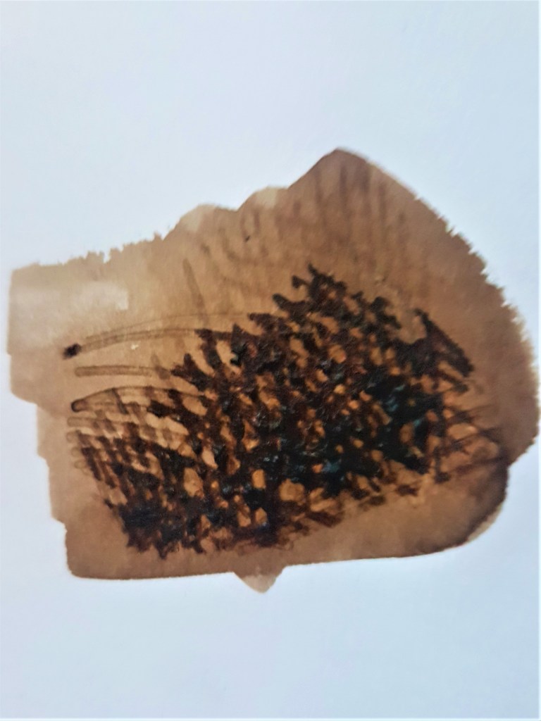
[2]
Ink wash and cross hatching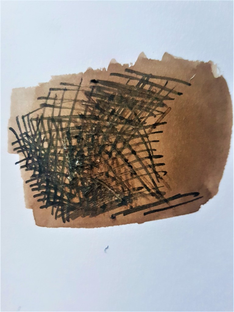
[3]
Ink wash and cross hatching in brown and black ink
As seen in the images above and previous drawings I’ve done, layering ink washes and cross hatching can be very effective in showing tone and texture. I found this technique worked really well for my onions prior to this exercise. I love the monochrome effect when using browns and blacks, and also when using coloured inks. I think it works best for me in a monochrome style, as it’s easier not to think about colour but rather focus on building up the tone. Using colour is something I should explore further so I can feel more confident and comfortable pursuing that style.
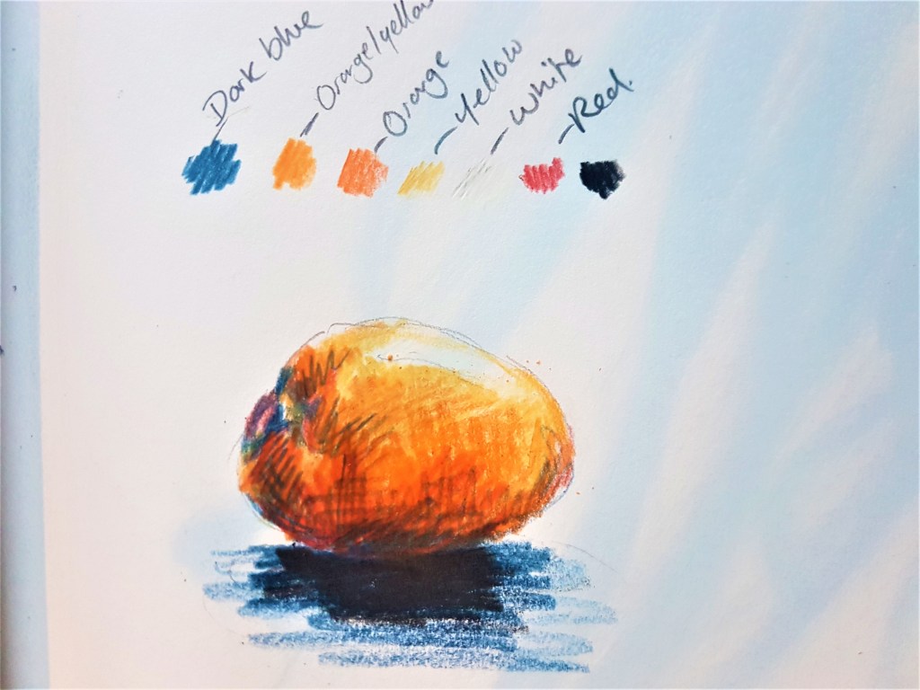
I found working with coloured pencils to be rather tedious to begin with but I did like the results I achieved with exercise 1. Layering the colours in different ways and directions can help create not only tone, but patterns and textures too. By using long straight lines on the leek for example, I was able to somewhat depict the smooth ridges the vegetable has. I liked layering the dark blue tone as a way of adding more subtle shadows, rather than using black. I found this worked really well over warmer toned colours, such as on the tomatoes and red onions. I would love to explore this technique further, and become more confident and skilled at using this medium.
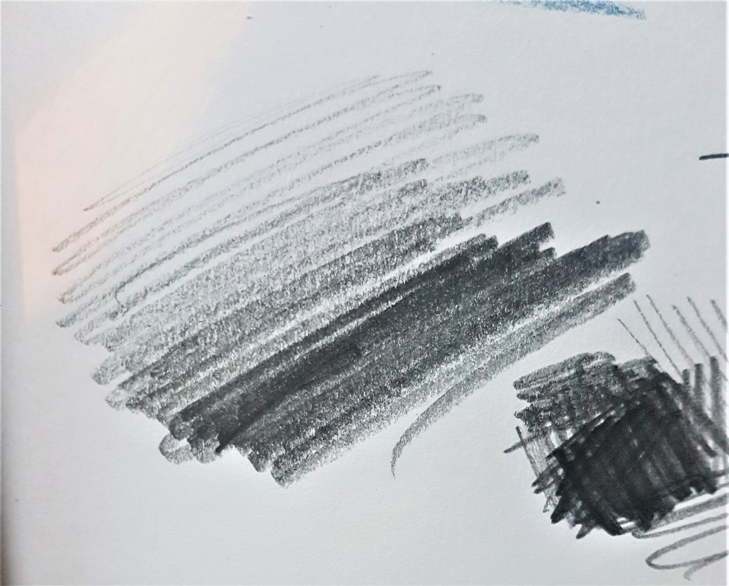
Finally I experimented with tonal pencil drawing when studying the Still Life of dead fish. I found varying pressure can help define areas of darker tone and pattern. I played around with pressure to depict the pattern and texture of the fish scales as they reflected light, so there was a big variation in tone there. I feel very confident using pencils to sketch and draw still life, and these skills worked well when applying them with coloured pencils for this exercise also.
Creating more interesting compositions
Although I am pleased with my technical drawing skills with this exercise, I feel my compositional skills with Still Life needs some work, especially with organising a background that effectively works with the foreground. I’ve done some rough sketches to think through how I could lay out my still life compositions moving forward.
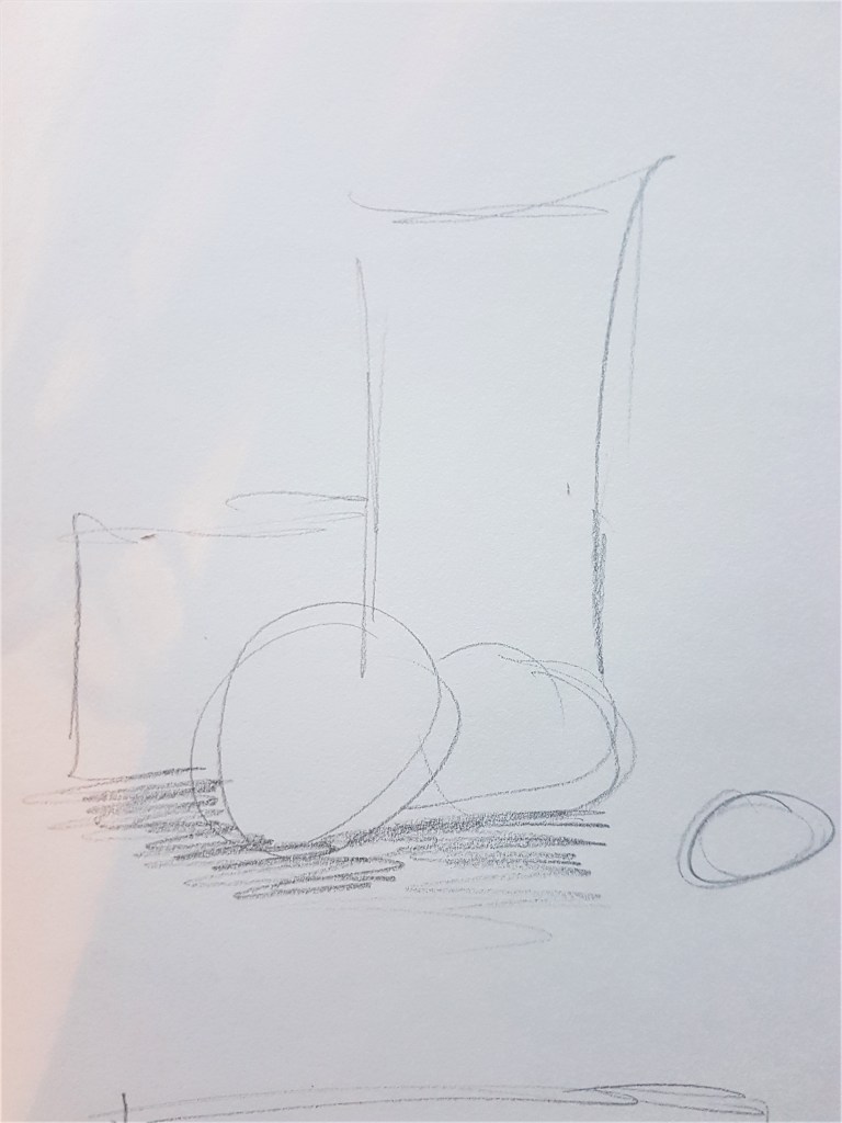
I began by looking at the idea of building a structure in a sense, or a staircase. Slowly building up the height of my objects to draw the viewers gaze to the tallest one, working their way up from the smallest to the tallest. I think this could work great in a portrait composition, to really focus on the height that I am building up, bringing focus and concentration into the structure of the objects and their composition as well as tonal qualities and details.
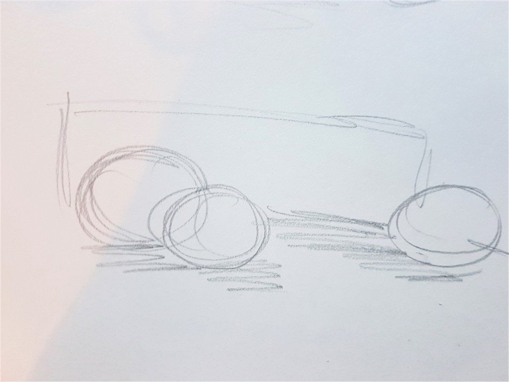
Similar to the composition I used in this exercise, I created a quick sketch, toying with the idea of drawing the viewers gaze across a landscape page, the opposite of my previous idea but close in concept. I could perhaps use a long object, such as the leek I used to create a long space that draws the viewers gaze across naturally, adding in other objects along the way to add intrigue and complexity. Unlike my attempt with this current exercise, I should look at filling more of the page with this concept.
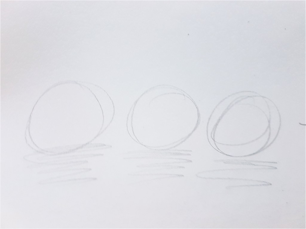
I also want to look at maybe trying a minimalistic approach to a composition as well as more complex ones, and experiment with what works with my style and choices of media. In this concept sketch, I look at placing similar shaped items, maybe identical in a row, and playing with something simple and pleasing to the eye. I think that could work well with a detailed approach to the still life subjects and a simple background. It could also work very effectively with my technique of ink washes and cross hatching.
I would like to look further into my use of composition and take into consideration the ideas I have just looked at with the next exercises in part 3, and see what i can create and what works well an dwhat needs rethinking.
