Detailed Observation of Natural Objects
Before starting Exercise 1, I wanted to take some more time to expand on my skills of looking at and capturing natural forms, as my strengths often lie within man made objects. I also wanted to look at how two different mediums help me to capture detail and create atmosphere with natural forms. I wanted to look at capturing a single object before trying it as a group, to build on my compositional skills as well. I began with fish, as they have an unusual shape and texture, that I’m not used to capturing and thought it could be interesting to begin my experiments there.
The start of exploring natural forms
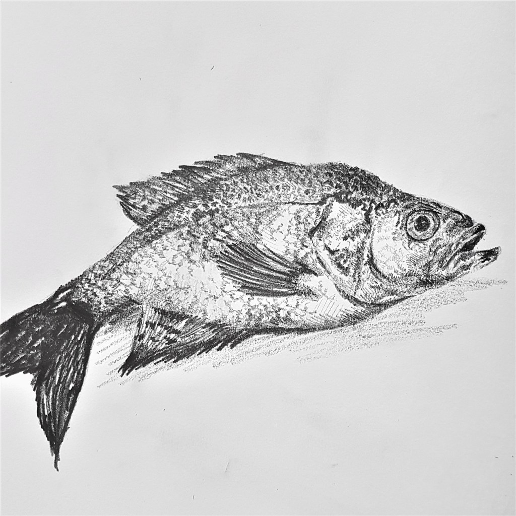
Pencil in Sketch Book
For this sketch I used pencil and focused on capturing areas of tone in order to provide a sense of texture. A fish is more unusual for a natural form still life with its shiny, reflective texture. In order to try and capture this I left areas untouched and white towards the fishes belly to show where the light was hitting and reflecting. I also used areas of white amongst my use of lines to help show the scaly texture a bit better.
I had a lot of fun with this piece and found the shapes interesting and unique compared to what I have drawn before with much more structured and harsh, man made forms.
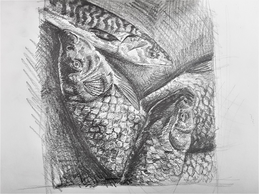
Pencil in Sketch Book
I moved on using fish I sourced from a market for my composition, layering them like I found them in the market, slumping one over another. Using lighting to cast darker shadows in order to emphasise certain textures. I’m really happy with how this turned out with the layered composition and capturing textures. To improve on this and my composition I could try using a bigger variety, like more mackerel, as I love how the stripe detail turned out on the one I did. Furthermore I could look at beginning to introduce colour to my work.
Looking to other forms, shapes and textures

Shell [1] 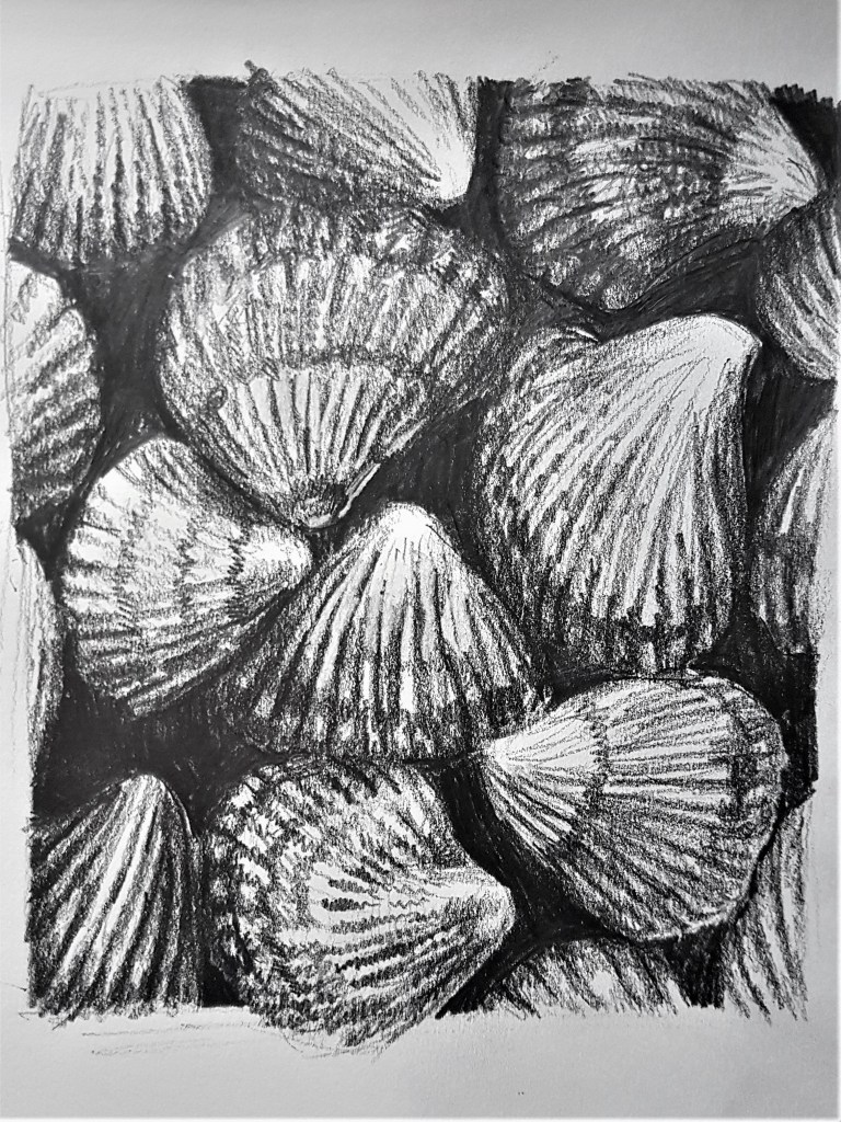
Collection of Shells [2]
Pencil on paper
I moved on to studying shells from my bathroom, starting by studying a single, simple shell. Needless to say I struggled with this shape and texture for some reason. The singular shell sketch [1] did not come out as well as I hoped it would and there is room for improvement. I struggled to capture the detail of the fine lines and grooves affectively as well as the shadows they cast. I did much better with a larger group of shells without such a large heavy focus on one to be perfect. With the dark gaps between the shells in sketch [2] I think it was easier to focus on thick areas of tone rather than details, which worked well to get the basic shapes. I don’t think shells are a subject I’d like to focus on, I prefer softer textured pieces, like food (fish and vegetables) as they hold more intrigue to me and what I can do, as an artist, to present them.
Changing media
[1] 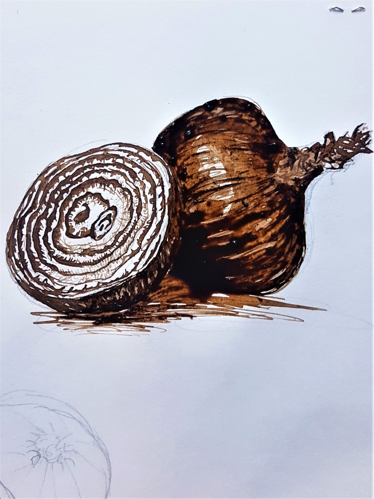
[2] 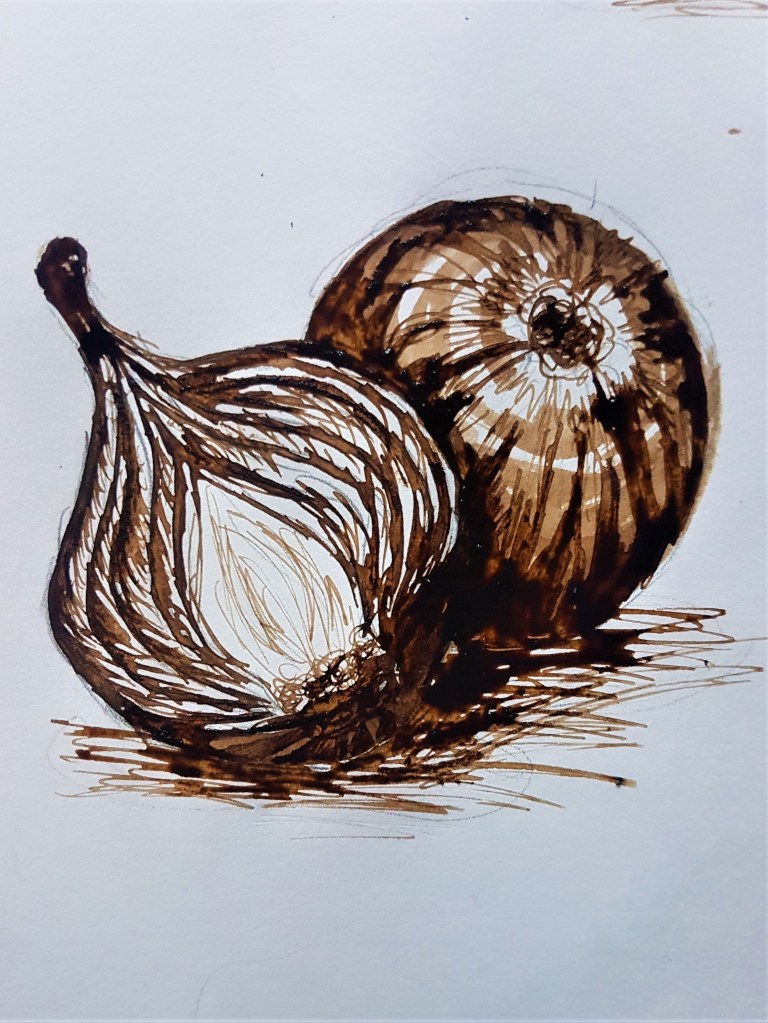
[3]
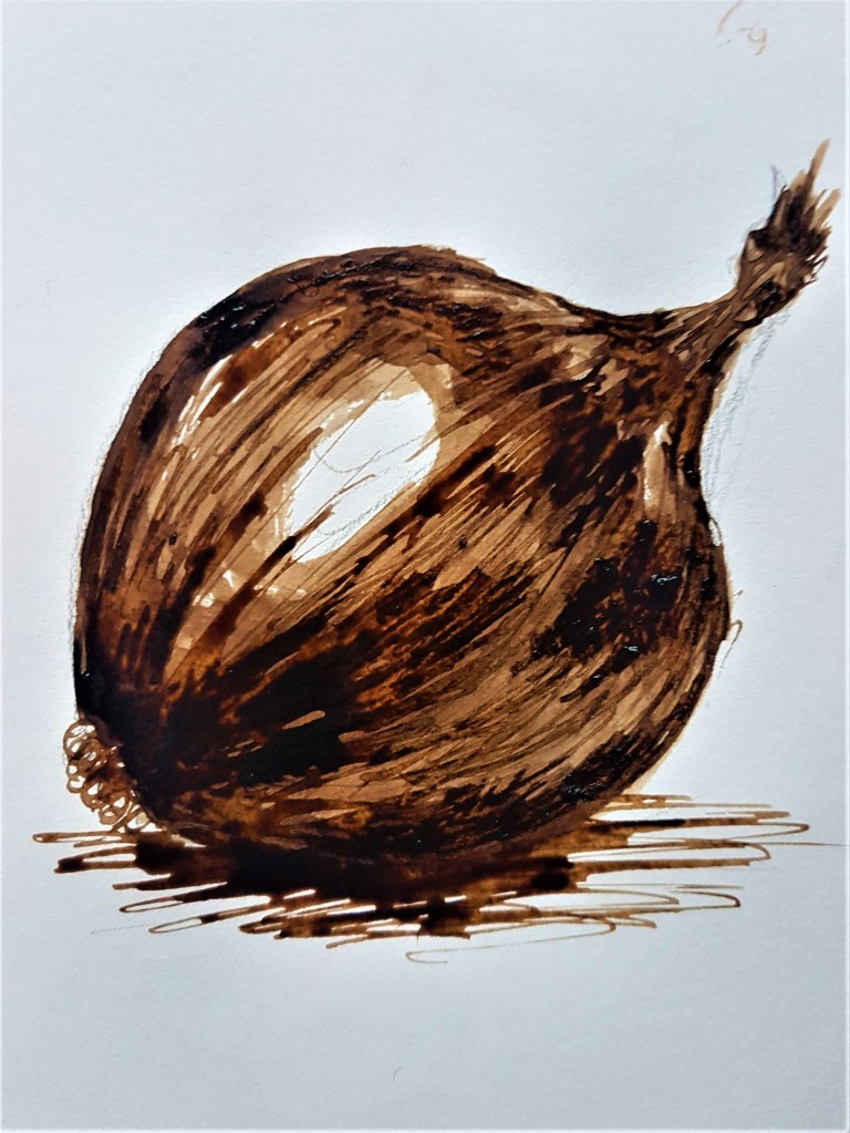
Walnut Ink in Sketch Book
I decided to switch up my media again just to experiment with tonal properties and capturing texture. I decided on this lovely walnut coloured ink as it provided more options for capturing tone than black ink, which is much harsher. I am happy with how I captured the texture and reflection of the onions in Sketches [1] and [2], however I think with sketch [3] I need to work on capturing the intricacies of the inside cross sections of the vegetables. the finer lines and how the colour would show up in a monochrome piece like this.
Walnut ink in Sketch Book
Like with my previous attempt at the onions, I am much better at capturing the outside texture compared to the cross section. With my cross section I tried to focus on tonal areas as I couldn’t quite get the lighter areas of detail with the ink, I made it too dark with my wash. Capturing lighter areas is harder with ink I have found, as you can’t erase dark areas if you make them too dark. I could try drawing over with a white gel pen next time, and see what effect that gives me. However I wanted to focus in a lot more on my next exercise, and decided to explore capturing a natural form in colour in my next sketch.
Adding colour
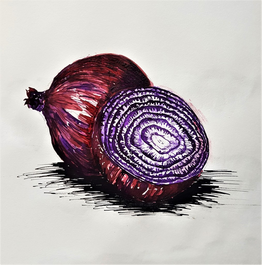
Italian ink in burgundy and violet in Sketch Book
I am happy with how this came out, I think the colours work well to accurately capture a red onions colours. I like how the cross section came out, with adding lighter splodges of purple by dabbing some ink with a tissue. My technique stayed somewhat similar to before with adding washes and layers, waiting for them to dry before going on top again, making a darker layer. I like ink as a medium as it allows me to explore a much more illustrative style into my still life sketches, which I rather like. Moving forward I feel much more confident to tackle the next exercise and start being able to utilise colour into my Still Life sketches. I plan to transfer what I’ve done with this sketch into soft pencil by creating layers of colour overlapping. I’m excited to move my work forward.
