After my previous research into interesting ways to incorporate negative space into composition, I felt inspired and full of ideas, which I could use to make my compositions of Still Life much more interesting and unique. I was really moved by the work of Henrique de Franca and Ileana Hunter and wanted to explore and experiment with incorporating some of their techniques into my work.
Firstly, I wanted to explore the techniques of Henrique, and how he builds a composition by only using very little of his paper, and using markings that suggest the rest of his scene. I had the idea of creating a scene of Still Life, a notebook being written in. However I wanted to use as little markings as I could to suggest my composition rather than to have it all exposed as I usually would. I also wanted to play around with Ileana Hunters techniques of removing hands. I thought I could experiment with incorporating hands but taking them out, leaving a negative space. Removing actual life tangled within a Still Life.
First Sketches
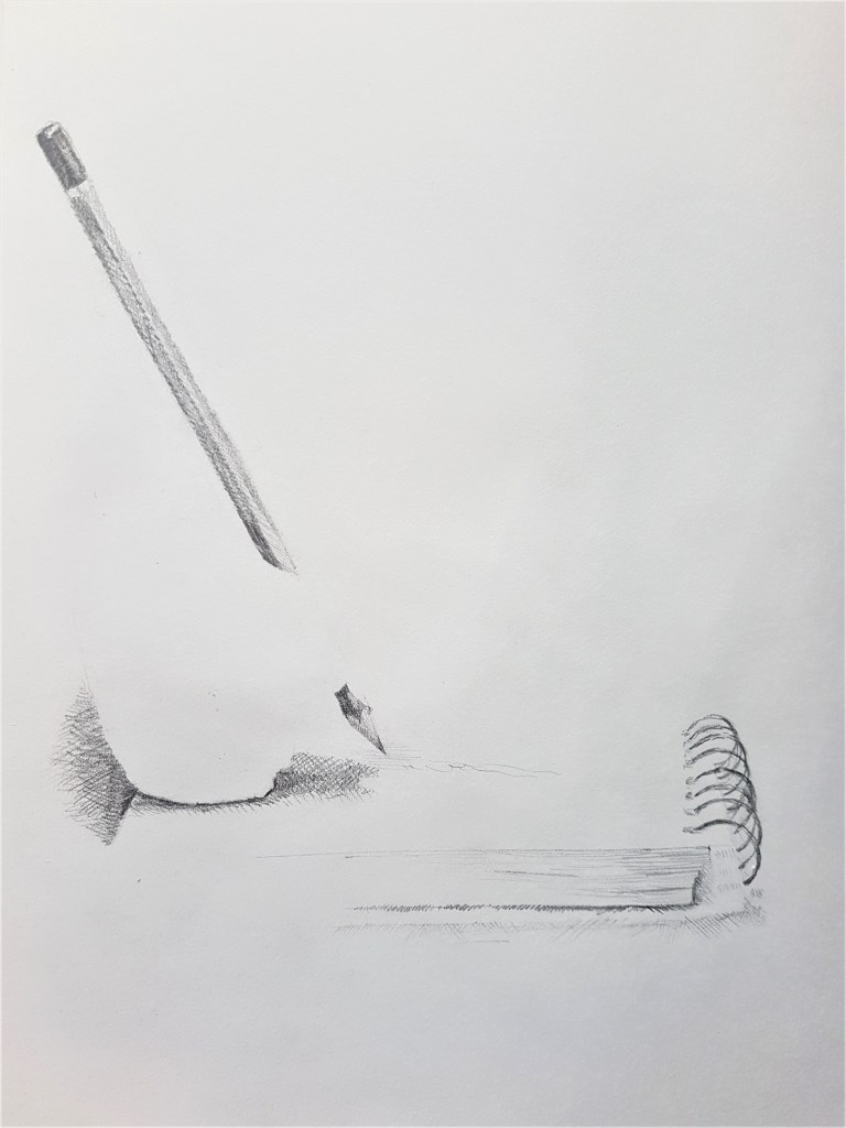
[1] 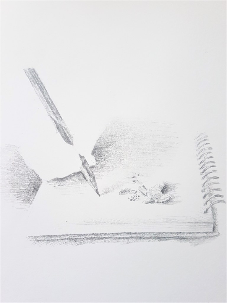
[2]
I began with some pencil sketches of my original idea, a Still Life scene of a notebook being used, only hinting at the ‘bigger picture’ with my markings. And take it a step further by removing ‘Life’ from my Still Life, by removing the hand, but leaving its presence. I really love my attempt of the notebook in Sketch [1]. I think I captured the minimalistic quality I aimed for and used just enough markings to suggest my Still Life scene without it being too much. I think I hinted at just enough of the notebook to make an effective composition. However in Sketch [2] I feel I incorporated too much of the notebook and could have had a much more striking and minimalistic composition had I kept too more minimal markings as in Sketch [1]. I do prefer the shape of the hand in Sketch [2] as the shape is more clear and shows the grip of the thumb. By adding pencil shavings in Sketch[2] it creates an interesting and fuller composition, however I need to use less shading around the hands to create a much more convincing style and composition. Less is more with this style of composition.
Changing Media
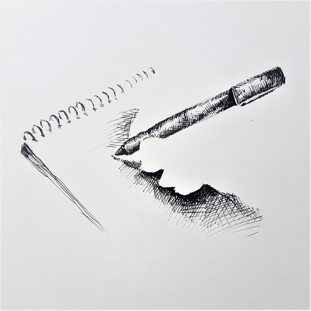
[3] 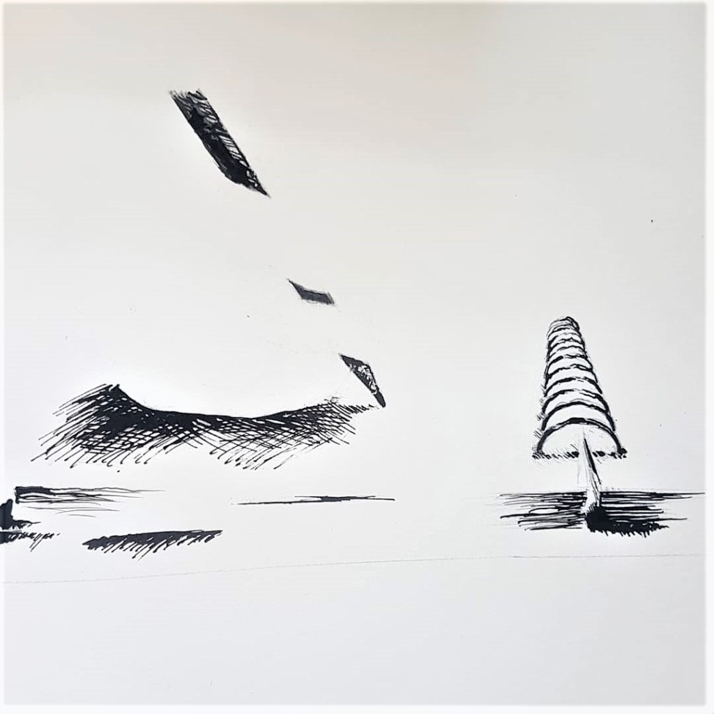
[4]
Ink and Calligraphy pen.
I wanted to explore my idea in the harsher, more permanent medium of ink. I think Sketch [3] captures more of the minimalistic style I want these Still Life sketches to embody. I changed the pencil to a pen to play around with a new more reflective texture, and I much prefer the shine it has and capturing that with my markings. I angled the hand positioning differently and worked with my lighting to cast a shadow to much more effectively show the shape of the hand. For Sketch [4] I tried a similar composition to my original sketches, I made the same mistake as Sketch [2] by showing too much with my markings.
I like the look of ink with this minimalistic style and composition, I think it makes a bold and striking look with the use of tone and the bold black marks against the vast white page.
A change of scene
I wanted to try a new subject to focus on with this style and compositional techniques. Hands were a staple with this idea, so I wanted to try hands holding fruit for my Still Life scene. Firstly I explored hands holding fruit while sticking to my pattern of incorporating negative space into the hands.
[5] 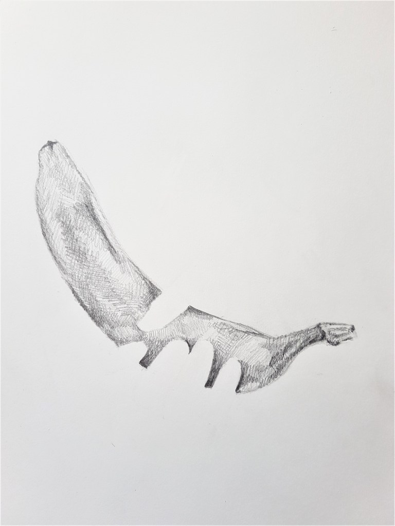
[6]
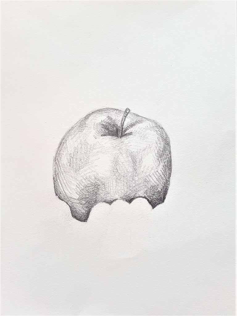
I feel these pieces emulate Ileana Hunters work more than my previous. I’m still sticking to that minimalistic style and I feel the sketches still create interest with the viewer. I feel the focal point is much more straight forward in these sketches as the subject is centre in contrast to my previous compositions which feel quite fussy in comparison. I tried a subtle approach to the hands in Sketch [5] however I feel the low hand placement is distracting rather than adding to the composition. I much prefer my second attempt, Sketch [6] and how the fingers break up the banana. I love the simplicity and the shapes, they work together to create a unique, minimalistic sketch which draws the viewers gaze from contrast created by tone.
Switching it up

Pencil in Sketch Book
For this experiment, I tried reversing the idea, making the fruit the area of negative space. I love how this came out, I love how the space of grapes is hinted at through subtle shapes, going back towards Henrique’s techniques somewhat. Furthermore, I think the minimalistic style of sketching works great with this idea, I think leaving the centre of the grapes empty of any markings works well, as it draws the eye into the centre for it to expand out onto the hands. I could try and explore this further by filling in the background with the clothes of the person holding the fruit, and leave the fruit completely blank, a space. However I’m not sure if that would work effectively within the style I’m exploring currently, with a minimalistic composition.
Returning to Ink.
I deciding to experiment with one last idea that instead of leaving an area blank to indicate negative space, to rather block it in with solid colour. I thought Ink would be ideal for this experiment, as with black ink you don’t really very visible streaks and w thus would work great with creating a block of colour to fill a shape.
[8] 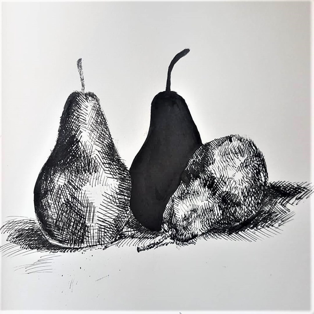
[9]
Ink and Calligraphy Pen
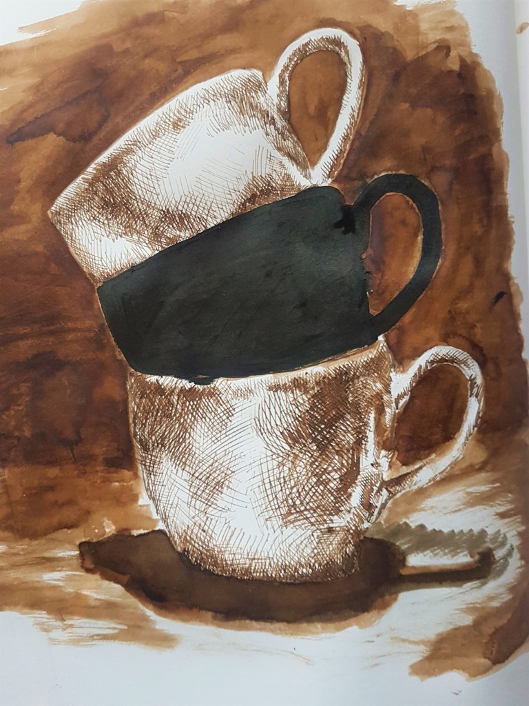
I wanted to begin a focus on a larger group of objects that make up a Still Life, so I began with a set of three teacups. I used brown ink to sketch them in using cross hatching and blocked out the background and floor shadows using a brush. This helped created a much darker atmosphere tonally. I then blocked in middle teacup in black ink. I made the mistake of knocking my sketchbook causing some of the ink and markings to splodge around, so the finished sketch came out on the messier side, however I’m happy with how it came out and the overall look and style. Although it is heavier in tone than my previous pieces, it still hold minimalistic qualities with the blocking in of spaces.
For my final sketch, I went back to my roots of keeping a vast white space. I decided to do some overlapping pears as I thought its would be interesting to block out one of them in the middle, and how the shapes would overlap. I think with the contrasting white background, this sketch feels bolder out of the two.
Moving forward.
I found it much easier to suggest three-dimensional form on man made objects, as they have a much clearer structure than the loose rounded, and often more complicated structures of natural objects and forms. The harsher lines and shapes make it easier for me to map our the structures of man made objects, as straight lines and often map out clear areas of tone which help define the 3D structure of the man made form.
Changing the composition did also make a change in my approach to my drawing and the way I created form. I ended up shifting my technique when it came from moving from the notebook to the natural forms of fruit, instead of suggesting the form or structure, I ended up drawing the whole shape, whilst still leaving out the hands. I kept to more suggestive lines when I drew the grapes, however they did not suggest detail on the grapes, where as I suggested details in the notebook sketches.
I’m really happy with the outcomes of exploring and creating a unique and minimalistic style, that helps me to create striking Still Life sketches and drawings. It needs some fine tuning, but I love the outcomes and can’t wait to create some more that really showcase negative space and composition. I’m glad I took the time to look at other artists to find inspiration but also take the time to really think about a composition and effectively start putting some together that work well.
