Whenever you create a drawing of Still Life, you will be incorporating a use of negative and positive space to form the composition and final product of the drawing. Positive space being the main shapes of the composition, filled with detail. The negative spaces usually being the spaces and shapes in-between, lacking in ‘real form’ and detail, but are not void, they still fill the space they take up.
Gary Hume
Hume, G. (2010). Vicious. [12 colour Silkscreen printed on 410 gsm Somerset Tub Sized paper] Available at: https://www.artspace.com/gary_hume/vicious [Accessed 20 Mar. 2020].
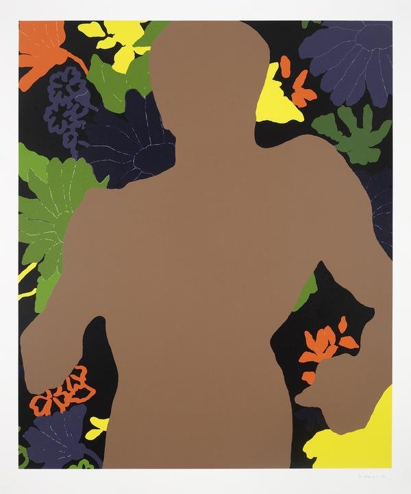
This first piece I’m looking at by artist Gary Hume is very striking and bold. It’s eye catching with its bright colours and minimalistic approach to shapes and form. His use of composition seems purposeful and well thought out with his placement of the male figure taking up so much space while also void of detail, thus the focus ends up of the flowers in the background rather than the foreground. The figure of the man looks as though he has some weight to him from his posture, he looks heavy and powerful which creates a deep contrast to the flowers behind, as flowers are dainty and delicate. This could be commenting on the relationship between man and nature, how the relationship is not a healthy nor sustainable one. If we look to the description given on Artspace, Hume’s piece is based around the song ‘Vicious’ by Lou Reed, a deep focus surrouding the first lyric; ‘you hit me with a flower’. [1] leading him to focus on ‘the idea of violent beauty.‘ [1] . Looking deeper into the lyrics of the song, it is strongly hinting at a toxic and abusive relationship as expressed in later lyrics; ‘When I watch you come, baby, I just want to run far away
You’re not the kind of person around I want to stay’ [2] . To me, from what I interpret from Hume’s visualisation of the song, it could be commenting on the relationship between man and nature with the contrast he shows in his work. Looking at current events it is easy to see that the relationship between the two is a toxic one. Man takes and abuses nature, whether it is wildlife or the much bigger issue of the environment. Humanity takes from nature, destroys it all for our own gain, rarely giving back. Man has both a dominating and intimidating presence in nature, this point is driven forward by Hume’s depiction of the mans silhouette and posture, again channelling an intimidating and powerful stance.
Hume’s use of colour shows a distant relationship between man and the flowers, with the man being a dull brown, while the flowers contrast this with bright, bold colours. No reds or pinks were used, removing ‘romantic’ colours from the mix, in my opinion to rid the idea of romance between the man and the flowers. Furthermore, contrast is also created through the use of line and shapes. Very little detail is used on the flowers, but it is enough to make a difference between the flowers and the man. The thin lines used to add detail to the flowers help to also create a sense of delicate fragility, a stark contrast to the powerful stance of the man.
Hume’s use of negative space is intentional and executed well, it doesn’t take away with there being an ’empty’ shape but rather adds to the painting both visually and in meaning. It makes you wonder what kind of presence is lost by the figure being absent in a sense. I feel that by not having a specific identity, the man therefore becomes man as a whole. He takes on the identity of the ‘strong’ and ‘powerful’ business men, who are the main abusers of the environment. The absence of a man gives him more of a presence as a group of intimidating men. Men with power.
Negative space can play into your themes and help you provide a narrative when executed in a thoughtful manner as Hume has done so here. It has given me something to think about in terms of creating a narrative or supporting a theme in a visually interesting way as I explore Still Life further in my course.
Ileana Hunter

[1] 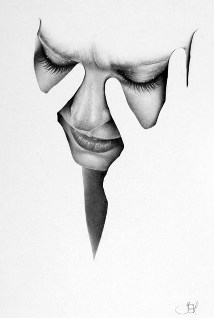
[2]
[1]-Hunter, I. (n.d.). Fragments. [Pencil on extra smooth bristol board] Available at: https://www.etsy.com/uk/listing/157774447/original-portrait-pencil-drawing-fine?show_sold_out_detail=1&ref=anchored_listing&frs=1 [Accessed 3 Apr. 2020].
[2]- Hunter, I. (n.d.). Fragments: Lou. [Pencil on extra smooth bristol board] Available at: https://www.etsy.com/uk/listing/626937313/pencil-drawing-portrait-fine-art-print?ref=sold_out-13&frs=1 [Accessed 3 Apr. 2020].
Hunter has a different approach in her use of negative space, using it to frame her portraits, and to create a line in which to direct the viewers gaze. The contrast created from the negative space helps to create a focus on the portrait, and helps to exaggerate the expression. It creates a juxtaposition of what should be a tight closed in space around the face, making it much more open, putting the subjects feelings on full display rather than hiding it, which is what they want to do with their hands.
In my work, I could look at using negative space to frame and draw focus to a certain area within my drawings, and how negative space could create a clear focus for what I would like to portray. Furthermore, how I can take a meaning within my drawing and changing it with how I use or fill up the space as Hunter has done, making the hands absent and blend into the space around the face.
Henrique de Franca
[1] 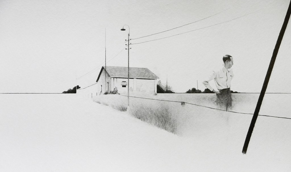
[2] 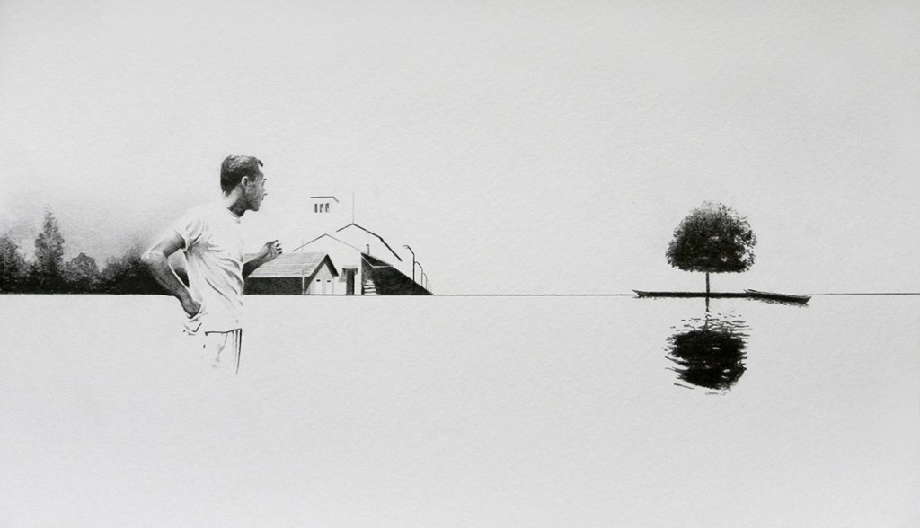
[3]
de Franca, H. (2016). Torpor- Drawing series. [Pencil on paper] Available at: https://www.behance.net/gallery/32875525/Torpor-drawing-series [Accessed 3 Apr. 2020].
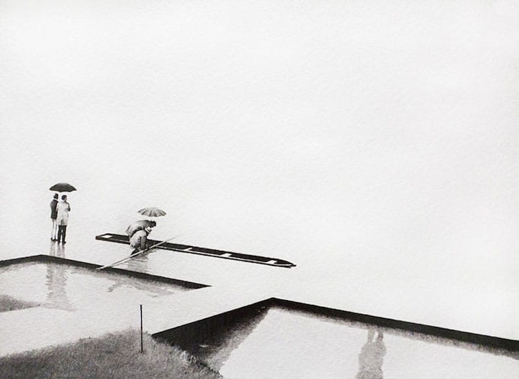
Henrique de Franca creates beautiful landscapes in his Torpor drawing series, where he hints at just enough to give the viewer a sense of where they are and allows their minds to fill in the gaps, constructing beautifully minimalistic pieces. Like Hunter, he relies on tone for detail, but doesn’t use it as heavily, allowing the vast white page to give the spotlight and attention to his markings, as since there are so few each one is important and intentional. They are thoughtfully placed. I love how he hints at the surroundings that aren’t necessarily included, for example in piece [1] the hinting of a persons presence in a reflection in the bottom left but the actual person is no where to be seen. Or in piece [3] how a body of water is hinted at with the reflection of the tree but not physically shown. It creates a feeling of wanting to know more and unfulfillment even though you are looking at stunning sketches. This is done intentionally, perhaps to create the need to explore as he has done and inspire the viewer to go searching for themselves. Or maybe to use their imagination and realise they don’t need every single mark to see what so few can give them.
I could look into using fewer marks and focusing on using less to get a narrative and drawing across to my viewers. Making each one purposeful and really looking at the space I have on a page, and how much of that space do I need to take up to spark a reaction from the viewers of my work.
Moving forward…
Looking at these artists and the variety of ways I can use negative space has opened my eyes to the work I can create. I want to think more about the space I take up on a page, and how I fill up that space with my composition and use of shapes. Do I need to fill up the entirety of the space? Can fewer marks create more of an emotional impact within my work? How could I use certain shapes and negative space to frame my work in an effective way like Hunter does? I have a few ideas I want to develop and experiment with after being inspired by these artists I have looked at, and I can’t wait to start experimenting with my composition and style, and develop more as an artist.
Sources and References:
Image 1- Vicous by Gary Hume: Hume, G. (2010). Vicious. [12 colour Silkscreen printed on 410 gsm Somerset Tub Sized paper] Available at: https://www.artspace.com/gary_hume/vicious [Accessed 20 Mar. 2020].
Source [1] : Artspace. (n.d.). Vicious, Gary Hume | Artspace.com. [online] Available at: https://www.artspace.com/gary_hume/vicious [Accessed 2 Apr. 2020].
Source [2]: genius.com. (n.d.). Lou Reed – Vicious. [online] Available at: https://genius.com/Lou-reed-vicious-lyrics [Accessed 3 Apr. 2020].
Image 2- Hunter, I. (n.d.). Fragments. [Pencil on extra smooth bristol board] Available at: https://www.etsy.com/uk/listing/157774447/original-portrait-pencil-drawing-fine?show_sold_out_detail=1&ref=anchored_listing&frs=1 [Accessed 3 Apr. 2020].
Image 3-Hunter, I. (n.d.). Fragments: Lou. [Pencil on extra smooth bristol board] Available at: https://www.etsy.com/uk/listing/626937313/pencil-drawing-portrait-fine-art-print?ref=sold_out-13&frs=1 [Accessed 3 Apr. 2020].
Images 4,5 and 6: de Franca, H. (2016). Torpor- Drawing series. [Pencil on paper] Available at: https://www.behance.net/gallery/32875525/Torpor-drawing-series [Accessed 3 Apr. 2020].
