In this exercise, I began looking at my use of tone in more detail, how do I go about creating it effectively within my work. To start with I began experimenting with four different mediums and how they varied with different approaches to applying tone.
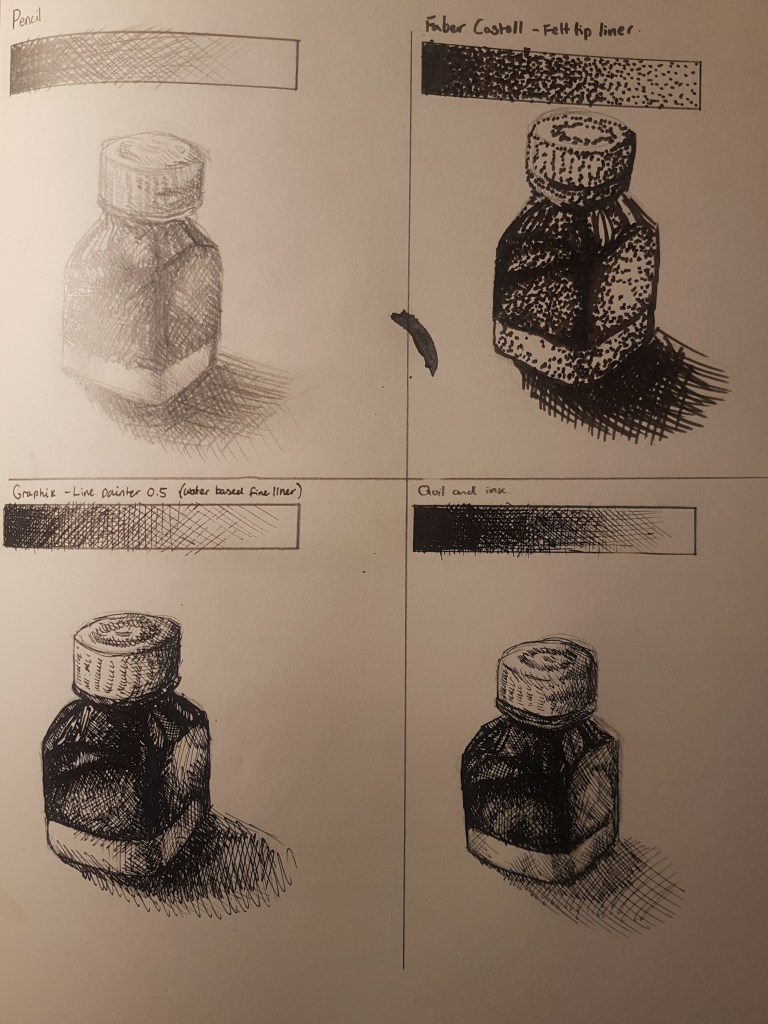
I began by creating four rectangular boxes, and choosing four different drawing tools to draw with; pencil [top right], Faber Castell felt tip liner [top left], Graphik line painter [bottom left] and ink with a calligraphy pen [bottom right]. By filling in the boxes, creating a a gradation of tone allowed me to see how the material works and how I could best use it in order to effectively show tone. With the felt tip liner [Top right] I tried a different approach to cross hatching as the strokes were very thick, instead I tried using spots to show my gradation of tone. I’m happy with how all the rectangles of tone look, three of them obviously came out looking very similar. As for my attempt at using spots, I think using another medium could have looked better or being a bit more sparing with my use of dots towards the end of the rectangle could have helped bring it together more. I then moved on to see these techniques in action. I used the same item to draw when looking at each medium, to accurately judge my use of each technique and drawing tool.
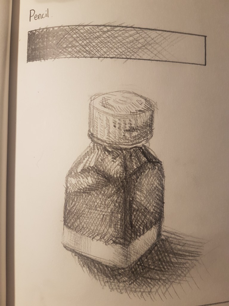
Pencil [1] 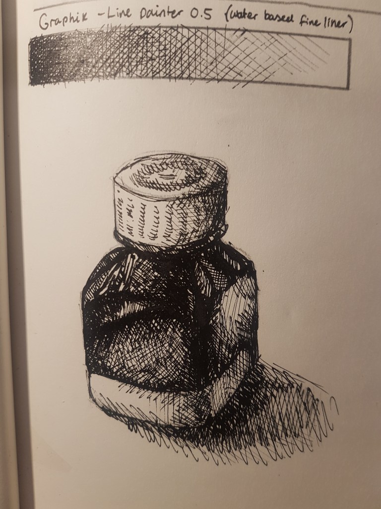
Graphik liner [2]
I think the outcome of these two attempts are very similar, due to my use of cross hatching, a technique I’m very comfortable with. I am happy with the pencil sketch I did but can’t but feel I should do move with it, such as blend or smudge the markings for a more realistic approach to a tonal sketch. I think that because I used a HB pencil it was harder to capture the darker areas than if I used a 2B pencil, something darker. As for the Graphik liner attempt, I was much happier with how this one came out. It was a lot easier to create tone with cross hatching since the darkness of the material doesn’t vary with pressure. Its all a solid colour. So building up lines to create darker areas wasn’t as difficult as using a pencil where your pressure matters.
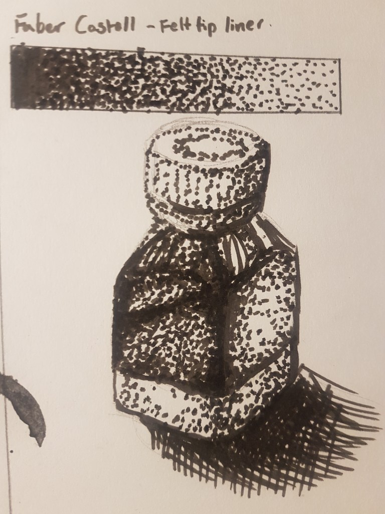
I am not as happy with this attempt, I don’t think I really nailed this technique, but maybe with more practice or using a different medium I could utilise it better within my work. I think the felt liner is a bit thick and I didn’t use that efficiently here to show off tone effectively. I think the cap is almost there, I should have used it more so to show areas of light and dark rather than to outline the shape of the object. So moving forward with my work on tone I plan to not focus on the outline of the shape, but more so just areas of light and dark. However I did also utilise cross hatching in the shadows, as I thought the long lines would capture how the shadow stretches better than dots could. Maybe with a finer pen the dots could have worked better, or if I gave more thought to how I used them in my composition.
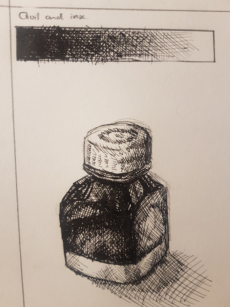
I think I am most happy with this piece. I like how the ink can vary in thickness depending how you hold the quill/pen, but it never is too thick. Furthermore the strokes become invisible when you build it up and blend into the ink already on the page. I like this effect and how the ink isn’t streaky, which can sometimes take away from the tonal aspect of a drawing. I found it resembles Odilon Redon’s traditional style and his use of ink and cross hatching. I would like to experiment further with the medium and see what I can create, especially taking into account Redon’s work and seeing how that may influence my work and style as an artist.
Part 2- Creating a still life
Looking more into how to create a tonally interesting still life, I gathered a group of objects in order to try and capture a still life using the techniques I just looked at.
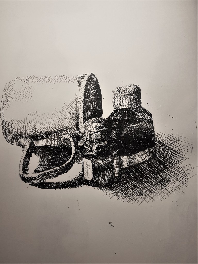
For my composition, I gathered three objects, two ink pots and a mug. I liked the contrast with the white mug, compared to the dark little pots of ink, furthermore by placing a light source from an above angle it creates an interesting shadow with the mug handle and nice reflections on the pots and mug. I started with a loose line drawing to get my proportions and composition right. I then used cross hatching with ink, as I really wanted to experiment further with this medium and I found that I really enjoy using it. Especially since it is not a material I have ever thought of using before. I began by going for the darkest areas first, working left to right as not to smudge any wet ink. I was careful, especially with the darker pots, to leave areas for highlights and light reflections. After finishing off with the ink, I then went back over it rubbing out the pencil outlines to leave an entirely tonal piece.
I am very happy with this piece, I think I captured the tone and proportions really well this time. This exercise and crafting this drawing really helped me to better understand my use of tone and how I can effectively use it to create much more realistic and accurate tonal pieces, and understand that not every drawing needs an outline to capture the shape of the subject effectively. It is somewhat reminiscent of Odilon Redon’s work, but I want to try something similar in order to create an effective atmosphere as Redon does so well in his work.
I decided to do one more drawing for this exercise, but this time, much more heavily influenced by Redon’s style, but still try and make it my own. I was inspired by his piece ‘The Egg’.
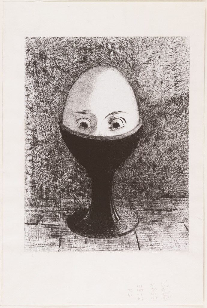
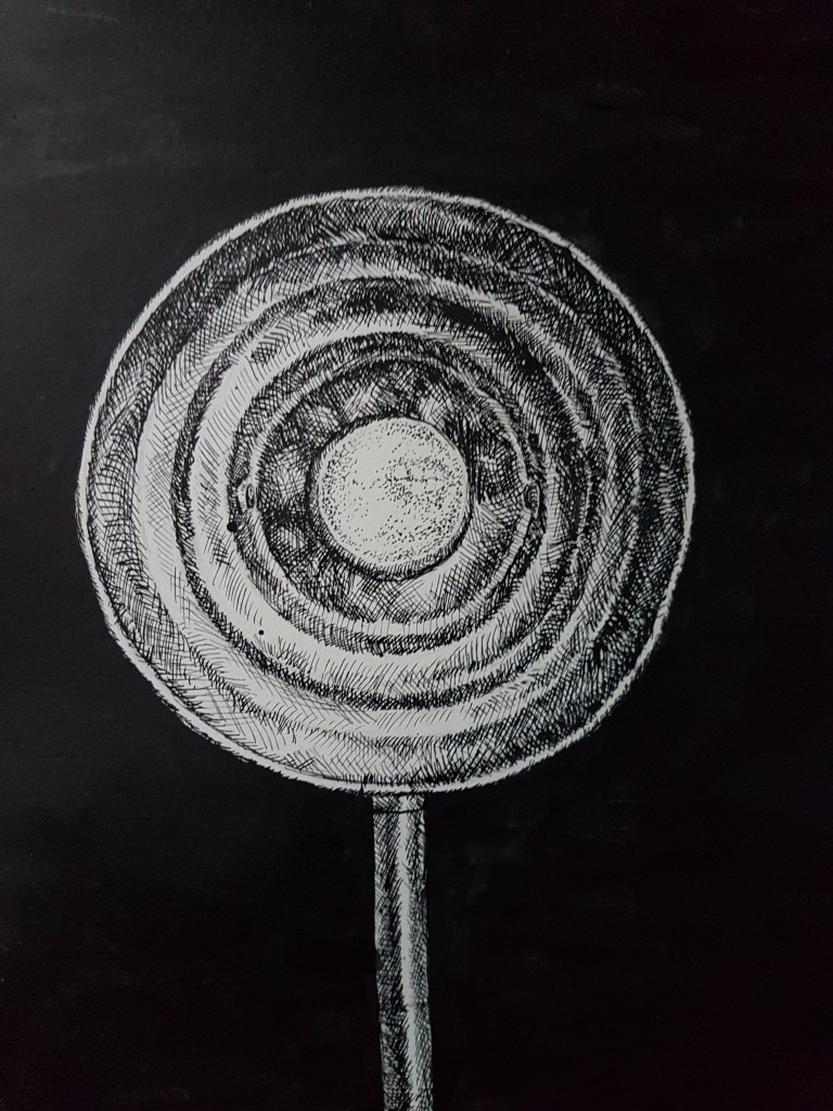
The Egg- Odilon Redon
There is a lot of texture here, as well as minimalism within the composition. The focal point is clear and surreal. All of this combined helps to create a mysterious but creepy atmosphere, very effectively. I would like to do something similar. I wanted to create a drawing where my technical skills of tone can effectively capture a texture, and have a minimalistic aesthetic, utilising a dark background to help create an atmosphere. Keeping with Redon’s style of course but still somewhat making it my own.
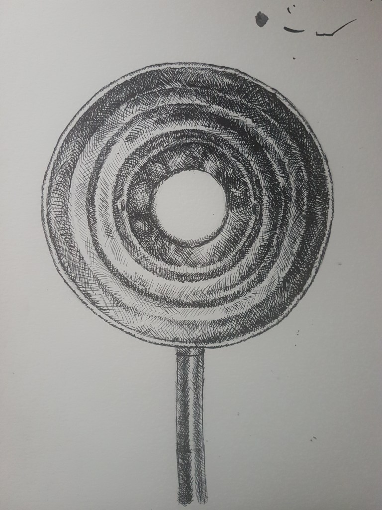
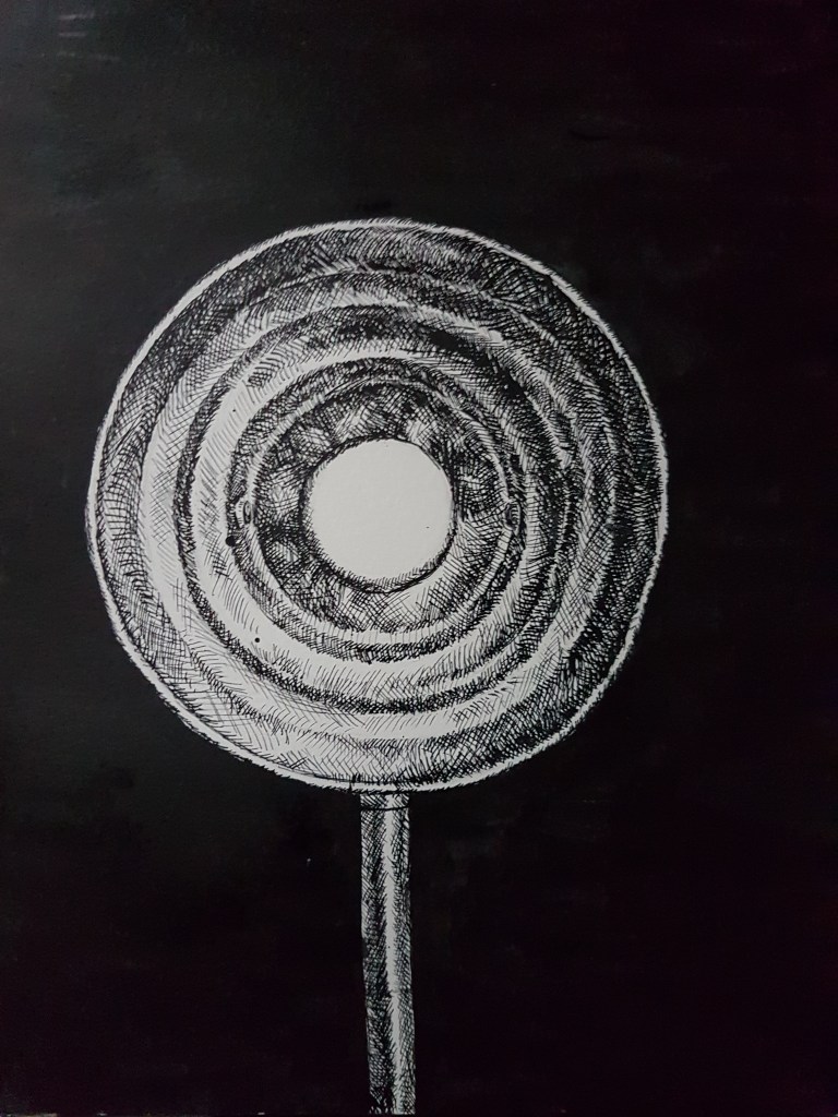
For my composition, I decided to stick with one object, to keep to a minimalistic approach and also to have one clear, main focal point. As Redon did with his print, I had my object ( a front facing lamp) front and centre. I think the pole on the bottom of the lamp, and the rings created by the ridging, help to point and draw the viewers eyes straight to the bulb of the lamp, making the bulb the clear, main focal point. I think I captured the smooth and reflective texture of the metallic lamp, especially on the pole. I wasn’t sure how to go about adding tone to the bulb, so left it bare for the time being, unsure of whether I wanted it white, or wanted to add the detail of the reflection on the bulb. While thinking on that aspect of the drawing I went ahead and added a smooth black background to create an atmosphere. I like how the ink wasn’t streaky and dried very smooth and clean. I feel the black background helped bring the piece together, and made it look much more finished than with just a white background. I really liked how it looked, but couldn’t help but feel that the drawing would not be complete without the reflection of a window which can be seen in the bulb. However I didn’t want to use more cross hatching, as I felt this would blend the bulb in with the rest of the drawing, I wanted it to stand out and be different compared to the rest of the lamp. I wanted it to be clear and pop out in contrast to the rest of the drawing. So I went and looked at Redon’s piece again, and saw how he made the egg different to the rest of the drawing by changing his way of creating tonal markings from cross hatching to using dots, or specks. So I decided to give that a try, changing my markings to keep the bulb and lamp still somewhat separate from one another.
I love my use of dots as a way of tone in this piece, it helps to create a delicate feel to the bulb, which I rather like. I also think my use of the dots as a way of tone has improved since my last attempt. I used the dots sparingly to keep the light colour of the bulb, while also incorporating the reflection of the window that I really wanted to incorporate into the drawing. I think that looking at the finished drawing, I have somewhat been able to capture an atmosphere, however instead of the surreal aspect of Redon’s work, I have created more of an abstract one. Upon receiving feedback, many people did not get that it was a lamp until it was pointed out, which after the lamp was all they could see. I feel the rings add an abstract quality to my piece as they come across much more like a pattern, than part of a lamp or object. One viewer of my work told me it looked like a planet or portal, while others saw a lollipop or a pan with a fried egg. I am happy with the piece, as I have created something very broad and open. I think I did capture some of Redon’s style. This style is something I would like to look into further and experiment with more in order to create minimalistic and atmospheric drawings of still life.
