In order to create a sense of reality within ones work, the use of tone is crucial. The use of tone, creating areas of light and dark, help to make a 2D drawing have a 3D feel, and along side texture, helps to create a real feeling drawing. I wanted to experiment with some drastic lighting and objects casting shadows to play around and experiment with the aspect of tone, and how well I can create a life like drawing. I chose objects with smooth surfaces and not much texture to them to keep the focus on the tonal side of creating a drawing.
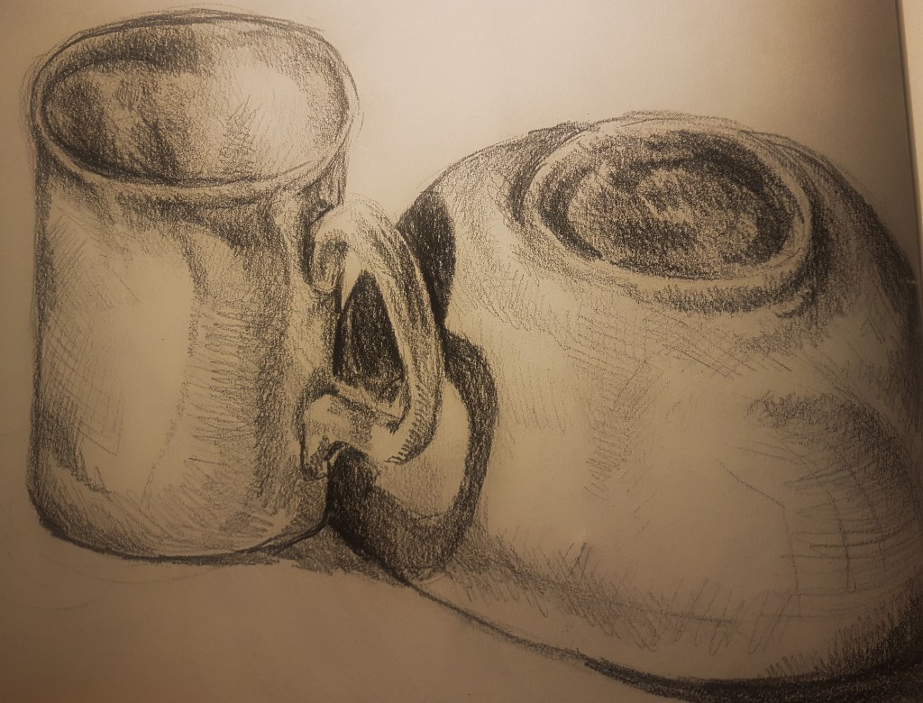
For this first attempt of the exercise, I sat a coffee mug next to an upside down bowl, and lit them from an angle in order to cast an interesting shadow. I then sketched out the basic shapes of my composition, and blocked in areas of tone, using cross hatching, lines and shading. I was happy with the results but knew I could do better once I got into the swing of it. I decided I would adjust the angle of light and try again.
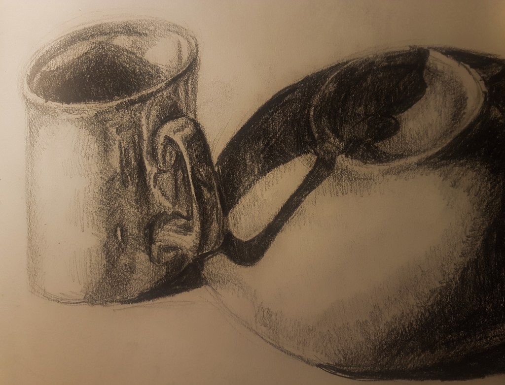
I adjusted the angle of my light source in order to cast larger and longer shadows, that would make sketching my composition a lot more interesting. I had larger areas of tone to block in, in new interesting curves and shapes cast onto the bowl. I like how the shape of the mug handle is cast onto the bowl , curving around the bowl. When creating the areas of tone, I decided to make them a lot more intense, especially in the darker areas, which helped me to create a much more realistic piece than my previous attempt.
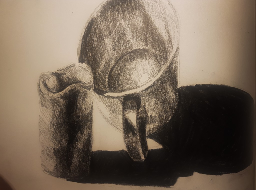
For my third attempt I decided to try a new composition including a new object, a small candle. I kept with using smooth, rounded objects. The candle was new and interesting to draw as it was a matte material, where as the mug and bowl have a porcelain shine and reflect light. So I added some lighter shading to the lighter areas of the candle to try and capture the dullness of the was material. I like how I captured the translucent area towards the top of the candle, where the thickness of the candle has been thinned out by the flame, and therefore the light from my light source shines through just a little bit. I am happy for the most part with how I created blocks of tone on the mug, however I feel I could have gone darker on the side of the mug that the light didn’t really hit. As I went quite dark in my approach to the handle, it doesn’t make sense why it wouldn’t be that dark on the right side of the mug. To improve next time I should take my time to observe my drawing and make sure I am completely happy with my areas of tone.
[4] 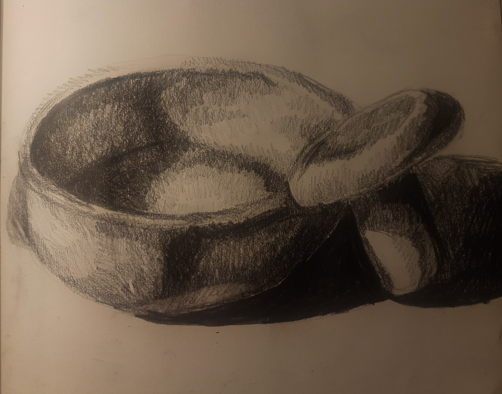
[5]
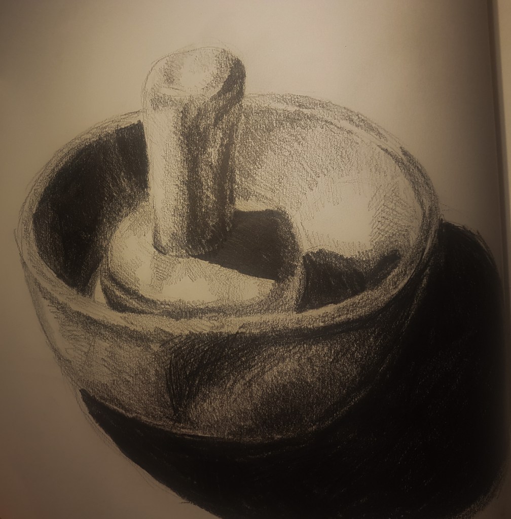
I tried new objects and a new composition for my fourth and fifth attempts, using a mortar and pestle in two different positioning’s. In drawing [4] I think I did well on creating areas of block tone, however my proportions of the bowl are a bit off, which is annoying. I like the clear shadow created by the handle and how it curves in the bow, but is also broken up by other shapes. In drawing [5] I think my proportions are improved. I like how my blocked out areas of tone are clear, however I could improve on the dip in the pestle, it could use some highlights to define the shape further.
[6] 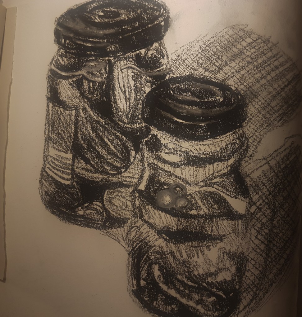
[7]
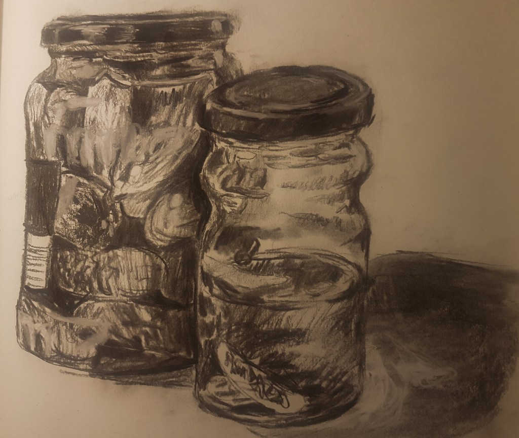
For attempts 6 and 7 I changed the composition to something more challenging and with a lot more varied areas of tone; two pickle jars, one full and one empty. I started with the basic shapes, and then began to fill in the darkest areas first such as the lids and space between the pickles, I then used lines and shading to fill in other areas of tone and to add a bit of texture to the pickles. On the second jar, I used an eraser to create lighter areas which had been covered by dark shadows, in order to create the resemblance of water filling the jar. On drawing [6] I smudged the shadow created by the jars to show the translucency of the jar filled with water. For drawing [7] I just used simple cross hatching in order to keep the focus on the jars. I think Drawing [6] was the best one I produced from this exercise, as it contains a lot of detail from the areas of tone I created, and hold more texture due to my use of lines.
I found this exercise useful for helping me to grasp tone and how to portray it by simplifying it into basic block shapes of light and dark. In my next few exercises I would like to branch out from using lead and charcoal and be more experimental with my use of media and what affects they can create compared to more textured mediums like charcoal and lead. I would like to try something smoother like ink perhaps and see what kind of images I can create in my drawings.
